Will “Buy the Dips” Work Again in November 2025?

How can you tell that an uptrend is still an uptrend? In a bullish phase, it’s less about the new highs and more about the higher lows. If investors are still optimistic about market conditions, then dip buyers will come in and buy charts showing short-term weakness. A failure to hold the most recent swing low, representing the absence of willing buyers, can often serve as the most important indicator of a major top.
In our most recent monthly Top Ten Charts video, Grayson Roze and I discussed a number of stocks that have been in established uptrends into November. Will dip buyers provide the higher low that would confirm the uptrend, or is this week’s weakness just a taste of the deterioration in store for Q4?
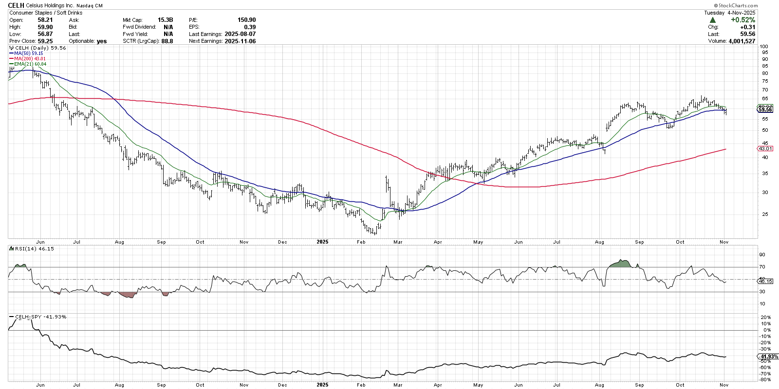
The chart of Celsius Holdings (CELH) is marked by a bearish momentum divergence, where the most recent new price highs have been accompanied by weaker momentum readings. But despite the lack of upside momentum, we can still observe a clear pattern of higher highs and higher lows. Celsius is in a strong uptrend until that pattern breaks!
But if this is indeed a sustained uptrend going forward, then we would reasonably expect an influx of buying power right around current levels. CELH has pulled back to its 50-day moving average a number of times since the end of April. In each instance, this moving average has served as short-term support before the stock resumes its uptrend phase. If CELH breaks below the 50-day moving average, and if the RSI drops below the 40 level on that pullback, then we would consider the uptrend off the February low to be very much in question.
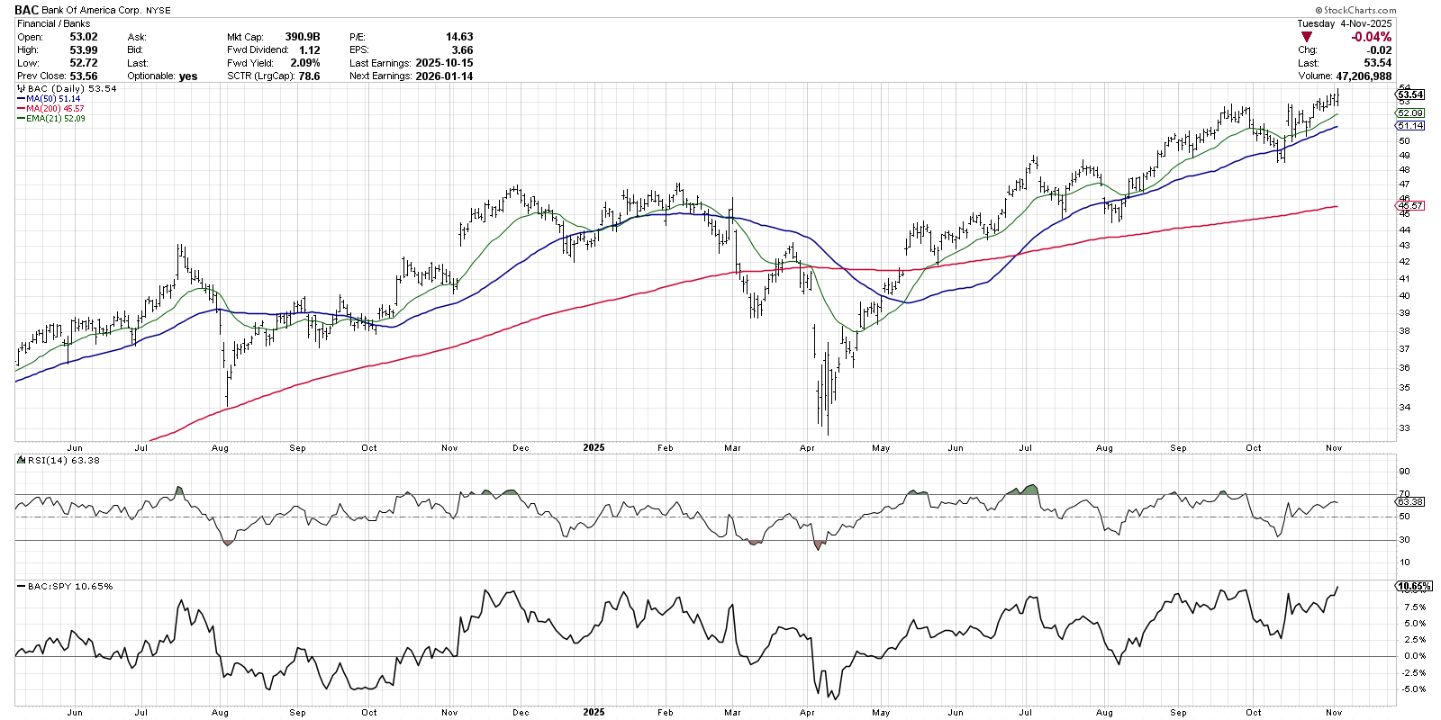
Why might we expect support at the 50-day moving average? Our next example, Bank of America (BAC), demonstrates how a long-term uptrend can include a number of tests of moving average support. The pullback in July and August created a classic “bull flag” pattern before the mid-August breakout confirmed a new bullish phase. Then, in early October, we saw another pullback to the 50-day before an eventual break to a new 52-week high into November.
Even though the S&P 500 and especially the Nasdaq 100 experienced a painful drop on Tuesday, it’s worth noting that the financial sector actually finished higher for the day. Charts like BAC are perfect examples of how winning stocks can show strength despite broader weakness in the major equity averages. As long as we establish another higher low on the next pullback, the uptrend appears to be in great shape for Bank of America.
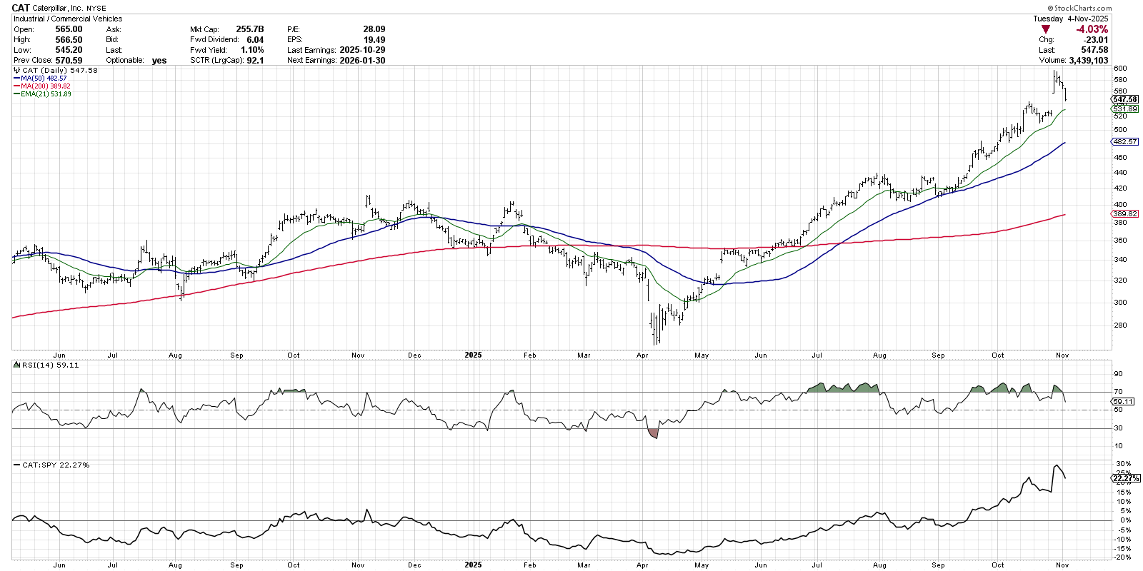
Caterpillar (CAT) was another name I highlighted in this month’s video, as it represents several stocks that gapped higher after a strong Q3 earnings release. The bad news for charts like CAT is that they traded lower after the upside gap, indicating a lack of upside follow-through and therefore a lack of willing buyers.
For CAT and similar charts experiencing this recent earnings gap, I’m focused on the 21-day exponential moving average (EMA) as an initial warning signal. A brief pullback after a strong upside gap is common, if not expected. But if CAT can’t hold the 21-day EMA on its next pullback, then perhaps that recent gap was actually an “exhaustion gap” which, often pops up at the very end of a bullish market phase.
The reality is that charts like CAT, BAC, and CELH have been trending higher for quite some time. And every uptrend will at some point be interrupted by a major pullback as investors take profit and the market resets for the next trend. The good for these three charts is that they can provide fairly clear signals if dip buyers are coming in as expected. But if charts like this are unable to hold recent support, then perhaps the warning signs we’ve been observing were indeed a harbinger of a new bearish phase for stocks.
RR#6,
Dave
P.S. Ready to upgrade your investment process? Check out my free behavioral investing course!
David Keller, CMT
President and Chief Strategist
Sierra Alpha Research
marketmisbehavior.com
Disclaimer: This blog is for educational purposes only and should not be construed as financial advice. The ideas and strategies should never be used without first assessing your own personal and financial situation, or without consulting a financial professional.
The author does not have a position in mentioned securities at the time of publication. Any opinions expressed herein are solely those of the author and do not in any way represent the views or opinions of any other person or entity.


