Year-End Rally Watch: How Sector Rotation Is Fueling the Bull Case

Key Takeaways
- It's a pivotal week filled with the Fed, mega-cap earnings, and global trade headlines all set to move markets.
- Bond yields and volatility have cooled, hinting at a setup for continued equity strength into year-end.
- Find out the best tools to track sector rotation, yield trends, and the next potential leg of the rally.
Earnings season gets real this week, with 44% of the S&P 500 Index’s earnings reporting over the next four-plus days. Five of the Mag 7 names serve up Q3 numbers, including Apple (AAPL), Microsoft (MSFT), Alphabet (GOOGL), Amazon (AMZN), and Meta Platforms (META).
Toss into the mix a Fed meeting and the much-anticipated Trump/Xi handshake to hash out trade deal terms, and this may be the most pivotal week on the macro front through the end of 2025.
Calm Before the Storm
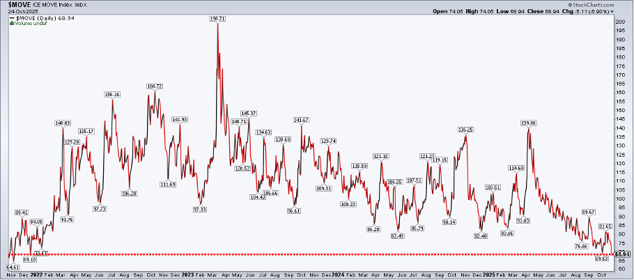
Ahead of so many volatility catalysts, you won’t find a whole lot of Wall Street jitters. The Cboe Volatility Index ($VIX) sank under 15 to kick off the week, and the ICE BofA MOVE Index of Treasury market volatility ($MOVE) settled at its lowest mark in nearly four years last Friday.
What’s more, throw a dart at a board of global equity indices, and there’s a good chance you’ll land on an all-time high.
Last week, I noted that the VIX spiked to within a whisker of 29, which may have laid the groundwork for the much-touted year-end charge. The narrative is playing out well to this point — we've gotten through the sometimes-scary September–October period relatively unscathed, and November has historically been the best month of the 12.
The Bond Market’s Quiet Phase
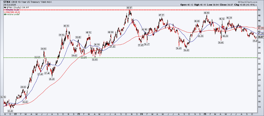
Let’s zoom in on the Fed and the apparently sleepy bond market. At 4.02% on the benchmark 10-year Treasury note ($TNX), we haven’t seen the violent day-to-day swings in rates that we were accustomed to from 2022 through Q2 of this year. Pull back the 10-year's chart to a few years ago, and it’s clear that bond vigilantes remain in waiting for the next leg up in yields.
Technically, TNX is now below its falling 50-day and 200-day moving averages. I’m not taking that as a significant signal, though, as we’ve seen previous instances of the 10-year drifting below those trend-indicator lines.
It’s a good reminder for traders that when there’s no price trend, moving averages lose some of their value. After peaking at 4.27% in May amid concerns about the One Big, Beautiful Bill Act (OBBBA), it has been in steady decline. A letup in the global sovereign bond selloff has helped buoy support for U.S. 10-year notes, too.
Fed Week: Relaxed Policy in Focus
Turning to the Fed, a quarter-point cut is baked in as the 12 voting members gather starting on Tuesday to outline policy. We won’t get a Summary of Economic Projections (SEP) this go-round, so that puts more emphasis on Powell’s Wednesday afternoon presser.
With inflation humming at 3%, the case for cutting is problematic. So, the Fed chief may lean on the September SEP (the dots) to explain why three consecutive eases are likely in the works.
A Look at Key Macro Relationships
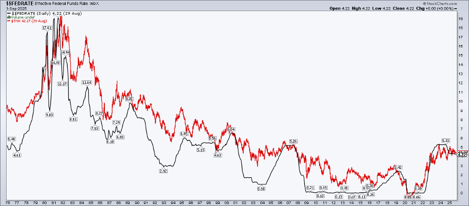
You can be your own macro pundit using StockCharts’ tools. One view I gravitate toward during Fed Week is the plot of the Effective Fed Funds Rate (EFFR) and TNX. That spread has averaged near 150 basis points during non-recession periods.
The two are on top of each other today, so fixed-income portfolio managers may be reluctant to extend duration. Does that change in the 12 months ahead? Potentially, if Fed Funds futures verify, and the policy rate retreats toward 3%, along with the benchmark yield venturing higher to 4.5%.
Cash on the Sidelines
Maybe it makes sense that money market fund assets rose again last week to $7.398 trillion. Pair an ample nominal cash hoard with a technical clearing event (the VIX jumping to the high 20s), and we could have a recipe for higher stock prices over the next two months and change.
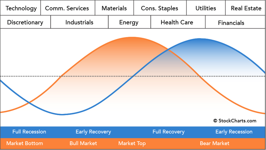
Sector Rotation Fuels the Bullish Narrative
Sector rotation also supports the bull case in the year’s final 50 sessions. Leading over the past month isn’t Information Technology or Communication Services. The defensive Health Care space is best among the 11 S&P 500 sector ETFs. It’s said that bull markets’ lifeblood is sector rotation, and we have indeed seen elegant handoffs among specific groups since April.
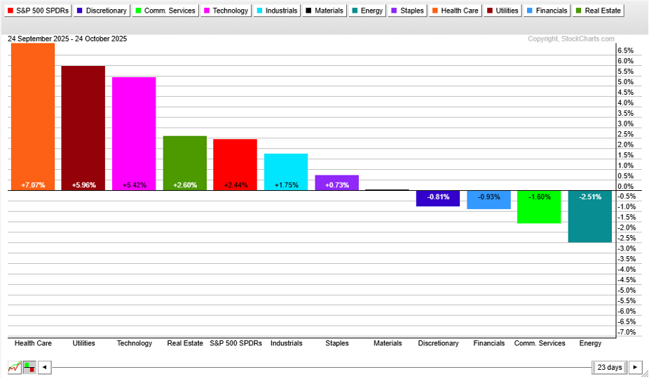
Sector-rotation aficionados might turn nervous when they see Health Care hitting its stride, as the textbook claims that when it leads, equities as a whole could face headwinds. The Sector Rotation Model is just guidance — it’s not gospel.
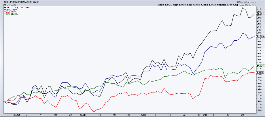
Furthermore, if we peek under Health Care’s hood, we find that some of its riskiest niches have driven the rally. Since late July, the Health Care Select SPDR ETF (XLV) has performed on par with the S&P 500 SPDR ETF (SPY), but the two most well-known biotech funds (XBI and IBB) have taken flight.
High-Risk Biotech’s Breakout
Tying it back to the bond market, the Fed’s apparent stance of allowing the economy to run hot is the ideal setup for long-duration, often unprofitable biotech components. The group has momentum, and I expect a year-end performance chase given the macro backdrop.
The Bottom Line
Amid a dearth of official data (with the government shutdown now seen lasting into mid-November), this week’s onslaught of Fed takes and mega-cap tech earnings could prove the most crucial stretch of the balance of 2025. Trends are in place for further gains through December 31, and recent momentum areas (like biotech) are benefiting from a chilled-out FOMC that seems fine letting inflation coast at 3%.
Disclaimer: This blog is for educational purposes only and should not be construed as financial advice. The ideas and strategies should never be used without first assessing your own personal and financial situation, or without consulting a financial professional.


