MEMBERS ONLY
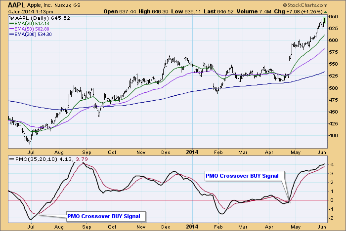
Apparently, No Double Top for AAPL
by Carl Swenlin,
President and Founder, DecisionPoint.com
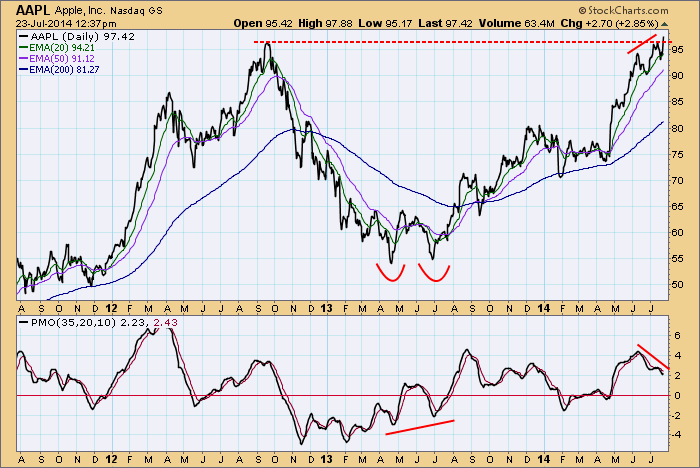
Apple reported earnings yesterday after the close, missing the 1.33 estimate by five cents. This set up a fundamental reason for the market to punish the stock, and there is a technical situation also pointing toward a potential decline. AAPL is challenging the all-time highs set in 2012, but...
READ MORE
MEMBERS ONLY
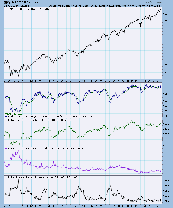
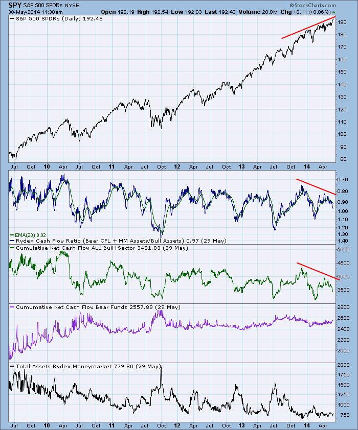
About the Rydex Ratios
by Carl Swenlin,
President and Founder, DecisionPoint.com
Sentiment has traditionally been measured by taking polls of selected groups of investors, advisors, investing professionals, etc. There have been and still are problems associated with this methodology: (1) The polls are normally taken over a period of several days, during which time market movement and investor outlook can change...
READ MORE
MEMBERS ONLY
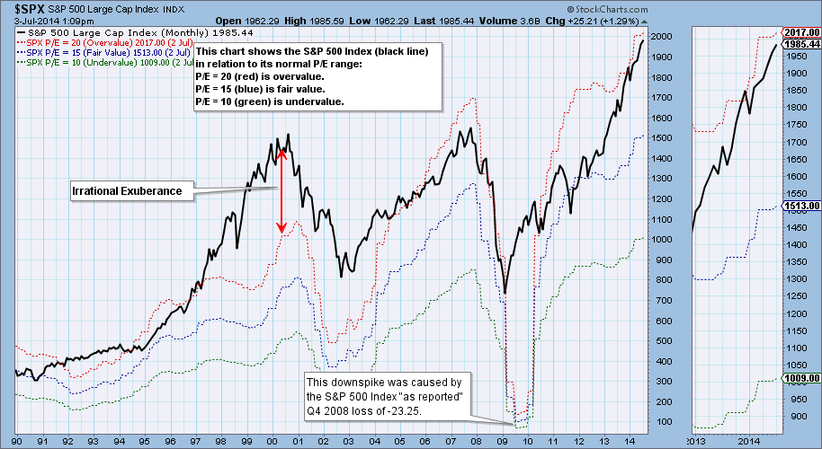
Q1 2014 Earnings: Market Merely Overvalued
by Carl Swenlin,
President and Founder, DecisionPoint.com
Standard & Poors has just finalized the S&P 500 earnings for the first quarter of 2014, and although there is some talk of an equities bubble, the market is merely overvalued. The following chart shows the S&P 500 with bands that show where the index would...
READ MORE
MEMBERS ONLY
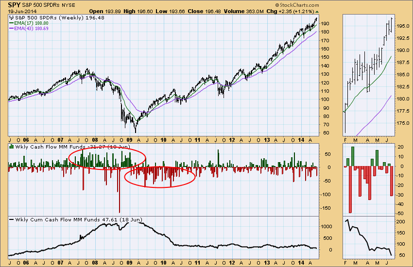
Money Market Weekly Cash Flow Shows Bullish Sentiment
by Carl Swenlin,
President and Founder, DecisionPoint.com
One of the data sets we keep is Money Market Mutual Fund Weekly Net Cash Flow, published on ICI.org. It is a sentiment indicator that allows us to watch short-term sentiment, as well as sentiment trends. The histogram on the chart below reflects the weekly cash flow in billions,...
READ MORE
MEMBERS ONLY
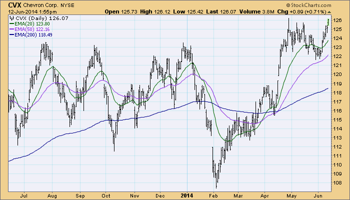
Understanding Price and Moving Average Relationships
by Carl Swenlin,
President and Founder, DecisionPoint.com
A useful and basic technique for deciding if a stock is bullish or bearish to observe the relationship of price to its moving averages. I use the 20EMA (short-term), 50EMA (medium-term), and 200EMA (long-term), and the stock is considered to be bullish or bearish in a given time frame depending...
READ MORE
MEMBERS ONLY
Nasdaq 100, Health Care, and Technology Have Excess of PMO Buy Signals
by Carl Swenlin,
President and Founder, DecisionPoint.com
The Precentage of Stocks on PMO Crossover Buy Signals is flashing a warning on three of the indexes we track in the decisionPoint Alert Daily Report. The Price Momentum Oscillator is a primary DecisionPoint indicator that generates short-term Buy and Sell signals when it crosses above and below its 10EMA....
READ MORE
MEMBERS ONLY
Rydex Cash Flow Undermines Market Rally
by Carl Swenlin,
President and Founder, DecisionPoint.com
We calculate and chart daily and cumulative net cash flow, which is the actual cash entering and leaving each fund in the Rydex group of funds. This is done by calculating the amount that total assets in a fund should have changed based upon the percentage change of per share...
READ MORE
MEMBERS ONLY
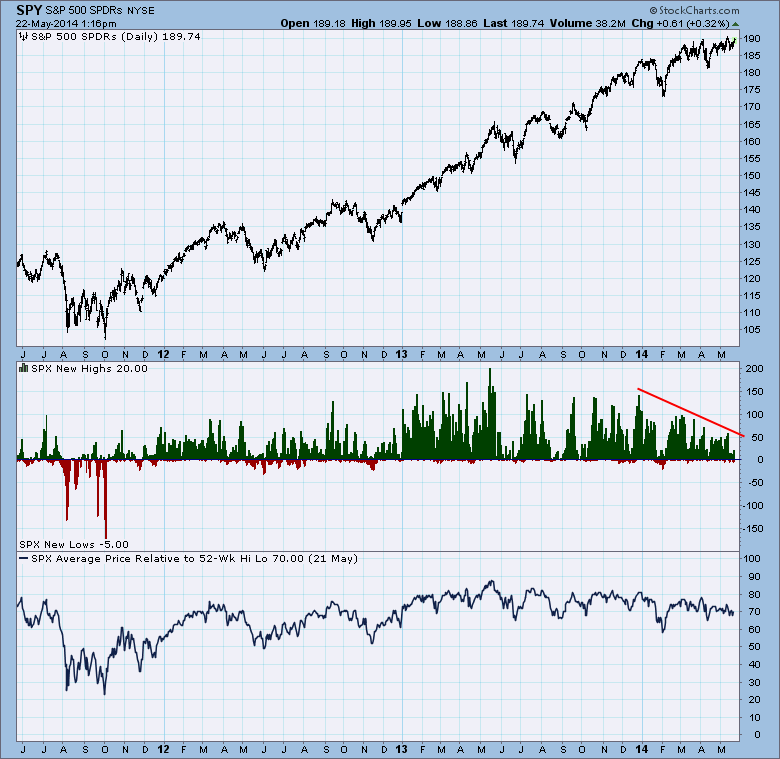
Fading New Highs Not a Problem Yet
by Carl Swenlin,
President and Founder, DecisionPoint.com
In the last three months price has been squeezing out new record highs, but the number of new 52-week highs has been contracting. Clearly, fewer stocks are participating in the push to new price highs, and this divergence is of concern. However, we also note that there has not been...
READ MORE
MEMBERS ONLY
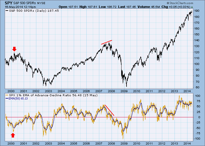
The 1% EMA A-D Index: A Long-Term Breadth Indicator
by Carl Swenlin,
President and Founder, DecisionPoint.com
Our focus is so often on the short term, but an awareness of what is happening longer-term is essential to getting a complete sense of market condition. One useful long-term indicator is what we call the 1% EMA of the Advance-Decline Ratio. I first learned of this indicator from Stan...
READ MORE
MEMBERS ONLY
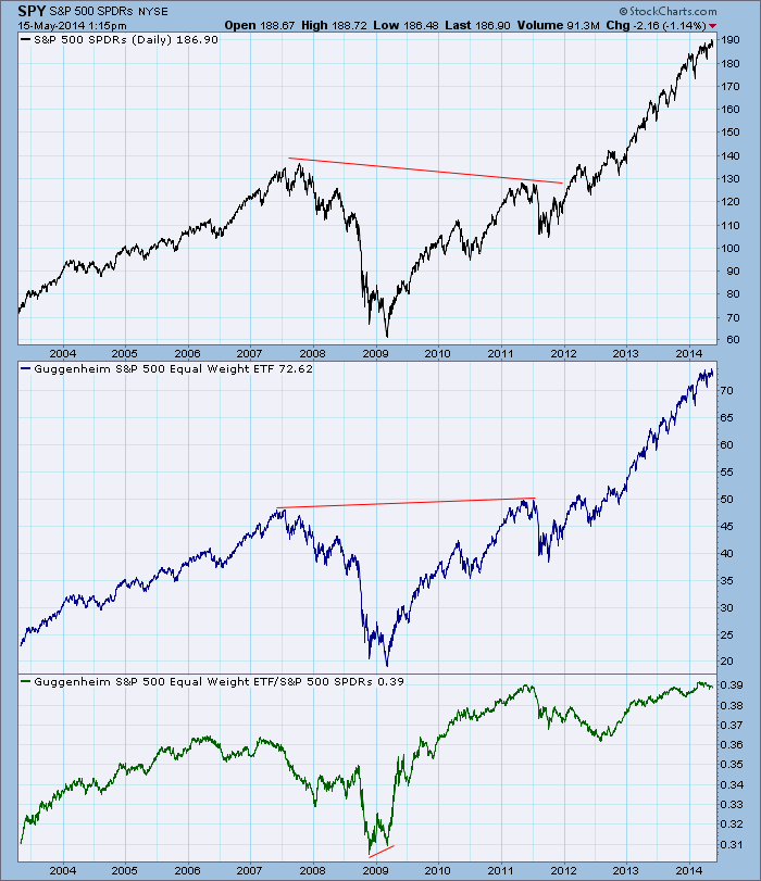
Expect Equal Weight Index Underperformance
by Carl Swenlin,
President and Founder, DecisionPoint.com
The recent emerging weakness in small-cap stocks should alert us to potential weakness in equal weight market/sector indexes. To demonstrate this point let's look at a comparison between SPY and the S&P 500 Equal Weight Index (RSP). But wait! How do we learn about small-cap...
READ MORE
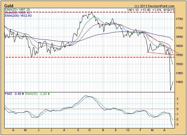
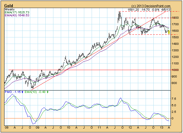
MEMBERS ONLY
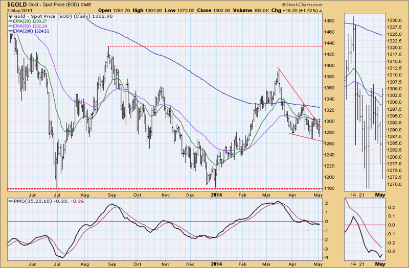
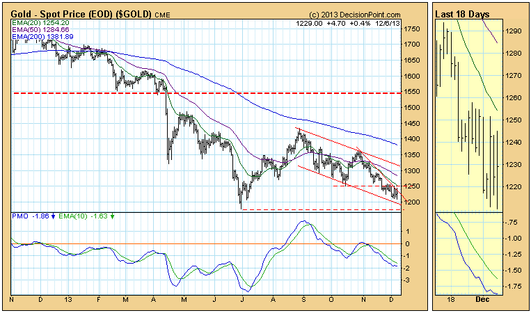
Gold Breaks Out of Falling Wedge
by Carl Swenlin,
President and Founder, DecisionPoint.com
Gold broke out of its recent falling wedge pattern, which is the normal expectation for that pattern.
The weekly chart shows price sliding down the declining tops line. Nice that it is staying on top of the line, but it needs to reverse direction.
Despite the breakout, as of 4/...
READ MORE
MEMBERS ONLY
Visa (V) Breaking Down
by Carl Swenlin,
President and Founder, DecisionPoint.com
After a quick review of the charts of Dow 30 Industrial stocks, the worst looking chart, in my opinion, is that of Visa (V). The first and most obvious problem is that price has broken down through a shallow parabolic line that defines the upward trend. The second issue is...
READ MORE
MEMBERS ONLY
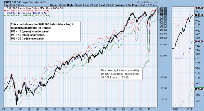
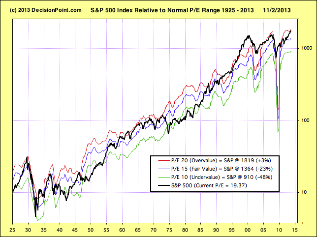
This Market Is Officially Overvalued
by Carl Swenlin,
President and Founder, DecisionPoint.com
On any given day we can find a wide range of opinions as to whether the stock market is undervalued or overvalued, and the bases for these assessments are also wide ranging and sometimes overly optimistic. I think a good starting point for estimating value is to use a price...
READ MORE
MEMBERS ONLY
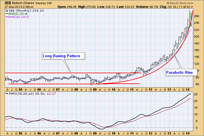
Biotech Bubble?
by Carl Swenlin,
President and Founder, DecisionPoint.com
This morning on one of the business channels the moderator was asking guests if there was a bubble the Biotech Sector, and at the same time a three-week line chart was displayed on the screen. Pretty frustrating, but it did tickle my curiosity, so I made a 10-year monthly bar...
READ MORE
MEMBERS ONLY
Gold Sentiment Still Negative
by Carl Swenlin,
President and Founder, DecisionPoint.com
Central Gold Trust (GTU) is a closed-end mutual fund, which means that it trades like a stock on the NYSE. The fund owns only gold -- the metal, not stocks. Closed-end funds trade based upon the bid and ask, without regard to their net asset value (NAV). Because of this,...
READ MORE
MEMBERS ONLY
Volume Ratios Turn Bearish
by Carl Swenlin,
President and Founder, DecisionPoint.com
In his book "Winning on Wall Street", the late Marty Zweig showed us the value of volume ratios. A ratio of 9:1 or greater of up/down volume is considered to be very bullish and 9:1 down/up volume is considered to be very bearish. We...
READ MORE
MEMBERS ONLY
Volume Ratios
by Carl Swenlin,
President and Founder, DecisionPoint.com
In his book "Winning on Wall Street", the late Marty Zweig showed us the value of volume ratios. A ratio of 9:1 or greater of up/down volume is considered to be very bullish and 9:1 down/up volume is considered to be very bearish. We...
READ MORE
MEMBERS ONLY
Climactic Activity On Volatile Short-Term Indicators
by Carl Swenlin,
President and Founder, DecisionPoint.com
Yes! It's Carl. I thought it was about time that I contribute to the new DecisionPoint blog on StockCharts.com. I plan to periodically blog here when I find something of particular interest that I'd like to share, similar to the Chart Spotlight on DecisionPoint.com....
READ MORE
MEMBERS ONLY
Analyzing the Recent Rise in Investor Sentiment using the DP Chart Gallery
by Carl Swenlin,
President and Founder, DecisionPoint.com
The bulls had been dropping out of the ring during the recent correction, but they're baaaaack.
The DecisionPoint Chart Gallery has a section devoted to sentiment. There is the Investor's Intelligence Survey chart with not only the percentage of bulls and bears, but also a bull-bear...
READ MORE
MEMBERS ONLY
An Introduction to SharpCharts for DecisionPoint.com Users
by Carl Swenlin,
President and Founder, DecisionPoint.com
The StockCharts charting tools are very powerful but can be a little confusing at first, especially if you are used to the simpler charting tool on DecisionPoint.com. So I wanted to take time today and talk a little bit about the differences between those two tools.
First off, I&...
READ MORE
MEMBERS ONLY
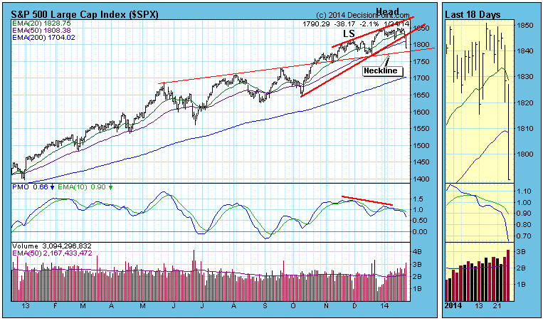
Possible Head and Shoulders Developing
by Carl Swenlin,
President and Founder, DecisionPoint.com
The head and shoulders pattern is frequently how a price index puts in a top, and, while it may be a bit early to start talking about it, it is one possible scenario that we can anticipate.
A few weeks ago we identified a rising wedge pattern, which believed would...
READ MORE
MEMBERS ONLY
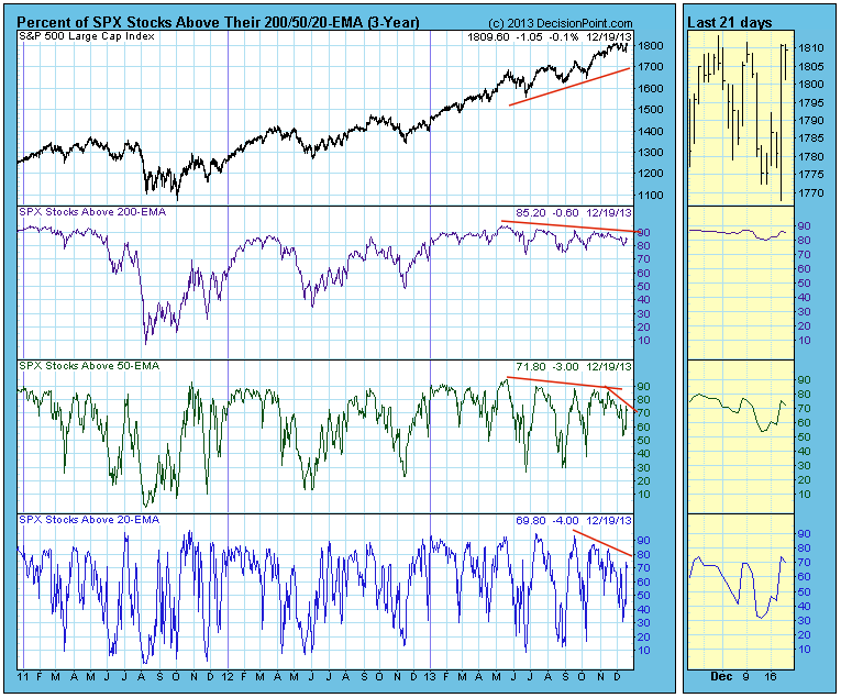
Prices Relative to Moving Averages
by Carl Swenlin,
President and Founder, DecisionPoint.com
When a stock is above a moving average it is considered bullish, and the stock can be considered to be in a rising trend for that time frame. A good way to determine the market's condition (overbought/oversold) across a range of time frames is to analyze the...
READ MORE
MEMBERS ONLY
Gold: A Chance for a Bottom
by Carl Swenlin,
President and Founder, DecisionPoint.com
After making a bear market low in June, gold rallied about 20%. Then from the August top, price headed back down for a possible retest of the June low.
There is a good chance that the retest will fail, sending bear market prices to lower levels, but there is also...
READ MORE
MEMBERS ONLY
Stocks Overvalued but No Bubble
by Carl Swenlin,
President and Founder, DecisionPoint.com
As usual we are hearing many claims regarding market valuation, mostly that stocks are undervalued based upon future earnings projections. We are also seeing a lot of headlines about stocks being in a bubble. Using twelve-month trailing earnings for the S&P 500 Index, we find that stocks are...
READ MORE
MEMBERS ONLY
Positive Seasonality Period Begins
by Carl Swenlin,
President and Founder, DecisionPoint.com
Research published by Yale Hirsch in the Trader's Almanac shows that the market year is broken into two six-month seasonality periods. From May 1 through October 31 is seasonally unfavorable, and the market most often finishes lower than it was at the beginning of the period. From November...
READ MORE
MEMBERS ONLY
Persistent Bull
by Carl Swenlin,
President and Founder, DecisionPoint.com
A month ago the market seemed to be setting up for an intermediate-term correction.
On the month-old chart below we can see a bearish rising wedge accompanied by negative divergences in price, breadth, and volume. Our comments at the time: "We expect the SPX to correct down to the...
READ MORE
MEMBERS ONLY
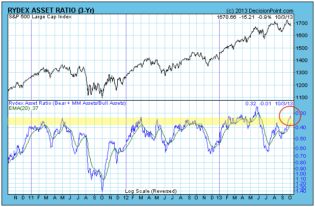
Rydex Ratio in the Danger Zone
by Carl Swenlin,
President and Founder, DecisionPoint.com
The Rydex Ratio has reached a level where it is telling us that sentiment is too bullish, and that stock prices are vulnerable.
The Rydex Ratio gives a view of sentiment extremes using using the totals of assets in Rydex mutual funds. It is calculated by dividing Money Market Assets...
READ MORE
MEMBERS ONLY
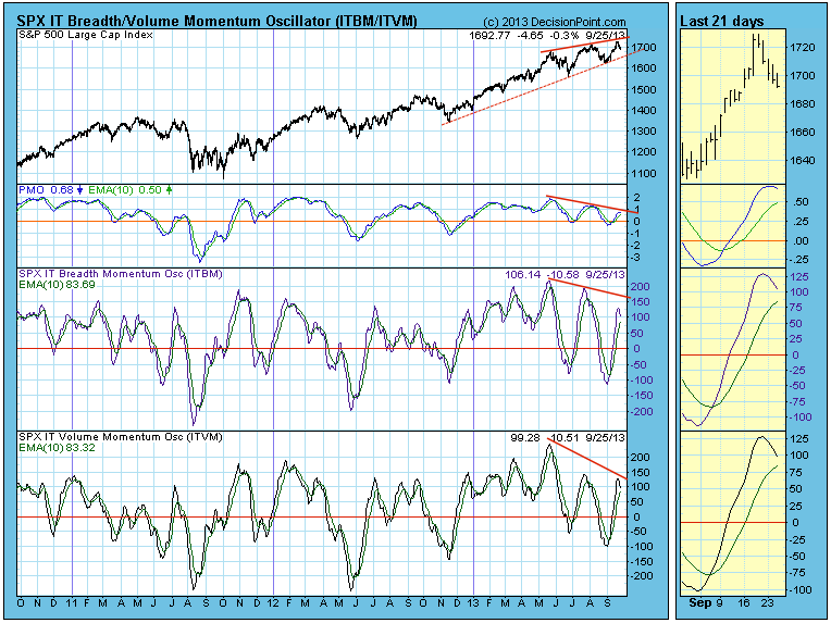
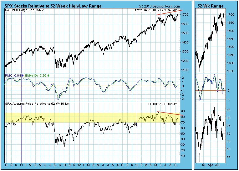
"Rel-to-52" Shows Fading Participation
by Carl Swenlin,
President and Founder, DecisionPoint.com
When looking at a chart that shows new 52-week highs and lows, have you ever wondered what is happening with all the other stocks in the index? Where are they in relation to their 52-week high-low range? DecisionPoint.com's "Rel-to-52" index provides that answer.
DecisionPoint.com...
READ MORE
MEMBERS ONLY
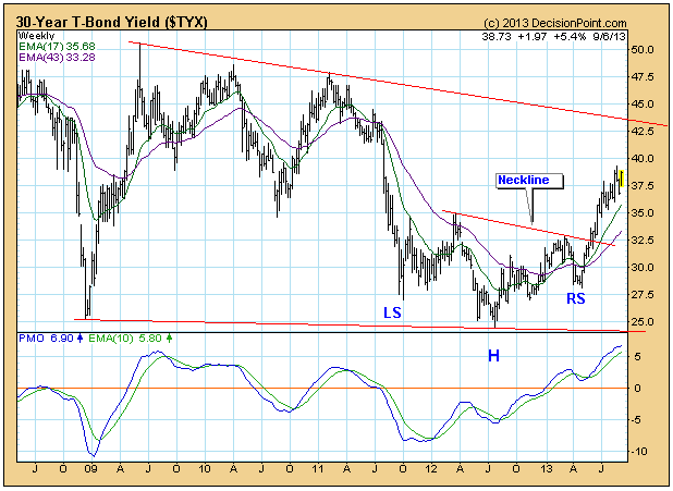
Bond Yield Very Overbought
by Carl Swenlin,
President and Founder, DecisionPoint.com
We have been observing how, in spite of the Fed's efforts, bond yields have been persistently rising, but now they have become very overbought.
On the weekly bar chart, we can see how a reverse head and shoulders pattern is in progress and yield is headed toward a...
READ MORE
MEMBERS ONLY
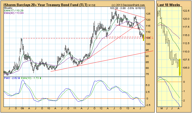
Bonds (TLT) Break Important Support
by Carl Swenlin,
President and Founder, DecisionPoint.com
This week let's take a look at bonds because rising rates are capturing broad attention. We use the 20+ Year T-Bonds ETF (TLT) as the surrogate for long bond timing. As of 5/20/2013 TLT is on a Trend Model NEUTRAL signal, which means that the model...
READ MORE
MEMBERS ONLY
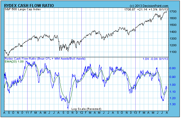
Rydex Ratio: Investors Not Committing to Rally
by Carl Swenlin,
President and Founder, DecisionPoint.com
The Rydex Cash FLow Ratio is one of the sentiment indicators we track, and currently it is showing that investors are unusually reluctant to commit money to the current rally. The Rydex Cash Flow Ratio gives an improved view of sentiment extremes by using cumulative cash flow (CCFL) into Rydex...
READ MORE
MEMBERS ONLY
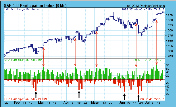
Short-Term UP Participation Wanes
by Carl Swenlin,
President and Founder, DecisionPoint.com
DecisionPoint.com has a unique market indicator that measures very short-term participation of stocks in a given index. The Participation Index (PI) is a dynamic, price-based measure of the percentage of stocks that are literally pushing the short-term price envelope -- not just advancing or declining, but actually meeting or...
READ MORE
MEMBERS ONLY
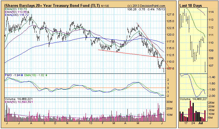
Another Breakdown for Bonds
by Carl Swenlin,
President and Founder, DecisionPoint.com
Last week TLT, our bond market surrogate, made a new low, then bounced up to the resistance of the declining tops line drawn from the May top. It turned down on Wednesday, we thought beginning a move to test the recent low, but today TLT didn't bother to...
READ MORE
MEMBERS ONLY
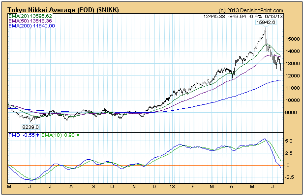
Long-Term Look at the Nikkei
by Carl Swenlin,
President and Founder, DecisionPoint.com
The Tokyo Nikkei Average has been in another free-fall since the top in May, falling -22%. Before we get to the long-term chart, let's look at the one-year daily bar chart.
The average rose +82% in just six months in a parabolic move that was doomed from the...
READ MORE
MEMBERS ONLY
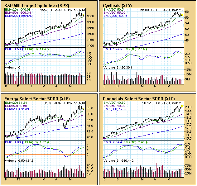
Sector Check
by Carl Swenlin,
President and Founder, DecisionPoint.com
The S&P 500 component stocks are divided into nine sectors. All the stocks are used, and each stock is only used once. Those sector indexes are typically tracked using the nine SPDRs, which are essentially ETFs that whereby the sectors can be traded. We thought it would be...
READ MORE
MEMBERS ONLY
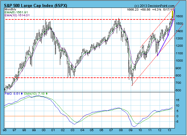
Long-Term Breakout
by Carl Swenlin,
President and Founder, DecisionPoint.com
While we tend to focus more on the short and intermediate term, we notice that there is a lot going on in the long term time frame. Most obvious is the breakout above the top of a long-term trading range. The breakout is decisive (more than three percent), so the...
READ MORE
MEMBERS ONLY
Precious Metals Sentiment
by Carl Swenlin,
President and Founder, DecisionPoint.com
With the recent volatility in gold and silver prices, it would be nice to get an idea of what kind of sentiment is being generated. Measures of sentiment tell us if there is too much optimism or pessimism in a particular market. There are a number of sentiment trackers for...
READ MORE
MEMBERS ONLY
A Technical View for Gold
by Carl Swenlin,
President and Founder, DecisionPoint.com
In the last few weeks gold has experienced a major breakdown, and, of course, there are many opinions as to what will happen next. Let's take a broad look at the technicals, so that we have some context for making decisions.
The daily chart shows the critical break...
READ MORE
MEMBERS ONLY
Gold Mining Stocks Still Negative
by Carl Swenlin,
President and Founder, DecisionPoint.com
While gold is still maintaining a long-term consolidation, gold mining stocks have signalled still lower prices to come.
A quick look at the weekly gold chart shows that the metal is holding above a line of support that goes back over a year.
In contrast, the XAU (gold mining stocks)...
READ MORE
MEMBERS ONLY
Advance-Decline Lines Confirm New Price Highs
by Carl Swenlin,
President and Founder, DecisionPoint.com
There are negative divergences on a lot of indicators we track (price makes a new high, but the indicators makes a lower high), but the advance-decline lines for breadth and volume are actually confirming the recent new price highs. This is reassuring but, it does not guarantee that even higher...
READ MORE