MEMBERS ONLY
This Health Care Stock Only Needs to Break Resistance
by Julius de Kempenaer,
Senior Technical Analyst, StockCharts.com
Inside the Health Care sector, IDXX is one of the stocks that stands out in a positive way.
Since mid-2019, IDXX has been bouncing against resistance around $290, but never managed to get to a clear break. The peak that was set in the week beginning 2/19 was the...
READ MORE
MEMBERS ONLY
Have You Seen That Small-Cap Growth Stocks are Picking Up Momentum?
by Julius de Kempenaer,
Senior Technical Analyst, StockCharts.com
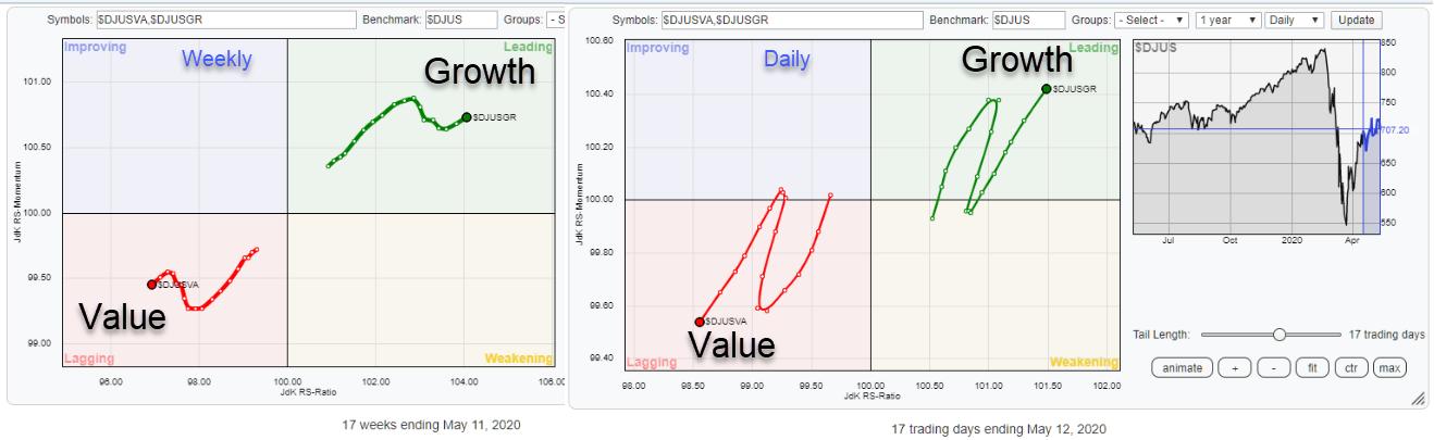
Growth-Value is a pre-defined group on the RRG page, showing the relative rotation for the Dow Jones Growth Index vs. Dow Jones Value Index, using the Dow Jones US index as the benchmark.
The last crossover for Value into the leading quadrant, and Growth into lagging, happened in November 2018....
READ MORE
MEMBERS ONLY
Sector Spotlight: Tops and Flops in Technology
by Julius de Kempenaer,
Senior Technical Analyst, StockCharts.com
On this episode of Sector Spotlight, I highlight the Technology sector and picks some Tops and Flops that are worth keeping an eye on using RRG. In the second part of the show, I answers a question from the Mailbag and suggest a new pair trade idea.
This video was...
READ MORE
MEMBERS ONLY
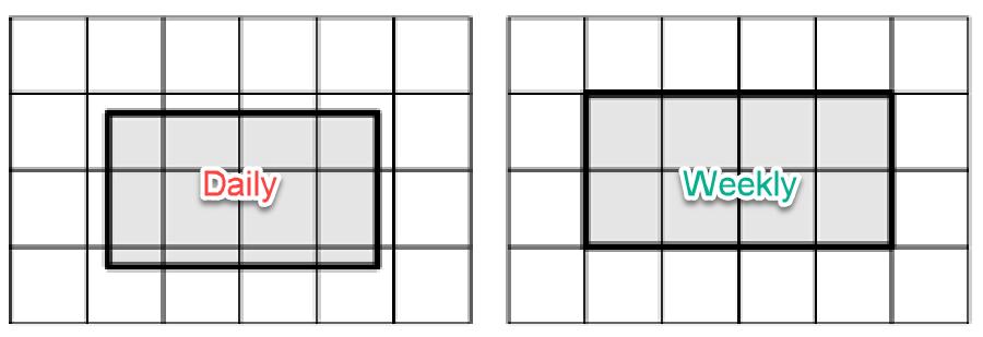
How Daily and Weekly RRGs Are Aligned
by Julius de Kempenaer,
Senior Technical Analyst, StockCharts.com
This article appeared in the Chartwatchers newsletter last weekend (5/9) but as it touches on one of the core interpretation basics for Relative Rotation Graphs I wanted to have it in the RRG-blog as well. So in case you missed this weekend's newsletter, here is your second...
READ MORE
MEMBERS ONLY
The Alignment of Daily and Weekly Relative Rotation Graphs
by Julius de Kempenaer,
Senior Technical Analyst, StockCharts.com
Sometimes it is unclear how daily and weekly RRGs align with each other.
Just to be clear, this is not the same as the difference between daily and weekly RRGs. With regard to that difference, there is a ChartSchool article that explains it in detail.
What we are talking about...
READ MORE
MEMBERS ONLY
PFE For The Win?
by Julius de Kempenaer,
Senior Technical Analyst, StockCharts.com
The above chart shows the daily and weekly tails for PFE overlaid on the same Relative Rotation Graph.
And before you ask... NO, you cannot do this on the site. I did need to be a little bit creative with cutting-copying-pasting-etc. But I thought it was worth it. A bit...
READ MORE
MEMBERS ONLY
Sector Spotlight: Seasonality and Sector Rotation in US Stocks
by Julius de Kempenaer,
Senior Technical Analyst, StockCharts.com
On this episode of Sector Spotlight, I walk through asset classes and US sectors using RRG in combination with monthly charts. Afterwards, I answer a question from the mailbag regarding the alignment of weekly and daily RRGs. In the seasonality segment, I highlight two sectors that are showing a strong...
READ MORE
MEMBERS ONLY
Current Sector Rotation for These Two Sectors is Lining Up with Their Seasonality!
by Julius de Kempenaer,
Senior Technical Analyst, StockCharts.com
At the end of the month, or the beginning of a new month, I like to look at the expected strength for sectors based on seasonality.
The chart above visualizes the seasonal strength for US sectors in one 3D image. The numbers in the table represent the % of occurrences for...
READ MORE
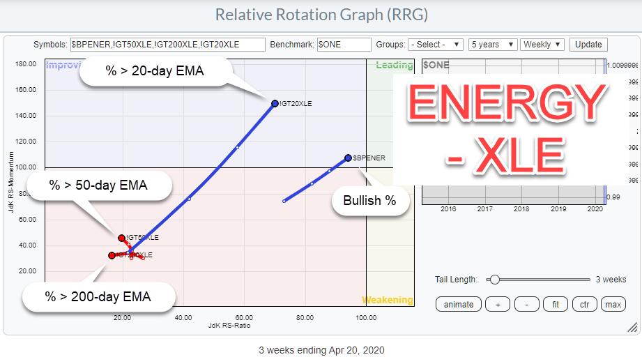
MEMBERS ONLY
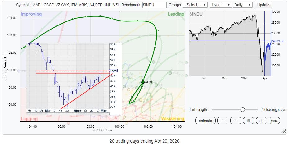
XOM is Turning Around Back Into Leading vs. $INDU
by Julius de Kempenaer,
Senior Technical Analyst, StockCharts.com
The Energy sector keeps coming back on my radar as a sector that's potentially turning around. The sector has been in a relative downtrend for ages already and, from a long-term perspective, things still do not look very good. However, things never look good just before or in...
READ MORE
MEMBERS ONLY
Sector Spotlight: What Sectors are Rotating This Week?
by Julius de Kempenaer,
Senior Technical Analyst, StockCharts.com
On this episode of Sector Spotlight, I begin with a quick overview of what happened with asset classes and sectors in the markets last week. Afterwards, I take a look at the current state of sector rotation and finish up with an in-depth look at the relative rotation for all...
READ MORE
MEMBERS ONLY
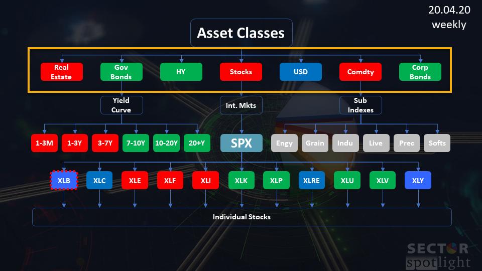
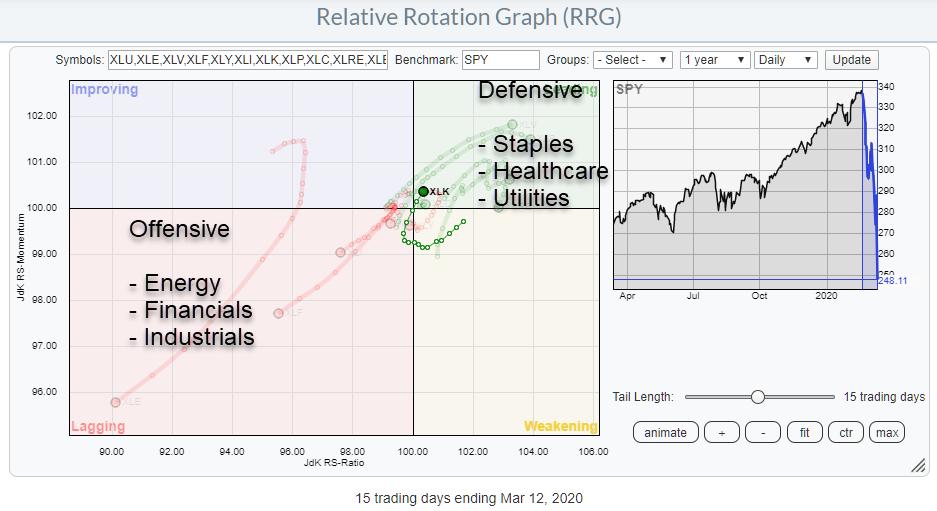
Asset Class Rotation on RRGs Sends Clear RISK-OFF Message
by Julius de Kempenaer,
Senior Technical Analyst, StockCharts.com
In the latest episode of my StockCharts TV series Sector Spotlight, I took an in-depth look at the relative rotation of asset classes vs. VBINX, the Vanguard Balanced Index fund, which represents a 60/40 stocks/bond portfolio. The image above shows the investment pyramid that I use to show...
READ MORE
MEMBERS ONLY
Is the Energy Sector Preparing for a Turnaround?
by Julius de Kempenaer,
Senior Technical Analyst, StockCharts.com
Recently I have been picking up some work that I had done in the past with regard to plotting (sector) breadth data on Relative Rotation Graphs.
You can review the segment in this episode of Sector Spotlight and read more about possibilities with breadth on RRGs in this article "...
READ MORE
MEMBERS ONLY
Following Up With Breadth Data On a Relative Rotation Graph
by Julius de Kempenaer,
Senior Technical Analyst, StockCharts.com
In the 4/14/20 episode of my show Sector Spotlight, which airs every Tuesday at 10:30am ET on StockCharts TV, I talked about plotting breadth data on a Relative Rotation Graph.
The link below starts at that segment.
In this article, I will add another option to take...
READ MORE
MEMBERS ONLY
Sector Spotlight: RRG Signals Risk OFF, Pointing to Lower Yields
by Julius de Kempenaer,
Senior Technical Analyst, StockCharts.com
On this episode of Sector Spotlight, I perform an in-depth overview of asset class rotations, finding that RRG still suggests a cautious approach for stocks; meanwhile, (long) bonds are on the verge of breaking higher, sending yields to even lower levels.
This video was originally broadcast on April 21st, 2020....
READ MORE
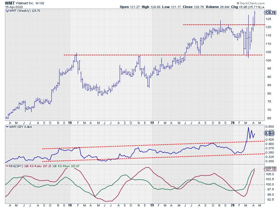
MEMBERS ONLY
No Crisis For WMT as It Pushes To New Highs
by Julius de Kempenaer,
Senior Technical Analyst, StockCharts.com
No matter what sort of general market regime we are in, there are always a few that go the other direction.
From 2017 to 2019, when the S&P surged, GE went completely the other way and more than halved. At the moment, we have a market that is...
READ MORE
MEMBERS ONLY
UDIs (User Defined Indexes) + RRG (Relative Rotation Graph) Opens Up New Possibilities
by Julius de Kempenaer,
Senior Technical Analyst, StockCharts.com
Relative Rotation Graphs can show many different relationships. They do not necessarily have to come from regular price data-series like stocks or indexes.
In my weekly show on Stockcharts TV, Sector Spotlight, which airs every Tuesday from 10.30-11.00 am ET I spent time on pair trades on a...
READ MORE
MEMBERS ONLY
Sector Spotlight: Plotting Sector Breadth on RRG
by Julius de Kempenaer,
Senior Technical Analyst, StockCharts.com
On this episode of Sector Spotlight, I demonstrate how you can create UDIs to plot pairs, as well as how to use breadth data for sectors on RRG. In addition, I also showcase a new idea for a pair trade.
This video was originally broadcast on April 14th, 2020. Please...
READ MORE
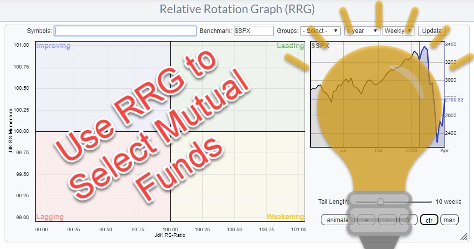
MEMBERS ONLY
Using Relative Rotation Graphs as a Selection or Evaluation Tool for Mutual Funds
by Julius de Kempenaer,
Senior Technical Analyst, StockCharts.com
Last week on Wednesday (4/8) I wrote an article in the RRG blog on how you can use ChartLists, in combination with Relative Rotation Graphs to monitor your mutual fund portfolio. The article was inspired by a question which I received in the mailbag of my weekly show Sector...
READ MORE
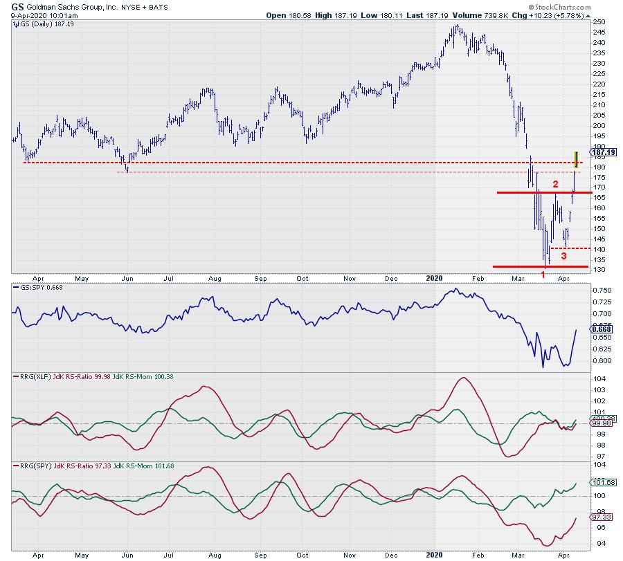
MEMBERS ONLY
Did GS Just Come Back to Life Again?
by Julius de Kempenaer,
Senior Technical Analyst, StockCharts.com
$248.94... That was the high for GS, set on Jan 17/2020. Two months later, on Mar 19/2020, a low was reached at $130.85. The stock is almost halved... so now what?
On the (weekly) RRG for US sectors, Financials is traveling well inside the lagging quadrant...
READ MORE
MEMBERS ONLY
Use ChartLists and RRG to Monitor your Mutual Fund Portfolio
by Julius de Kempenaer,
Senior Technical Analyst, StockCharts.com
Recently I received a message asking if Relative Rotation Graphs would be useful for tracking Mutual Funds. My answer: Of course they are!
Pricing of Mutual Funds
In essence, the prices of mutual funds are also the result of people buying and selling on financial (stock) markets. The difference between...
READ MORE
MEMBERS ONLY
Sector Spotlight: Sector Rotation, Monthly Charts using RRG and Mutual Funds
by Julius de Kempenaer,
Senior Technical Analyst, StockCharts.com
On this episode of Sector Spotlight, I take a look at sector rotation on monthly charts (since it is the first Tuesday of the month). In addition, I answer a question whether RRG can be used to monitor mutual funds.
This video was originally recorded on April 7th, 2020. Please...
READ MORE
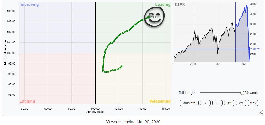
MEMBERS ONLY
+10% in the Last 30 Weeks, Outperforming SPY by 26% and Still Moving Further Into Leading Quadrant.
by Julius de Kempenaer,
Senior Technical Analyst, StockCharts.com
Tails that rotate from the leading quadrant into weakening and then back into leading always have my attention. The reason for that is that securities that rotate along such a path are already in a relative uptrend and the rotation from leading, through weakening, back into leading ,eams that another...
READ MORE
MEMBERS ONLY
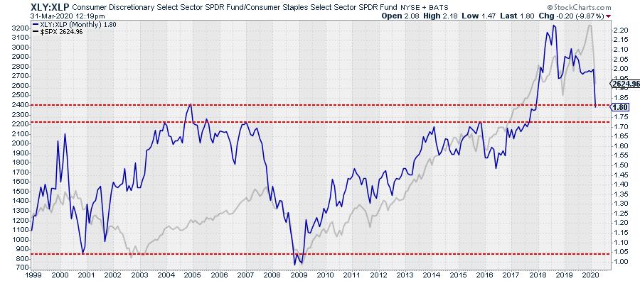
How One Stock is Holding Up an Entire Sector
by Julius de Kempenaer,
Senior Technical Analyst, StockCharts.com
The ratio between XLY:XLP, Consumer Staples vs. Consumer Discretionary, has traditionally been a pretty good gauge to get an idea about being in a risk-on or risk-off environment.
The chart above shows the XLY:XLP ratio, with the S&P 500 plotted behind it. Around the big turns,...
READ MORE
MEMBERS ONLY
Sector Spotlight: Strong Seasonality for Utilities Going Into April
by Julius de Kempenaer,
Senior Technical Analyst, StockCharts.com
On this episode of Sector Spotlight, I take a closer look at what's happening in the various Asset Classes. Afterwards, I examine the Utilities sector, as it has a strong seasonality going into April which is now backed by a strong tail/rotation on the RRG.
This video...
READ MORE
MEMBERS ONLY
And the Worst Section of the US Stock Market Is.......
by Julius de Kempenaer,
Senior Technical Analyst, StockCharts.com
Instead of simply looking at sectors, it also makes sense to keep an eye on segments of the stock market based on different criteria.
The Size Factor
One example is to group stocks based on Market Capitalization, i.e. Large-, Mid- and Small-Cap stocks.
A Relative Rotation Graph of that...
READ MORE
MEMBERS ONLY
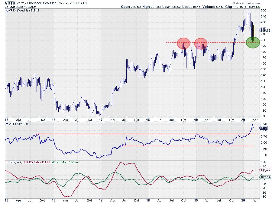
Resistance is Turning Into Support for This Biotech Stock
by Julius de Kempenaer,
Senior Technical Analyst, StockCharts.com
A lot of eye balls on the health care sector these days, and for good reasons. Traditionally, this has been one of the more defensive sectors, and it seems to be picking up that role at the moment.
On the weekly RRG for US sectors, XLF hooked sharply upward, moving...
READ MORE
MEMBERS ONLY
Sector Spotlight: Cap-Weighted vs. Equal-Weight Sectors
by Julius de Kempenaer,
Senior Technical Analyst, StockCharts.com
On this episode of Sector Spotlight, I discuss the subtle differences between cap-weighted and equal weight sector ETFs on RRG. I also take some time to show how you can plot pairs/ratios on a Relative Rotation Graph.
This video was originally recorded on March 24th, 2020. Please note the...
READ MORE
MEMBERS ONLY
What About the US Dollar.....? and Other Currencies
by Julius de Kempenaer,
Senior Technical Analyst, StockCharts.com
Everybody's looking at the stock market these days, but, in other areas of the market, big shifts seem to be underway as well. One of the areas that I like to keep an eye on is currencies, and Relative Rotation Graphs can help you keep an eye on...
READ MORE
MEMBERS ONLY
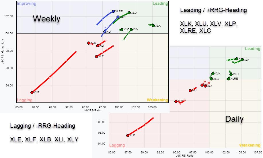
Subtle Differences Between Equal Weight and Regular Sector RRGs
by Julius de Kempenaer,
Senior Technical Analyst, StockCharts.com
The image above shows two Relative Rotation Graphs for US sectors, side by side. The one on the left is the RRG (as I usually use it in my blogs and the Sector Spotlight show) holding 11 US sector ETFs, the SPDR ETFs offered by State Street. The one on...
READ MORE
MEMBERS ONLY
Sector Spotlight: Looking at US Sectors Through the Mayhem
by Julius de Kempenaer,
Senior Technical Analyst, StockCharts.com
On this episode of Sector Spotlight, I try to see through the mayhem and get an angle on US sector rotations on weekly Relative Rotation Graphs. In addition, I go a bit more in-depth answering some questions from the Mailbag.
This video was originally recorded on March 17th, 2020. Please...
READ MORE
MEMBERS ONLY
Sector Rotation in Sync On Daily and Weekly RRGs - What Does it Tell Us?
by Julius de Kempenaer,
Senior Technical Analyst, StockCharts.com
The US sector universe is split pretty much evenly around the benchmark SPY. That is normal. It is also split pretty distinctively in sectors that are inside the leading quadrant and/or traveling at a positive RRG-Heading, which means that they are in a relative uptrend vs. the market. Under...
READ MORE
MEMBERS ONLY
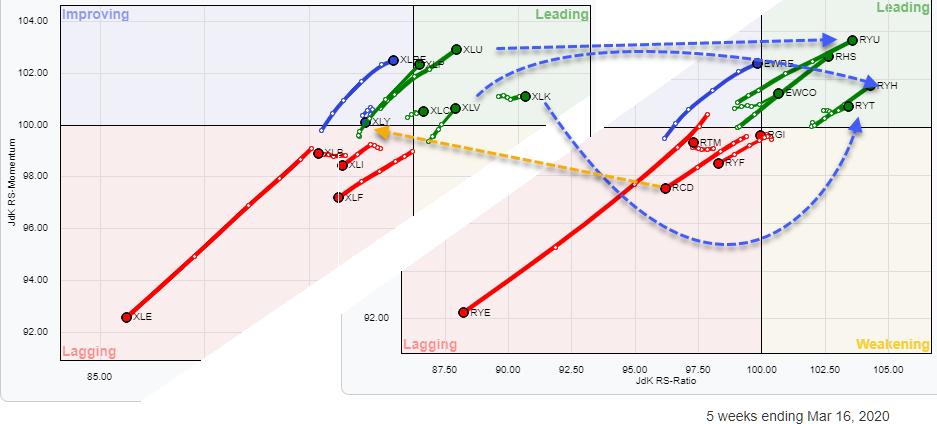
Technology Emerging as a Defensive Sector? Here are a Few Stocks to Watch
by Julius de Kempenaer,
Senior Technical Analyst, StockCharts.com
The mayhem in the markets over the past three weeks has clearly caused a rotation out of the more offensive sectors towards defensive ones. The sectors with the clearest rotations are mentioned on the chart above.
One sector that I would have expected inside the lagging quadrant, or at least...
READ MORE
MEMBERS ONLY
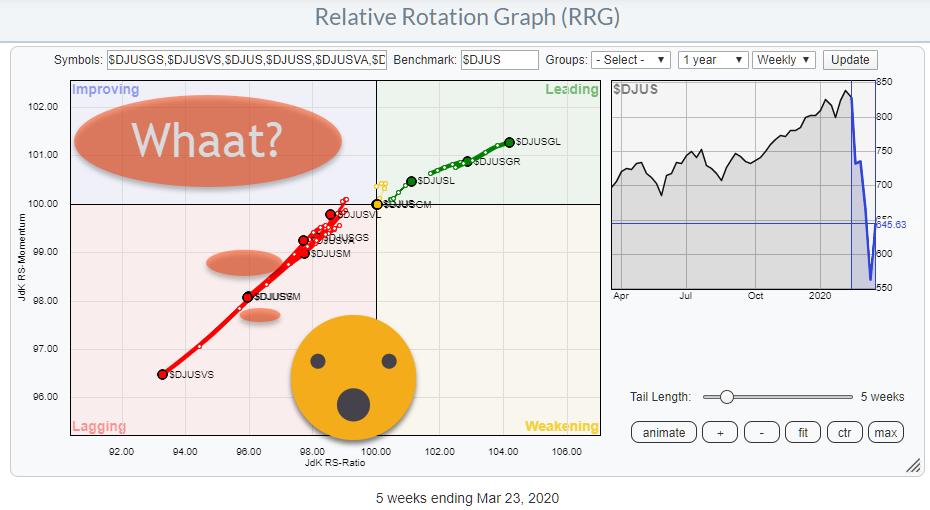
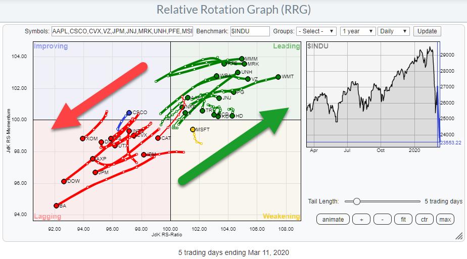
How's That for a Split Universe...?
by Julius de Kempenaer,
Senior Technical Analyst, StockCharts.com
The Relative Rotation Graph for the DJ Industrial constituents shows a clear split between stocks in the leading quadrant vs. stocks inside the lagging quadrant, with only one inside weakening (MSFT) and one inside improving (CSCO).
A few stocks inside the leading quadrant are starting to roll over and a...
READ MORE
MEMBERS ONLY
Sector Spotlight: Markets Are All Over the Place
by Julius de Kempenaer,
Senior Technical Analyst, StockCharts.com
RRG can help you put things into an international perspective. In this edition of StockCharts TV'sSector Spotlight, I look at international stock markets through the RRG lens and comes up with two new pair trade ideas.
This video was originally recorded on March 10th, 2020. Please note the...
READ MORE
MEMBERS ONLY
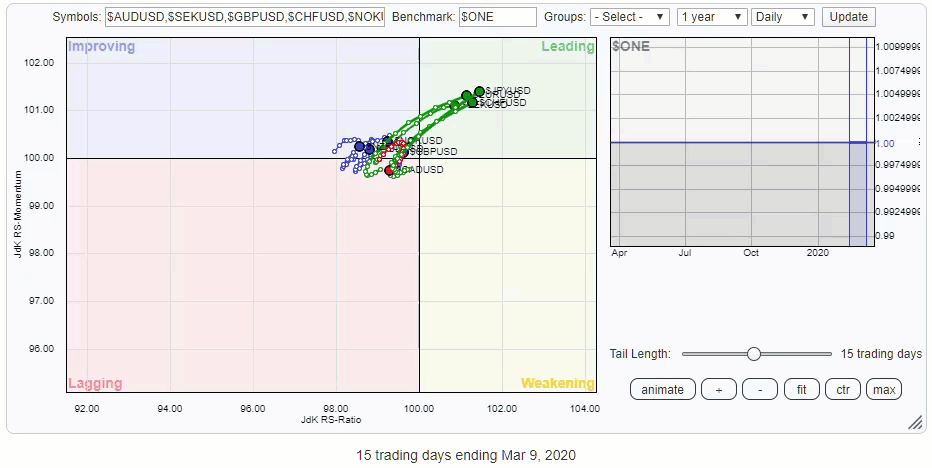
Use RRG to Help You Put Recent Developments into International Perspective
by Julius de Kempenaer,
Senior Technical Analyst, StockCharts.com
What a week ....
With stock markets flying all over the place, I always find it an enlightening exercise to take a step back and put things into a broader perspective. This can be done in multiple ways, including taking a longer-term approach, looking at different segments of the market via...
READ MORE
MEMBERS ONLY
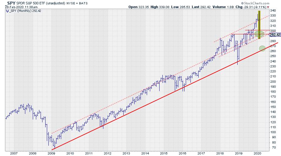
It's a Crucial Time for SPY and These Are Crucial Levels to Watch!
by Julius de Kempenaer,
Senior Technical Analyst, StockCharts.com
When the market tanks, like it did from 24 February onwards, there is not much you can do anymore. You basically have to sit and wait and see which level(s) support or resistance are respected by the market. And the problem is, you will not know until a few...
READ MORE
MEMBERS ONLY
Sector Spotlight: A Look at Monthly Charts for Asset Classes and Sectors
by Julius de Kempenaer,
Senior Technical Analyst, StockCharts.com
In this edition of StockCharts TV'sSector Spotlight, I look at the monthly charts for asset classes and sectors in combination with their rotations on RRG. In addition, I also answer a question from the mailbag on using leveraged ETFs on Relative Rotation Graphs
This video was originally recorded...
READ MORE
MEMBERS ONLY
This is My Trendline, Which One is Yours?
by Julius de Kempenaer,
Senior Technical Analyst, StockCharts.com
What a week...
Where do I start???
Let's just say that this was not a boring week for the markets...... at all!
When markets go crazy and swings get out of control, I have learned to step back and look at the bigger picture - and keep it...
READ MORE
MEMBERS ONLY
Use RRG to Get a Grip on Where the Action is - Throw in Symbol Summary to Be Prepared
by Julius de Kempenaer,
Senior Technical Analyst, StockCharts.com
Days with wild swings, as we are seeing at the moment, are either heaven or hell, depending on what kind of trader or investor you are. Those looking for action will have a field day.
But how do you easily find tradable securities? And how do you get a handle...
READ MORE
MEMBERS ONLY
Sector Spotlight: Stock/Bond Relationship Rolling Over on RRG
by Julius de Kempenaer,
Senior Technical Analyst, StockCharts.com
In this edition of StockCharts TV'sSector Spotlight, I analyze the impact of current market movements on sector- and asset-class rotations. After the break, I answer a question from the mailbag and introduce a new pair trade idea.
This video was originally recorded on February 25th, 2020. Click anywhere...
READ MORE