MEMBERS ONLY
The Break to New Highs in the S&P 500 is Now Getting Support From Rotation To Offensive Sectors
by Julius de Kempenaer,
Senior Technical Analyst, StockCharts.com
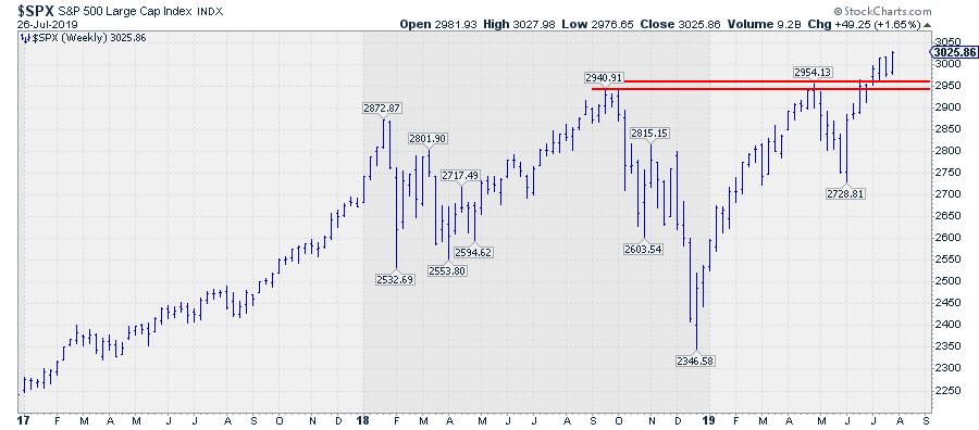
In the run-up to its resistance level (around 2950), along with first two weeks after breaking that barrier while pushing to new highs, more defensive sectors like Utilities and Consumer Staples were leading the market higher.
The situation is changing now, adding more reliability to this important breakout.
RRG Positions...
READ MORE
MEMBERS ONLY
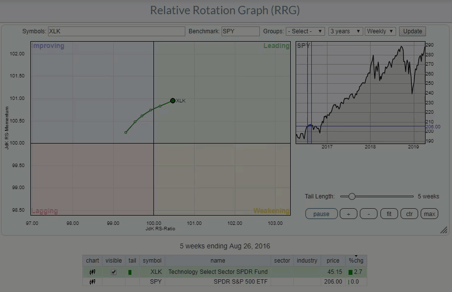
Strong Rotation For Technology Amid Shift To More Offensive Sectors
by Julius de Kempenaer,
Senior Technical Analyst, StockCharts.com
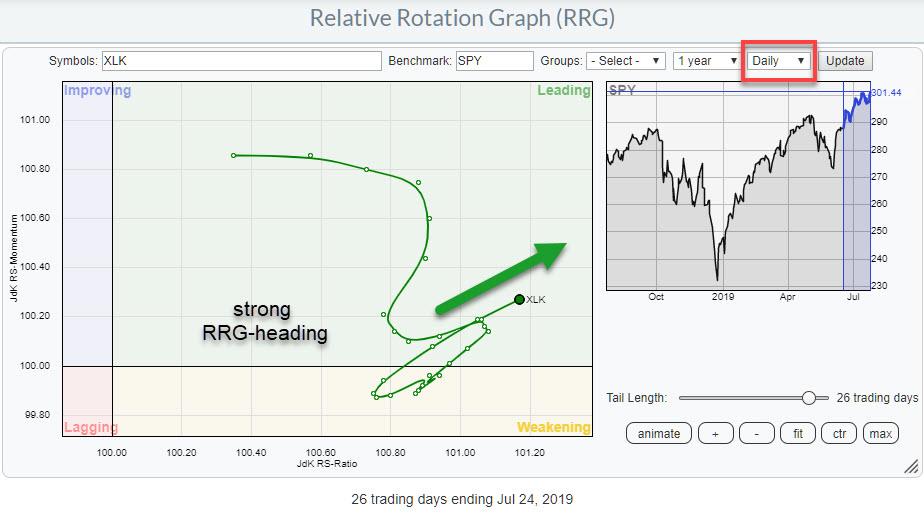
When I opened up the Relative Rotation Graph for US sectors (weekly version), the position and the current rotation for the Technology sector caught my attention.
If you are a regular reader of articles you will know that my default time frame is weekly. On that weekly RRG, XLK is...
READ MORE
MEMBERS ONLY
How To Get From a Table of Market Movers To a Trading Idea Based on RRG
by Julius de Kempenaer,
Senior Technical Analyst, StockCharts.com
StockCharts.com has an incredible wealth of technical tools available both for free users as well as subscribers. That said, though, users who subscribe will have a greater amount of tools and functionality available to them.
Very recently, there was a panel discussion on MarketWatchers LIVE with Tom, Greg and...
READ MORE
MEMBERS ONLY
Forces Are Shifting in The Battle Between INTC and MSFT
by Julius de Kempenaer,
Senior Technical Analyst, StockCharts.com
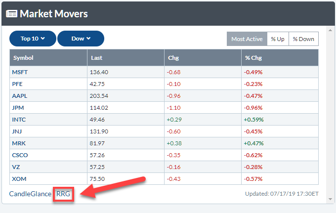
When you open up StockCharts.com and go to Your Dashboard, one thing you'll find is a section called "Market Movers", located in the top-right corner of your screen.
I currently have this section of the page set up so that it shows the top 10...
READ MORE
MEMBERS ONLY
A Strong Rotation on RRG and a Break to New Highs Make For a Killer Combination
by Julius de Kempenaer,
Senior Technical Analyst, StockCharts.com
At present, the Technology sector is rotating through the weakening quadrant on the Relative Rotation Graph. Following a strong move in the first months of this year, relative strength for XLK started to level off and has remained more or less flat since April. We'll have to wait...
READ MORE
MEMBERS ONLY
Team USA Wins the Soccer Final, But Three International Markets Beat the S&P
by Julius de Kempenaer,
Senior Technical Analyst, StockCharts.com
Last night (Sunday 7/7) the Dutch women's soccer team played the World Cup final against Team USA. I am not a huge soccer fan but, as a Dutchie, you have to catch at least part of that event! It did not work out for us, so congrats...
READ MORE
MEMBERS ONLY
The S&P Just Broke Out of a Two-Year Consolidation, But There are Still Some Pockets of Concern
by Julius de Kempenaer,
Senior Technical Analyst, StockCharts.com
A short, but strong, trading session just before the Fourth of July holiday pushed the S&P, along with the Nasdaq 100 and the DJ Industrials indexes, to new highs.
Breaks to new highs are pretty strong signs and should not be ignored. At the end of the day,...
READ MORE
MEMBERS ONLY
Brexit is SOOO 1776!
by Julius de Kempenaer,
Senior Technical Analyst, StockCharts.com
Happy Fourth of July!
On this public holiday - for the US, anyway; not so much for me ;) - I looked up a bit more about the history of Independence Day and, while doing so, it occurred to me that even back then, the British were involved in a separation....
READ MORE
MEMBERS ONLY
An Investment Process Is All About Piecing Things Together To Get Other Or Better Insights.
by Julius de Kempenaer,
Senior Technical Analyst, StockCharts.com
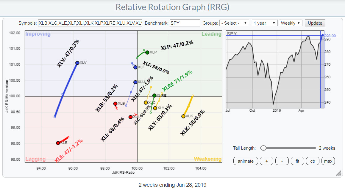
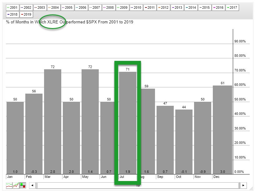
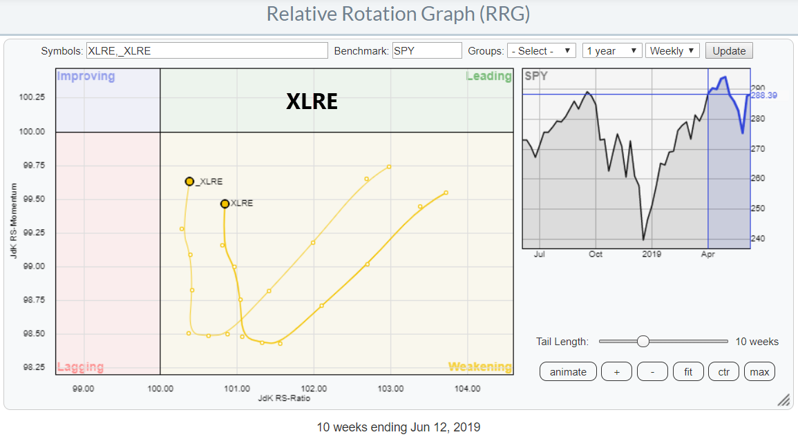
In my last DITC contribution, I wrote about the Real Estate sector, which is crossing over into the leading quadrant at the same time as the seasonality chart for that sector indicates that, over the last 20 years, XLRE closed the month of July higher 71% of the time, with...
READ MORE
MEMBERS ONLY
This Sector Just Returned to the Leading RRG-Quadrant AND Shows an Outperformance 71% of the Time in July
by Julius de Kempenaer,
Senior Technical Analyst, StockCharts.com
I do not believe that there is just one single tool, strategy, method, etc. that fits all our needs as investors or traders. For me, the power of research and analysis lies in combining information from various sources and subsequently putting all that together into a market-view, strategy, system, etc....
READ MORE
MEMBERS ONLY
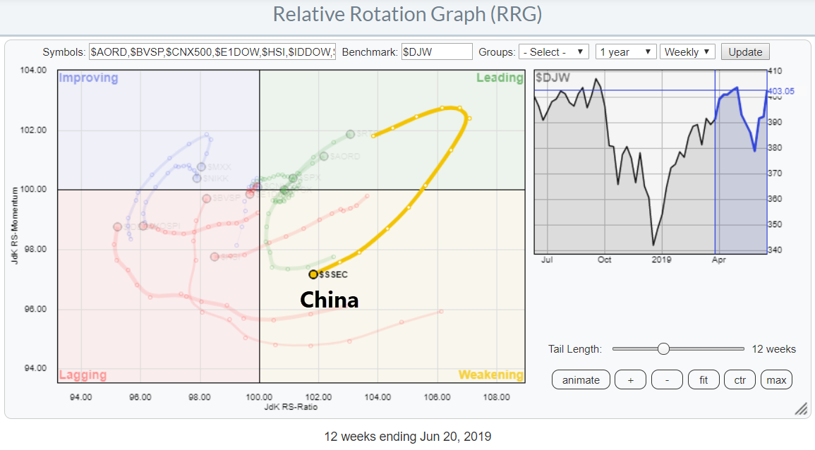
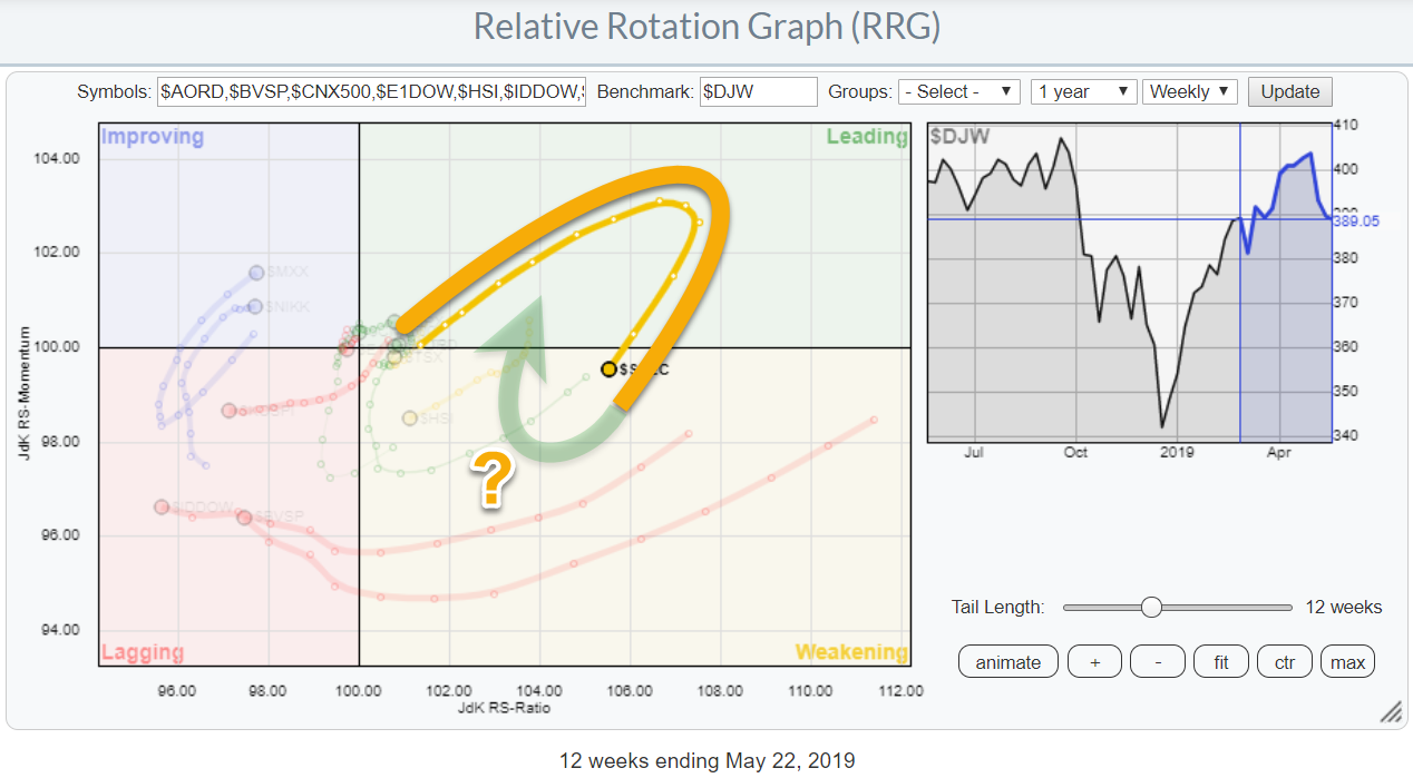
Will China Be Able To Complete Its Current Rotation Inside Positive Territory And Start A New Period Of Outperformance??
by Julius de Kempenaer,
Senior Technical Analyst, StockCharts.com
On the above Relative Rotation Graph, which shows the rotation for international stock indexes against the Dow Jones World index, we really ought to pay attention to the long tail inside the weakening quadrant for the Chinese market.
This rotation follows a strong performance of the Chinese market during the...
READ MORE
MEMBERS ONLY
The Dollar Beats All Currencies In The G10 Except For The Japanese Yen
by Julius de Kempenaer,
Senior Technical Analyst, StockCharts.com
Relative Rotation Graphs can be used to visualize the relative movement of much more than just stocks and sectors.
In the example below, the RRGshows the relative rotation for the G10 currency universe usingUSD as the base currency.In this case, you will see nine currencies, all expressed in USD...
READ MORE
MEMBERS ONLY
(Technical) Market Analysis And Portfolio Construction Are Two Completely Different Animals In The Same Zoo.
by Julius de Kempenaer,
Senior Technical Analyst, StockCharts.com
First of all, let me say that I really appreciate any feedback and comments I get on any of my articles, either via DISQUS below each blog post, via email or in SCAN. I do read all of them and I try to answer most of them, I think my...
READ MORE
MEMBERS ONLY
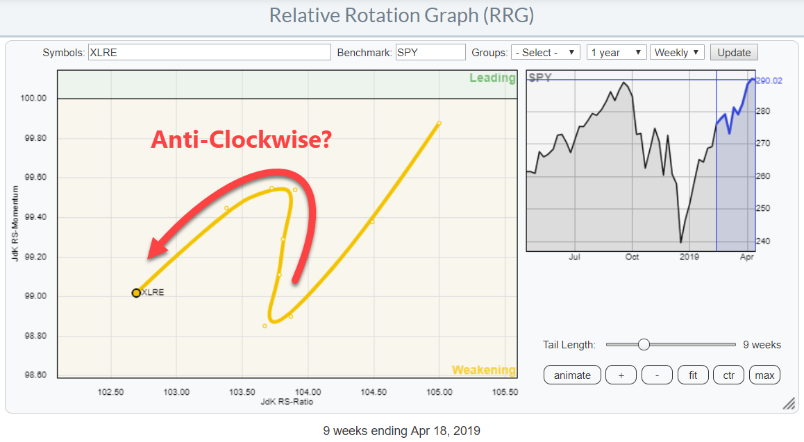
Real Estate Is Getting Back In Shape!
by Julius de Kempenaer,
Senior Technical Analyst, StockCharts.com
The Relative Rotation Graph for US sectors shows the sector Real Estate (XLRE) inside the weakening quadrant, but that sector moving upward (almost vertically) on the JdK RS-Momentum scale. This type of rotation usually indicates that a second (or third, etc.) leg of a relative uptrend is about to get...
READ MORE
MEMBERS ONLY
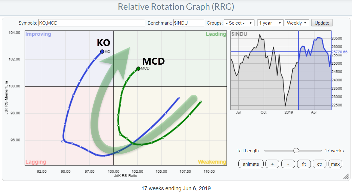
Can I Have A Coke (KO) With My Big Mac (MCD) Please?
by Julius de Kempenaer,
Senior Technical Analyst, StockCharts.com
While browsing through the stocks in the DJ Industrials index, my attention was grabbed by the tails on KO and MCD, both in a positive way.
KO is making a wide rotation through lagging into improving and is now very close to crossing over into the leading quadrant. MCD, meanwhile,...
READ MORE
MEMBERS ONLY
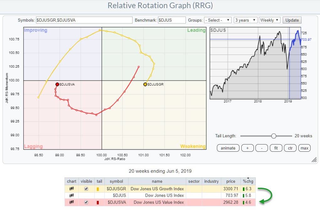
Value Is Taking Over From Growth And Shows Positive Rotation On RRG
by Julius de Kempenaer,
Senior Technical Analyst, StockCharts.com
One of the Relative Rotation Graphs that I like to follow, as a way of keeping a handle on the bigger picture, is the one that shows the rotation of growth- versus value stocks.
This RRG is predefined in the dropdown box under the header "US MARKETS" and...
READ MORE
MEMBERS ONLY
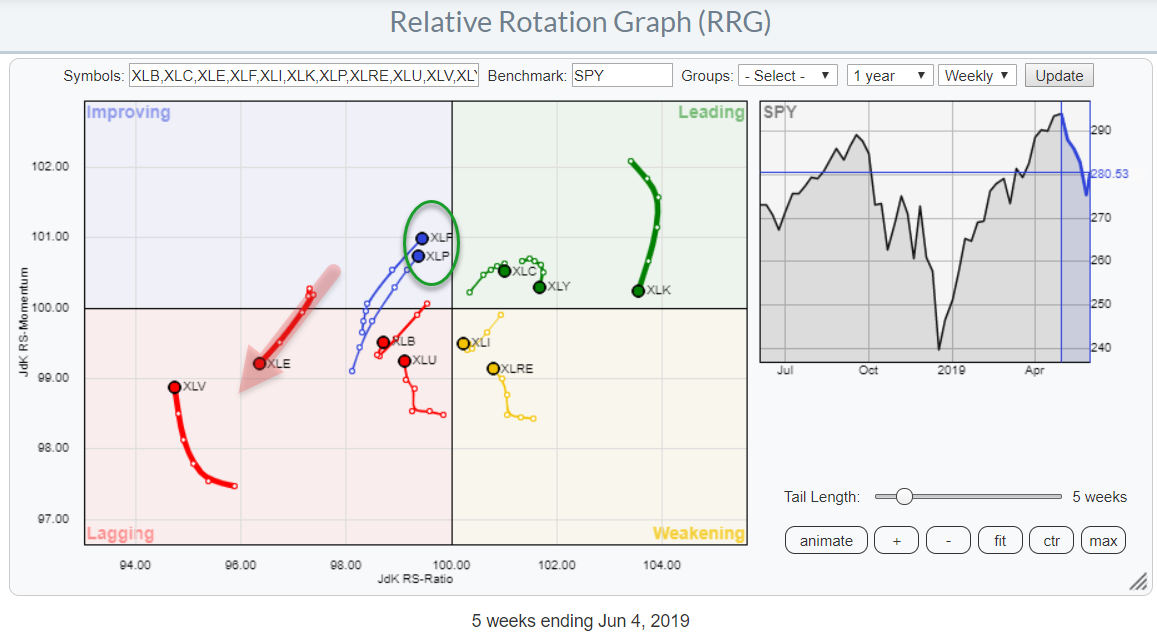
Staples and Financials Head Towards the Leading Quadrant While Energy Rolls Back into Lagging
by Julius de Kempenaer,
Senior Technical Analyst, StockCharts.com
The chart above shows the relative rotation for US sectors against the benchmark S&P 500. Over the last five weeks, the tails for Consumer Staples (XLP) and Financials (XLF) started to move in a similar fashion. Both are heading towards the leading quadrant.
The Energy sector, on the...
READ MORE
MEMBERS ONLY
Did We Just Complete a H&S Top In $SPX?
by Julius de Kempenaer,
Senior Technical Analyst, StockCharts.com
It seems I did not have to look very far to find today's DITC entry...
The S&P 500 ($SPX) provides enough ammunition to get excited - or maybe worried is a better word - and not ignore the price action that is unfolding at the moment....
READ MORE
MEMBERS ONLY
Spotting Strength And Weakness Inside The Financial Sector (XLF)
by Julius de Kempenaer,
Senior Technical Analyst, StockCharts.com
Looking at the Relative Rotation Graph showing the sectors of the S&P 500, we can see that the tail on the Financials sector stands out, having seen a big increase since last Friday.
Over the last 12-13 weeks, Financials rotated from the lagging into weakening quadrant, then moved...
READ MORE
MEMBERS ONLY
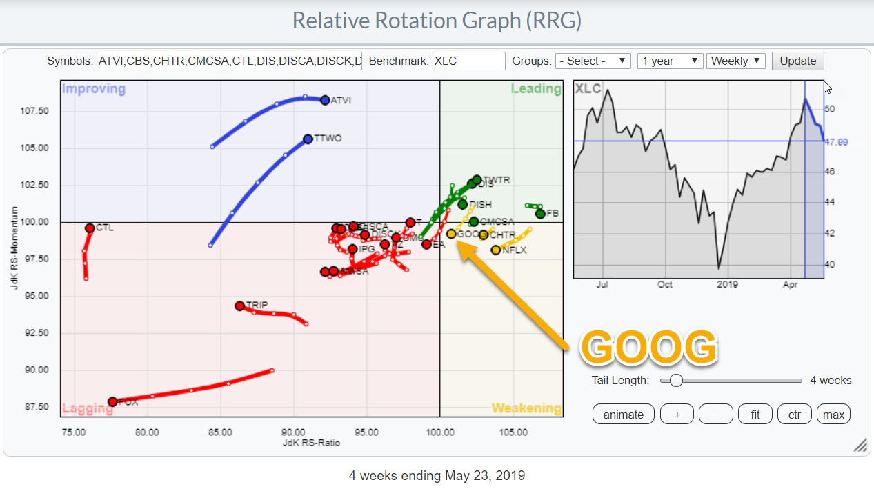
Communication Services Shows a Strong Rotation, But GOOG Is Not Participating
by Julius de Kempenaer,
Senior Technical Analyst, StockCharts.com
Relative Rotation Graphs can help to identify threats and opportunities within groups of securities. In this article, I will be looking at the position and rotation of the Communication Services Sector against the S&P 500 and other sectors, followed by a closer look at the rotation of various...
READ MORE
MEMBERS ONLY
Is China About To Pick Up The Pace Again?
by Julius de Kempenaer,
Senior Technical Analyst, StockCharts.com
Yesterday, I wrote about the relationship of US stocks against other international stock markets in my regular RRG Charts article.
The Relative Rotation Graph that I use for these analyses is one of the pre-defined groups and is shown above.
While working on that article, I noted the long tail...
READ MORE
MEMBERS ONLY
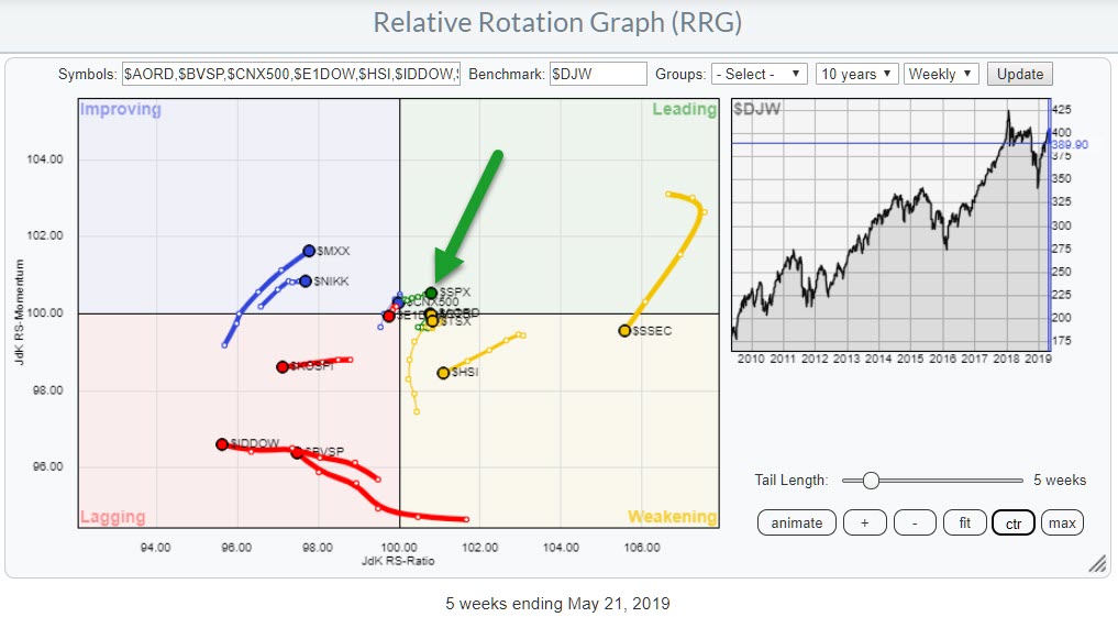
What Does It Mean When The US Starts Outperforming Other International Stock Markets?
by Julius de Kempenaer,
Senior Technical Analyst, StockCharts.com
Stock markets around the world are giving mixed signals. Returns over the last 5 weeks have varied from +4% in Australia to -10% in China. The Relative Rotation Graph above shows the relative trends that are currently in play among the various international stock market indexes.
For a pure, and...
READ MORE
MEMBERS ONLY
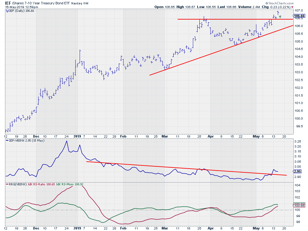
Will this break in IEF be able to hold up?
by Julius de Kempenaer,
Senior Technical Analyst, StockCharts.com
Browsing some Relative Rotation Graphs, the relationship between Stocks and Bonds once again drew my attention.
When I shifted to their respective charts, I decided that the current price action of IEF, as shown in the graph above, deserves our (or, at least, my) attention.
This ETF, which tracks the...
READ MORE
MEMBERS ONLY
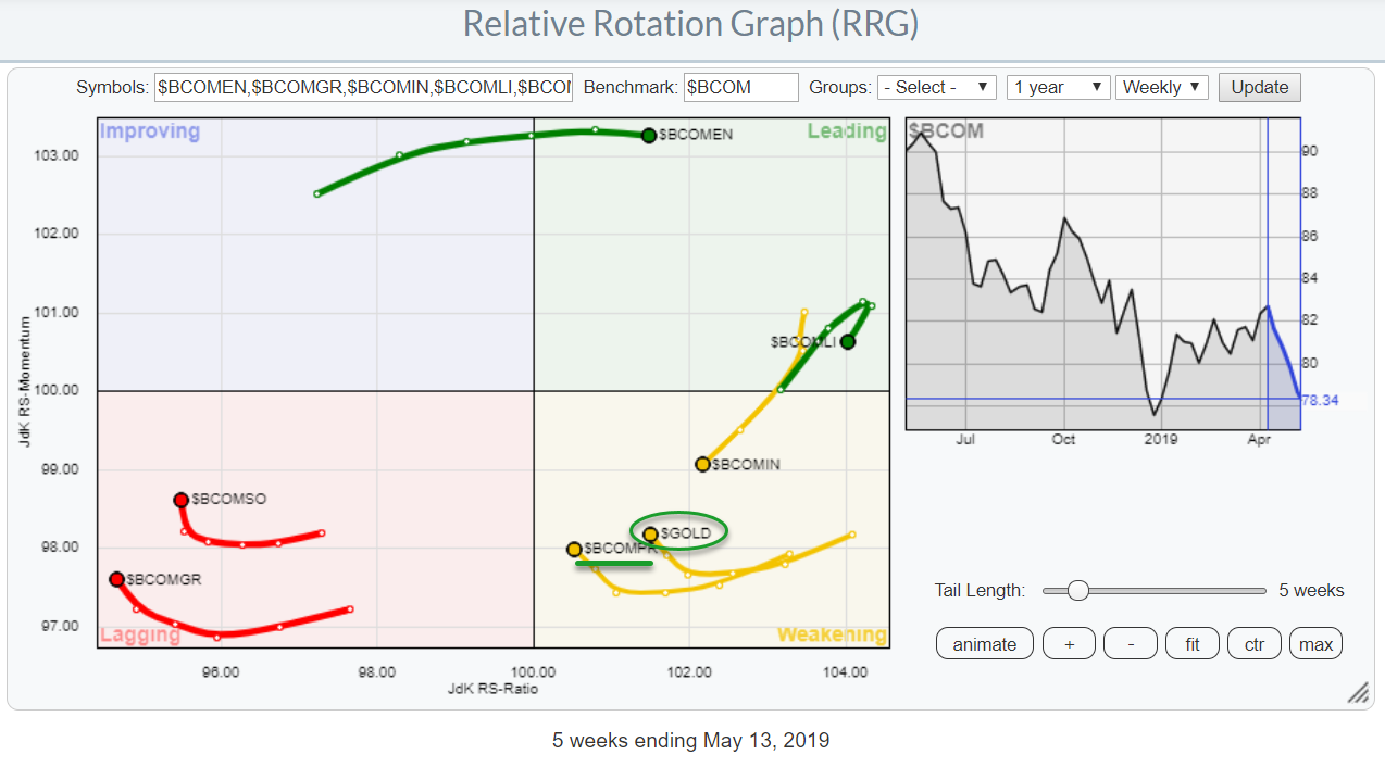
Gold Pops As The Stock Market Drops
by Julius de Kempenaer,
Senior Technical Analyst, StockCharts.com
After a struggle with resistance around its previous high of 2940, the S&P 500 index failed to break and started to come down off of its highs.
A lot of political and fundamental issues and news are influencing the behavior of market participants at the moment; this uncertainty...
READ MORE
MEMBERS ONLY
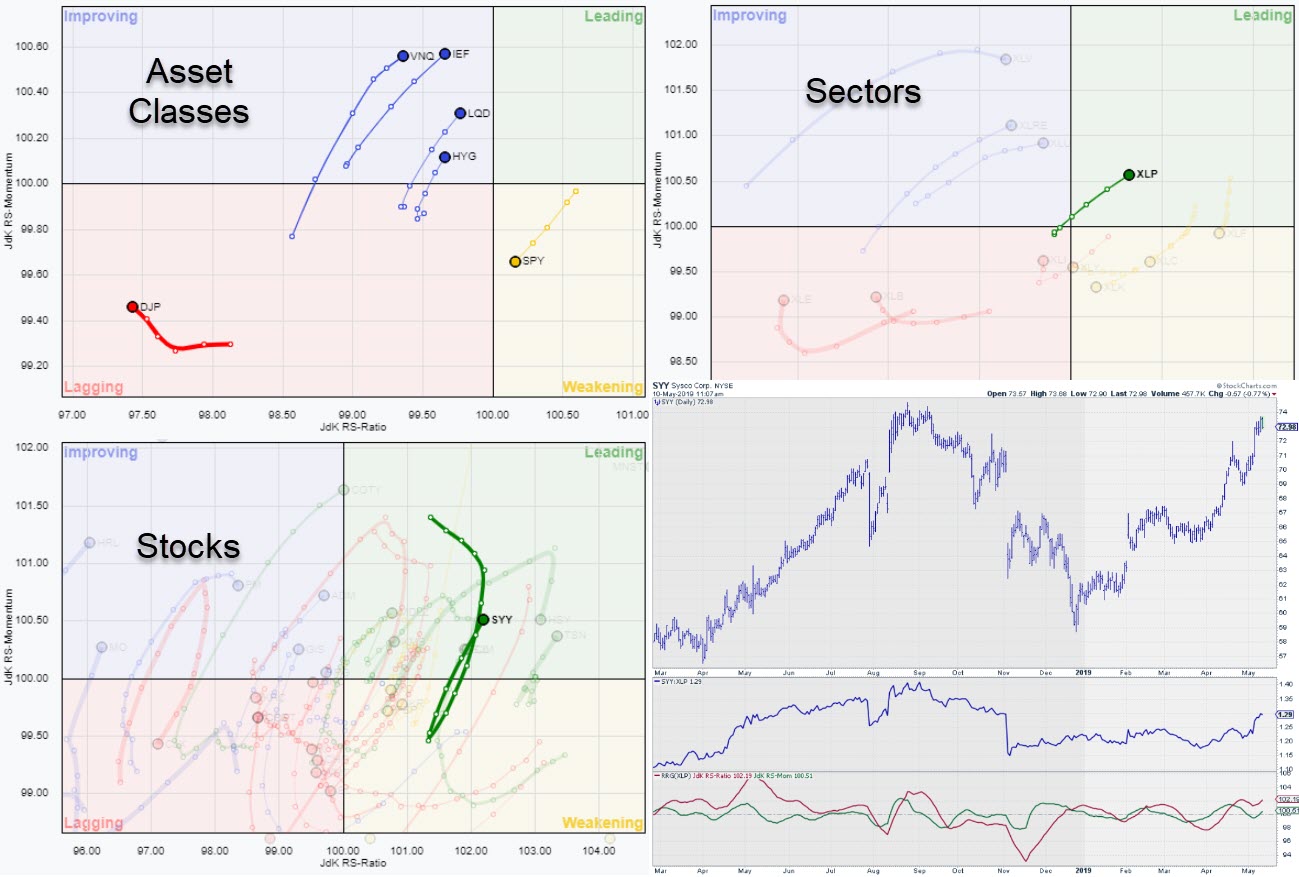
Building A Case For SYY In The Staples Sector Using Three Relative Rotation Graphs
by Julius de Kempenaer,
Senior Technical Analyst, StockCharts.com
Relative Rotation Graphs can be a great asset in getting a high-level overview of what is going on in the markets and keeping an eye on the big picture. Beyond that, though, they can also help you to drill down to find new individual investment possibilities and trading ideas.
For...
READ MORE
MEMBERS ONLY
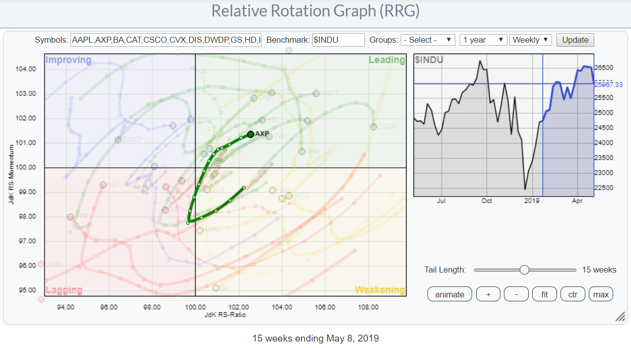
Strong Rotation For AXP on RRG vs DJ Industrials
by Julius de Kempenaer,
Senior Technical Analyst, StockCharts.com
Watching the Relative Rotation Graph for the DJ-Industrials universe, you can see a few stocks, like AAPL, BA and WBA, that stand out immediately. Despite the current setback in the market, there are still some stocks that are worth approaching from a buyer's perspective.
Inside The Leading Quadrant...
READ MORE
MEMBERS ONLY
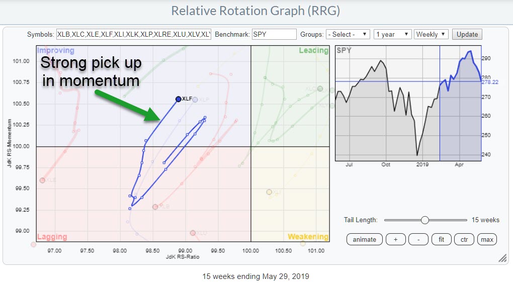
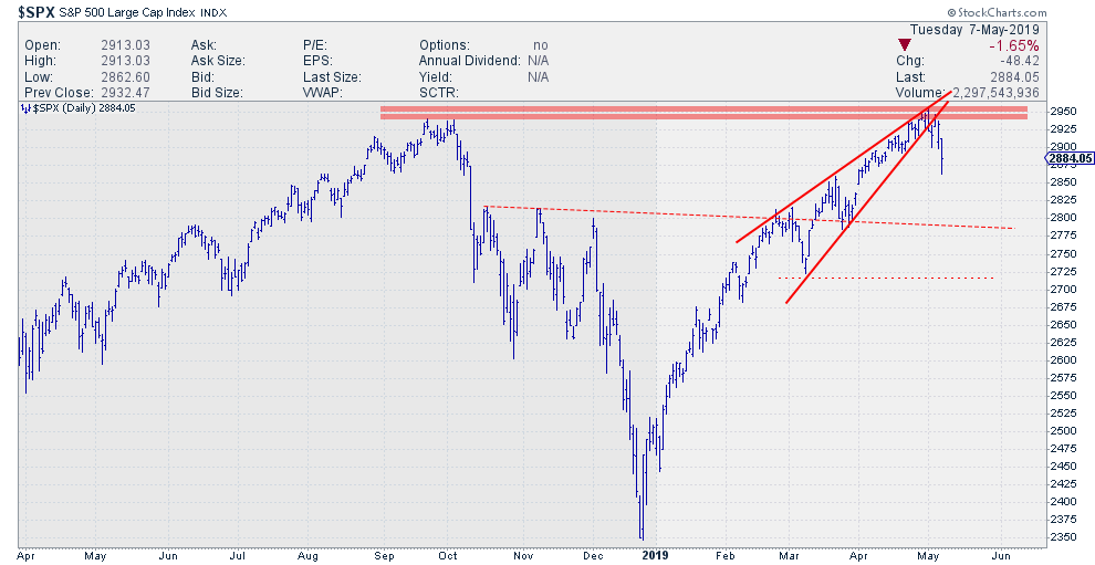
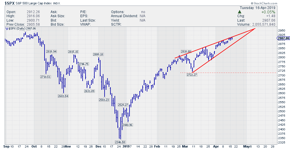
S&P Executes Wedge And Rotation To Defensive Sectors Accelerates
by Julius de Kempenaer,
Senior Technical Analyst, StockCharts.com
Since printing its high on 1 May, the S&P 500 has struggled to keep up and make its final push through resistance. Over the last three to four days, the bulls have capitulated, putting a reinforcement of the 2940-2950 resistance zone into place. The rising wedge formation that...
READ MORE
MEMBERS ONLY
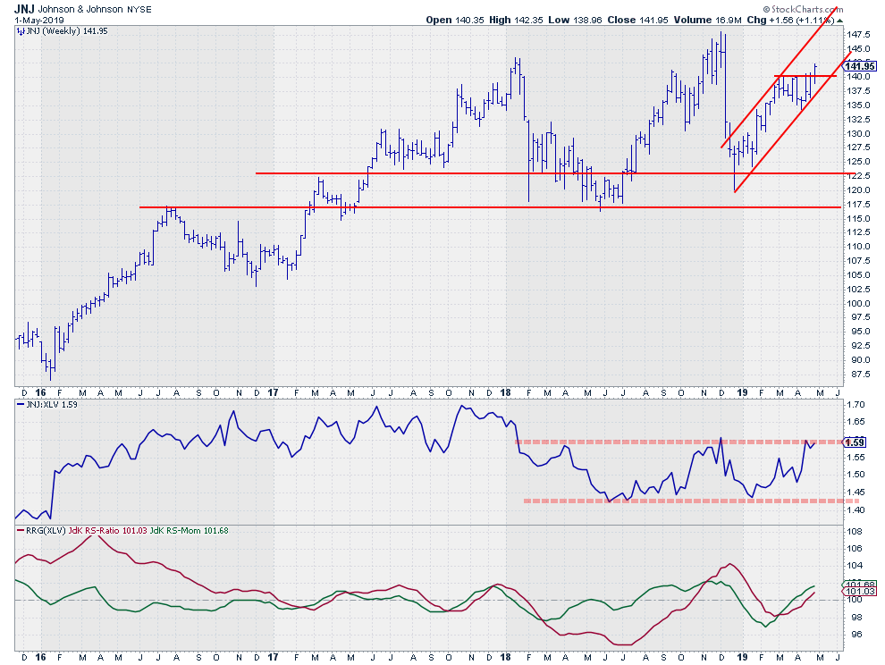
Will JNJ Be Able To Pull The Sector Back On Its Feet?
by Julius de Kempenaer,
Senior Technical Analyst, StockCharts.com
The Healthcare sector is not in its best shape. On the Relative Rotation Graph for US sectors, XLV is deep down inside the lagging quadrant against SPY, without any signs of improvement at the moment. However, if you feel that this situation will not last forever and are gutsy enough...
READ MORE
MEMBERS ONLY
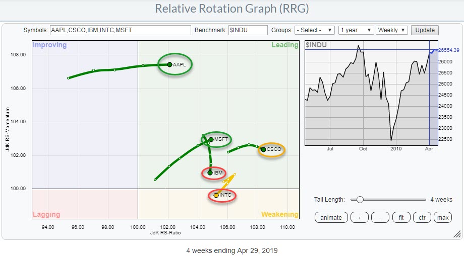
Mixed Rotations For Technology Stocks Inside The Dow - MSFT Comes Out On Top!
by Julius de Kempenaer,
Senior Technical Analyst, StockCharts.com
The Relative Rotation Graph shows the five technology stocks inside the DJ Industrials index, all of which are at the right-hand side of the RRG. This is not surprising, considering the strong rotation of the sector as a whole against the S&P 500 index.
Despite the strength of...
READ MORE
MEMBERS ONLY
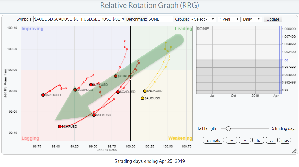
All Eyes On The Mighty Greenback! This Is How It Looks On A Relative Rotation Graph
by Julius de Kempenaer,
Senior Technical Analyst, StockCharts.com
A lot of eyeballs are watching the USD these days. Not surprisingly, as a lot (or most) people pay attention to the chart of the USD index ($USD), which compares the USD to a basket of other currencies. That chart now seems to be breaking out - to the UPside,...
READ MORE
MEMBERS ONLY
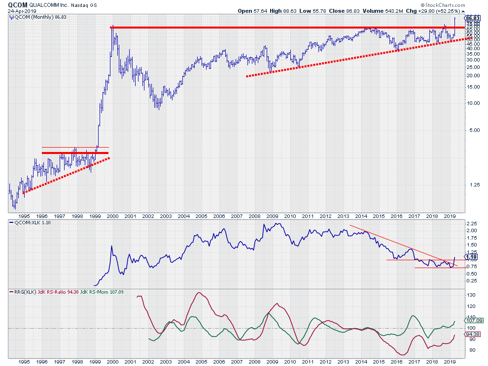
Party Like It's 1999 for QCOM
by Julius de Kempenaer,
Senior Technical Analyst, StockCharts.com
Technology is doing very well on the Relative Rotation Graph for US sectors, with a rotation that is well inside the leading quadrant and pushing further into it. If we shift gears and look specifically at the RRG for the technology sector (against XLK), we can see there is one...
READ MORE
MEMBERS ONLY
"Hooks" And One Sided Rotations On Relative Rotation Graphs
by Julius de Kempenaer,
Senior Technical Analyst, StockCharts.com
Last Thursday, 18 April, was the third Thursday of the month, my regularly scheduled guest appearance on MarketWatchers LIVE. As Tom Bowley was enjoying a well-deserved day off, it was just me and Erin on duty.
It wasn't my first time co-hosting, but every time I fill in...
READ MORE
MEMBERS ONLY
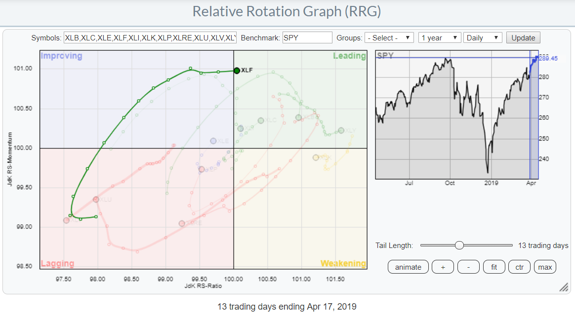
Financials Made It Into The Leading Quadrant, Now What?
by Julius de Kempenaer,
Senior Technical Analyst, StockCharts.com
At yesterday's close, the Financials sector (XLF) crossed over into the leading quadrant on the daily Relative Rotation Graph.
The tail of the sector started to curl upward inside the lagging quadrant roughly two weeks ago, before then proceeding to travel higher on both the Jdk RS-Ratio and...
READ MORE
MEMBERS ONLY
Are We Looking At A Wedge In The Making?
by Julius de Kempenaer,
Senior Technical Analyst, StockCharts.com
When acting in an environment of uncertainty (of which financial markets are a prime example) it is a good habit to double-check any findings. Think of it as an extra pair of eyes to confirm or deny what you (think you) are seeing.
In this process, please keep an open...
READ MORE
MEMBERS ONLY
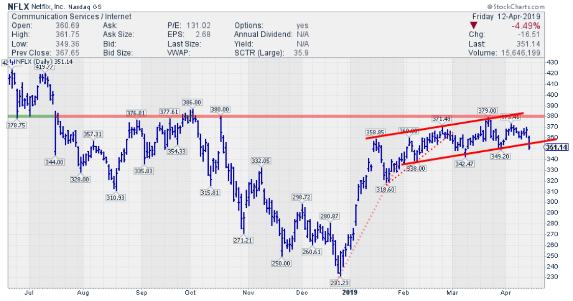
Three Breaks And You're Out For NFLX?
by Julius de Kempenaer,
Senior Technical Analyst, StockCharts.com
Since the beginning of the month, NFLX is lagging the S&P 500 index by more than 5%.
This is following the relative weakness that entered this stock after a strong start of 2019, where NFLX initially ran from $230 to $370 but started to move sideways, facing heavy...
READ MORE
MEMBERS ONLY
When Tails Remain On One Side Of A Relative Rotation Graph, What Does That Mean?
by Julius de Kempenaer,
Senior Technical Analyst, StockCharts.com
Relative Rotation Graphs are a great tool to use to visualize sector rotation, along with other asset rotations in various universes.
If you have used RRGs regularly and have monitored multiple rotational patterns, you may have noticed that the rotations do not always travel through all four quadrants in sequential...
READ MORE
MEMBERS ONLY
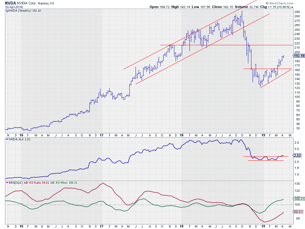
Is NVDA The Strongest Stock In The Strongest Sector?
by Julius de Kempenaer,
Senior Technical Analyst, StockCharts.com
Looking over some Relative Rotation Graphs this morning showed me that the Information Technology sector is currently the strongest sector in the S&P 500 universe.
XLK is positioned well inside the leading quadrant and is being powered further into that space by a long tail. It is difficult...
READ MORE
MEMBERS ONLY
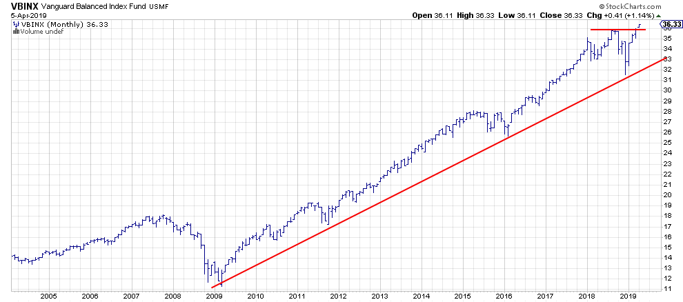
The 60/40 Balanced Portfolio Just Broke To New Highs - What About Stocks vs Bonds?
by Julius de Kempenaer,
Senior Technical Analyst, StockCharts.com
For asset allocation analysis, I generally use VBINX, a balanced index fund by Vanguard that holds 60% in stocks and 40% in a mix of different bonds.
This balanced portfolio (total return basis) just broke to new highs this week. Meanwhile, neither stocks (SPY) or bonds (IEF) have accomplished that,...
READ MORE
MEMBERS ONLY
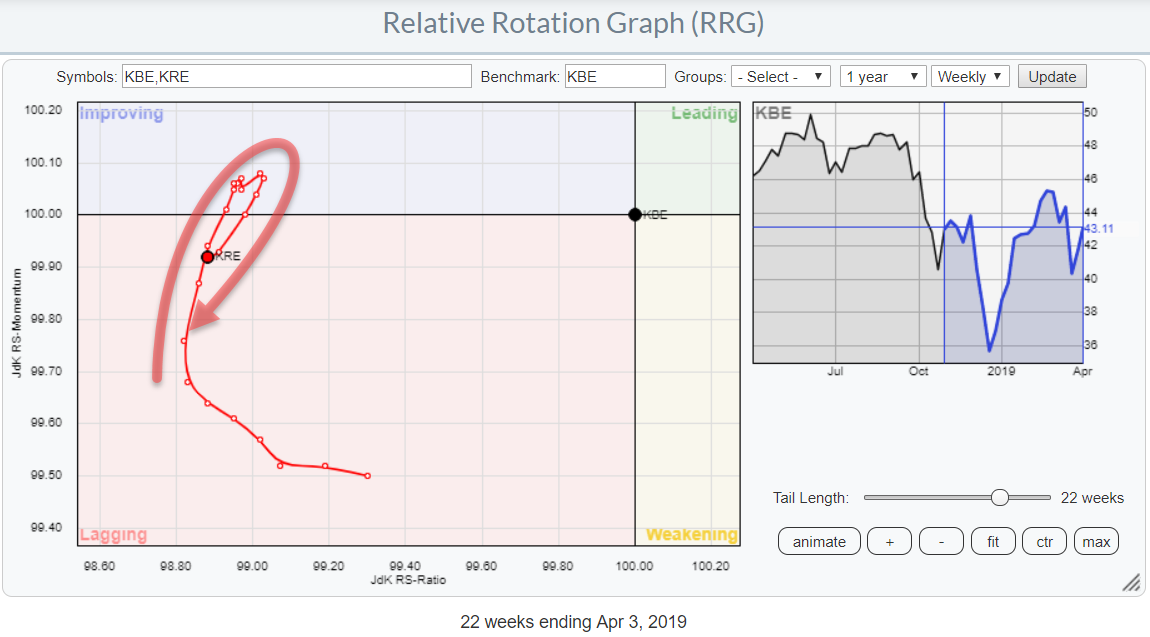
Financials Are Not Looking Very Strong But In That Sector Regional Banks Should Really Be Watched
by Julius de Kempenaer,
Senior Technical Analyst, StockCharts.com
On the Relative Rotation Graph for US sectors, the Financials sector (XLF) is not in the best shape at the moment. It is positioned inside the lagging quadrant and heading lower on both axes. So, not much good there.
At the moment I am in New York City to attend...
READ MORE
MEMBERS ONLY
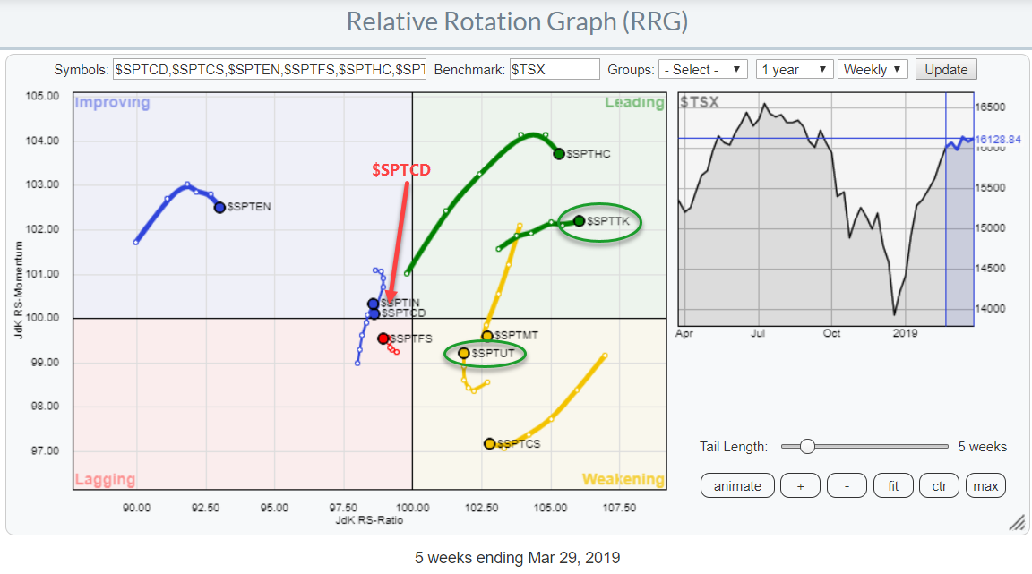
When In Canada.. Do As The Canadians, And Avoid The Consumer Discretionary Sector..
by Julius de Kempenaer,
Senior Technical Analyst, StockCharts.com
Last night I arrived in Toronto for a weekend with my son and his family, before heading towards New York to attend the CMTA symposium next week.
So for this article, it only seems appropriate to have a look at the Canadian sector landscape from an RRG perspective.
The Relative...
READ MORE