MEMBERS ONLY
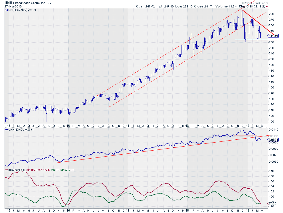
Triple whammy for UNH suggests more weakness ahead!
by Julius de Kempenaer,
Senior Technical Analyst, StockCharts.com
The weekly chart for UnitedHealth (UNH) shows a steady uptrend in both price and relative (vs $INDU) since the start of 2016.
That three-year move just came to an end.
The uptrend in relative strength emerged out of the low that was set in late 2015. Since then, UNH is...
READ MORE
MEMBERS ONLY
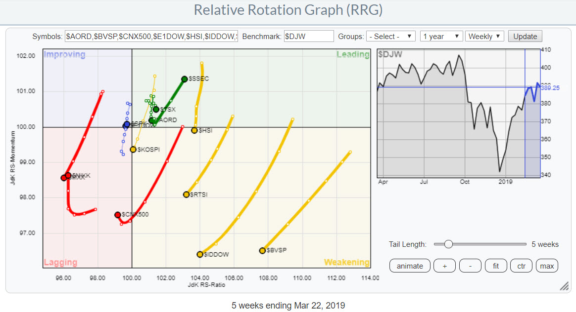
Europe vs The USA... And The Winner Is ....
by Julius de Kempenaer,
Senior Technical Analyst, StockCharts.com
I like to keep an eye on what's going on in the world around us. That means also monitoring what's happening in markets that are maybe not directly of interest when it comes to trading or investing.
For stock markets around the world I like to...
READ MORE
MEMBERS ONLY
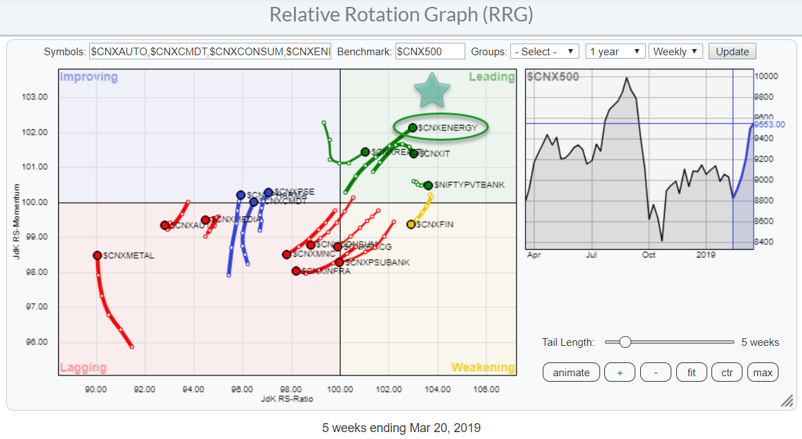
Energy Stands Out on Relative Rotation Graph For Indian Sectors
by Julius de Kempenaer,
Senior Technical Analyst, StockCharts.com
The list of pre-defined groups in the RRG-menu has been expanded with the universe covering Indian sectors against the Nifty 500 index as the benchmark. Very recently also the universe of individual stocks making up the Sensex 30 index was added. With the Nifty 50 group already on the list,...
READ MORE
MEMBERS ONLY
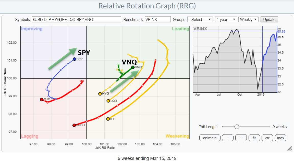
Real Estate Now Leading On Asset Class- And Sector RRGs
by Julius de Kempenaer,
Senior Technical Analyst, StockCharts.com
This Relative Rotation Graph shows the rotation for asset classes over the past 9 weeks. The main observation is that fixed income related asset classes are all inside weakening and heading, rapidly, towards lagging.
SPY (stocks) is close to returning into the leading quadrant. The strongest rotation at the moment,...
READ MORE
MEMBERS ONLY
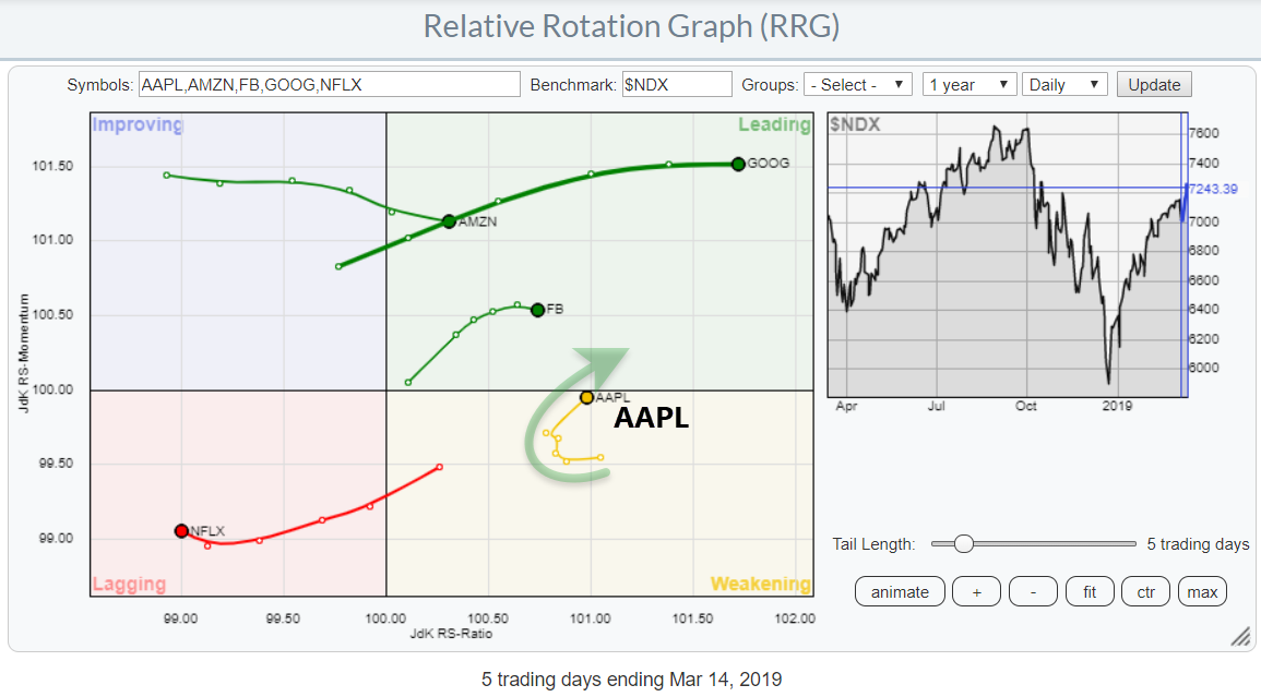
One A In FAANG Just Turned Back towards the Leading Quadrant
by Julius de Kempenaer,
Senior Technical Analyst, StockCharts.com
The Relative Rotation Graph shows the FAANG stocks against $NDX on a daily basis. The strong move of GOOG is evident and tracks the recent break of resistance.
Out of these five stocks, four are at the right-hand side of the graph, indicating a relative uptrend against the Nasdaq 100...
READ MORE
MEMBERS ONLY
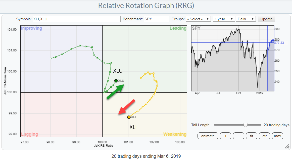
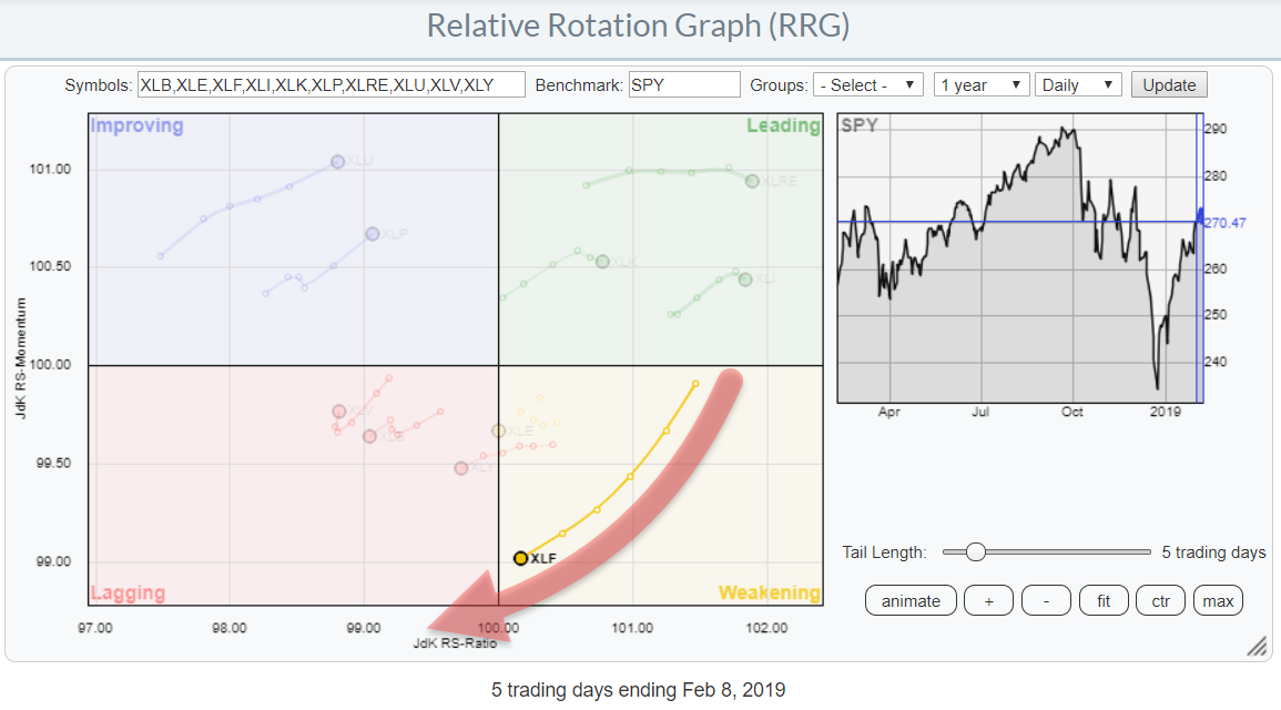
Spotting A Pair Trade On Relative Rotation Graph Of US Sectors
by Julius de Kempenaer,
Senior Technical Analyst, StockCharts.com
The above Relative Rotation Graph shows the daily rotation over the past 20-days for the Utilities and Industrials sectors.
I have isolated the tails of these two sectors to be able to show them in more detail and highlight the opposite directions that they started moving in.
When you bring...
READ MORE
MEMBERS ONLY
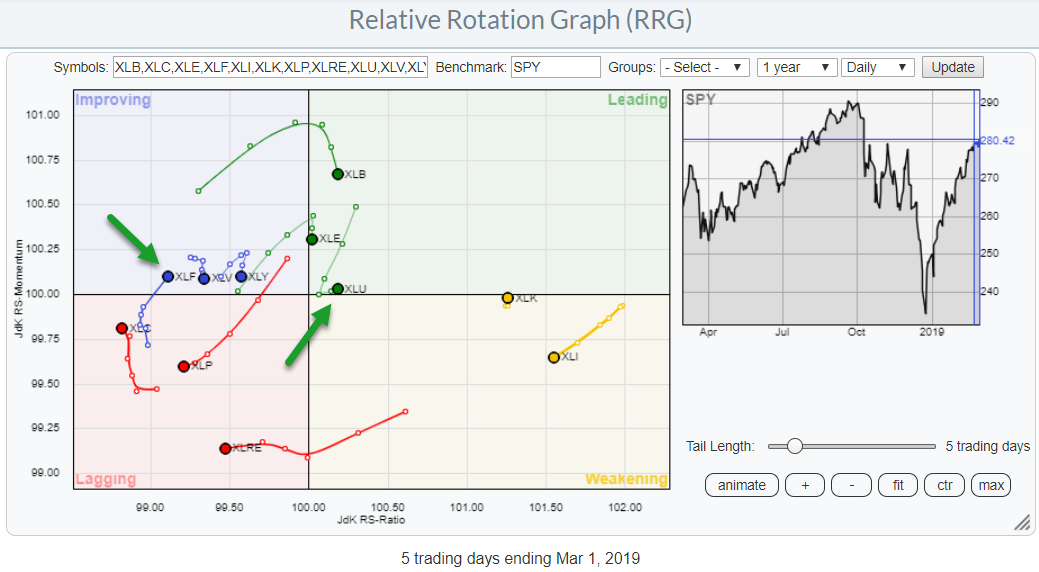
Something that makes me go ...Hmmmmmmm?
by Julius de Kempenaer,
Senior Technical Analyst, StockCharts.com
The daily RRG for US sectors shows a lot of sectors "hooking" lower and only two sectors that are, still, at a positive RRG-Heading, ie rising on both axes.
The chart above is showing a 5-day tail on every sector. if we look at the lengths and trajectories...
READ MORE
MEMBERS ONLY
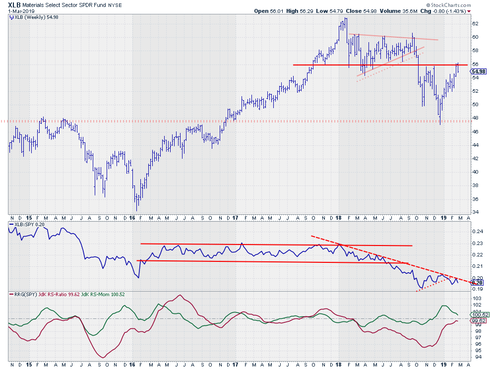
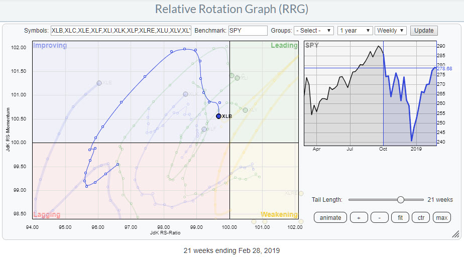
Materials (XLB) Are Failing To Break Resistance And Lose Relative Strength
by Julius de Kempenaer,
Senior Technical Analyst, StockCharts.com
The Materials sector, XLB, is testing overhead resistance around $56. This is the level where lows have been formed in 2017 and 2018 as well as two important highs at the end of 2018. For the time being, the attempt to break is failing, and this is visible on both...
READ MORE
MEMBERS ONLY
Materials Sector Rolling over On Both The Weekly And The Daily RRG
by Julius de Kempenaer,
Senior Technical Analyst, StockCharts.com
The chart above shows the weekly rotation for the Materials sector, XLB, within the universe of US sectors against SPY. After the tail turned upward inside the lagging quadrant, XLB kept up with the performance of SPY and moderately outperformed the market until the sector started to lose relative momentum...
READ MORE
MEMBERS ONLY
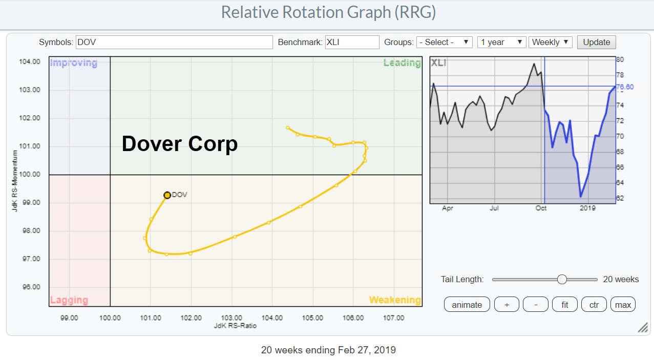
Is This Stock Breaking Out Or Building A Major Top-Formation?
by Julius de Kempenaer,
Senior Technical Analyst, StockCharts.com
On the weekly Relative Rotation Graph for US sectors, XLI, the Industrials sector is crossing over into the leading quadrant from improving. This indicates further improvement for Industrial stocks compared to other segments of the market.
While zooming in on the RRG for Industrial stocks against XLI I noted the...
READ MORE
MEMBERS ONLY
Join Me At The Traders EXPO in New York
by Julius de Kempenaer,
Senior Technical Analyst, StockCharts.com
Here's some shameless self-promotion!
On Monday 11 March I will be doing an RRG presentation at the TradersEXPO in New York and you are invited. For FREE ;)
Julius presenting RRG at TradersEXPO New York
I have never attended one of the TradersEXPO events let alone presented at them...
READ MORE
MEMBERS ONLY
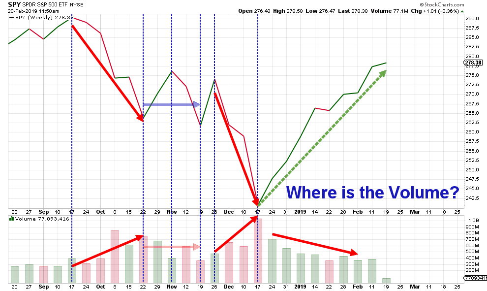
Where Is The Volume?
by Julius de Kempenaer,
Senior Technical Analyst, StockCharts.com
My last article in the RRG blog looks at sector rotation for US sectors and how there are some disconnects between groups of sectors on both the daily and the weekly time frames.
My conclusion from that article was that the current rotational patterns are sending mixed signals which makes...
READ MORE
MEMBERS ONLY
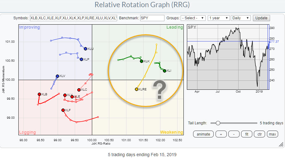
Two Sectors Are Rolling Over Inside The Leading Quadrant On The Daily RRG
by Julius de Kempenaer,
Senior Technical Analyst, StockCharts.com
The Relative Rotation Graphs, both daily and weekly, for US sectors are showing big disconnects between sectors.
The image above holds the US sectors and shows daily rotations.
It is immediately obvious that there is a big gap/disconnect between the right (=positive) side and the left (=negative)side of...
READ MORE
MEMBERS ONLY
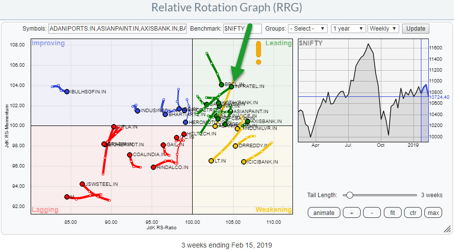
Checking The NIFTY 50 Universe On RRG Results In A Nice Setup For INFRATEL.IN
by Julius de Kempenaer,
Senior Technical Analyst, StockCharts.com
With more and more eyeballs looking at the Indian stock market and data for individual stocks and sectors becoming available on Stockcharts.com I started to keep an eye on developments in that market via Relative Rotation Graphs.
To make it easier (for you but also myself), the NIFTY 50...
READ MORE
MEMBERS ONLY
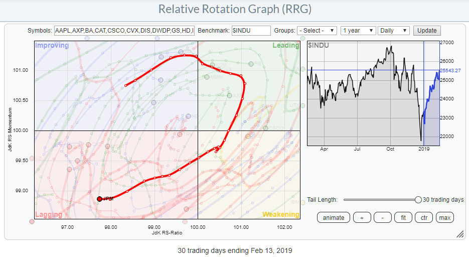
JP Morgan deteriorates further on Relative Rotation Graph
by Julius de Kempenaer,
Senior Technical Analyst, StockCharts.com
One of the choices in the drop-down selection on the Relative Rotation Graphs page is the DJ-industrials (Dow 30 Industrials). This RRG shows the rotation of all 30 Dow stocks against the $INDU.
The RRG above shows the daily rotation and highlights the rotation of JP Morgan Chase & Co....
READ MORE
MEMBERS ONLY
Watch Out For More Weakness In Financials This Week!
by Julius de Kempenaer,
Senior Technical Analyst, StockCharts.com
On the daily Relative Rotation Graph for US sectors, the rotation of Financials stands out. The tail is relatively long, indicating that there is good momentum behind this move,
The bad news is that the rotation is taking place inside the weakening quadrant and has almost reached the lagging quadrant....
READ MORE
MEMBERS ONLY
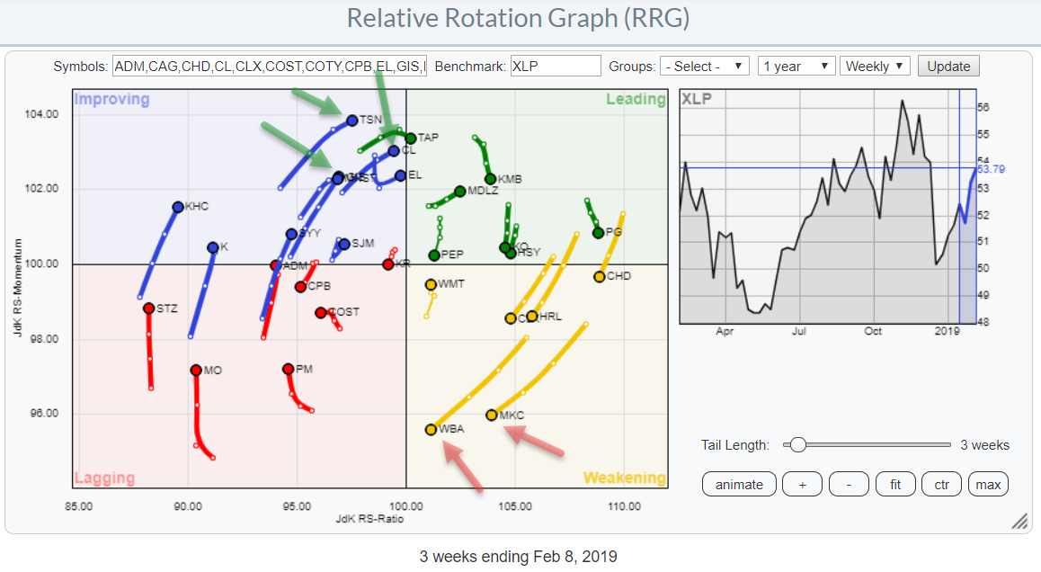
The Staples Sector Is Improving, But Which Stocks Deserve Attention?
by Julius de Kempenaer,
Senior Technical Analyst, StockCharts.com
The Relative Rotation Graph shows the rotation of the stocks in the Consumer Staples sector against XLP, the Consumer Staples sector index.
Keen observers may notice that I have left out COTY and CAG because they are very disconnected and distorting the picture. If you click on the image and...
READ MORE
MEMBERS ONLY
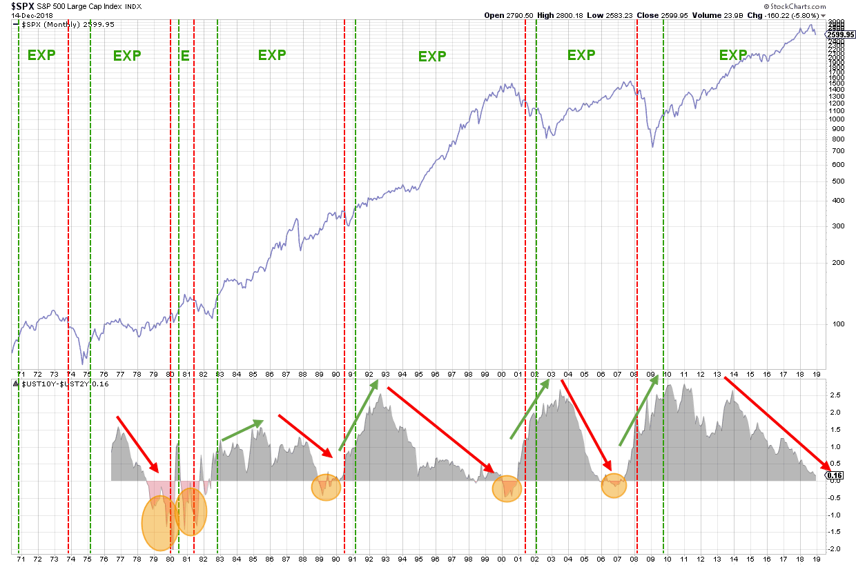
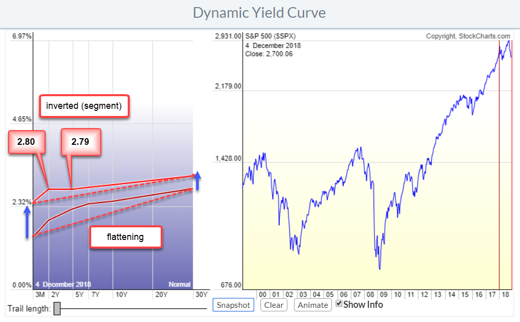
Save This Chart To Keep Track Of The Yield Curve Interaction With The Economic Cycle
by Julius de Kempenaer,
Senior Technical Analyst, StockCharts.com
The chart that I want to share with you today is part of a (bigger) research project that I am doing with regard to the various phases in economic cycles and their relation to the (shape of) yield curve.
The chart above shows the S&P Index in the...
READ MORE
MEMBERS ONLY
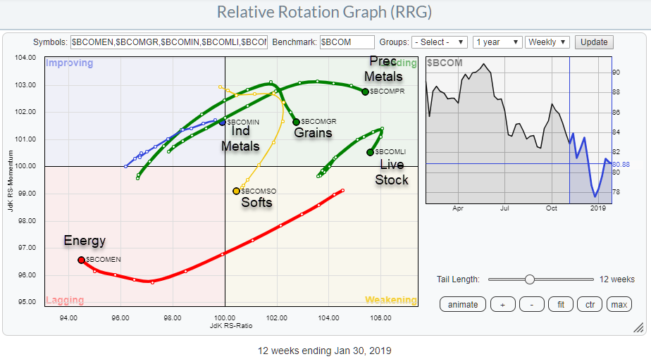
Using Relative Rotation Graphs To Break Down The Bloomberg Commodity Index Family
by Julius de Kempenaer,
Senior Technical Analyst, StockCharts.com
This article was published in the RRG blog on 31 January and takes a look at the Bloomberg Commodity Index Groups through the lens of a Relative Rotation Graph.
When possible, I prefer to use data-sets that come from the same family and creating a "closed universe." This...
READ MORE
MEMBERS ONLY
Breaking Down The Bloomberg Commodity Index Family On RRG
by Julius de Kempenaer,
Senior Technical Analyst, StockCharts.com
In this article, we are going to take a look at commodities using Relative Rotation Graphs and the Bloomberg commodity index family.
When possible, I prefer to use data-sets that come from the same family and creating a "closed universe." This is a universe where all securities on...
READ MORE
MEMBERS ONLY
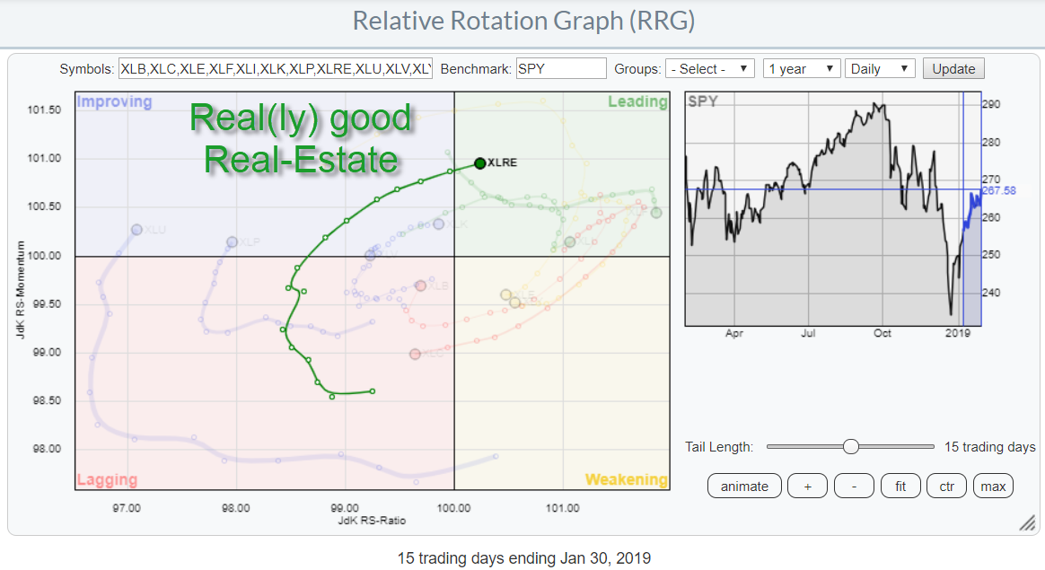
Real(ly) Good Real-Estate (XLRE) But It Needs To Break Resistance
by Julius de Kempenaer,
Senior Technical Analyst, StockCharts.com
The Relative Rotation Graph for US sectors shows a remarkably steady rotation for the Real-Estate sector. This is a daily RRG showing a 15 day tail, or three weeks. Yesterday XLRE crossed over into the leading quadrant and is now the only sector inside the leading quadrant at a solidly...
READ MORE
MEMBERS ONLY
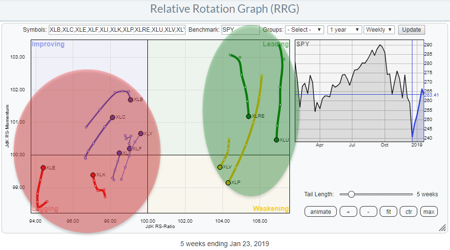
Defensive Sectors Starting Positive Rotations Again On Daily Relative Rotation Graphs
by Julius de Kempenaer,
Senior Technical Analyst, StockCharts.com
The Relative Rotation Graph for US sectors is showing a split picture. On the right, we have Utilities, Real-Estate, Consumer Staples and Healthcare. With the exception of Real-Estate maybe, these are generally accepted as "defensive" sectors.
All other sectors (7) are positioned to the left of the benchmark...
READ MORE
MEMBERS ONLY
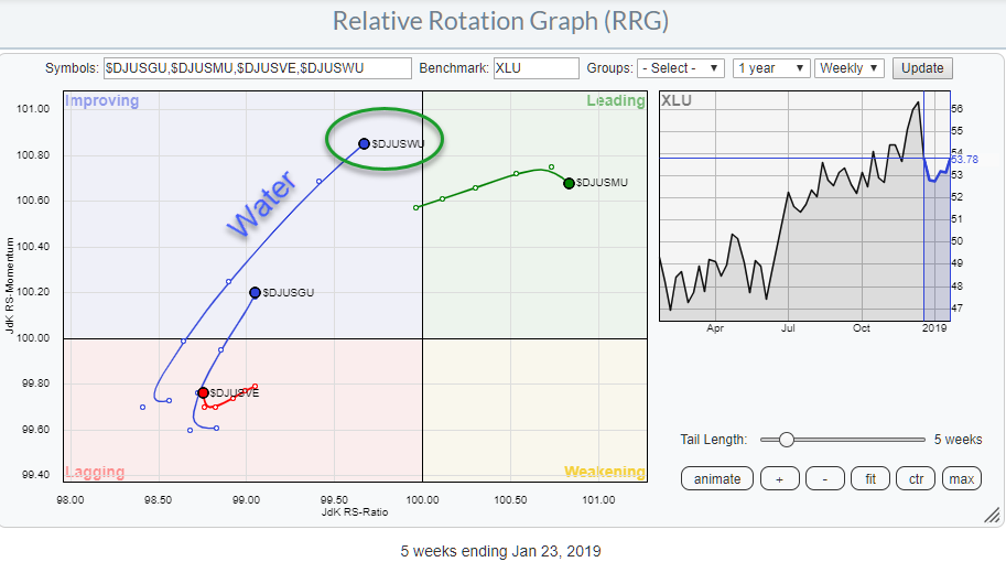
Water ($DJUSWU) Is The Leading Group Inside The Utilities Sector (XLU)
by Julius de Kempenaer,
Senior Technical Analyst, StockCharts.com
One of the pages that I often visit on Stockcharts.com is the sector summary. It gives a tabular overview of the price changes that occurred over a certain period (you can choose).
From that page, it is possible to open a Relative Rotation Graph that breaks the sector down...
READ MORE
MEMBERS ONLY
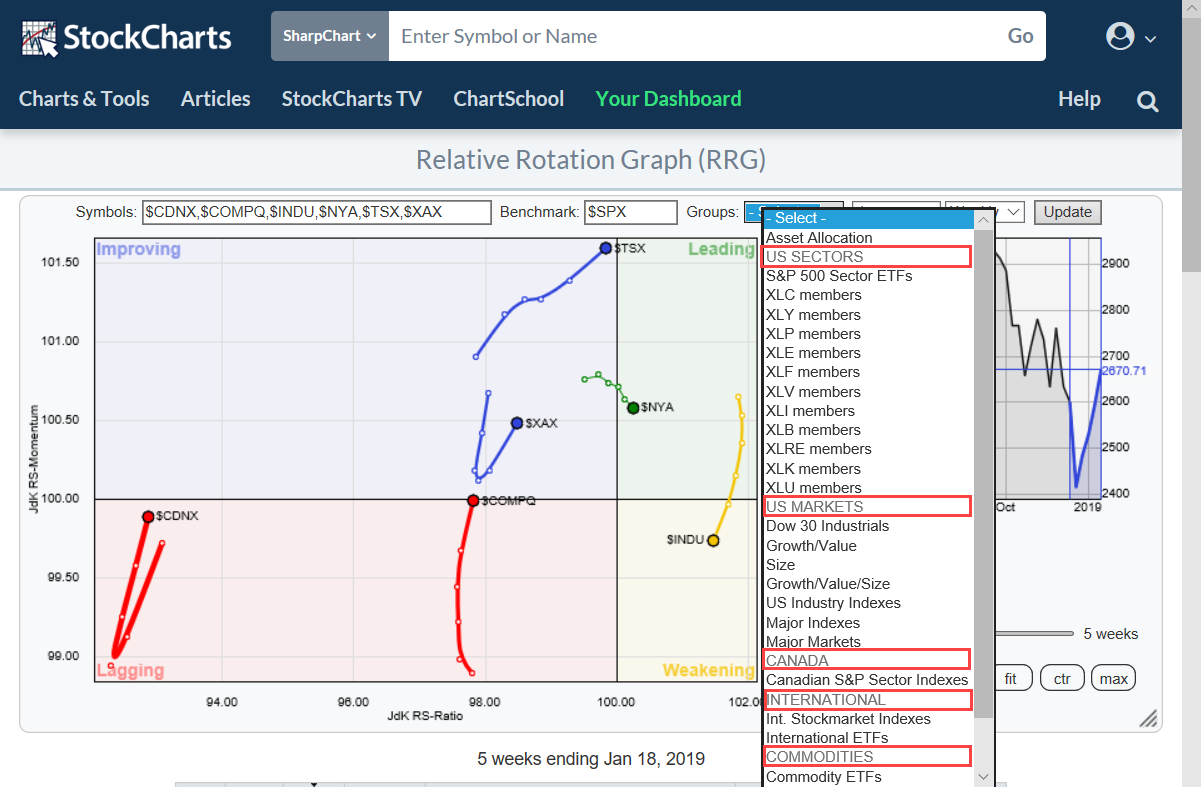
New Pre-Defined Groups And A Look At FAANG Stocks On Relative Rotation Graphs
by Julius de Kempenaer,
Senior Technical Analyst, StockCharts.com
If you are a regular user of Relative Rotation Graphs you are probably aware of the pre-defined groups (universes) that you can choose from when you open the drop-down box at the top op the chart.
In order to make life easier (for our users) and provide structure, I am...
READ MORE
MEMBERS ONLY
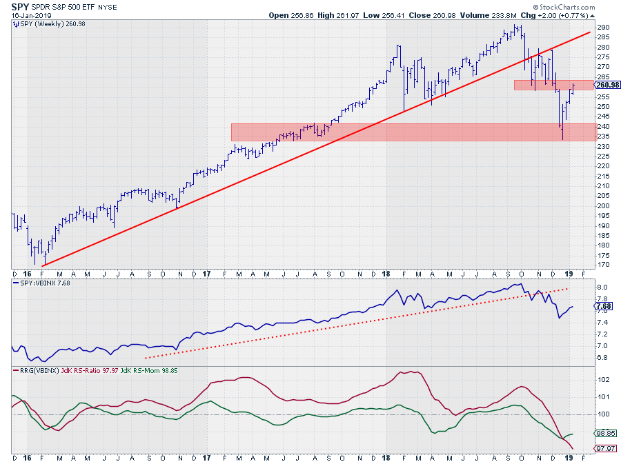
SPY Arrived In "Trouble Territory"
by Julius de Kempenaer,
Senior Technical Analyst, StockCharts.com
After the sharp sell-off in Q4 of last year, the market (SPY) started to recover from its lows near 235. And IMHO it is still a "recovery" before turning down again as opposed to a "turnaround" back up.
This weekly chart above clearly shows that the...
READ MORE
MEMBERS ONLY
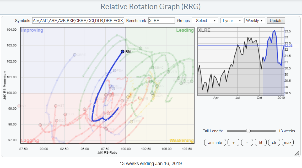
Long Tail And Strong RRG-Heading For IRM
by Julius de Kempenaer,
Senior Technical Analyst, StockCharts.com
The Relative Rotation Graph above highlights the rotation of IRM (Iron Mountain Inc.) in comparison to the other stocks in the S&P Real-Estate sector (XLRE).
The sector itself is interesting to keep an eye on as it is positioned well inside the leading quadrant but rolling over, at...
READ MORE
MEMBERS ONLY
Relative Rotation Graphs And Factor ETFs
by Julius de Kempenaer,
Senior Technical Analyst, StockCharts.com
It's Friday morning in Amsterdam and I just dropped my daughter off at school. On the way to my office, I usually stop at the local Coffee Company for a cappuccino and reading some, market-related, news, blogs etc.
For some reason, I noticed a lot of talk and...
READ MORE
MEMBERS ONLY
This DOW stock is pushing to new relative highs and rotates back into the leading quadrant on the Relative Rotation Graph
by Julius de Kempenaer,
Senior Technical Analyst, StockCharts.com
Visa is showing up, just, inside the leading quadrant on the Relative Rotation Graph vs $INDU above. These images are zoomed in from the RRG holding all the 30 DJ Industrials stocks (benchmark $INDU).
The tail in the chart on the left above shows 30 weeks of rotation and as...
READ MORE
MEMBERS ONLY
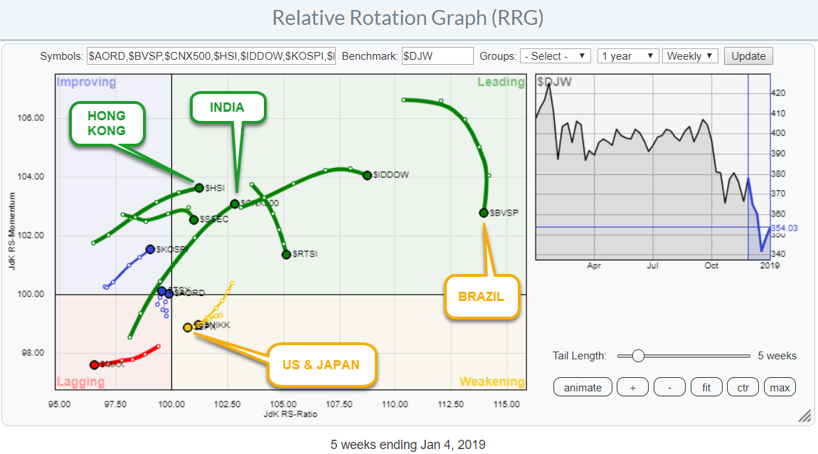
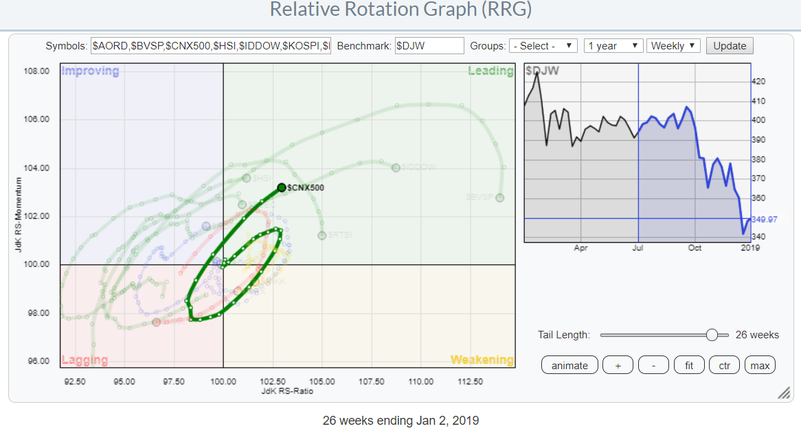
Use Relative Rotation Graphs To Get A Handle On International Markets
by Julius de Kempenaer,
Senior Technical Analyst, StockCharts.com
With the US stock market declining investors (may) need to look for alternatives in order to preserve capital. Sure enough, there are good opportunities in the US with bonds, IEF is doing very well, and cash is a very viable alternative if you do not "need" to be...
READ MORE
MEMBERS ONLY
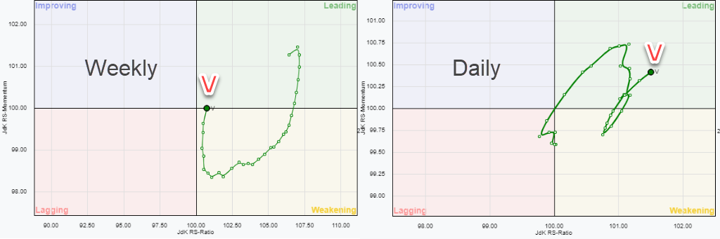
NIFTY (India) As An Alternative For SPY (US Stocks)
by Julius de Kempenaer,
Senior Technical Analyst, StockCharts.com
With the US stock market declining investors (may) need to look for alternatives in order to preserve capital. Sure enough, there are good opportunities in the US with bonds, IEF is doing very well, and cash is a very viable alternative if you do not "need" to be...
READ MORE
MEMBERS ONLY
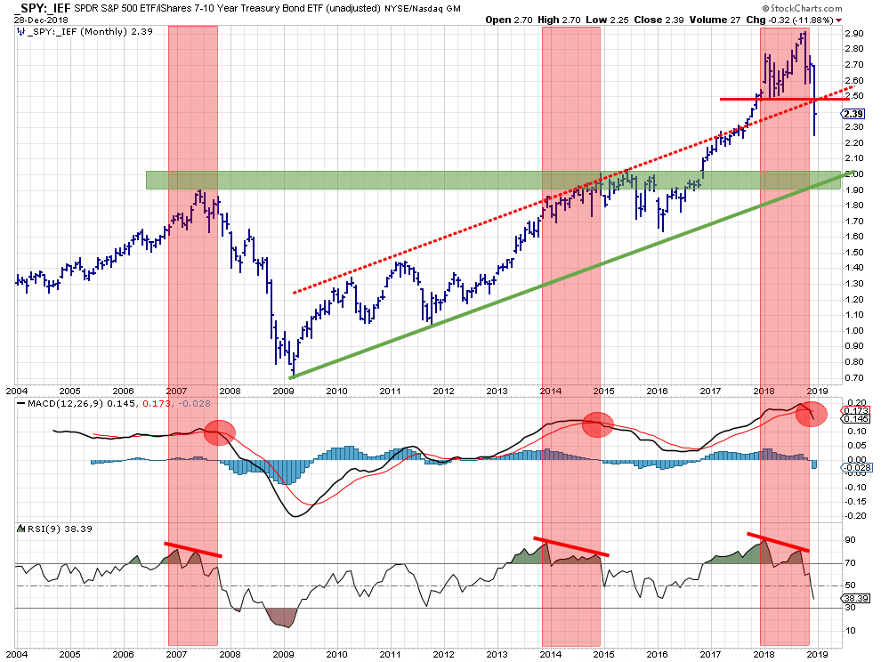
If the SPY:IEF ratio is going to test its support at the 2015 peaks where do SPY and IEF prices need to go?
by Julius de Kempenaer,
Senior Technical Analyst, StockCharts.com
The above chart shows the stocks/bonds ratio using monthly bars since 2004. IMHO this is one of the most useful charts to decide on an important portion of the asset allocation in your portfolio. Should you invest in stocks or in bonds. In other words, "Risk ON"...
READ MORE
MEMBERS ONLY
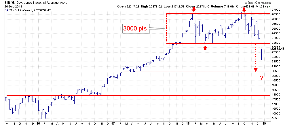
Okay, So You Rallied 1000 Points...? That Don't Impress Me Much.
by Julius de Kempenaer,
Senior Technical Analyst, StockCharts.com
Yesterday, on boxing day, the Dow jumped 1000 points from its 52-week low which, coincidentally, was also set yesterday. Never a dull moment. But, what does it mean?
Looking at the weekly chart above, at least IMHO, it means only a (small) recovery of the damage that has been done...
READ MORE
MEMBERS ONLY
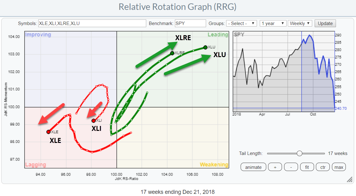
Relative Rotation Graph Shows BOB (EXC & WELL) vs WOW (NBL & FTV) Stocks
by Julius de Kempenaer,
Senior Technical Analyst, StockCharts.com
In my previous post, I highlighted both the Real-Estate and the Utilities sectors as (strong) outperformers during this weak period for stocks in general. This "Double + for Utilities and Real Estate on Relative Rotation Graph" pointed to the position inside the leading quadrant for both sectors on both...
READ MORE
MEMBERS ONLY
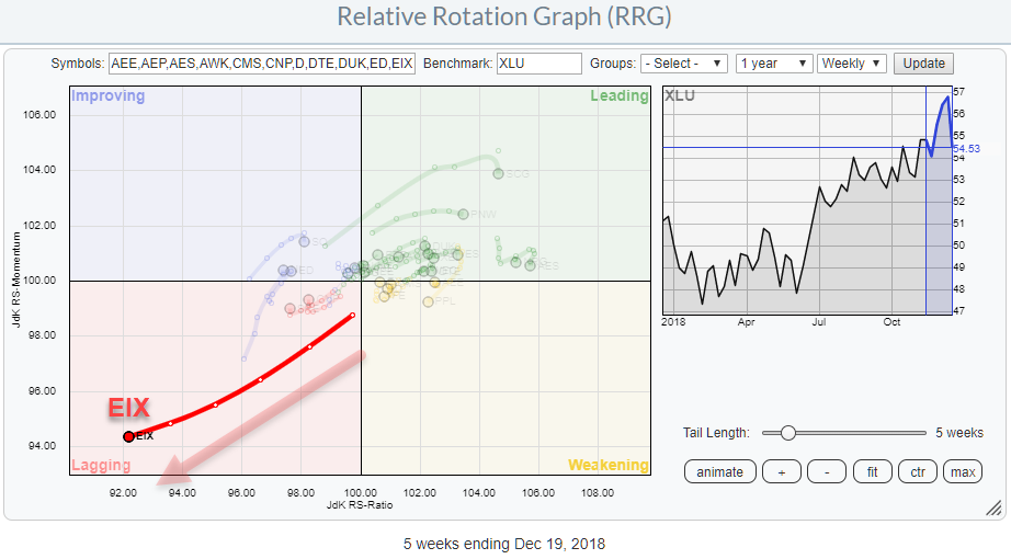
Utilities are OK but it's better to avoid EIX
by Julius de Kempenaer,
Senior Technical Analyst, StockCharts.com
The Utilities sector is acting as a safe haven for a lot of investors that need to park their money in the stock market because they cannot, or are not allowed to, hold all or significant amounts of cash when markets are going down.
These are the periods when relative...
READ MORE
MEMBERS ONLY
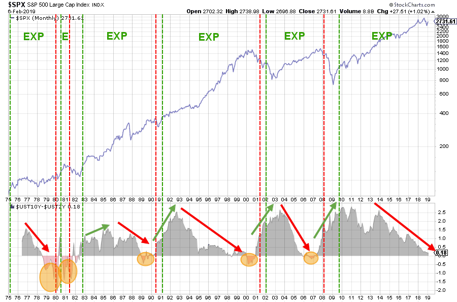
The Yield Curve And The Business Cycle
by Julius de Kempenaer,
Senior Technical Analyst, StockCharts.com
The "Yield Curve" is a term often used in finance and refers to the relationship between (government) bonds with various maturities.
The "Normal" relationship between the yield on various maturities is that the longer you lend money to someone. In this case the US government, the...
READ MORE
MEMBERS ONLY
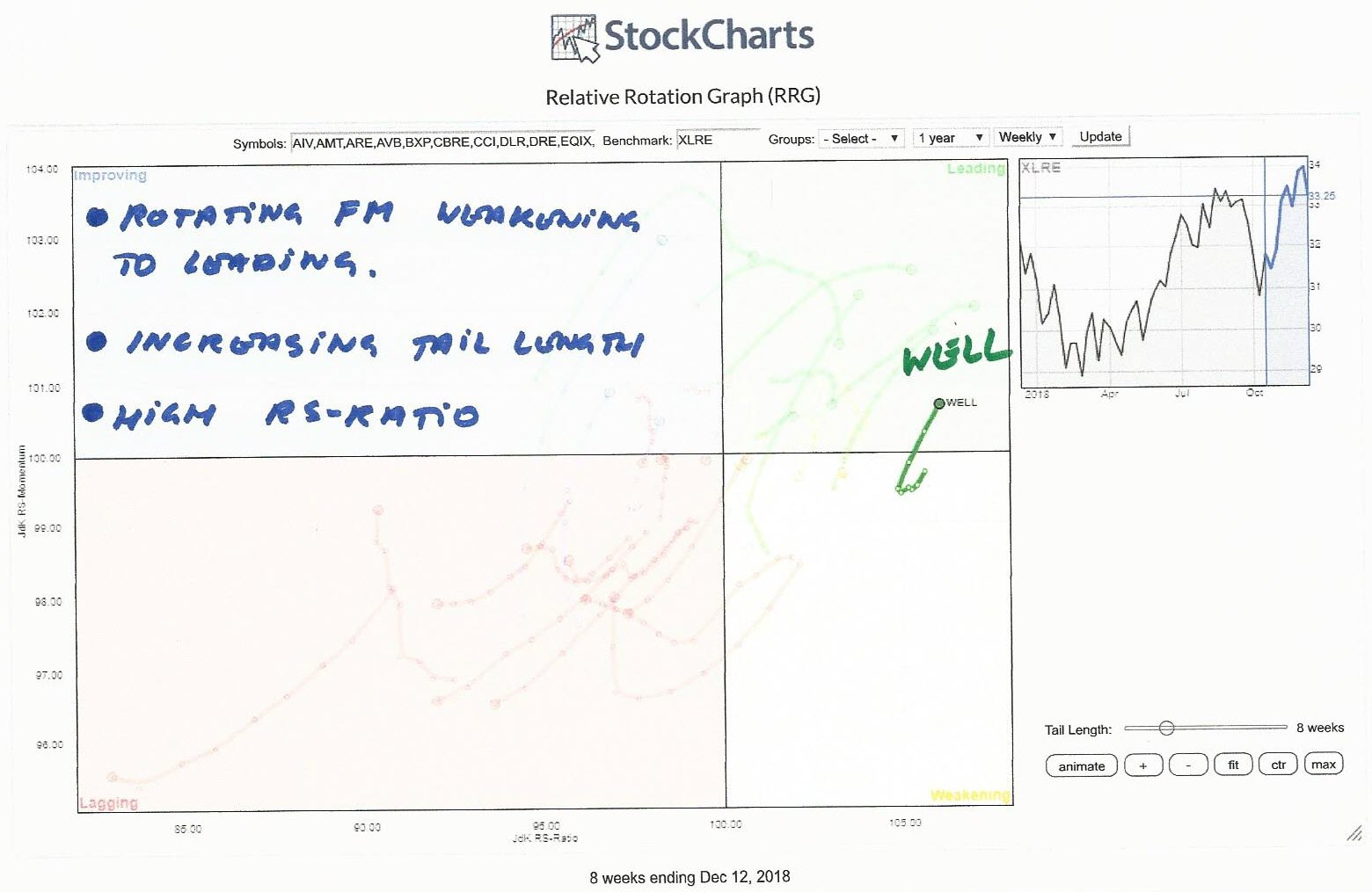
Oh WELL... What Can I Say?
by Julius de Kempenaer,
Senior Technical Analyst, StockCharts.com
On the Relative Rotation Graph, the Real-estate sector is one of the better performing sectors vis-a-vis the S&P 500 index.
The RRG above shows the rotation of all the stocks in XLRE against XLRE. This gives us a picture of the relative positions for all these stocks against...
READ MORE
MEMBERS ONLY
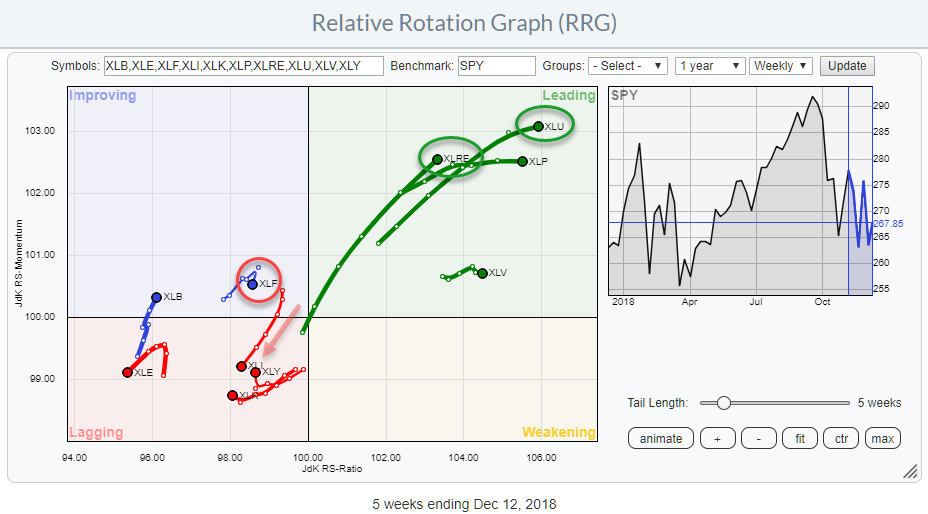
Double + For Utilities And Real Estate On Relative Rotation Graph
by Julius de Kempenaer,
Senior Technical Analyst, StockCharts.com
The market keeps throwing us curve balls on a daily basis. The Relative Rotation Graph above translates these curve balls into (sector-) rotational patterns.
The weekly chart above shows continuing strength for Utilities and Real Estate as they continue to move higher on both axes of the RRG.
Staples and...
READ MORE
MEMBERS ONLY
Why Is Everybody Talking About The Yield Curve? What Is All The Fuss About?
by Julius de Kempenaer,
Senior Technical Analyst, StockCharts.com
The yield curve has become a popular subject recently. Also, a few commentators on the site have mentioned the yield curve and its recent movements in their blogs recently. Read articles by Chief John, Greg Schnell, and Arthur Hill.
In my DITC contribution of 18 October, I showed how Relative...
READ MORE
MEMBERS ONLY
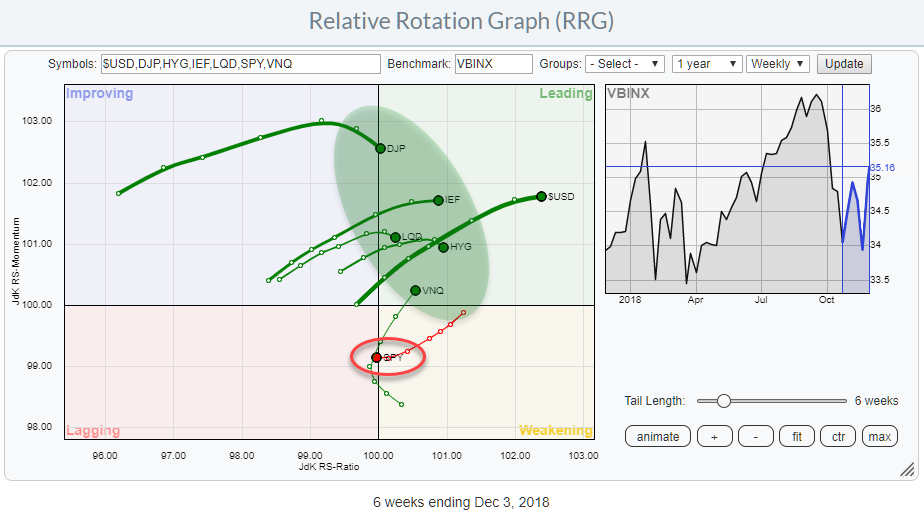
RRG Says Stocks Are The Weakest Asset Class
by Julius de Kempenaer,
Senior Technical Analyst, StockCharts.com
The Relative Rotation Graphs shows the rotation of various asset classes around a balance benchmark portfolio (VBINX).
The message could not be more clear. Stocks (SPY) just crossed over from weakening into the lagging quadrant while ALL other asset classes are inside the leading quadrant.
This is a pretty clear...
READ MORE
MEMBERS ONLY
Plotting breadth indicators on Relative Rotation Graphs - Part II
by Julius de Kempenaer,
Senior Technical Analyst, StockCharts.com
After finishing the previous article on plotting breadth indicators on Relative Rotation Graphs I have spent hours and hours on studying probably a couple of thousand different RRGs holding various groups of sectors in combination with their breadth equivalents.
And although I did not find the perfect prediction tool or...
READ MORE