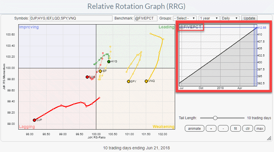
MEMBERS ONLY
Special benchmarks for Relative Rotation Graphs
by Julius de Kempenaer,
Senior Technical Analyst, StockCharts.com
Last week Thursday (6/21) was the third Thursday (try saying that out loud ;) ) of the month. The day that I join Tom and Erin in the Market Watchers Live show to talk about Relative Rotation Graphs.
In the show, which you can play back here, I talked about different...
READ MORE
MEMBERS ONLY
The BIG picture in ONE picture
by Julius de Kempenaer,
Senior Technical Analyst, StockCharts.com
Note 1: This article was posted earlier as part of the ChartWatchers newsletter last weekend. One paragraph and an up-to-date daily version of the Relative Rotation Graph for asset classes has been added to the bottom of this article.
Note 2: A pre-populated universe for Asset Allocation has been added...
READ MORE
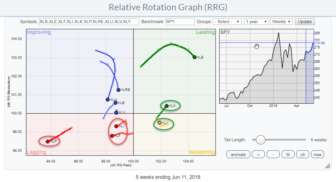
MEMBERS ONLY
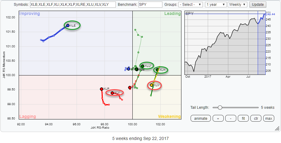
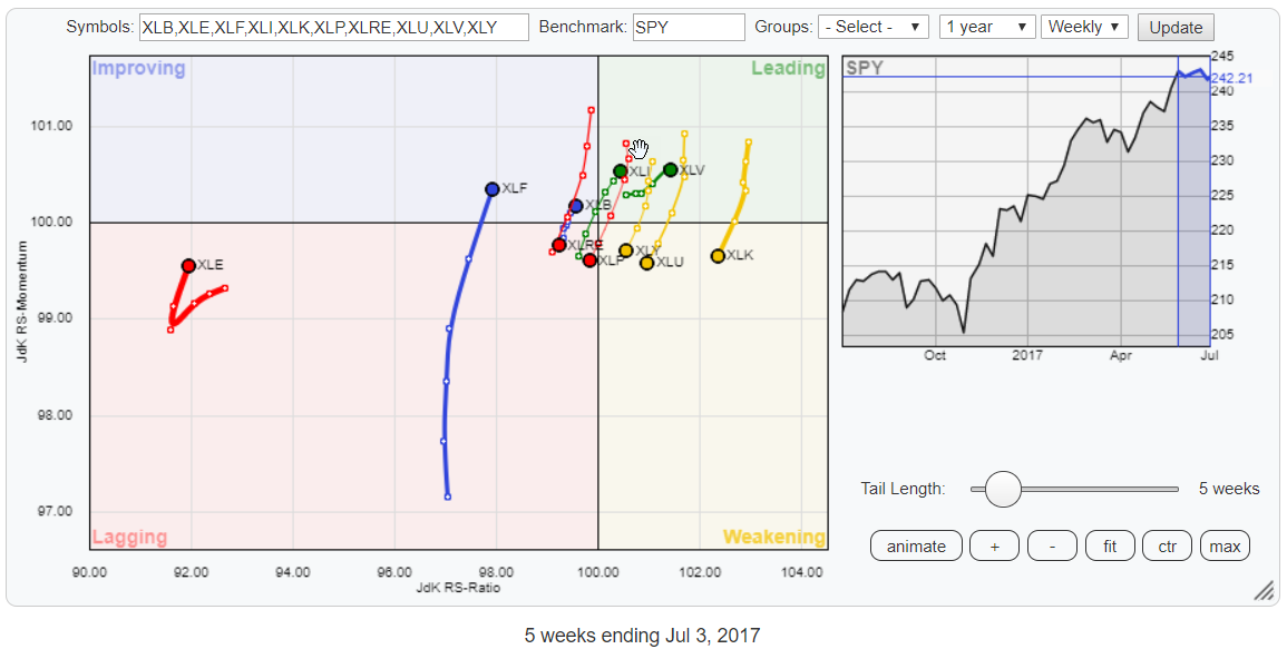
Technology sector rotating back to leading while Discretionary/Staples spread widens further
by Julius de Kempenaer,
Senior Technical Analyst, StockCharts.com
The Relative Rotation Graph shows the rotation of the ten S&P 500 sector ETFs (SPDR family) against the S&P 500 index ETF (SPY).
The rotation of the technology sector (XLK) back into the leading quadrant after a short period of rotation through the weakening quadrant is...
READ MORE
MEMBERS ONLY
Combining Relative Rotation Graphs and the "Turtle Soup" setup
by Julius de Kempenaer,
Senior Technical Analyst, StockCharts.com
On Monday 21 and Tuesday 22 May I stepped in for Erin Swenlin and acted as the co-host to Tom Bowley in the Market Watchers Live show. Clearly, we talked a lot about RRGs but as MWL is not all about RRG I wanted to bring something different to the...
READ MORE
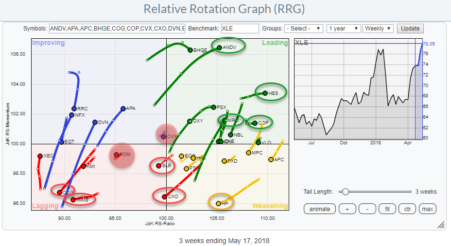
MEMBERS ONLY
Beat the Energy sector by avoiding XOM & CVX
by Julius de Kempenaer,
Senior Technical Analyst, StockCharts.com
In the previous RRG blog, I introduced the availability of pre-populated groups holding individual equities for each of the ten S&P sectors. This addition makes it much easier for users of the Relative Rotation Graph tool on Stockcharts.com to drill down to the individual equity level from...
READ MORE
MEMBERS ONLY
New pre-populated universes for Relative Rotation Graphs
by Julius de Kempenaer,
Senior Technical Analyst, StockCharts.com
If you have ever watched one of the webinars or Market Watchers Live shows that I have done here at Stockcharts.com, you may have seen me use Relative Rotation Graphs holding individual stocks and compare them to their sector benchmark.
After each appearance, I always got a few questions...
READ MORE
MEMBERS ONLY
Commodities taking over from equities?
by Julius de Kempenaer,
Senior Technical Analyst, StockCharts.com
For a very long time equities have been the dominating asset class, stuck at the right-hand side of the Relative Rotation Graph showing six different asset classes.
That situation is now changing. Equities (SPY) is still at the right hand (positive) side of the RRG but inside the weakening quadrant,...
READ MORE
MEMBERS ONLY
All eyes on the CAT
by Julius de Kempenaer,
Senior Technical Analyst, StockCharts.com
Yesterday, Thursday 19th of April, it was my turn again to join Tom and Erin in their Market Watchers Live show again. By the way, I will be joining them every third Thursday of the month to talk about RRG and talk about market developments from an RRG point of...
READ MORE
MEMBERS ONLY
AAPL and WMT moving in opposite directions on Relative Rotation Graph
by Julius de Kempenaer,
Senior Technical Analyst, StockCharts.com
Last week I attended the CMT Association’s annual symposium in New York City. One of the industry events that I visit each year.
On the one hand to learn from other industry professionals but very much also to catch up with friends and maintain relationships.
As I am writing...
READ MORE
MEMBERS ONLY
Relative Rotation Graph shows near term strength for Utilities and Staples
by Julius de Kempenaer,
Senior Technical Analyst, StockCharts.com
The Relative Rotation Graph for US sectors is showing us a few interesting rotational patterns for the week ending 4/6.
Studying the RRG above, there are two sector pairs which rotations I want to investigate a bit further.
The first one is Consumer Discretionary vs Utilities because they are...
READ MORE
MEMBERS ONLY
Putting things into perspective for the FB face-plant
by Julius de Kempenaer,
Senior Technical Analyst, StockCharts.com
Facebook has been making headlines recently. Not only in the newspapers and online news services but also in some of the blogs at Stockcharts.com.
With hindsight everything is easy and we can find many “signals” that “would have” given us early warning signals that we “should” have seen and...
READ MORE
MEMBERS ONLY
A view on Asset Class rotation and the difference between open and closed universes.
by Julius de Kempenaer,
Senior Technical Analyst, StockCharts.com
Last week I was the guest of Tom and Erin in their Market Watchers Live show on stockcharts.tv.
In that show, I talked about the difference between open and closed universes and what it means for a Relative Rotation Graph and following that discussion we had a look at...
READ MORE
MEMBERS ONLY
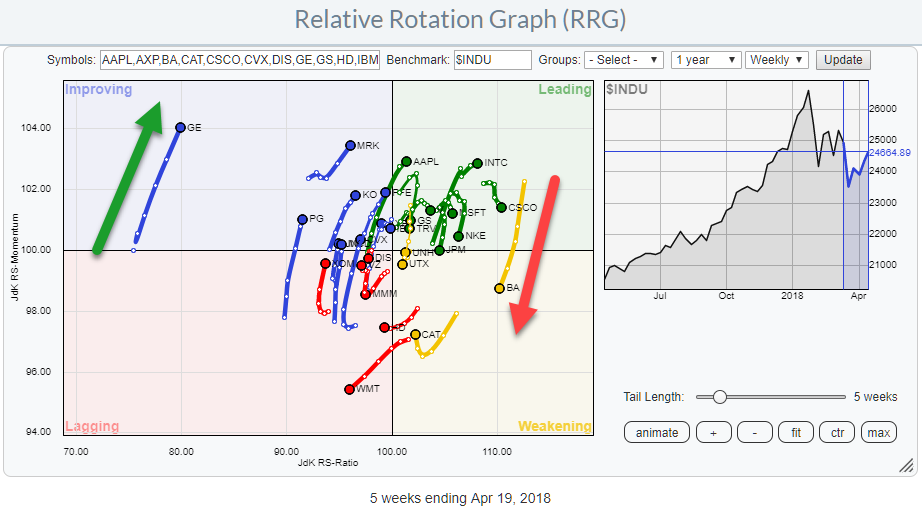
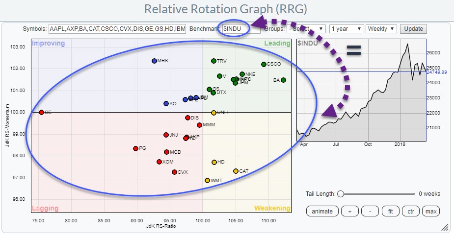
Scanning 30 Dow stocks in two minutes on a Relative Rotation Graph
by Julius de Kempenaer,
Senior Technical Analyst, StockCharts.com
In this blog, I will take another look at the 30 stocks that make up the DJ Industrials index.
A quick look learns that the real outsider in this index is GE which is positioned far to the left on the RRG, moving higher (almost vertical) on the JdK RS-Momentum...
READ MORE
MEMBERS ONLY
Nine tech stocks to watch from an RRG perspective
by Julius de Kempenaer,
Senior Technical Analyst, StockCharts.com
An inspection of the weekly Relative Rotation Graph for US sectors at the beginning of this week (ending 2 March) reveals that we have:
* 3 sectors in leading
* 2 sectors in weakening
* 4 sectors in lagging
* 1 sector in improving
Out of these 10 sectors, we have only 2 at...
READ MORE
MEMBERS ONLY
Painting the US equity landscape using Relative Rotation Graphs
by Julius de Kempenaer,
Senior Technical Analyst, StockCharts.com
Relative Rotation Graphs are a great tool to visualize sector rotation and that is probably where you will see them applied most. But they can be used for so many more (rotational) variations of different universes or similar universes in a different way.
In this post, I will show you...
READ MORE
MEMBERS ONLY
A few hundred points in the S&P 500.... Who cares?
by Julius de Kempenaer,
Senior Technical Analyst, StockCharts.com
The rough ride down in the markets last Friday was something that was probably expected by many but still came as a surprise. I am not a big fan of “calling tops”, or troughs for that matter. Mainly because many of these “predictions” have had many failed attempts to “call...
READ MORE
MEMBERS ONLY
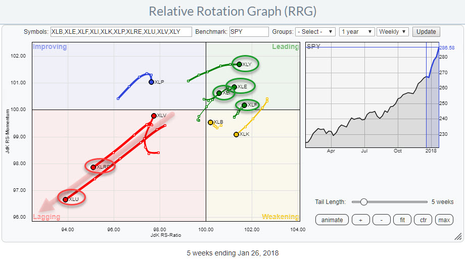
Relative Rotation Graphs are sending a clear message for Real-Estate (XLRE) and Utilities (XLU)
by Julius de Kempenaer,
Senior Technical Analyst, StockCharts.com
The Relative Rotation Graph shows the positions of US sectors against SPY as of 26 Jan. Sometimes the rotational patterns are not so clear but in this example, there is one observation sending a screaming message:
Avoid Real-Estate and Utilities.
At the other end of the spectrum inside the leading...
READ MORE
MEMBERS ONLY
Using Relative Rotation Graphs(R) to get a handle on both price- and relative rotation in ONE picture
by Julius de Kempenaer,
Senior Technical Analyst, StockCharts.com
In my last blog, we looked at the 30 components of the Dow Jones Industrials Index and more specifically at the relative positioning and relative rotation of these 30 stocks around their common denominator the DJ Industrials index ($INDU).
And despite the fact that this is valuable information you may...
READ MORE
MEMBERS ONLY
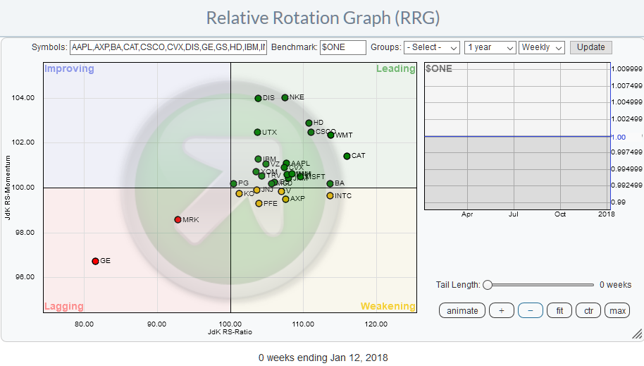
Selecting stocks to watch (and avoid) in the Dow 30 using Relative Rotation Graphs(r)
by Julius de Kempenaer,
Senior Technical Analyst, StockCharts.com
The Relative Rotation Graph shows the members of the DJ Industrials index against $INDU. This is a so-called closed universe which means that all elements that make up the universe are present in the plot. If we would calculate all the distances (vectors) from the center of the chart to...
READ MORE
MEMBERS ONLY
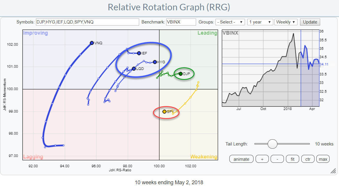
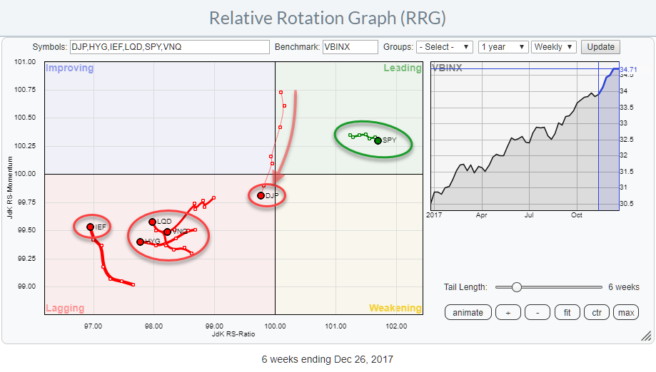
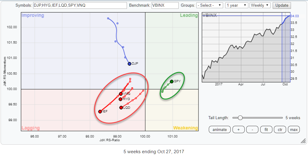
Relative Rotation Graphs suggest to stick with equities (SPY) while keeping an eye on commodities (DJP) going into 2018
by Julius de Kempenaer,
Senior Technical Analyst, StockCharts.com
As 2017 draws to an end, the Relative Rotation Graph for asset classes is sending a very clear message!
Equities are leading the way into 2018!
The RRG above shows some ETFs representing various asset classes and uses VBINX, a balanced index fund, as the benchmark.
With only SPY, representing...
READ MORE
MEMBERS ONLY
RRG shows two sectors continuing to carry SPY higher and three sectors to avoid going into the new year
by Julius de Kempenaer,
Senior Technical Analyst, StockCharts.com
The Relative Rotation Graph for US sectors is showing us three sectors to avoid but also two which may offer good potential.
Inside the leading quadrant, we find XLK and XLF still being the strongest sector in US equity market based on their JdK RS-Ratio reading.
Energy (XLE) started heading...
READ MORE
MEMBERS ONLY
Responding to comments and answering questions from MWL last week
by Julius de Kempenaer,
Senior Technical Analyst, StockCharts.com
Last week Wednesday (29 November) I was the guest of Tom and Erin in the Market Watchers Live show.
During the show, we talked a lot about RRG, Relative Rotation Graphs, covering some basics and some new(er) techniques and interpretations that I have been working on.
If you missed...
READ MORE
MEMBERS ONLY
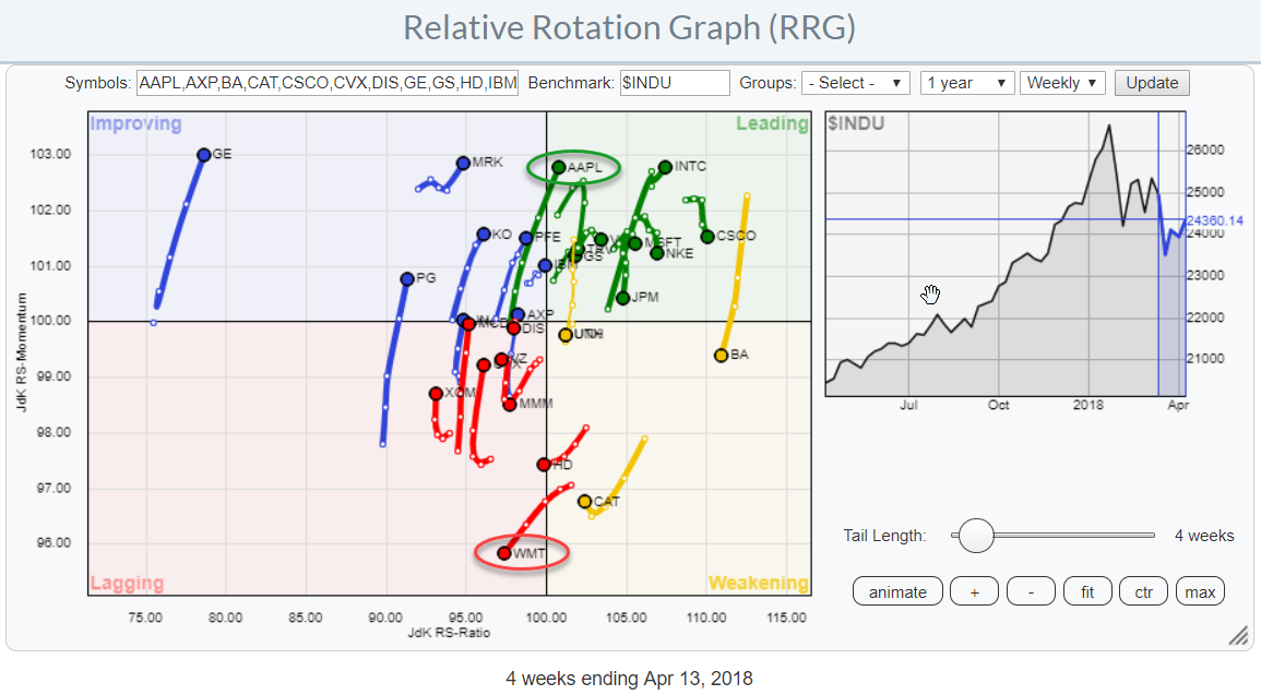
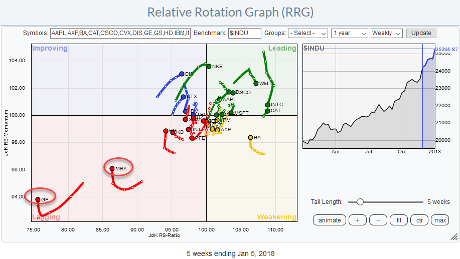
GE in freefall while WMT is shooting for the stars on Relative Rotation Graph for $INDU
by Julius de Kempenaer,
Senior Technical Analyst, StockCharts.com
Above is the Relative Rotation Graph for the DJ Industrials index, comparing the relative rotation of all members around $INDU.
On this chart, a few stocks stand out because of their clear directional moves.
Inside the leading quadrant, INTC, CSCO, and WMT are pulling away from the crowd further into...
READ MORE
MEMBERS ONLY
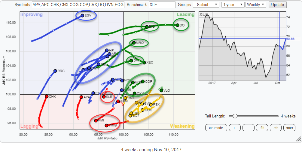
Energy sector bursting into leading quadrant on Relative Rotation Graph, strong potential for EOG and COP
by Julius de Kempenaer,
Senior Technical Analyst, StockCharts.com
The Relative Rotation Graph above shows all the members of the S&P 500 Energy sector against XLE, the ETF that tracks the Energy sector price index.
The main reason for looking at this universe at the moment is the fact that the sector (XLE) on the RRG for...
READ MORE
MEMBERS ONLY
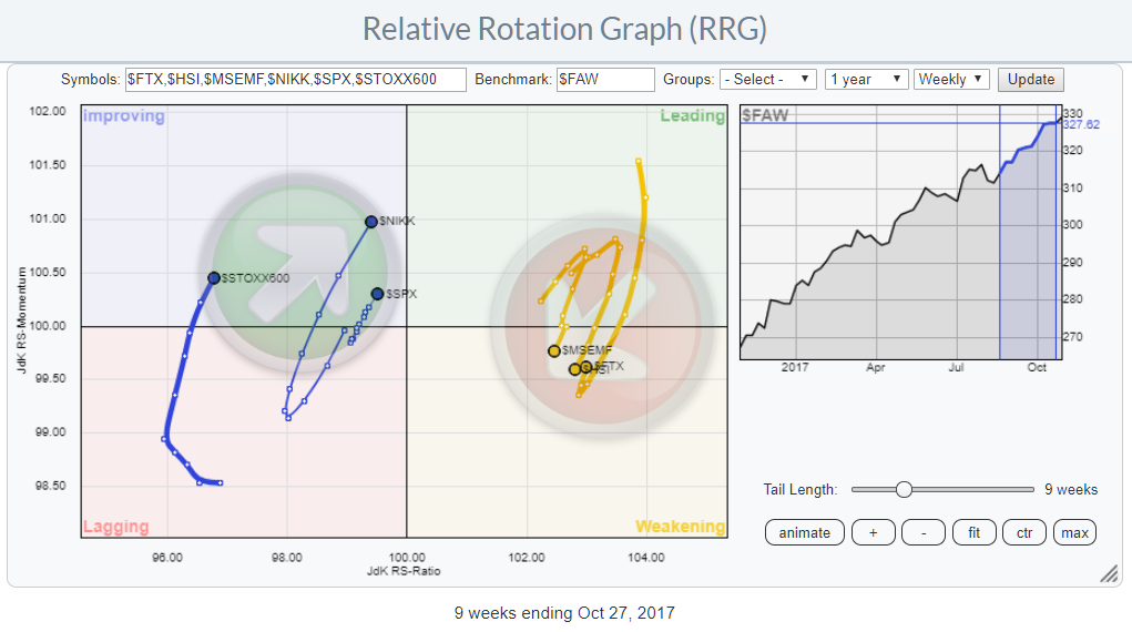
S&P 500 in nose bleed area? ... Not from this perspective!
by Julius de Kempenaer,
Senior Technical Analyst, StockCharts.com
The Relative Rotation Graph above plots a number of world equity markets against the FTSE all-world index and shows their relative rotation around this benchmark.
With all the chatter going around on the S&P 50o index camping in the nose-bleed area this gives a refreshing angle to look...
READ MORE
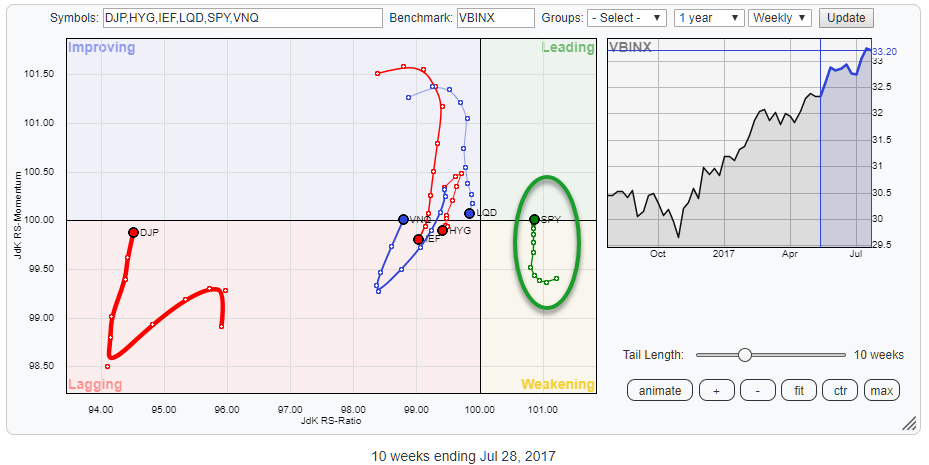
MEMBERS ONLY
Once again, strong rotation for SPY vs other asset classes on RRG
by Julius de Kempenaer,
Senior Technical Analyst, StockCharts.com
The Relative Rotation Graph above holds six ETF that represent various asset classes.
The picture gives you the big picture of what is going on at asset class level on a relative basis against VBINX which is a Vanguard balanced index fund (60% equity / 40% bonds).
This one frame immediately...
READ MORE
MEMBERS ONLY
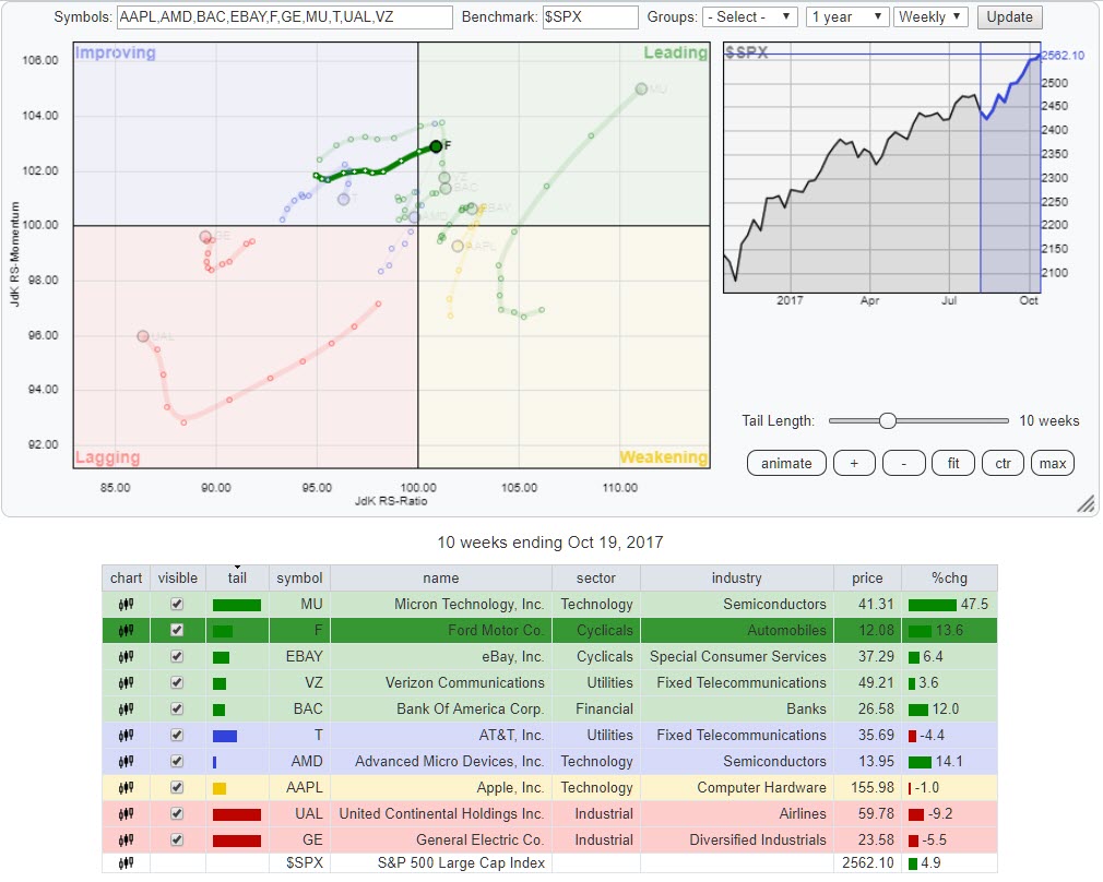
Using RRG to pick Ford from "most active" table
by Julius de Kempenaer,
Senior Technical Analyst, StockCharts.com
In the top-right corner of the homepage at StockCharts.com, there is a table that holds "Market Movers". It defaults to the top10 "most active" in the S&P 500 but you can change that using the buttons and drop-downs.
Below the table, you will...
READ MORE
MEMBERS ONLY
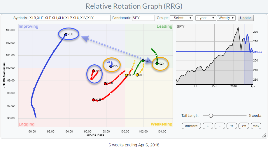
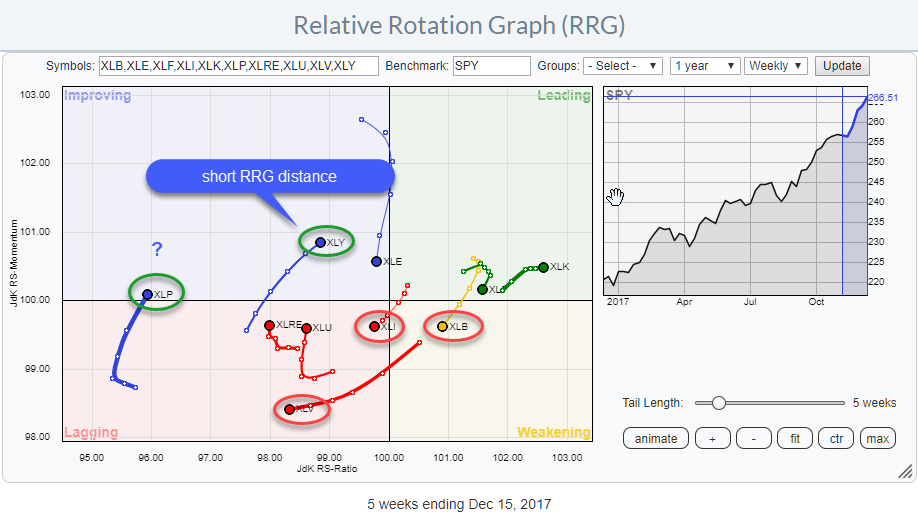
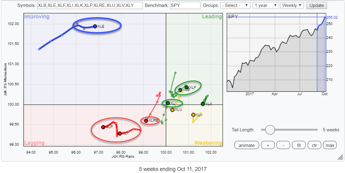
RRG suggests sector rotation out of Real Estate (XLRE) into Industrials (XLI)
by Julius de Kempenaer,
Senior Technical Analyst, StockCharts.com
The Relative Rotation Graph for US sectors shows seven sectors clustered around the benchmark in the middle of the graph (SPY) and three of them further away.
XLE is more or less detached from the rest of the universe while XLP and XLY are breaking away together and heading deeper...
READ MORE
MEMBERS ONLY
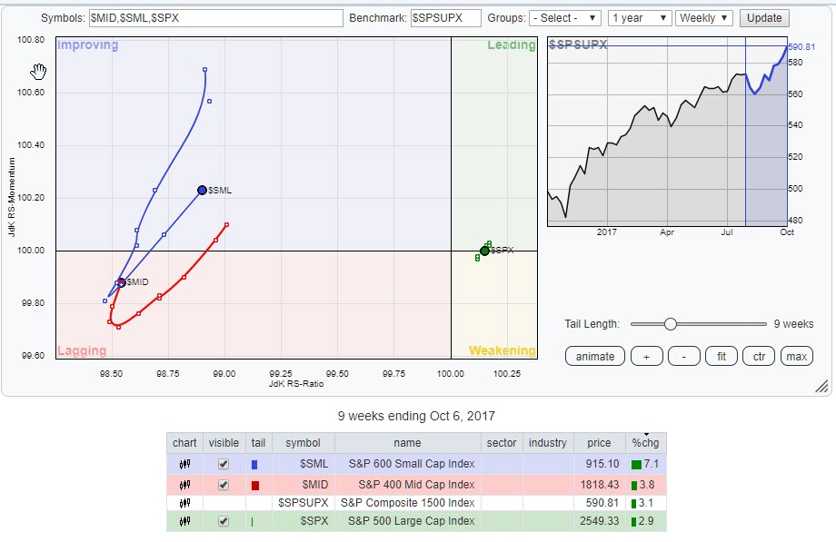
RRG says you need to keep an eye on Small Caps!
by Julius de Kempenaer,
Senior Technical Analyst, StockCharts.com
The Relative Rotation Graph above shows the rotation of the three size indices that make up the S&P Composite 1500 index.
Although the S&P 500 large cap index ($SPX) is still clearly on the right-hand side of the RRG, making very small rotations close to the...
READ MORE
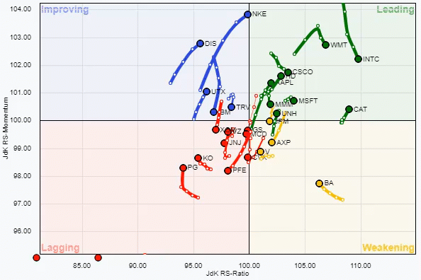
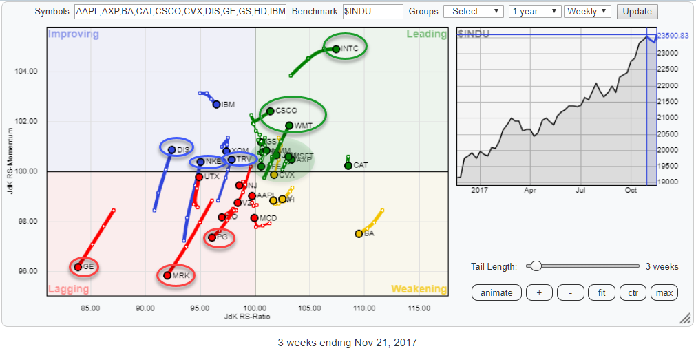
MEMBERS ONLY
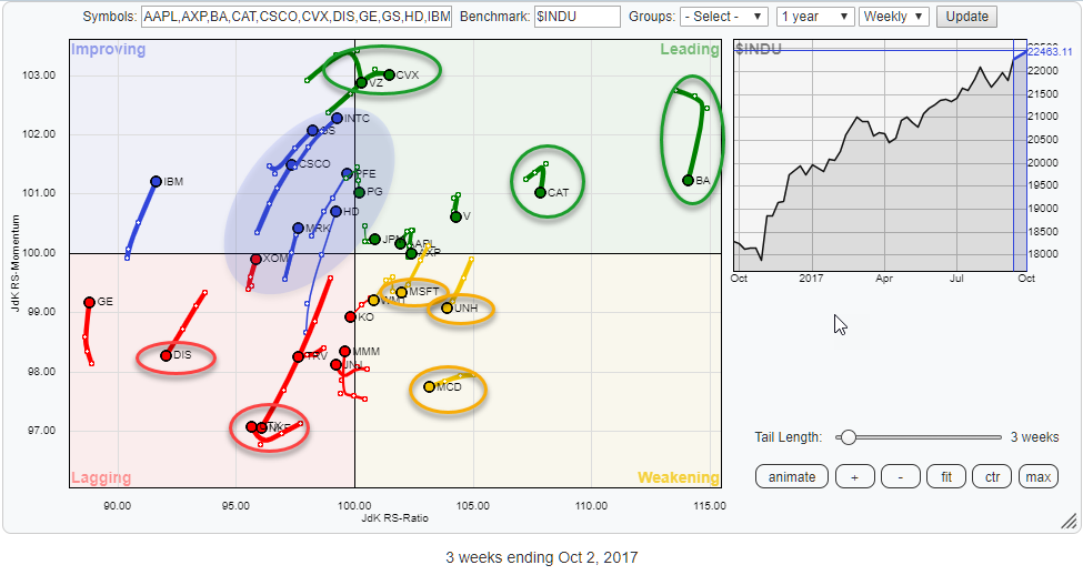
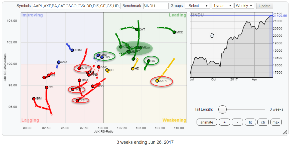
INTC and PFE expected to dominate relative rotation in $INDU while NKE, DIS, and TRV are lagging
by Julius de Kempenaer,
Senior Technical Analyst, StockCharts.com
Plenty of actionable rotation towards the edges of the Relative Rotation Graph above. The RRG holds the 30 members of the Dow Jones Industrials index. Scanning around the outside of the chart the following stocks draw the attention.
In the weakening quadrant, MCD is at the lowest JdK RS-Momentum reading...
READ MORE
MEMBERS ONLY
Pair trade opportunity in XLV/XLK and potentially strong (rare) rotational pattern for XLI
by Julius de Kempenaer,
Senior Technical Analyst, StockCharts.com
The Relative Rotation Graph above holds the ten sector SPDR ETFs that make up the complete S&P 500 index (SPY).
At the moment the positioning of the various sectors and their rotational patterns are relatively evenly spread over the RRG canvas except for XLE which is far away...
READ MORE
MEMBERS ONLY
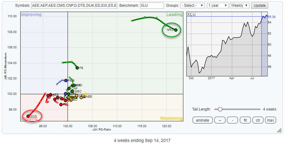
"Boring" Utilities moving up to main stage
by Julius de Kempenaer,
Senior Technical Analyst, StockCharts.com
Bringing up the Relative Rotation Graph that holds all members of the Utilities sector (XLU) gives the picture above. With NRG all the way up in the top-right corner of the leading quadrant and SCG in the lower left-hand corner of the lagging quadrant, the remaining stocks in the sector...
READ MORE
MEMBERS ONLY
Is TECHNOLOGY now a defensive sector?
by Julius de Kempenaer,
Senior Technical Analyst, StockCharts.com
The Relative Rotation Graph above shows the US sector universe based on S&P 500 indices (ETFs).
Two sectors stand out on this chart. These are Energy (XLE) inside the improving quadrant but at low levels on the JdK RS-Ratio axis, and Financials (XLF) inside the Leading quadrant which...
READ MORE
MEMBERS ONLY
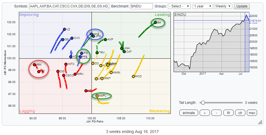
PG and PFE at similar location on RRG but one of them looks much stronger
by Julius de Kempenaer,
Senior Technical Analyst, StockCharts.com
The Relative Rotation Graph above holds the 30 stocks that make up the Dow Jones Industrials Index and compares their relative rotation to $INDU.
From the first observation of this chart, a few tails/stocks catch the eye. First, there is BA in the top-right, leading, quadrant still powering further...
READ MORE
MEMBERS ONLY
SPY returning to leading quadrant on Relative Rotation Graph!
by Julius de Kempenaer,
Senior Technical Analyst, StockCharts.com
The above Relative Rotation Graph holds some ETFs representing various asset classes and compares the against VBINX, a balanced index fund that holds 60% equities and 40% bonds.
The most striking observation is the fact that there is only one asset class on the right-hand side of the plot AND...
READ MORE
MEMBERS ONLY
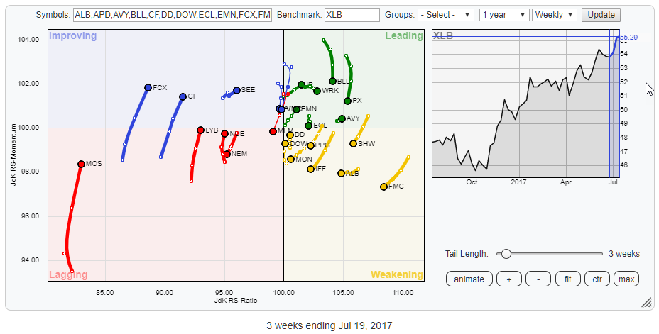
What's going on in Materials? (XLB)
by Julius de Kempenaer,
Senior Technical Analyst, StockCharts.com
The Relative Rotation Graph above holds the constituents of the Materials sector (XLB). The picture shows a fairly evenly distributed pattern with no real stocks standing out, maybe with the exception of MOS as it has the longest tail of all stocks on the graph while being at the lowest...
READ MORE
MEMBERS ONLY
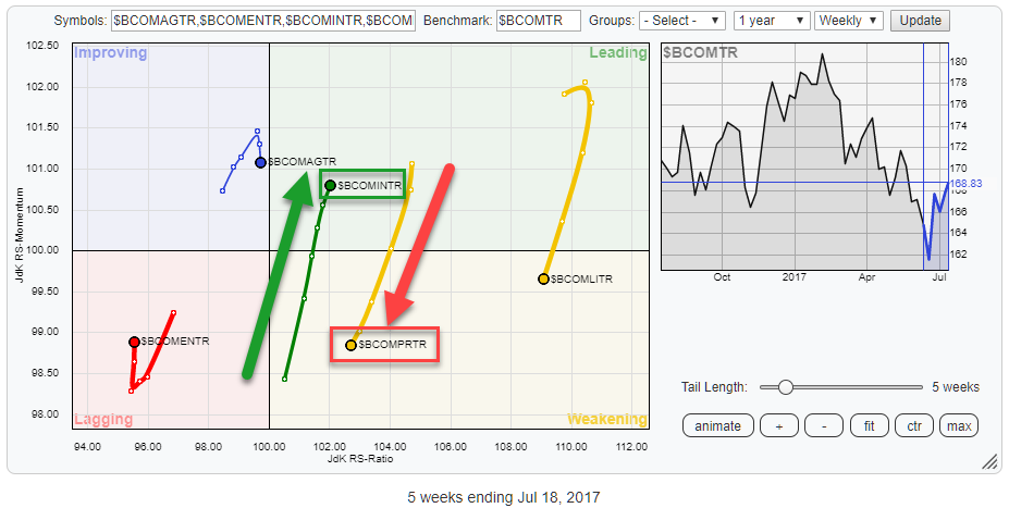
Which metals hold the most value at the moment?
by Julius de Kempenaer,
Senior Technical Analyst, StockCharts.com
The above Relative Rotation Graph holds the main commodity groups (BCOM family) and uses the Bloomberg Commodity Index as the benchmark.
The opposite directions in the rotations of Industrial metals ($BCOMINTR) and Precious metals ($BCOMPRTR) stand out for me.
As they are both on the right-hand side of the graph...
READ MORE
MEMBERS ONLY
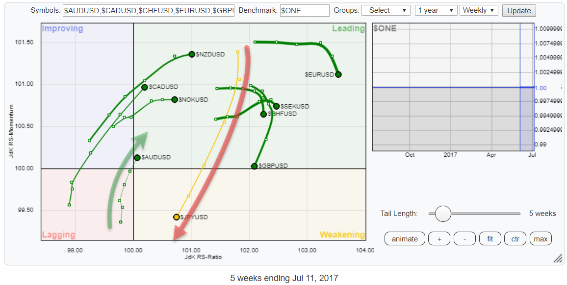
A FOREX pair trade idea from Relative Rotation Graphs
by Julius de Kempenaer,
Senior Technical Analyst, StockCharts.com
The Relative Rotation Graph above shows the relative rotation, on a weekly basis, for the G10 currencies using the USD as the base.
For a better understanding of how to use RRGs to monitor currency rotation please refer to this blog article on the subject.
Looking at the RRG above...
READ MORE
MEMBERS ONLY
Strong (relative) momentum based rotations among S&P 500 sectors, powerful tail for XLF
by Julius de Kempenaer,
Senior Technical Analyst, StockCharts.com
The almost vertical tails on the above Relative Rotation Graph for US sectors indicates a very clear (relative) momentum rotation, sending some sectors from North to South and vice versa.
The two most obvious tails on the RRG are for XLE, far away on the left while sharply hooking upward,...
READ MORE
MEMBERS ONLY
AAPL rotating opposite to BA on Relative Rotation Graph for $INDU
by Julius de Kempenaer,
Senior Technical Analyst, StockCharts.com
Watching the 30 members of the Dow Jones Industrials index on a Relative Rotation Graph always provides a great insight into what's going on under the hood of that universe.
The first quick takes from the graph above are a fairly evenly spread universe with no big outliers...
READ MORE