3-Step Process to Increase your Success Rate: Trend, Relative Performance and Chart Setup
Key Takeaways
- Apply this three-step process to filter stocks, focus on leaders, and time your entries for a favorable reward-to-risk ratio.
- First, determine the long-term trend.
- Then, quantify relative performance.
- Lastly, identify tradable setups on the price chart.
Successful entries are rarely accidents. The best trades come from a repeatable process that starts with long-term trend identification, a relative performance assessment, and a robust chart setup. Use this three-step framework to filter names, focus on leaders, and time entries with favorable reward-to-risk ratios.
Step 1: Identify the Long-term Trend
Start with the trend first, as a long-term uptrend is the foundation for higher-probability trades. Here are three methods.
- The Trend Composite provides an aggregated signal based on five trend-following indicators, which is often better than one study alone.
- Stocks or ETFs above their 200-day average are in long-term uptrends and more likely to resume higher after corrections.
- An upward-sloping 200 day line confirms a long-term upward bias.
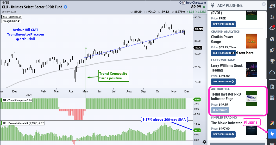
The example above shows the Utilities Select Sector SPDR Fund (XLU) trading 9.17% above its 200-day average, with a positive Trend Composite and a rising 200-day line. Long term uptrend? Check.
The Trend Compositie and Percent Above MA are two of 11 indicators in the TrendInvestorPro indicator edge plugin for StockChartsACP.
Step 2: Assess Relative Performance
Once you have an uptrend, narrow the field to leaders with a relative performance ranking. Current leaders are more likely to continue leading.
We also want to compare apples to apples by grouping similar instruments. As such, I placed the 11 sector SPDRs and SPY in a ChartList, which can be viewed in Summary format to rank performance. The table below is sorted by Percent above the 200-day (SMA200), and we can also see year to date percentage change (%Chg).
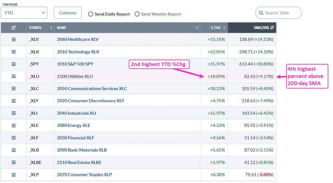
XLU is in the top tier for these two metrics, which means the sector shows relative strength. For instance, XLU has the second best year-to-date return (+18.89%) and the fourth highest level for percent above the 200-day (+9.17%).
Recent reports and videos at TrendInvestorPro:
- Healthcare and utilities continue to lead.
- Bullish setups in gaming software, semis, and cybersecurity.
- Treasury Bond and uranium ETFs set up bullish.
- Trend and breadth models remain net bullish (Market Regime).
- Core ETF ChartList (76 ETFs organized in a top-down manner).
Click here to take a trial and gain full access.
Step 3: Look for a Tradable Pullback
ETFs that are in long-term uptrends and showing relative strength should be on our watchlist for tradable setups. The classic setup is a corrective pullback within an uptrend, which is our focus at TrendInvestorPro. Here are some key elements:
- Corrections typically retrace 38.2 to 61.8 percent of the prior advance with 50 percent being the base case.
- A broken resistance level (supply) turns into future support (demand).
- Oversold conditions confirm a pullback within the uptrend. CCI dipping below -100 signals a short-term oversold condition.
- Falling wedge patterns are typical for corrective pullbacks after a strong run and often resolve to the upside.
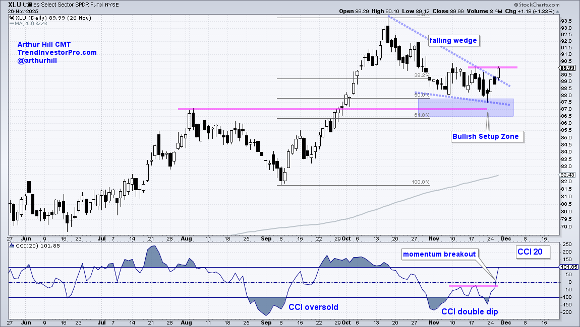
The chart above shows XLU with a Bullish Setup Zone marked in blue. Here we have the 50% retracement and broken resistance (pink line). CCI became oversold during this pullback and a falling wedge formed on the price chart. This is a classic setup.
Final Thoughts
Trading becomes simpler and more consistent when you apply a repeatable process. Start with the trend, favor the leaders, and wait for tradable pullbacks. Odds of success improve with each step. Uptrends are more likely to continue, and leaders are more likely to continue leading. This means pullbacks are more likely to be resolved to the upside.
See TrendInvestorPro for more reports and videos.