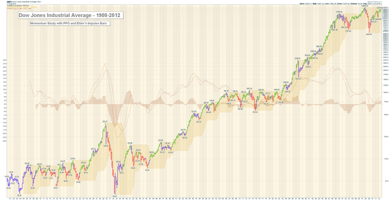
The Biggest Chart of the Dow We've Ever Created
Here's a quarterly chart of the Dow going back to 1900. It's 2500 pixels wide. You probably need to click on it once or twice to get it to expand to that size on your screen.

Members of our new PRO service can click here for a live version.
The PPO and the Elder Impulse bars give you a good sense of the Industrials' momentum during the last 100 years. Enjoy!
- Chip


