Beyond the Hormuz Headlines: Oil’s Bullish Foundations Run Deeper Than You Think

Most observers view the recent spike in oil prices as temporary, expecting that, once safe passage through the Strait of Hormuz is restored, prices will retreat towards prior levels. In an emotional market such as this, the temptation to project hopes, fears, expectations, and opinions on probable outcomes is overwhelming. Consequently, I have tried more than normal to assess what the price action is saying rather than what I would like it to say.
In that respect, a deeper look at the technical backdrop suggests that the price of crude is on firmer long-term footing than is generally accepted and that any event-driven near-term pullback is likely to unfold in the context of a broader primary bull market. That view rests on the idea that energy markets prior to the Iran War had already reached the point in the cycle where a major uptrend was overdue; the conflict simply added a substantial layer of bullish “icing” to a cake that was already baking.
By way of background, commodity prices form part of the business cycle, which is essentially a repeating sequence of chronological relationships. In a typical cycle, gold bottoms first, followed by copper, with oil turning later. Chart 1, which plots a commodity subset, illustrates this clearly through the right‑slanting green arrows.
Gold leads because it responds primarily to shifts in inflation expectations — investment demand rises or falls well before industrial activity. Copper typically bottoms ahead of oil for a more straightforward reason: copper is tied directly to early‑cycle restocking in construction, electrical equipment, and appliances, so it reacts quickly when manufacturing begins to revive. Oil demand, by contrast, is dominated by transportation, air travel, petrochemicals, and broad consumer activity, areas that strengthen later in the cycle. As a result, oil tends to lag copper in the bottoming sequence.
In the current cycle, gold momentum bottomed in 2023, copper followed in 2024, and oil did not complete its turn until early 2026. The lead between copper and oil has been especially pronounced this time, as highlighted by the steep angle of the arrow connecting their respective lows.
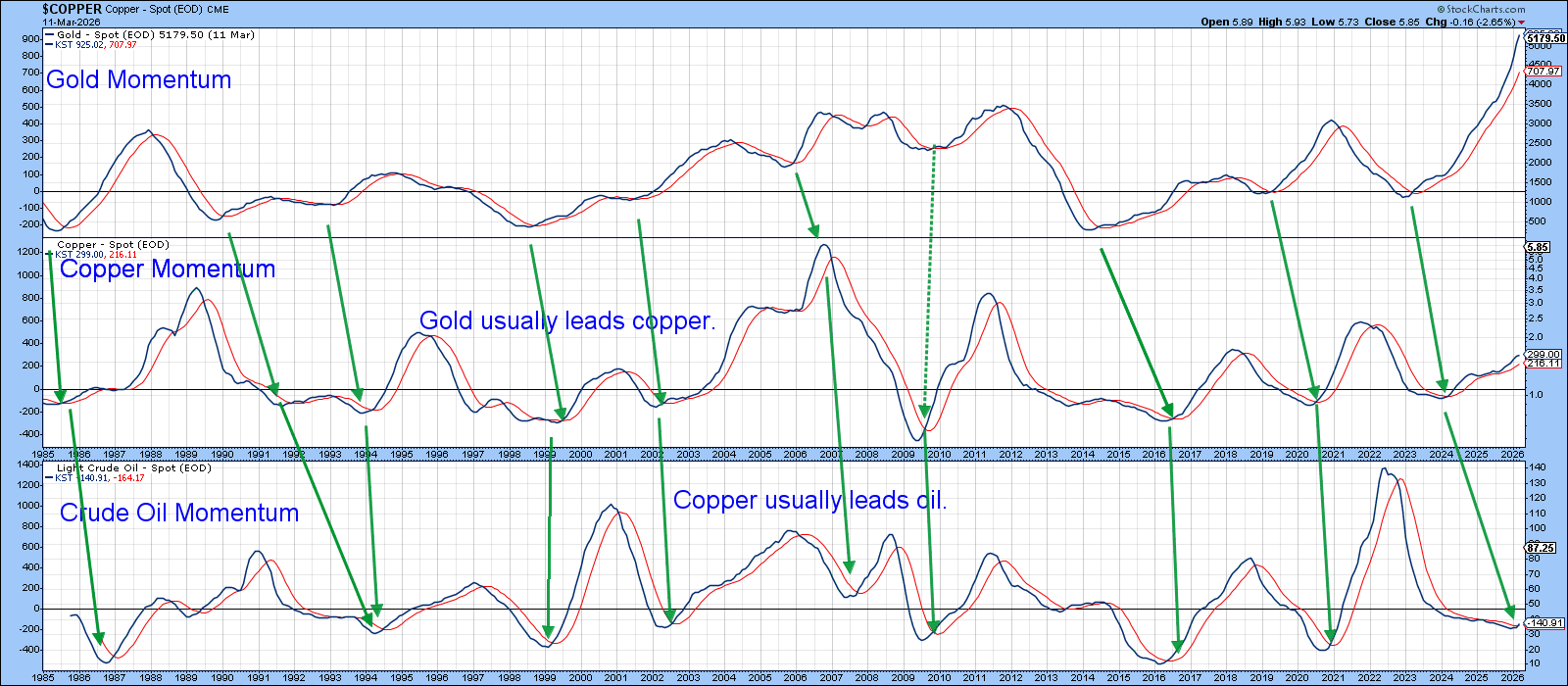
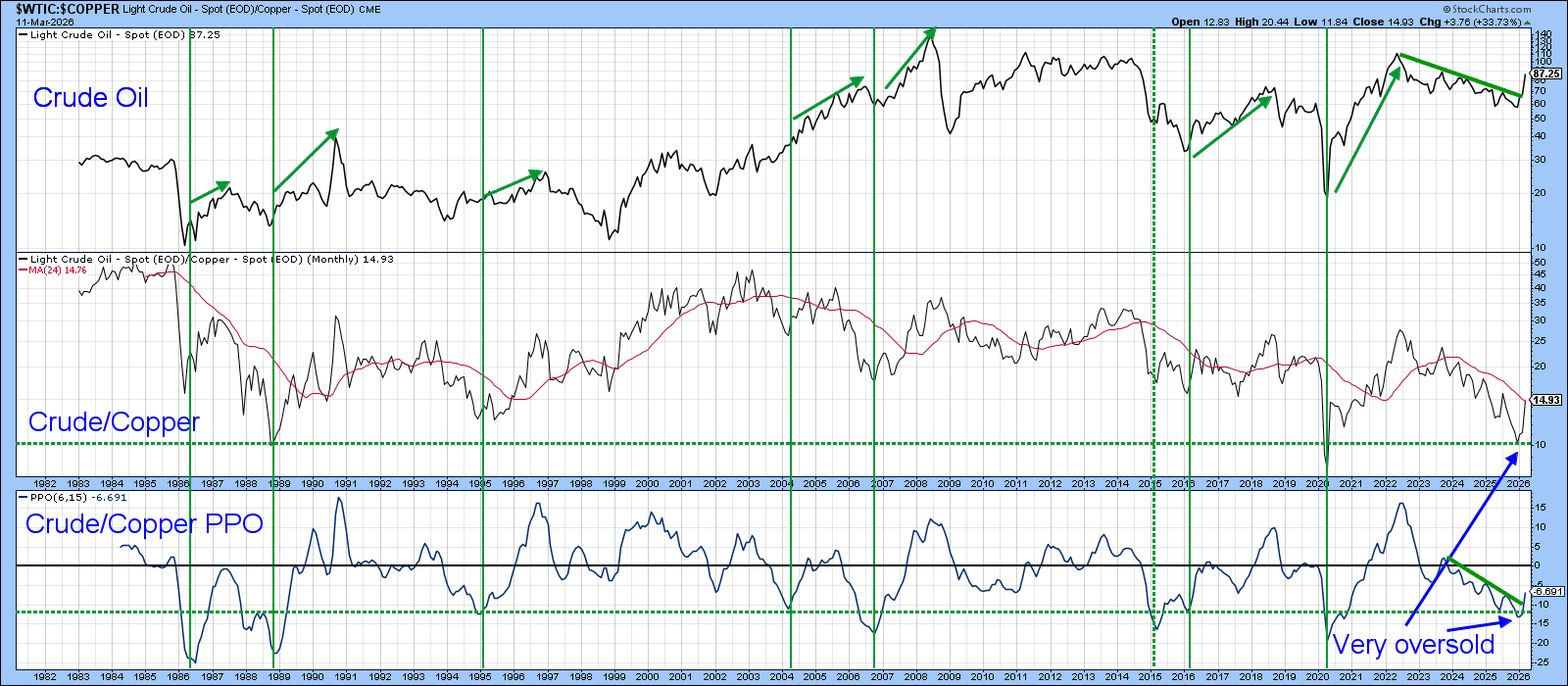
Chart 1 presents the three momentum indicators that illustrate the chronological sequence of turns in the commodity complex. But momentum itself isn’t tradable; only price is. That’s why Chart 2 shifts focus to the copper/oil relationship expressed directly through prices. The bottom panel plots the Percentage Price Oscillator (PPO) of the actual ratio, using the same 6‑ and 15‑period parameters applied to the ratio in the center window. The vertical lines highlight oversold upside reversals, most of which have historically been followed by crude oil rallies lasting well over a year.
The March rebound, combined with a decisive trendline break in the PPO and price ratio, strongly argues for higher oil prices, subject to one important caveat. The chart is plotted only through March 11, and for full consistency, the signal requires confirmation using month‑end data on March 31.
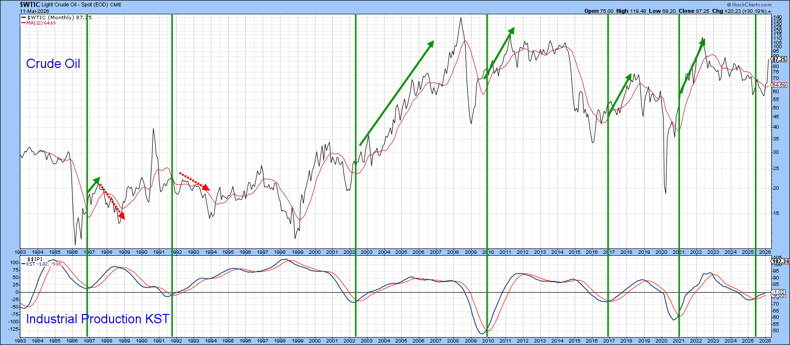
Oil prices are, of course, heavily influenced by swings in the global economy, but Chart 3 shows that U.S. conditions also play a meaningful role. The vertical lines demonstrate that a bull market in crude typically follows a bottoming in U.S. industrial production momentum. The dashed red arrows highlight the two notable exceptions to this otherwise consistent relationship. Industrial production looks as if it has bottomed and therefore supports higher crude prices going forward.
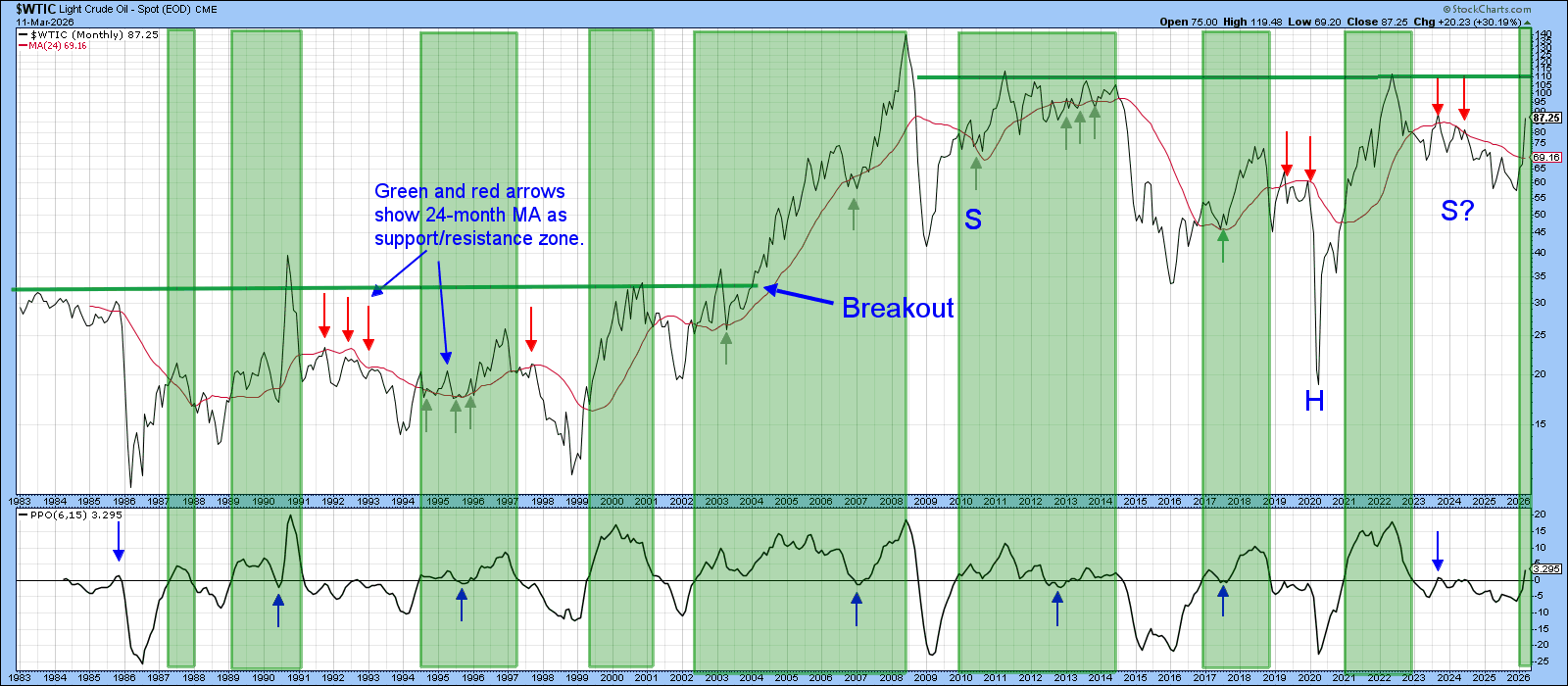
The green shadings in Chart 4 highlight that when the PPO in the lower window is above zero, crude oil is typically in a primary bull market. The 1987 reading was the lone exception to that rule. Subject to the earlier caveat about needing month‑end confirmation, the latest plot has now triggered another buy signal.
It is also worth noting — and this is an observation, not a prediction — that crude may be in the final stages of completing a large, multi‑year inverse head‑and‑shoulders pattern. The potential neckline sits just above $110. A decisive move through that level would carry implications similar to the early‑2004 breakout, which is also marked on the chart.
Finally, Chart 5 compares crude oil to its 12‑day Rate of Change (ROC). The red and green arrows mark instances where the ROC has peaked from a position at or above the blue overbought line. The implications of these reversals depend heavily on the preceding price trend. When the prior move was preceded by a bull market, this unusually strong momentum signaled buyer exhaustion and proved bearish. The two earlier examples of that pattern are shown in red.
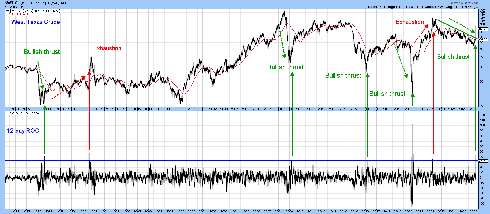
On the other hand, when an overbought ROC reading is preceded by a bear trend, it typically signals the emergence of a young and exceptionally vibrant bull market. Since 1984, all four such signals were followed by substantially higher crude prices. There is little reason to assume the current bullish thrust will behave differently. That said, it would be entirely normal for the path toward ultimately higher prices to include bouts of near‑term volatility in both directions, especially given the current event‑driven nature of the market.
Good luck and good charting,
Martin J. Pring
The views expressed in this article are those of the author and do not necessarily reflect the position or opinion of Pring Turner Capital Group of Walnut Creek or its affiliates.