Beyond the Bull Market: Three Charts Still Showing Technical Strength

With high-flying semiconductors taking a huge step back on Friday, and even gold and silver finally taking a break from their relentless uptrends, investors are understandably questioning the state of the Great Bull Market of 2025–2026. While previous leadership themes struggled this week, I’m not having difficulty finding constructive charts out there.
The first quarter of 2026 is shaping up to be one of those times when it’s not just about blindly following the euphoria, but rather about scanning for impressive technical configurations. Mindful investors have a regular process for identifying winning stocks and ETFs. Let’s review some of the types of charts that I feel are quite common, and break down the technical characteristics that inspire confidence.
Still Showing Strength: WMT
I always describe charts like Walmart (WMT) as “long and strong”, in that they remain in a consistent uptrend of higher highs and higher lows. And as long as the uptrend phase continues, charts like this should be considered “innocent until proven guilty.”
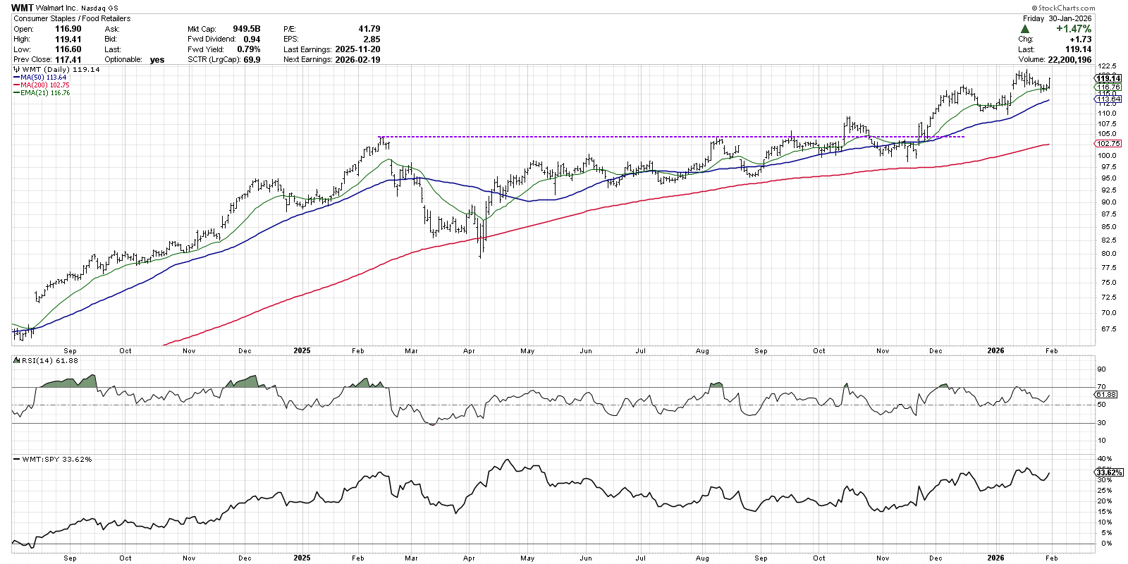
We can see a false breakout in October 2025 that was followed soon after by another upside breakout the following month. That November rally began a strong uptrend as WMT pushed to a new 52-week high, with the three moving averages shown eventually settling into a bullish configuration.
The Relative Strength Index (RSI) shows how this rally phase has seen consistently positive momentum, with price pullbacks being marked by the RSI generally remaining above 50. With the straightforward bullish trend action, alongside reasonable momentum and healthy relative strength, charts like these are usually great ideas in any market environment.
Holding Key Support: CVS
At first glance, the chart of CVS Health (CVS) seems to be dominated by a huge double-top pattern. Highs in October 2025 and earlier this month line up right around the $84 level. Following a recent downside gap, CVS may just be finding support at a key moving average.
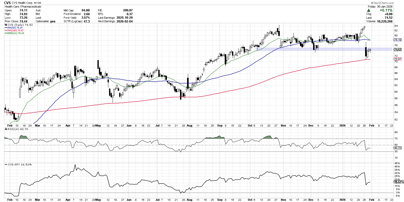
It’s interesting to note that the downside gap this week dropped CVS just below a support zone based on the October, November, and December lows. But before we can think about retaking that price range, we should note that the recent test of the 200-day moving average featured a “bullish piercing line” pattern. This two-candle pattern suggests a quick reversal in sentiment, and implies that the next one to three bars are likely higher.
Previous tests of the 200-day moving average were punctuated by a hammer candle in May 2025, followed by a bullish harami pattern in July. The lesson? Look for bullish candle patterns occurring at or around anticipated long-term levels of support!
Meaningful Upside Breakout: CMCSA
At the recent CMT Association Midwinter Retreat in Tampa, I was talking to other attendees about the concept of “technical diversification.” Instead of diversifying a portfolio just for the sake of diversification, perhaps we can consider a variety of constructive technical analysis setups to round out our positions.
With that in mind, let’s consider a chart like Comcast (CMCSA), which closed above its 200-day moving average this week for the first time since December 2024.
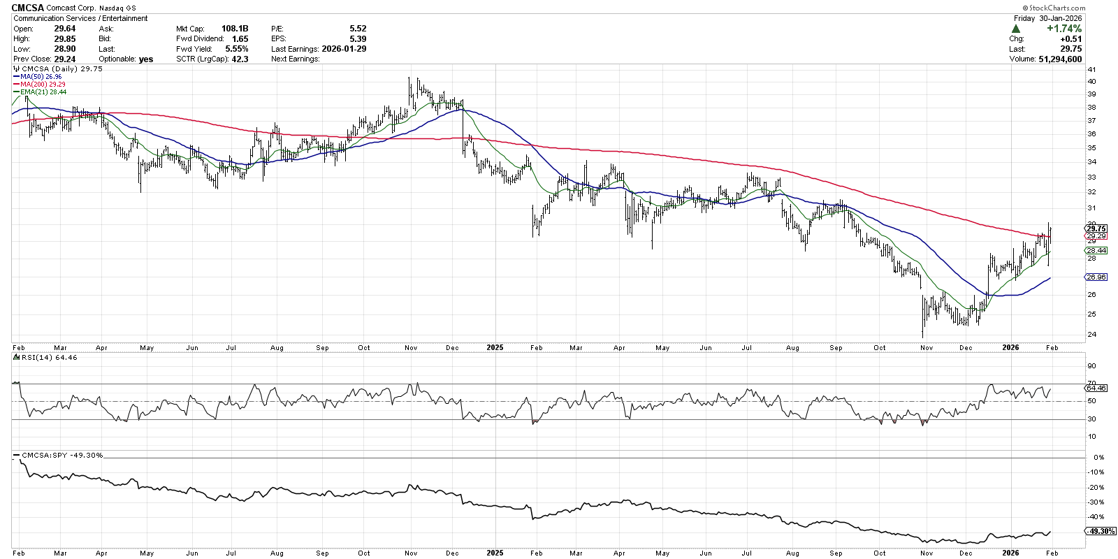
When a stock like Comcast is in a persistent downtrend for months on end, I find it hard to justify taking a position. I am happy patiently waiting for signs of accumulation to emerge, demonstrating that there is finally demand for the chart after an extended period of investor apathy.
After CMCSA pushed above its 50-day moving average in December, the stock then continued to appreciate as it tested the 21-day EMA on frequent pullbacks. At this point, with the stock back above its 200-day moving average, the question is whether Comcast can hold this crucial long-term barometer. If we continue to see signs of investor optimism, I’m inclined to consider charts like this as welcome alternatives to overextended growth stocks that are ripe for further short-term deterioration.
RR#6,
Dave
P.S. Ready to upgrade your investment process? Check out my free behavioral investing course!
David Keller, CMT
President and Chief Strategist
Sierra Alpha Research LLC
marketmisbehavior.com
https://www.youtube.com/c/MarketMisbehavior
Disclaimer: This blog is for educational purposes only and should not be construed as financial advice. The ideas and strategies should never be used without first assessing your own personal and financial situation, or without consulting a financial professional.
The author does not have a position in mentioned securities at the time of publication. Any opinions expressed herein are solely those of the author and do not in any way represent the views or opinions of any other person or entity.