Gold and Silver: Was That the Top?
Last week was a wild one in the precious metal pits as prices exploded to significant new highs, only to end with a decline. In and of itself, that’s not unusual. What is unusual lies in that this extremely volatile action cumulated a 5-year advance and experienced record volume; this holds for both the SPDR Gold Shares (GLD) and the iShares Silver Trust (SLV). Let’s take a close look at each.
Gold's Price Action
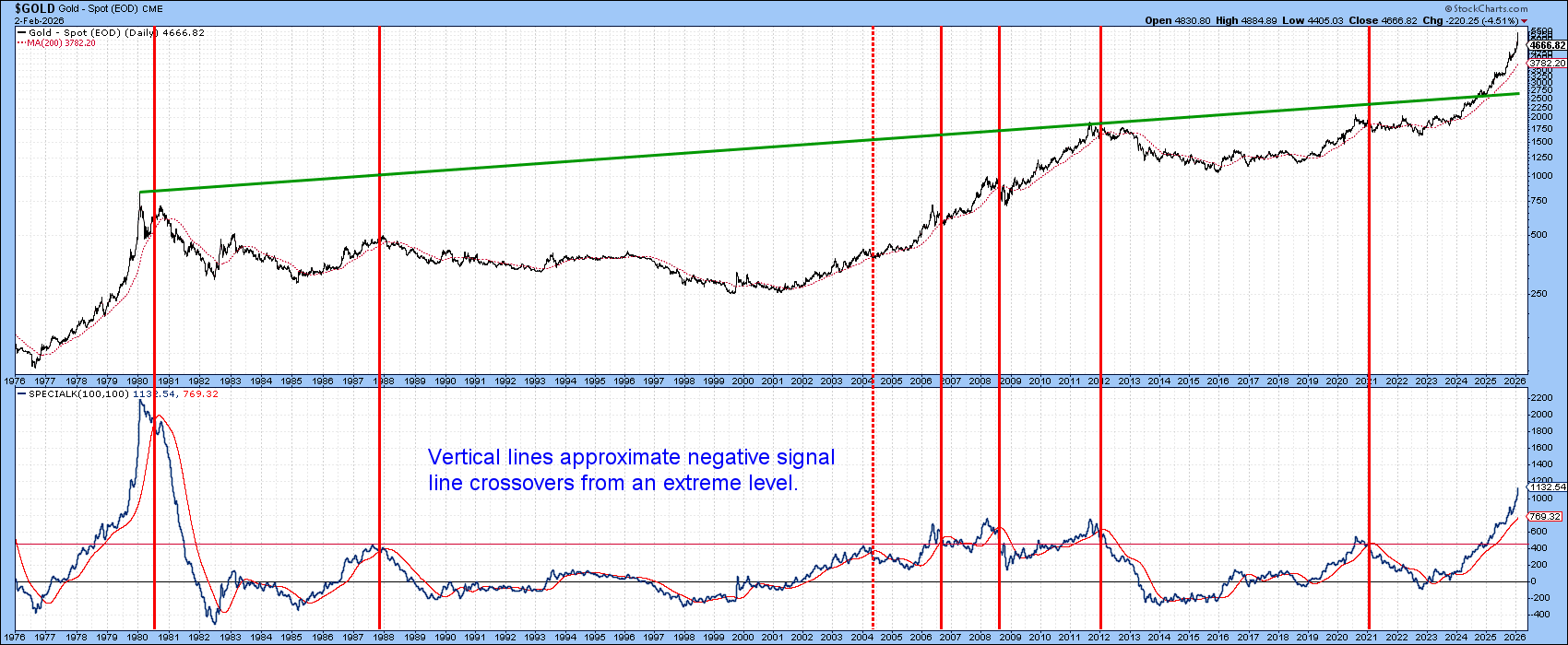
Using the Special K (SPK) of spot gold as our benchmark, Chart 1 shows that, by historical standards, the post-2020 rally is already overextended. The vertical lines mark negative signal line crossovers, which were triggered from extreme levels. Note the current reading has only been exceeded once before — at the 1980 peak. That experience shows the SPK can remain at levels higher than the current ones for many months.
Nonetheless, last week’s action, as displayed in Chart 2, hints that a sell signal may not be too far away. The rationale comes from a bearish exhaustion bar formed from last week’s price action.
These patterns develop when, following a rally, the price rises well above the opening on an intrabar basis, but closes near its starting point. Note that the bars displayed in the chart are based on weekly data and are far more significant than, say, those constructed from daily data. Two examples were developed in 2024 and 2025. Both were followed by a trading range lasting at least 17 weeks, certainly enough to temporarily slow any upside momentum for a while.
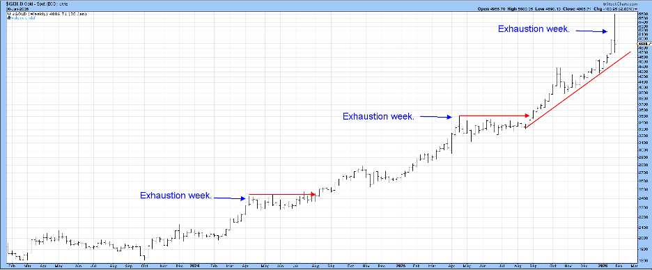
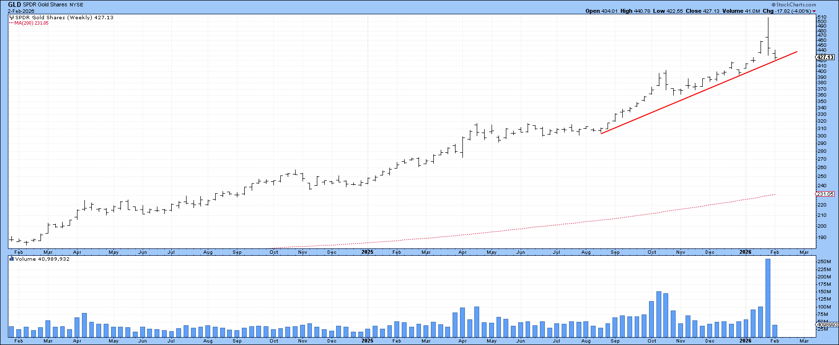
Due to several factors, last week’s bar was far more significant. Firstly, it was preceded by a stronger rally than its predecessors, implying more substantial profit-taking potential. Second, its huge width reflects a gigantic battle between buyers and sellers, ending in seller dominance and, in effect, leaving buyers exhausted. Third, Chart 3, featuring the GLD, experienced record volume.
Given these unusual characteristics, I would expect to see the latest exhaustion bar followed by a far bigger consolidation or decline than either of the previous two. That said, a bearish bar only represents one piece of evidence in the technical arsenal. What’s really needed is some confirmation, such as a violation of the up trendline in Chart 2. Using spot gold as our benchmark, that line is currently around $4500. It's important to bear in mind is that, if the line is breached, it would likely foreshadow a Special K negative signal line crossover.
Silver's Price Action
The vertical lines in Chart 4 indicate when the Percentage Price Oscillator (PPO) for silver, using the 6 and 15-month parameters, experiences a negative (dashed) overbought line crossover. Generally speaking, the higher the level from which the PPO retreats, the more substantial the subsequent corrective activity is likely to be.
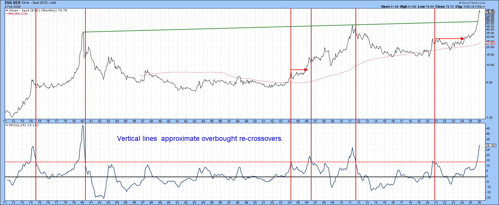
At the moment, the indicator is on an upward trajectory. However, it has reached the solid red overbought line that reversed the 1971–1974 and 2001–2011 bull markets. Only the 1980 peak reversed from a higher level. Unfortunately, this analysis does not tell us where or when the ultimate turning point will materialize.
Chart 5, though, makes a partial case for it having taken place last month. That’s because a huge bearish outside bar developed during the final week of January. In candlestick speak, this price action also qualifies as a giant engulfing pattern or even dark cloud cover.
An outside bar is one that totally encompasses its predecessor. This one is particularly impressive, being especially wide; an above-average width indicates a huge battle between buyers and sellers. The bar also closed near its low, indicating that sellers ended the week as the dominant party. Finally, it was accompanied by record volume, again reflecting the sheer size of the battle that had just been fought.
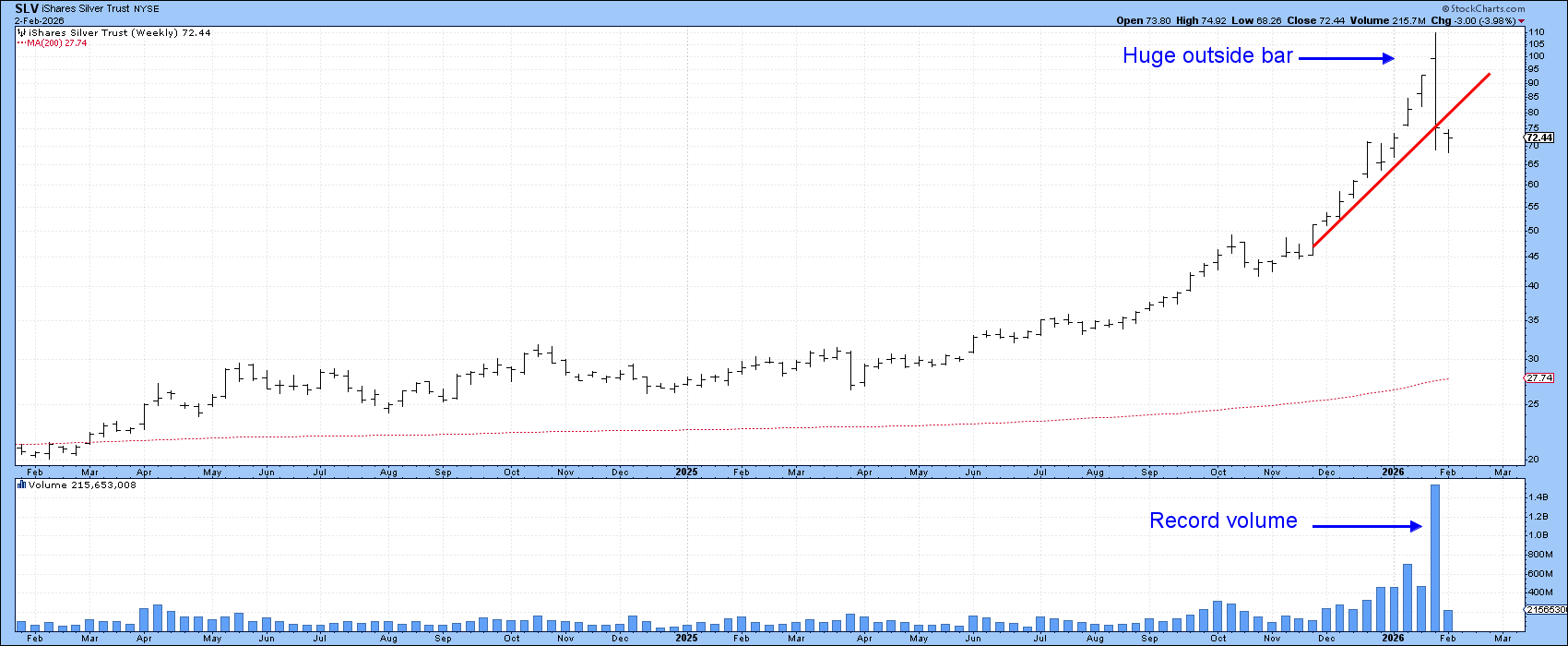
The impressive credentials of this bar suggest the January high will hold for a very long time, especially as confirmation has already been given from the violation of the red up trendline. Since this strongly suggests the slowing down of longer-term upside momentum, it is likely resulting in a PPO sell signal.
Good luck and good charting,
Martin J. Pring
The views expressed in this article are those of the author and do not necessarily reflect the position or opinion of Pring Turner Capital Group of Walnut Creek or its affiliates.