How Long Can the Fed Hold Off Raising Rates?

It may be time to contemplate the unthinkable: interest rates, across maturities and across oceans, appear to be in the early stages of breaking to the upside. And this comes after an extended period of relative calm. We often default to viewing rate trends through a U.S.‑centric lens, but history shows that major bull and bear markets in yields are typically global phenomena.
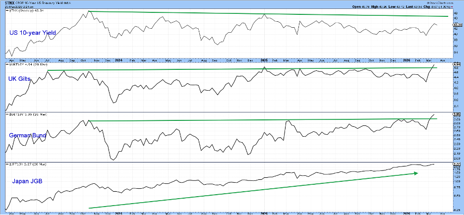
Chart 1 illustrates that U.S., U.K., and German 10‑year yields have all been locked in trading ranges in recent months. Japan, meanwhile, has been the outlier. The JGB yield has been trending steadily higher, and is now being joined by upside breakouts in both U.K. Gilts and the German Bund. The U.S. 10‑year remains the laggard, but its technical picture suggests it is not far behind and may soon follow the others higher.
To build the case, I’ll begin with U.S. money‑market and short‑term rates, then move progressively out the curve to the longer‑dated maturities.
The 2‑Year Yield and the Fed Funds Rate
As the dominant force in the money markets, the Fed can influence short‑term rates with relative ease. That influence diminishes as maturities lengthen, and where the market becomes the primary arbitrator. A good illustration is the divergence since mid‑2024: the Fed Funds rate has fallen by roughly 100 basis points, while the 30‑year yield has risen by about 10 basis points over the same period.
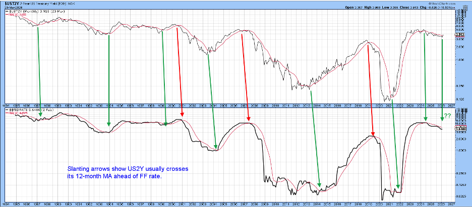
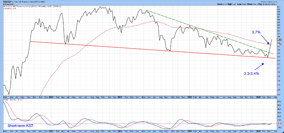
A useful exercise is to compare the behavior of the market‑driven 2‑year yield with the policy‑driven Fed Funds rate. Chart 2 shows that the 2‑year almost always crosses its 12‑month moving average ahead of the Fed Funds rate. The amount of lead time varies from cycle to cycle and is reflected in the angle of each arrow slanting to the right.
This framework also helps explain the Fed’s contribution to the 2021–22 CPI spike: the 2‑year surged well before the Fed responded, and the slow adjustment in the Funds rate amplified the inflationary impulse.
Fast‑forward to the present, and the 2‑year has already crossed above its 12‑month MA. One important caveat: the chart is based on month‑end closes, so the late‑March 23 plot is not yet an official reading. Even so, it offers an early indication of where things could well stand at the end of March, and it points toward renewed upward pressure on rates.
The same month‑end caveat applies to Chart 3, where the green highlights mark periods when the PPO, using the 6‑ and 15‑month parameters, is above zero. Those green shadings identify the phases in which the oscillator is in positive territory, and they have captured the bulk of the major yield rallies. The unshaded periods, by contrast, have aligned with most of the declines.
At the moment, the PPO remains below zero, placing it in a negative mode. Even so, it is clear that only a modest amount of additional upside activity would be enough to push the oscillator back into bullish territory. More importantly, the rate has already crossed above its 12‑month moving average and broken through its two‑year down trendline. Taken together, those developments strongly suggest that a new bull‑market signal is likely to emerge.
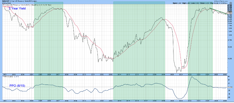
Chart 4 shows that the yield has now decisively violated its weekly‑based two‑year down trendline. Because that line has been touched or approached repeatedly, it represents a formidable barrier, and its upside penetration carries major technical significance. What makes the breakout even more compelling is that it is occurring just as the short‑term KST has begun to turn higher. The combination of a well‑established trendline violation and a fresh uptick in short‑term momentum reinforces the view that a renewed yield advance is underway.
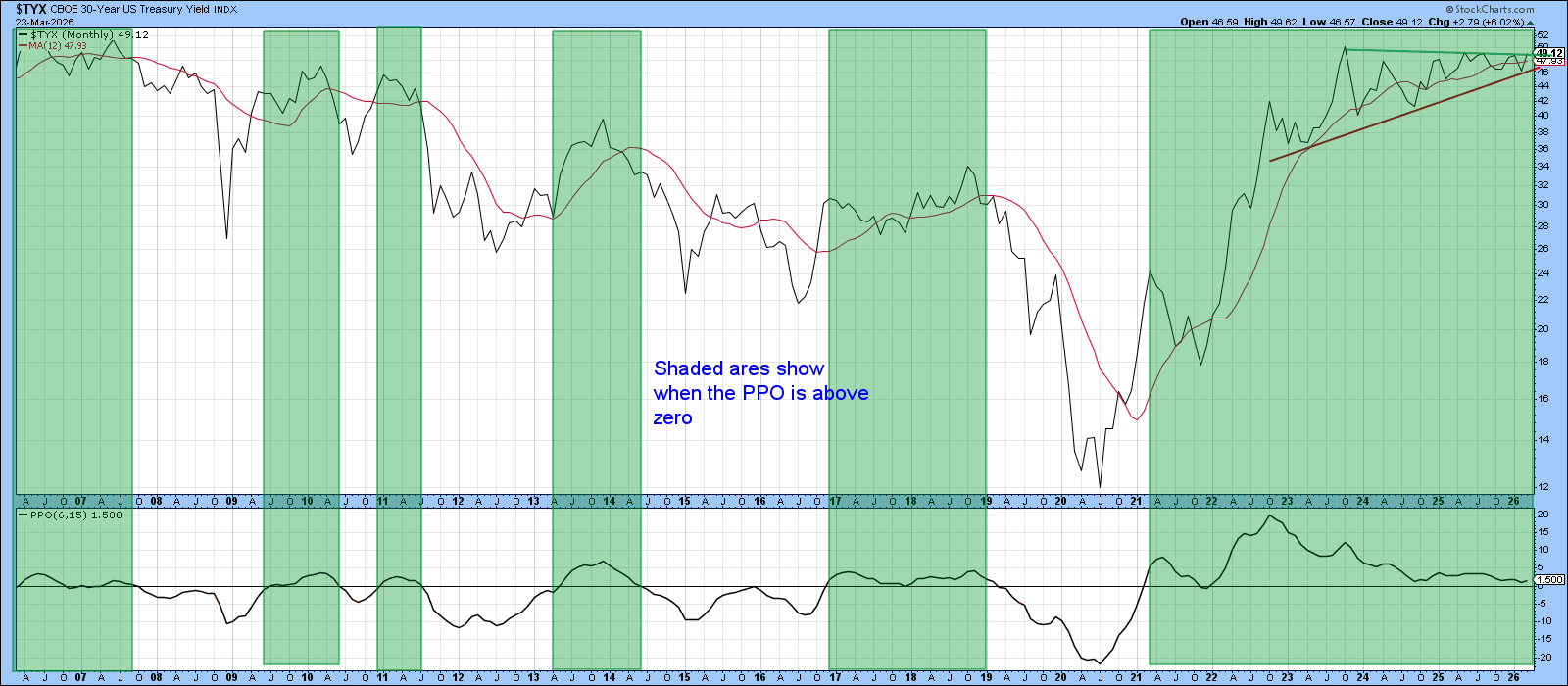
The shaded areas in Chart 5 identify periods when the PPO is above zero, a condition that has persisted since late 2021. That sustained positive reading has aligned with the bulk of the yield’s advance over the past several years. The most recent monthly close now shows the yield itself pressing up against resistance defined by a three‑year down trendline. It’s an important test: a decisive breakout above that barrier would add yet another layer of confirmation to the broader upside pressure already emerging across the rate complex.
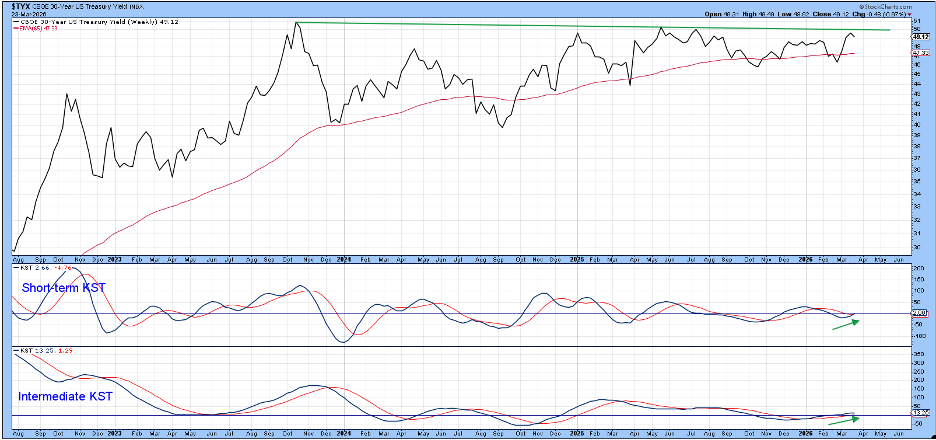
An upside resolution appears likely because the weekly plot in Chart 6 is being supported by a bullish short‑ and intermediate‑term KST, neither of which is overstretched at this stage. That combination of firming momentum and the fact that it has yet to approach an overstretched reading suggests the yield has the technical foundation it needs to break through resistance and extend its advance.
Good luck and good charting,
Martin J. Pring
The views expressed in this article are those of the author and do not necessarily reflect the position or opinion of Pring Turner Capital Group of Walnut Creek or its affiliates.