Markets Look Past DC Drama as Bank Earnings and Charts Take Center Stage

Key Takeaways
- Rising Treasury yields flash early warning signs as markets brace for key Financials sector results.
- Big banks face high expectations after a strong run and tightening technical conditions.
- Price action, relative strength, and momentum indicators offer clearer clues than media headlines.
The first week of earnings season started with a bang Sunday night. Futures dipped (don’t break out those Dow 50k hats just yet) and the dollar dropped on news that the DC U.S. Attorney’s Office launched a criminal investigation into Fed Chair Powell’s summer testimony to Congress regarding the central bank’s Washington headquarters renovation project.
President Trump denied knowledge of the inquiry, but it only adds to the drama between the administration and the Fed chief. Powell has just four months left in his tenure at the FOMC helm, though he has the option to remain on the Board of Governors.
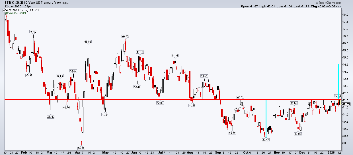
The Bond Market Clears Its Throat
That’s the big story. Price action—so far—remains less box office. Perhaps the most notable market impact was seen in the yield space, with the benchmark 10-year Treasury rate creeping up above 4.20% by Monday morning. That’s key, as a close above that level would confirm a short-term breakout, with a measured-move upside target to 4.45% based on the depth of the September–October decline (from 4.20% to 3.95%).
How might stocks react? Maybe the futures fall on Monday morning was the first glimpse. The dollar also retreated, while international ETFs caught a bid and precious metals soared.
Washington Makes Noise, Markets Keep Score
Trump v. Fed will remain in the spotlight, but both fundamental analysts and technical traders can reset their focus on more data and price action this week when the big banks report Q4 earnings.
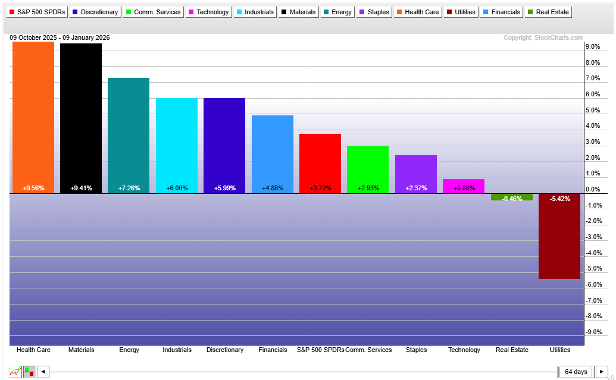
Since interest rates began consolidating in the high 3s/low 4s, the Financials sector has performed in line with the S&P 500. That’s rather bullish, considering the SPX (and the entire global stock market) came into this week at record highs.
Banks Walking Into a Buzzsaw?
Often, bank investors get a bit nervous over how the likes of JPMorgan (JPM), Bank of America (BAC), Citigroup (C), and Wells Fargo (WFC) will respond to quarterly numbers after a significant run-up leading into the reporting period. The Financial Select Sector SPDR ETF (XLF) zoomed 11% from November 20 to last week’s high, while the SPDR S&P Bank ETF (KBE) soared 17% over a similar stretch.
Put Up or Shut Up Season
So it now becomes a show-me story in terms of earnings reactions. We’ll get the first on Tuesday before the bell, when JPM posts Q4 revenue and earnings, followed by BAC, C, and WFC the following morning. The Bank of New York Mellon (BK) reports Tuesday morning as well. Capital markets companies — Goldman Sachs (GS) and Morgan Stanley (MS) — report Thursday morning. BlackRock (BLK) also hits on Thursday, while regional bank numbers roll in late this week and throughout next week.
Also, keep your eye on volatile credit services companies — the group was slammed to start this week after President Trump floated the idea of capping credit card interest rates at 10%. Capital One (COF) is first up within that group on Thursday next week. Visa (V), Mastercard (MA), and American Express (AXP) report on the 27th, 29th, and 30th, respectively.
Things May Get Choppy
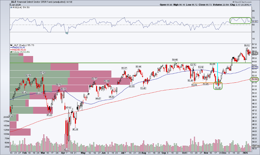
There’s no shortage of volatility catalysts looking out to the end of the month. What do the charts say? I’d like to poke some holes in XLF’s technical situation, but it’s hard to do so. Notice in the chart below that XLF remains within earshot of its all-time high, even with Monday’s giveback. What’s more, along with price reaching a new peak, the RSI momentum indicator tagged 70, helping to confirm the advance.
The long-term 200-day moving average, meanwhile, is on the rise, suggesting that the bulls control the primary trend. XLF also successfully tested the 200-day moving average in November before the year-end rally. The low right before Thanksgiving faked out the bears, as it appeared for a moment that a bearish head-and-shoulders topping pattern might have been unfolding.
Leadership Hides in Plain Sight
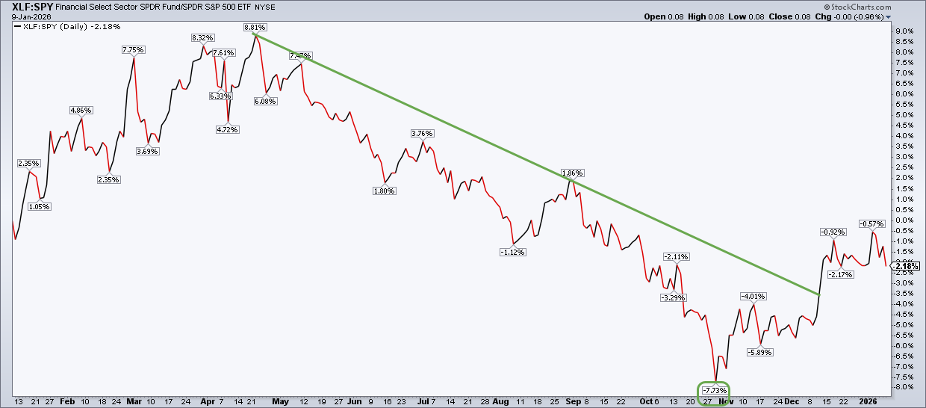
For now, it’s a series of higher highs and generally higher lows. You can also plot XLF vs. SPY for a relative strength look. That’s easy to do on SharpCharts.
XLF:SPY shows that the Financials sector actually lagged the domestic stock market from the April low to late October. Before XLF bottomed on November 20, it had already put in its relative low to the S&P 500, a telltale sign of the end-of-year pop.
XLF:SPY has retreated since early this year, though. I take that as a positive, given the onslaught of Q4 data about to hit the tape. The relative downtrend broke in December, and now a correction phase is underway. Technically speaking, it would make sense to see XLF churn through the end of the month before resuming its upswing versus the S&P 500.
Looking for Confirmation?
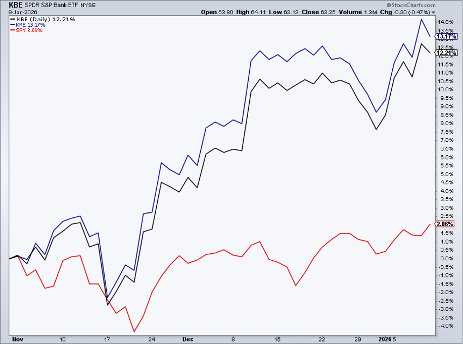
Elsewhere, KBE (equally weighted) and the always-volatile, smaller-cap SPDR S&P Regional Banking ETF (KRE) have outperformed the S&P 500 since October, helping to confirm decent action across the banking industry.
The Bottom Line
Do your best to ignore the Trump-Fed drama and all the midterm election-year shenanigans. Price action and market-based indicators will tell you what you need to know. That goes for technicians and fundamental investors alike.
This week’s bank earnings should reorient traders away from drama and back to actual market information. For now, bank charts appear generally constructive as 2026 gets underway.
Disclaimer: This blog is for educational purposes only and should not be construed as financial advice. The ideas and strategies should never be used without first assessing your own personal and financial situation, or without consulting a financial professional.


