Signs the Bear Market Rally May Be Over
Last time I reviewed the stock market, many of the Indexes had just experienced a bullish outside bar (see chart for the DIA). Since several of the oscillators had reached oversold readings, the idea of a rally seemed appropriate. By the same token, its important to remember that there is a consistent relationship between the peak in the short-term interest rate cycle and bear market lows. They either coincide or, more likely, rates peak ahead of bear market bottoms. Since rates look like they are going higher, even after today's hike, it seems likely that stocks have yet to see their lows.
My expectation was that the improving technical position would be result in a counter-cyclical advance. In simple terms, a bear market rally! That's still how I see it. It's possible that we have not witnessed its high point; after all, the year-end period, combined with a seasonally strong post-mid-term election season, could bring us a nice Christmas present. However, a review of several internal oscillators and other indicators suggests that this part of the rally is probably over.
Chart 1 plots the Dow ETF (DIA) and shows the bullish October outside bar I referred to earlier. We also see an outside bar for the November 2 price action. This time though, it's a bearish one. You can also see how the two previous declines since March started with a false break above the 200-day MA. Tuesday's action reflects a similar event. Finally, the 9-day RSI looks like it has peaked from an overbought condition.

Charts 2 and 3 feature advance/decline lines for the NYSE and the globe. All three series in Chart 2 are trading below their declining 200-day MAs. The Common Stock variety is moving in more or less in the same direction as the S&P and is not telling us anything special. However, the more broadly-based series in the bottom window failed to take out its early October high, suggesting some subtle weakness.
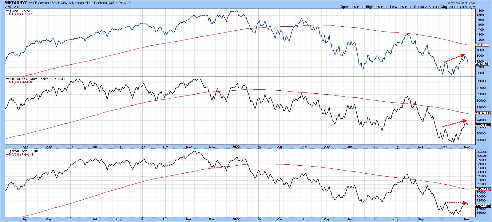
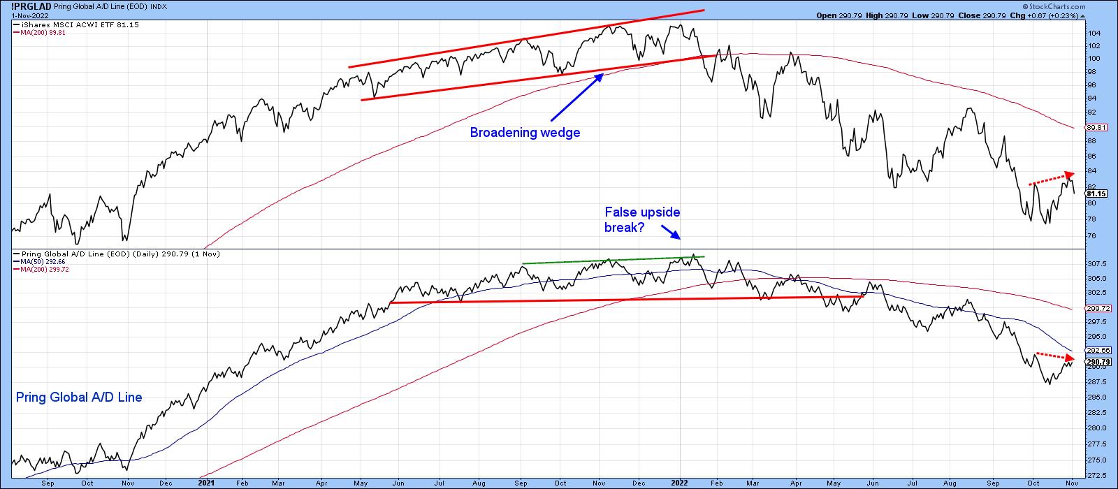
Chart 3 tells us that the Global A/D Line actually touched a slightly lower peak in November, unlike the World ETF (ACWI), which made a higher one. This represents another unwanted discrepancy.
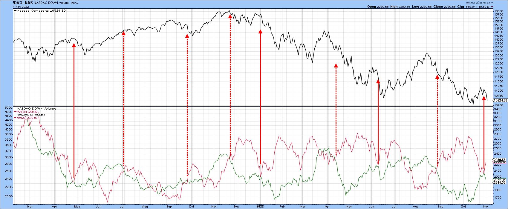
The relationship between the 20-day MA of up and down volume can sometimes be revealing. The dashed arrows in Chart 4 indicate that, when the red down volume for the NASDAQ crosses above the green up volume series, the Index usually declines. The solid lines indicate when the down volume falls to its green up volume counterpart but fails to cross it, which was the case earlier in the week. For the most part, these signals are also followed by a price drop.
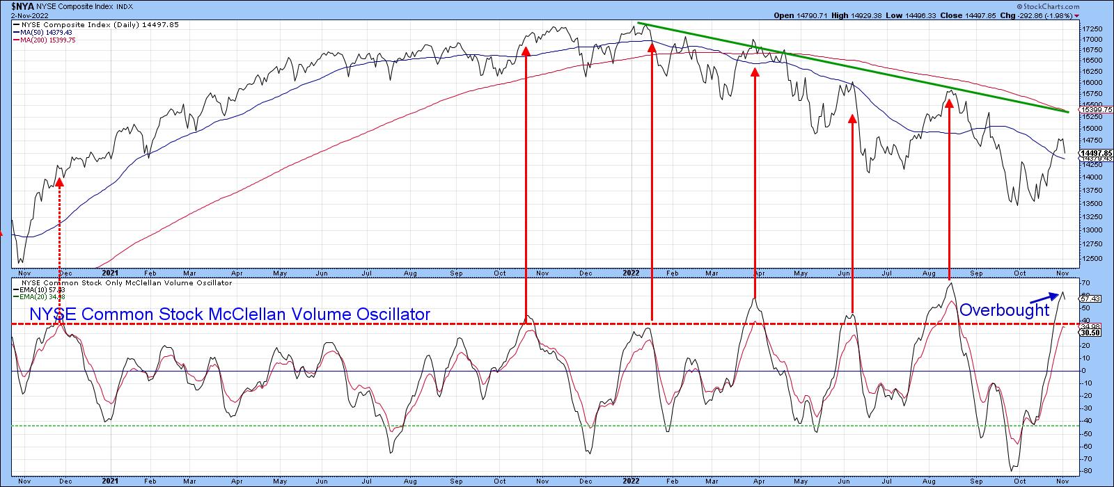
One of my favorite indicators of internal strength or weakness is the NYSE Common Stock McClellan Volume Oscillator. My preference is to calculate a 10-day EMA and compare it to a 20-day smoothing. Sell signals are triggered when it peaks from an overbought reading. The first one on the extreme left has been flagged by the dashed arrow; it does not work because it was a contra trend signal. Generally speaking, these are deceptive and subject to false signs of strength or weakness.
The primary trend changed direction this year. Since that point, the market has been very sensitive to downside reversals from an overbought condition Now it's true that this oscillator is still rising and has not yet triggered a sell signal. However, in order to avoid one, it will be necessary for the market to keep rising, which Chart 1 argues against. If my assumption about the rally peaking is incorrect, we have a great testing point at the 2022 down trendline and 200-day MA for the NYSE Composite. That's because these two indicators reinforce each other as resistance levels. If they should be surpassed, the game would change somewhat.
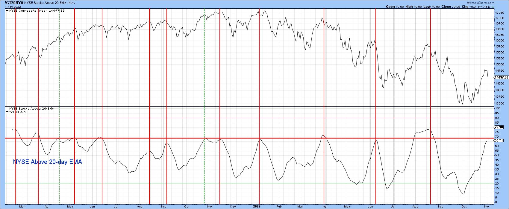
Another indicator that looks to be overextended is calculated from the number of NYSE stocks above their 20-day EMA. The indicator, plotted in Chart 6, is a 10-day MA as a way of smoothing the j raw data. The vertical lines show when this series peaks from a position at or above the red horizontal line. As with the volume oscillator earlier, it's still rising, so we cannot call it bearish at this point. Incidentally, if you want to follow it going forward, simply click on the chart. It's also possible to then save it to one of your chart lists.
Keep Watching Tesla
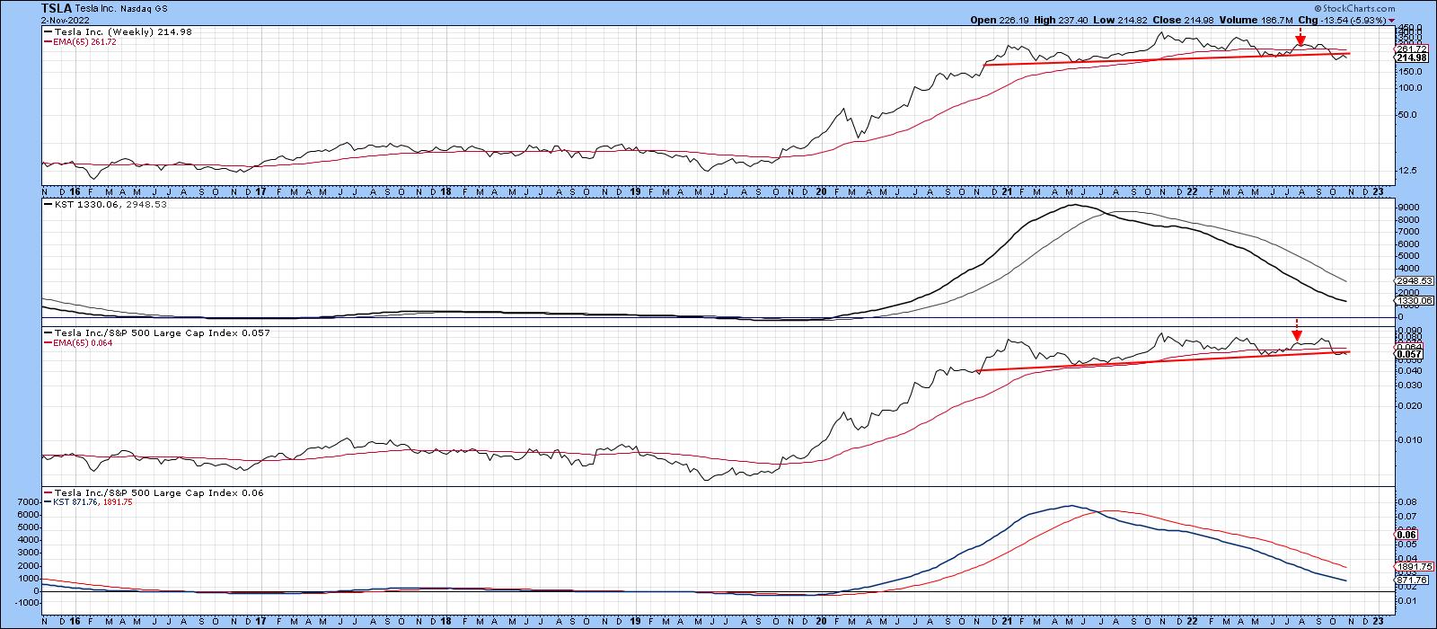
In a recent article, I suggested monitoring the progress of Tesla for a couple of reasons, first and foremost because it had begun to look toppy on both an absolute and relative basis. Moreover, as you can see from Chart 7, both long-term KSTs were in a bearish mode. The two arrows mark the point when the article was published. Prices have fallen a little since then, but that has been sufficient to result in a drop below the 65-week EMA and 2-year head and shoulders neckline.
The second reason why it makes sense to follow the stock is because it represents an icon for the post-2009 green and technology bubbles, just as Elon Musk himself has been for celebrity. Rising rates cause bubbles to burst and this may be no exception. Just sayin'!
Good luck and good charting,
Martin J. Pring
The views expressed in this article are those of the author and do not necessarily reflect the position or opinion of Pring Turner Capital Groupof Walnut Creek or its affiliates.