Mr. Powell, Tear Down These Interest Rates
These are not my words, but those of Mr. Market, who is doing his best to let the central bank know that rates are too high. Chart 1, for instance, compares the market-driven 5-year yield to that of the Effective Federal Funds. The dashed green arrows indicate that, in 2021, the Fed kept rates artificially low for an extended period, as evidenced by the backdrop of a rapidly rising 5-year yield. The result of this excessively easy monetary policy was the rampant inflation we are currently trying to recover from.
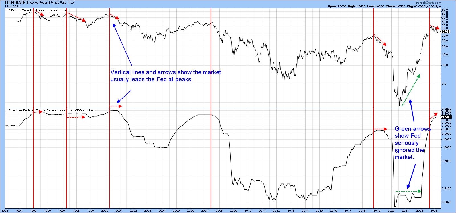
The red vertical red lines intersect with primary trend peaks in the 5-year series. Sometimes they coincide with highs in the Funds rate. However, the dashed red arrows indicate that the market yield usually leads it. In 2019, a weak economy caused the 5-year series to fall steeply for some time, as the funds rate was holding steady just prior to the 2020 recession.
Since late last year, the 5-year has once again been edging its way lower in the face of a rising funds rate. It's not as serious a discrepancy as took place in the previous cycle; however, it's sufficient enough to suggest the Fed should be lowering rather than raising rates. An analysis of this and other maturities hints that the central bank may be a little too aggressive in fighting inflation, as the technical position of these yields is either weak or potentially so.
More on the 5-Year Yield
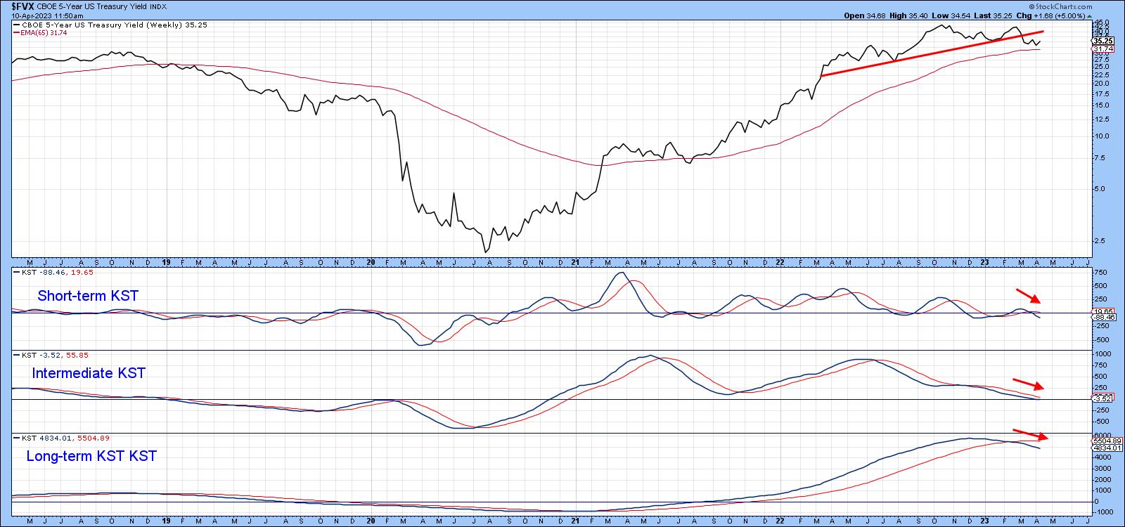
Looking at the 5-year series in greater detail, we see that a top has been completed and the yield has dropped below its 200-day MA. The Special K, which you can read about here, has now crossed below its signal line. The red and green arrows show that recent crossovers have provided reasonably timely and accurate indications of a change in trend.
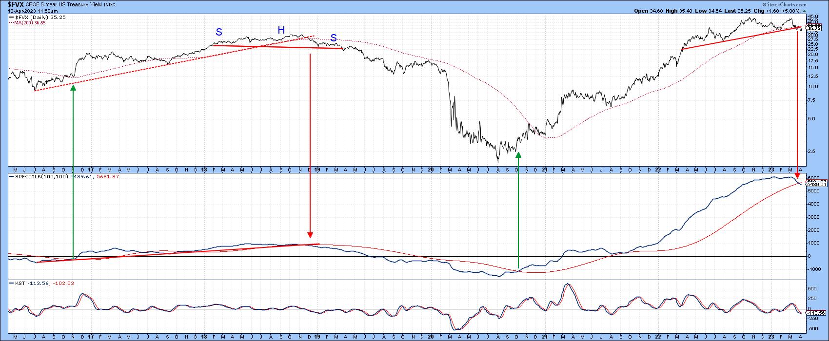
Chart 3 adds to its woes, as all three KSTs are in a declining trend. Only support, in the form of the 65-week EMA, is standing between it and lower yields.
Longer-Term Maturities
The 10-year yield is featured in Chart 4. It has also dropped below its 200-day MA and is trying hard to crack its 2022-23 up trendline, or rather, the neckline of a potential head-and-shoulder top. The ratio between the SPDR Financials (XLF) and the iShares 20-year + Treasury ETF (TLT) is also below its 200-day MA and attempting to drop below its 2021-23 up trendline. Since the long-term KST has already triggered a sell signal, a break in the ratio is more likely than not. That's important, because a falling ratio reflects confidence, as investors favor the safety of treasuries over the more speculative financial stocks.
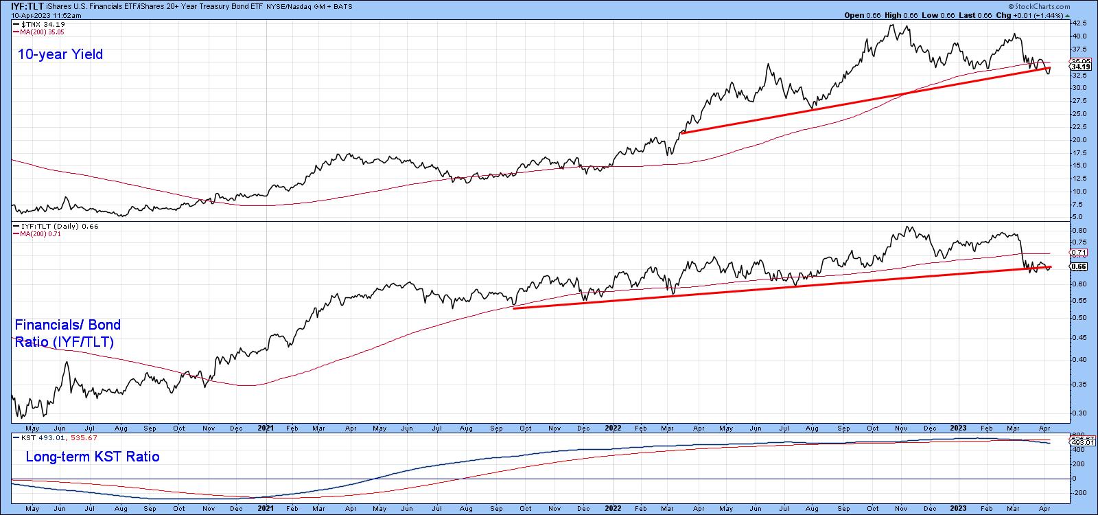
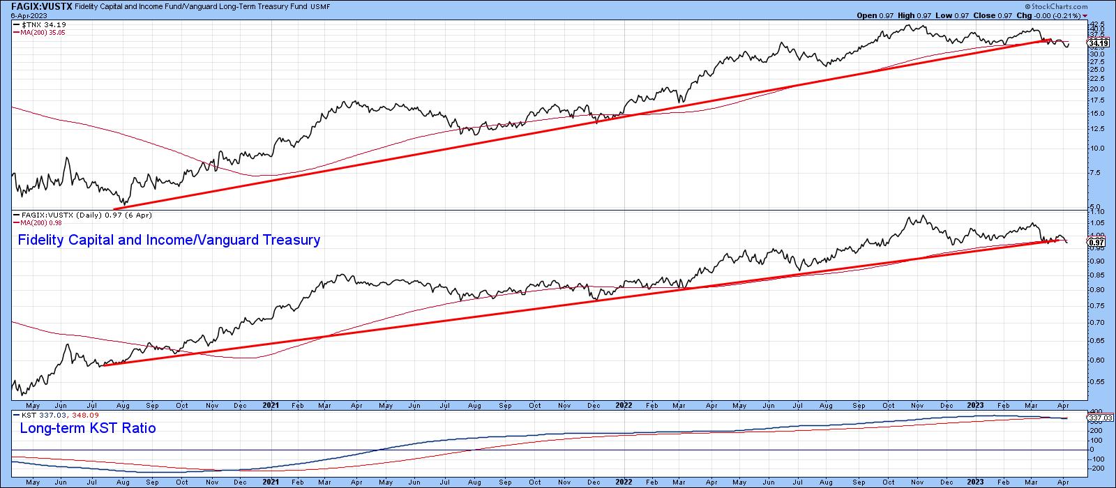
Chart 5 also shows that bond yields are on the edge of an important decline. This time, we are comparing the 10-year to a different measure of confidence, that between the Fidelity Capital and Income Fund (high yield) to the Vanguard Treasury (FAGIX:VUSTX). First, the 10-year is edging its way below its 2020-2023 up trendline. Second, so is the Fidelity/Vanguard relationship. Its long-term momentum is also just slightly bearish.
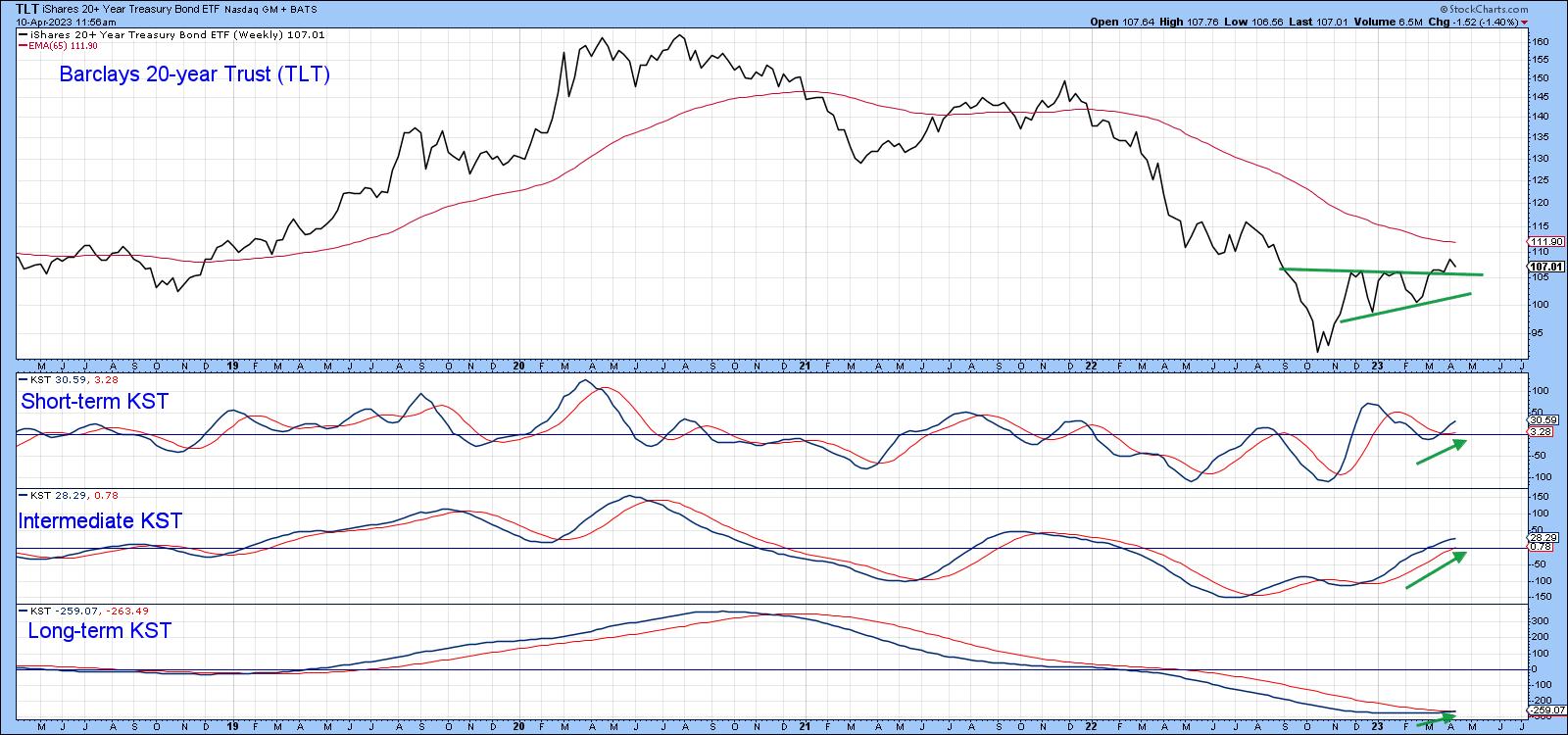
Prices move in the opposite direction to yields, and Chart 6 shows that the iShares 20-year+ Treasury Bond ETF (TLT) is looking positive because it has tentatively broken out from a bullish ascending triangle. Since this is being supported by three rising KSTs, the breakout is likely to be valid.
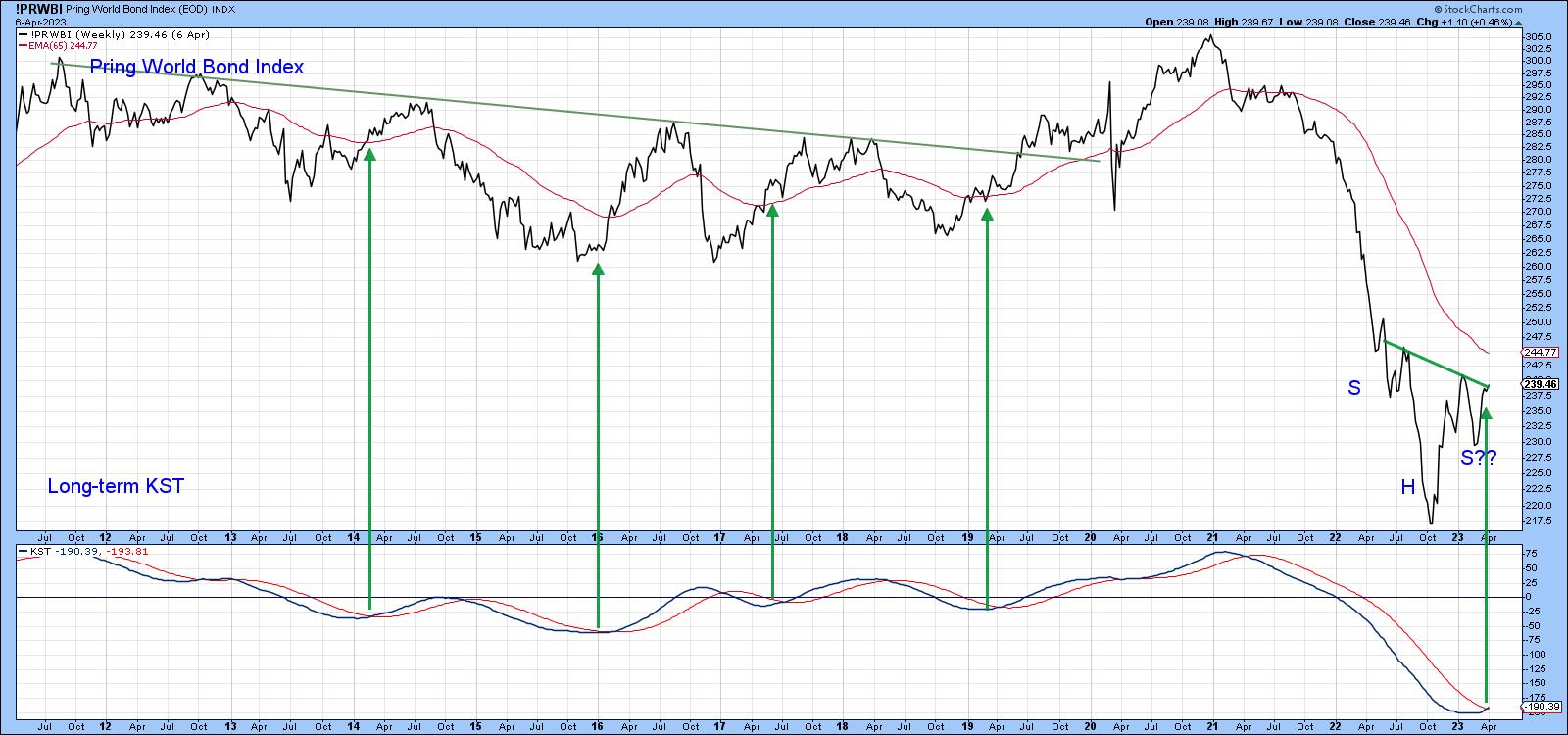
Finally my World Bond Index, which weights and combines the iShares Aggregate Bond (AGG) and the SPDR International Treasury (BWX) funds, looks as if it is also on the verge of an upside break. Since the long-term KST has just gone bullish, it seems likely that a breakout will soon materialize.
Conclusion
The Fed is usually behind the curve. From the technical position of the 5-year maturity, which bridges the gap between money market and long- term maturities, it looks as though the current situation is no exception. If that assumption is correct, the market is telling us that inflationary pressures are in the process of abating and the yields on longer-dated bonds about to follow the leadership role of the 5-year series in breaking down.
Good luck and good charting,
Martin J. Pring
The views expressed in this article are those of the author and do not necessarily reflect the position or opinion of Pring Turner Capital Group of Walnut Creek or its affiliates.