NYSE and Global A/D Lines Trade at New All-Time Highs
The magnitude and duration of corrections are largely determined by the direction of the prevailing primary trend. If it's bearish, they tend to be more severe and last longer. In a bull market, it's just the opposite, as they are generally short and sweet, if you can call temporarily losing money "sweet". Since the overwhelming majority of reliable primary trend indicators I follow are unequivocally bullish and are now being supported by the weight of short-term evidence, the odds favor that the internal correction, which began for many near-term indicators in January, is over. That's true both in the US and more generally for the vast majority of equity markets around the world.
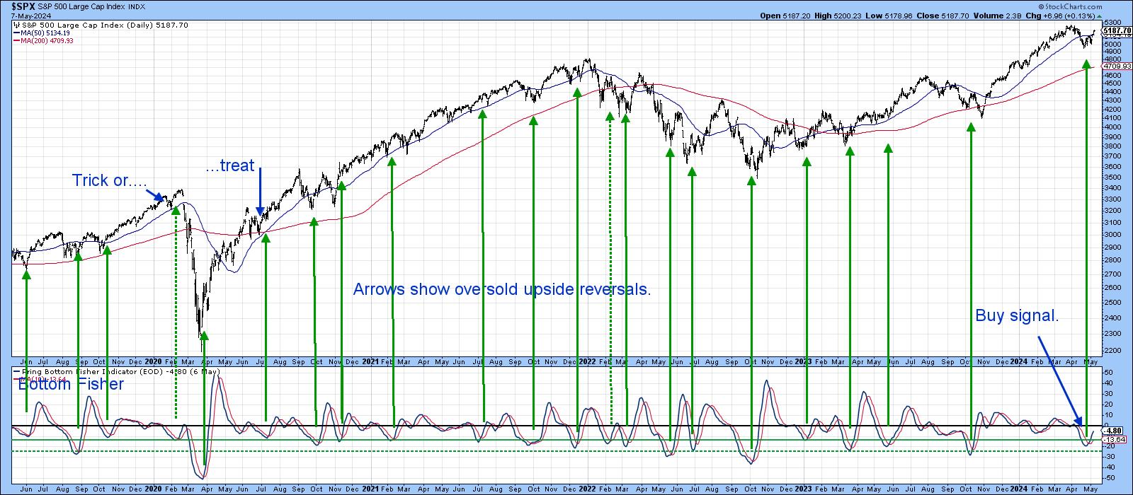
For example, the S&P and a host of other averages have crossed back above their 50-day (10-week) MAs. Chart 1 also shows that the short-term KST based on daily data has just triggered a buy signal.

Chart 2 features the NYSE A/D Line breaking to a new high, ahead of the averages. In my book, when breath leads the market higher it's a very positive sign, as is the lack of attention being paid to this development. It doesn't guarantee the correction is over -- nothing does that -- but it is certainly a lot more constructive than having been dragged up to confirm the averages.
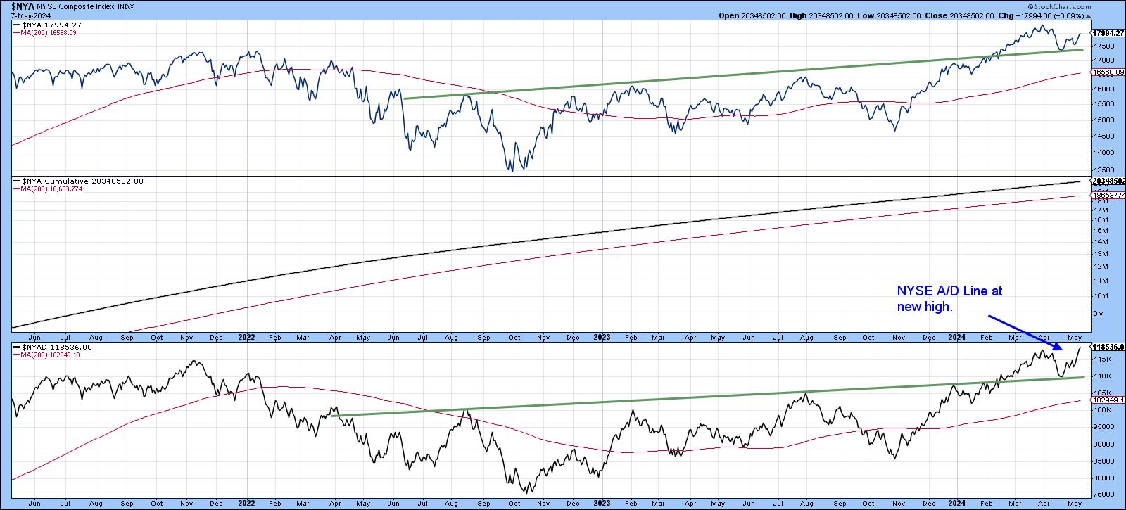
Chart 3 focuses on my Bottom Fisher, which you can read about here.The solid arrows tell us that when it bottoms from at or below the solid green horizontal line, a rally of varying proportions follows. The dashed arrows indicate false positives. The vast majority have been successful, so this week's buy signal is a welcome sign.
One of my favorite ways of analyzing the VIX is to calculate a 10-day MA and plot it inversely, so its swings correspond with those of the overall market. The vertical lines show upside reversals -- in other words, when traders are becoming less concerned. Once again, the solid lines reflect valid signals, and the dashed ones failures. It's always possible, of course, that the latest buy signal will be followed by similar action to that of early 2020, but the odds do not favor such an outcome. Nevertheless, that experience reminds us that even when the odds of a rally are overwhelming, high, say 80-90%, there is still a 20% chance of a decline or trading range.
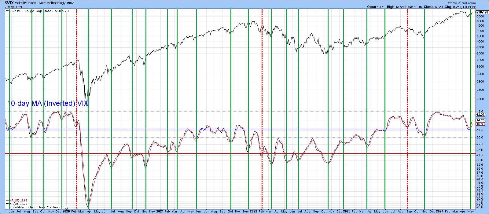
Chart 5 is also positive, since it shows the number of NYSE net new highs expanding rapidly. If the market is going to tank, we would expect that number to be negative or trading slightly above zero.
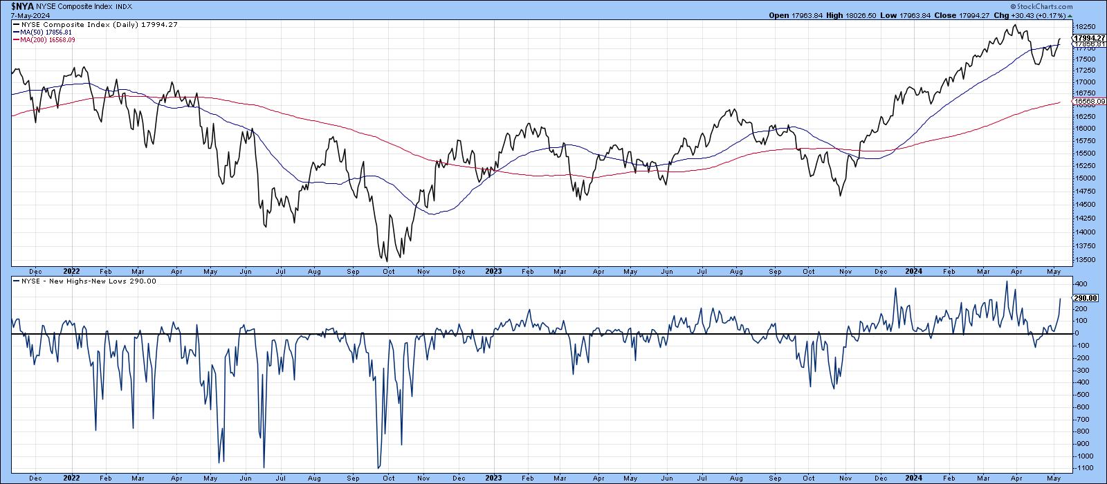
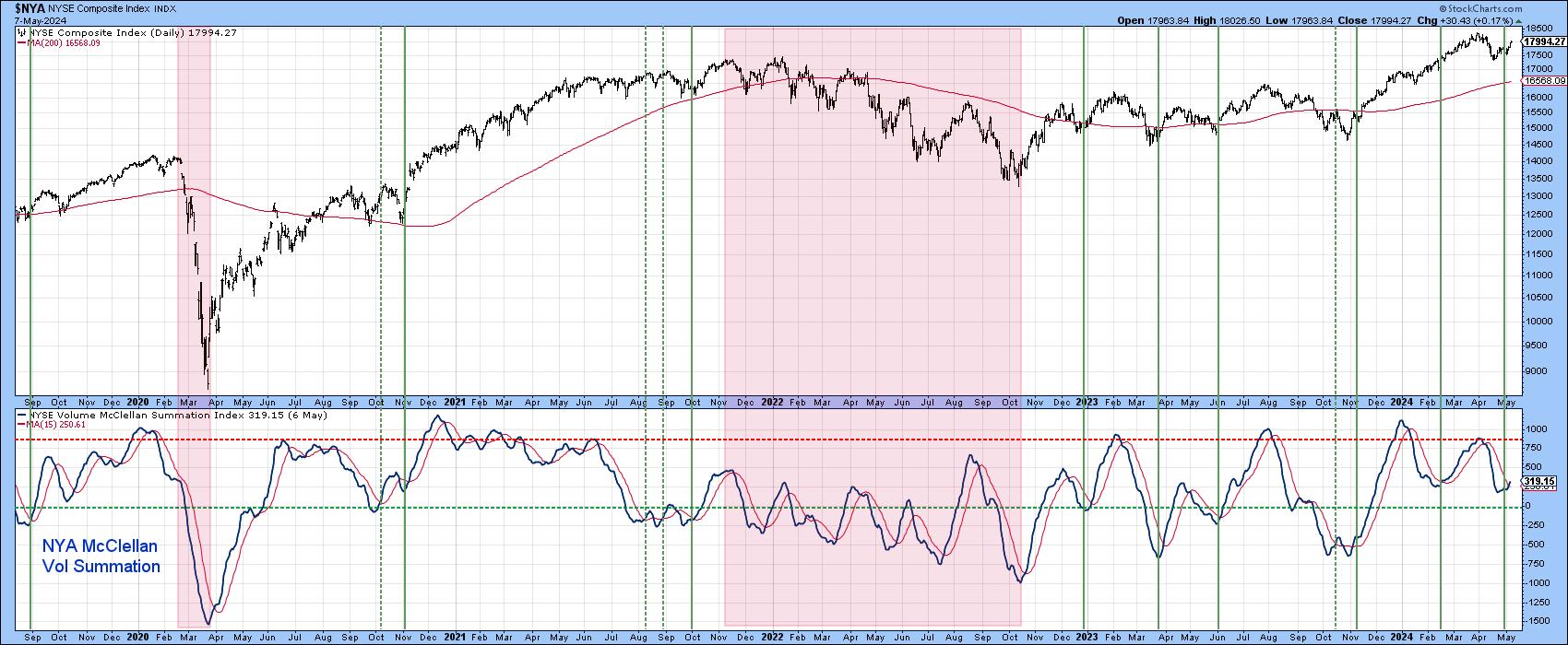
Chart 6 features the NYSE McClellan Volume Summation. The pink-shaded areas highlight the two bear markets. Note how the indicator is far more prone to trade below the equilibrium point during such periods. Indeed, during the 2022 bear market, it was unable to reach the red-dashed line at all. What I find encouraging is the fact that, since October, the indicator has remained above zero level and touched the overbought line twice, which is definitely in character with a primary bull market. The icing on the cake, of course, lies in the fact that it has just triggered a buy signal by crossing above its red 15-day MA.
Global Breadth Breakouts
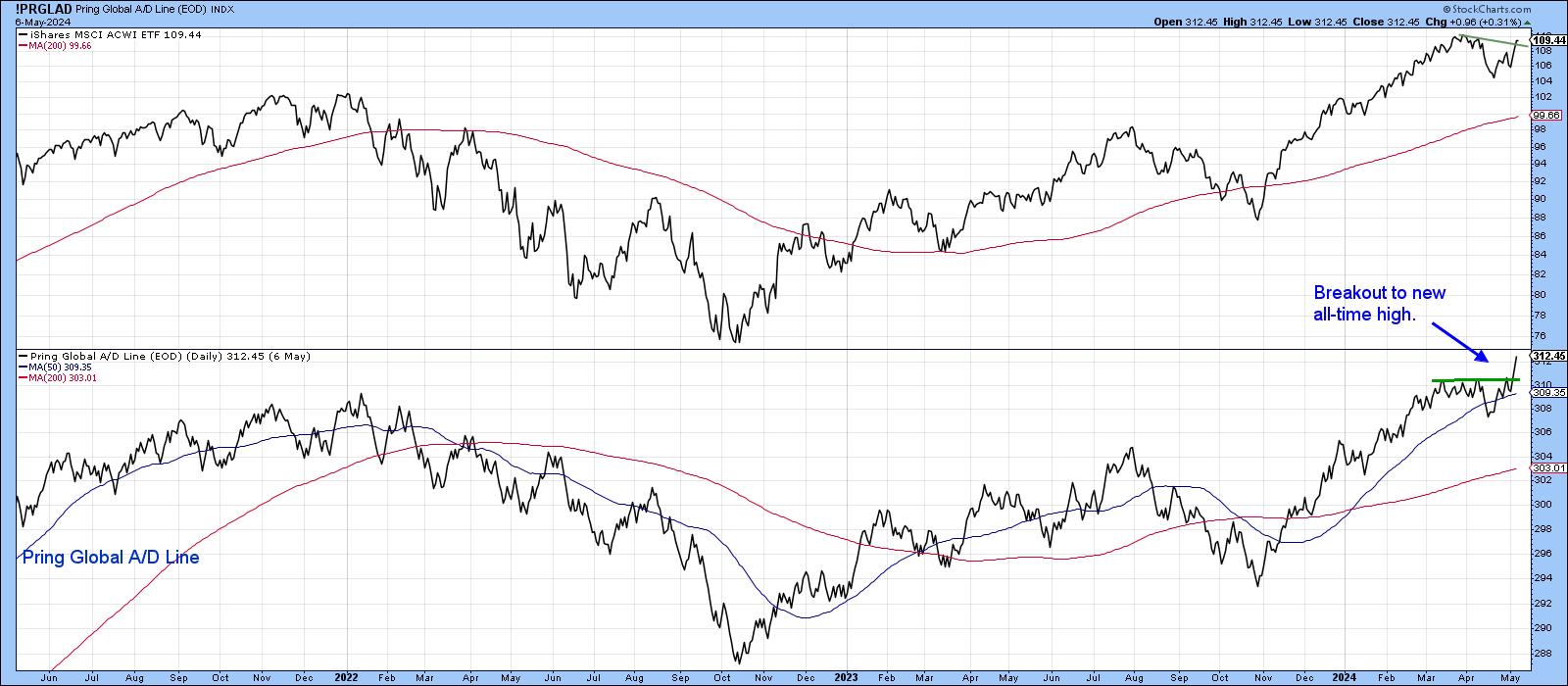
Things may be looking up in the US, but they are also perking up worldwide. In that respect, Chart 7 compares the MSCI World ETF (ACWI) to my Global A/D Line, which is constructed from a universe of country ETFs. The ACWI itself has not quite reached a new high, but has started to edge through a small resistance trendline, which suggests prices are going higher. The star of the show, though, is the A/D Line, which has exploded from its March/May trading range to a new all-time high.
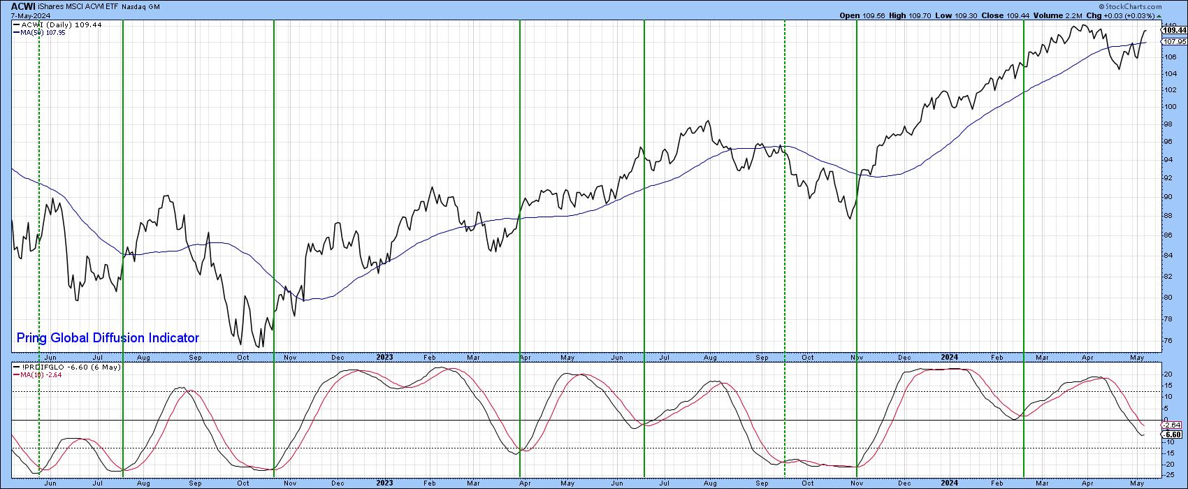
Finally, Chart 8 shows that the number of individual country ETFs in a positive trend has started to turn up. That upturn is likely to extend since the A/D line looks so strong. The vertical lines once again identify upside reversals, most of which have been followed by a nice advance. You can also see that the ACWI itself has managed to decisively clear its 50-day MA.
Remember, you can always update any of these charts by simply clicking on them going forward. That way you can make sure they are still behaving!
Good luck and good charting,
Martin J. Pring


