VIX Indicates Fear, But Is It Enough?
Last Monday, markets around the world experienced a sharp drop as the unwinding of yen carry trades followed the previous Friday's response to a weak employment report. The speed and sharpness of the equity sell-off got the attention of the general-purpose media and just about everyone else.
From a contrarian aspect, this would normally be interpreted as a very bullish development. After all, when everyone is aware that the train is coming, they get off track. Widely-disseminated news has a similar effect on markets, as sellers get out ahead of what they perceive as a negative development. When the whole world is aware of the problem there is no one left to sell, and prices head north. That's the theory of the case, and it's to some extent reflected by a high reading in the VIX.
Rather than consider the actual level of fear reflected by the indicator itself, I prefer to use a 10-day rate of change. The vertical lines in Chart 1 show that it has reached +30% and above nine times since the turn of the century. Last week saw a tenth attempt.
In some cases, subsequent S&P price action took off to the upside. At others, like in 2001, 2008, and 2020, the ROC exploded during the course of a primary bear market. However, in pretty well all cases, the $SPX thrashed around for a few weeks probing for a bottom prior to taking off on the upside. Two examples occurred in 2010 and 2011. A review of some other indicators also argues for a trading range environment.

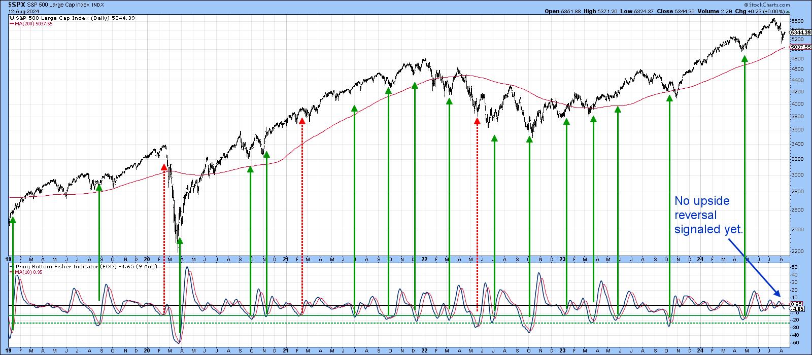
One example is my Bottom Fisher, which you can read about here.It calculates the KST slope and position for the Dow components, generating buy signals when it reverses to the upside from a position below the solid green horizontal lines. More oversold situations develop when the indicator drops even further below the dashed green line. Buy signals of varying degrees of success since 2019 have been flagged by the green arrows. The three dashed red ones highlight the obvious false positives. The point I am trying to make is that the termination of every decline of any consequence, except that of May 2019, has been signaled by the Fisher. So far, the indicator has failed to register an oversold reading below the green line, let alone reversing to the upside.
Another reason for suspecting additional rangebound action prior to an upside takeoff lies in the fact that several indicators had diverged negatively with the Dow at its July peak. Chart 3 shows one such discrepancy between the DIA and the number of Dow components sporting a positive silver cross, i.e. when the 50-day MA is above their 100-day MA. The dashed red arrows reflect negative divergences between the Index and the indicator that took place both recently and back in 2022 at the bull market high. Another point worth noting is that, during the high momentum run-ups since 2020, the oscillator in the lower window was able to reach its overbought zone, as flagged by the red horizontal line. Since early 2024, it has been unable to repeat this feat, suggesting that a linear uptrend environment, as identified by the solid green arrows is no longer in force.

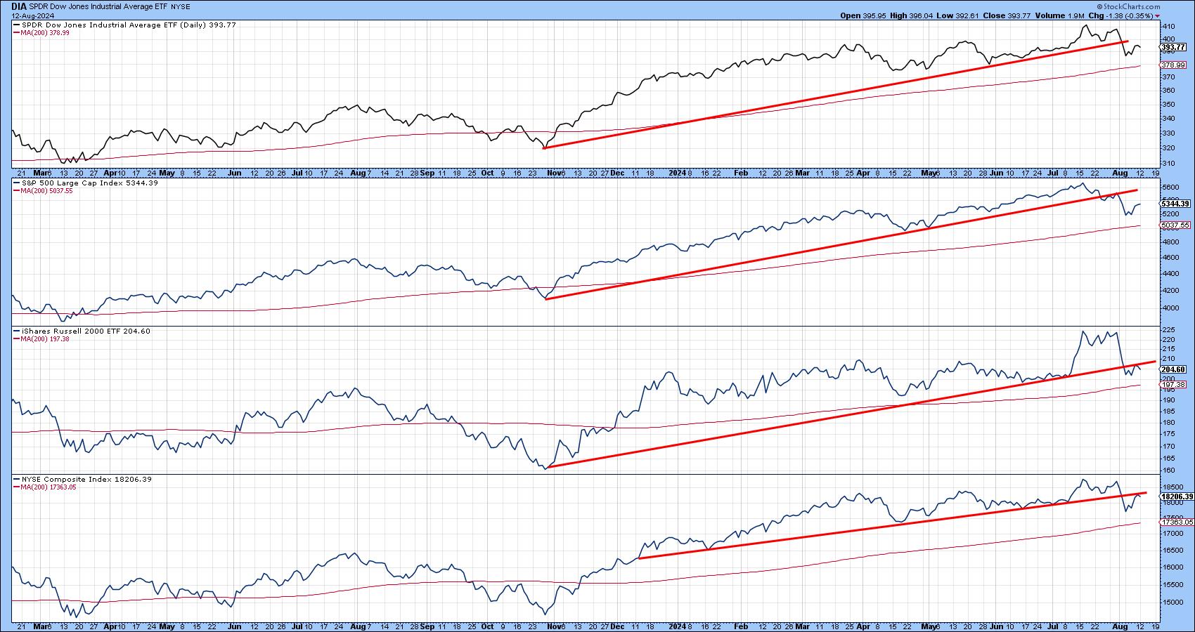
That's also the impression we get from Chart 4, where each of the Indexes have violated up trendlines of some kind. Excluding the possibility of a whipsaw, the violation of a trendline results in one of two possibilities, either an actual reversal or a trading range. Since all four series are trading above their respective 200-day moving averages, the long-term trend is up, which favors the probability of a trading range over a reversal.
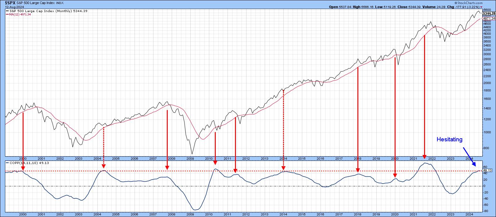
One reason to be careful comes from Chart 5, which features the Coppock Curve for the $SPX. Traditionally, this indicator has just been used to trigger buy signals, as it falls below zero and then turns up. However, the arrows in Chart 5 indicate that sell signals, based on downside reversals from above the equilibrium level, are almost as effective. I bring it up not to call a bear market, but to point out that it is currently trading at an elevated level that is consistent with a market peak. That said, preliminary data for August has caused it to hesitate and may be a signal thatthe primary bull market dating from October 2022 is in the process of peaking. It's a long shot, and it's only one indicator, but a Coppock downside reversal may well emerge if a trading range environment develops in the period ahead.
Good luck and good charting,
Martin J. Pring
The views expressed in this article are those of the author and do not necessarily reflect the position or opinion of Pring Turner Capital Groupof Walnut Creek or its affiliates.


