Four Intermarket Confidence Relationships that Aren't Confident
Most of the primary trend indicators I follow are in a bullish mode and show few signs of flagging. That said, some intermarket relationships, which help to indicate whether the environment is risk-off or risk-on, have started to move in a risk-off direction. That's usually a bearish omen for equities. It may, therefore, represent an early bird warning that those currently bullish primary trend breadth and momentum indicators could soon reverse to the downside.
Consumer Staples Relative Action
Take the ratio between the S&P and the consumer staple sector ($SPX/XLP). When this relationship is falling, it generally casts a shadow over the whole market, because it reflects a preference for the defensive consumer staples by investors. When the ratio is in a firming mode, it tells us market participants have become optimistic, as the relative safety of consumer staples is downplayed in favor of the more "speculative" S&P.
In that spirit, Chart 1 displays the $SPX in the upper window and consumer staple relative strength in the center one. The pink shadings represent periods when the ratio's long-term KST is trading below its 26-week EMA. These periods are not necessarily bearish for the overall market; however, if a bear trend is going to unfold, it generally happens when the KST is in a declining mode. Note that the unshaded portions of the chart are almost always associated with a rising market.

Right now, the KST is bullish, but has clearly started to flatten. This smoothed momentum indicator requires continued doses of rising confidence in order to avoid a sell signal. However, that is unlikely, since the RS line has recently dropped below its 65-week EMA and violated its 2023-4 up trendline.
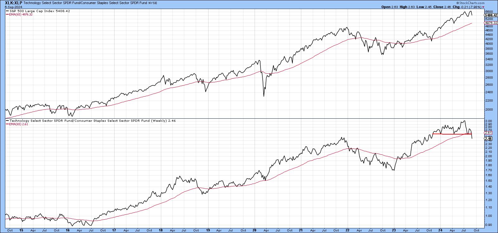
Technology vs. Staples
Another relationship that appears to be in the early stages of a reversal is that between technology and staples. Chart 2, for instance, compares the S&P in the upper window to the ratio in the bottom window. Most of the time, a rising ratio reflects improving confidence. It's not perfect, of course, but by and large, when the ratio is declining, such weakness spills out into the overall market. Note that it has just completed a head-and-shoulders top and crossed below its 65-week EMA. This break turn out to be a whipsaw, but the weak right shoulder argues for potential vulnerability.
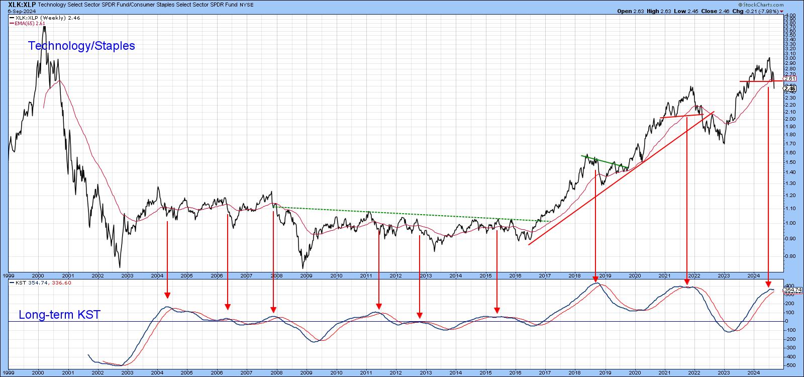
So does Chart 3, which plots the ratio back to the turn of the century. The red arrows approximate the eight KST sell signals that have taken place since then. Each was followed by some form of a decline or trading range. The latest arrow does not mark an actual signal, since the indicator has yet to cross below its 9-month MA. However, the completion of a top in the ratio and its negative 12-month MA crossover strongly suggest that it soon will.
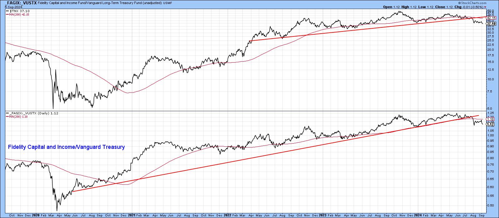
Bond Spreads Beginning to Collapse
Another intermarket confidence relationship that looks as if it is in the process of changing trend comes from that between poor quality corporates and high-quality treasuries. It is represented in Chart 4 by the ratio between the Fidelity Capital and Income and the Vanguard Treasury Fund. A rising relationship means bond investors are confident about the future course of the economy and, therefore, the risk of default. That's because they are showing a preference for the riskier Fidelity over the relatively safe Vanguard fund.
Chart 4 demonstrates two things. First, the swings in confidence reflected in the ratio are reflected in yield changes in the 10-year bond. Second, the ratio has decisively violated its post-2020 up trendline and 200-day MA. If it continues to drop, so too should bond yields in general.
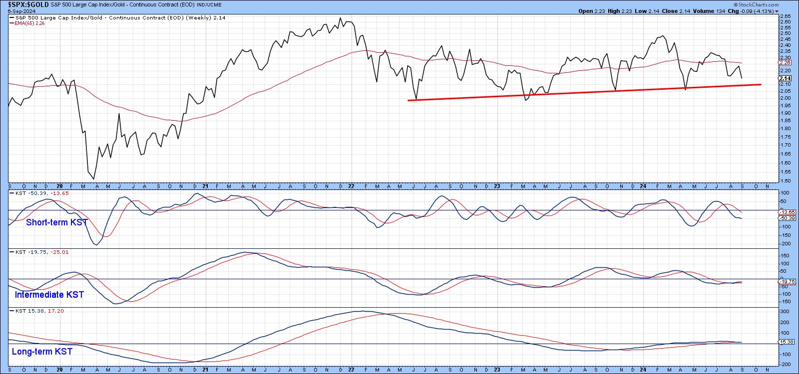
Stocks vs. Gold
Another way of assessing swings in confidence is to examine the Stock/Gold ratio, as shown in Chart 5. In my view, gold's principal function is to serve as an inflation hedge. In that respect, it tends to move ahead of commodity prices. However, gold is also regarded as a safe haven in times of trouble. Consequently, when the stock/gold ratio is rising, it tells us investors are unconcerned with inflation or geopolitical troubles. Alternatively, when it is in a declining trend, it is often, but certainly not always, associated with a trend of declining equities.
This relationship has been rangebound for the last 3 years and looks like it may be in the process of breaking down. Since there have been lengthy periods when the stock market has risen under the backdrop of a falling ratio, a downside penetration of the red trendline would not necessarily be bearish. However, given the move towards safety reflected in our other confidence relationships, it would at best provide a headwind for equities.
Good luck and good charting,
Martin J. Pring
The views expressed in this article are those of the author and do not necessarily reflect the position or opinion of Pring Turner Capital Groupof Walnut Creek or its affiliates.


