Is It Inflation or Deflation? What's in Your Wallet?
Every business cycle has an inflationary and deflationary part, and it's very important for both traders and investors at least to try to have some understanding which has the upper hand at any particular point in time.
For example, when the economy is in a slowdown or recessionary mode, deflation or disinflation is the dominant force, which means bonds and defensive sectors, such as utilities and staples, tend to put in a relatively superior performance. On the other hand, if we are at a more mature phase of the recovery, when capacity constraints are in force and demand is high, commodity prices firm up. Under that kind of environment, basic industry and natural resource stocks tend to come to the fore. I use the word "tend" because each cycle has its individual personality, and part of that persona often differs from the expected format. I bring this up because the charts tell me that inflationary and deflationary forces are currently in a very fine state of technical balance, which may well be resolved in September.
In this article, I am going to focus on some charts that will pinpoint the current state of the battle. If, however if you would like a more detailed and practical explanation of how the business cycle works, also read this account.
When I think of inflation in financial markets, I think of commodity prices. My proxy for deflation is bonds. A good exercise, therefore, is to calculate a ratio between them, as in Chart 1. In this instance, I have plotted the spread between the DB Commodity Tracking Index against the 20+ Year Treasury Bond ETFs (DBC/_TLT). Note the TLT has an underscore in front of its symbol, which means it has been plotted as a price series and does not include dividends or interest payments.
It looks very much as if the ratio has completed and broken down from a head-and-shoulders top on a monthly basis. The breakdown implies a deflationary environment in which bonds outperform commodities. The red arrows intersect with long-term KST sell signals. Each was followed by an important decline in this relationship. The only exception was the whipsaw signal triggered in 2011. The current deflationary one looks stronger than the 2011 example, since the pattern was completed simultaneously with a negative 12-month MA crossover. Both the neckline and MA represent support levels in their own right. When penetrated simultaneously, they represent a far stronger signal than if violated on separate occasions. Just think of the superior strength of two two-by-fours being attached together than if they were used separately.
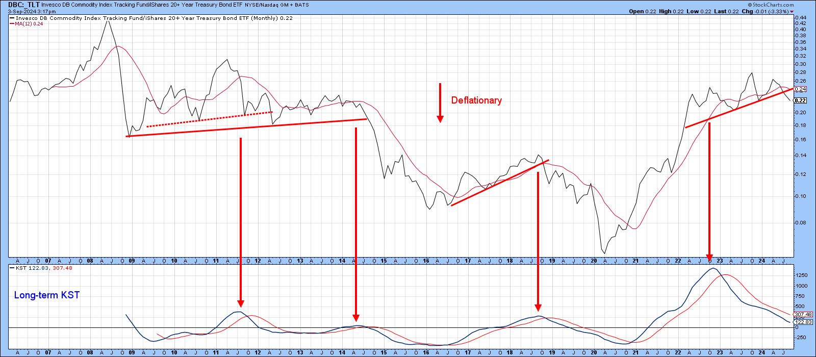
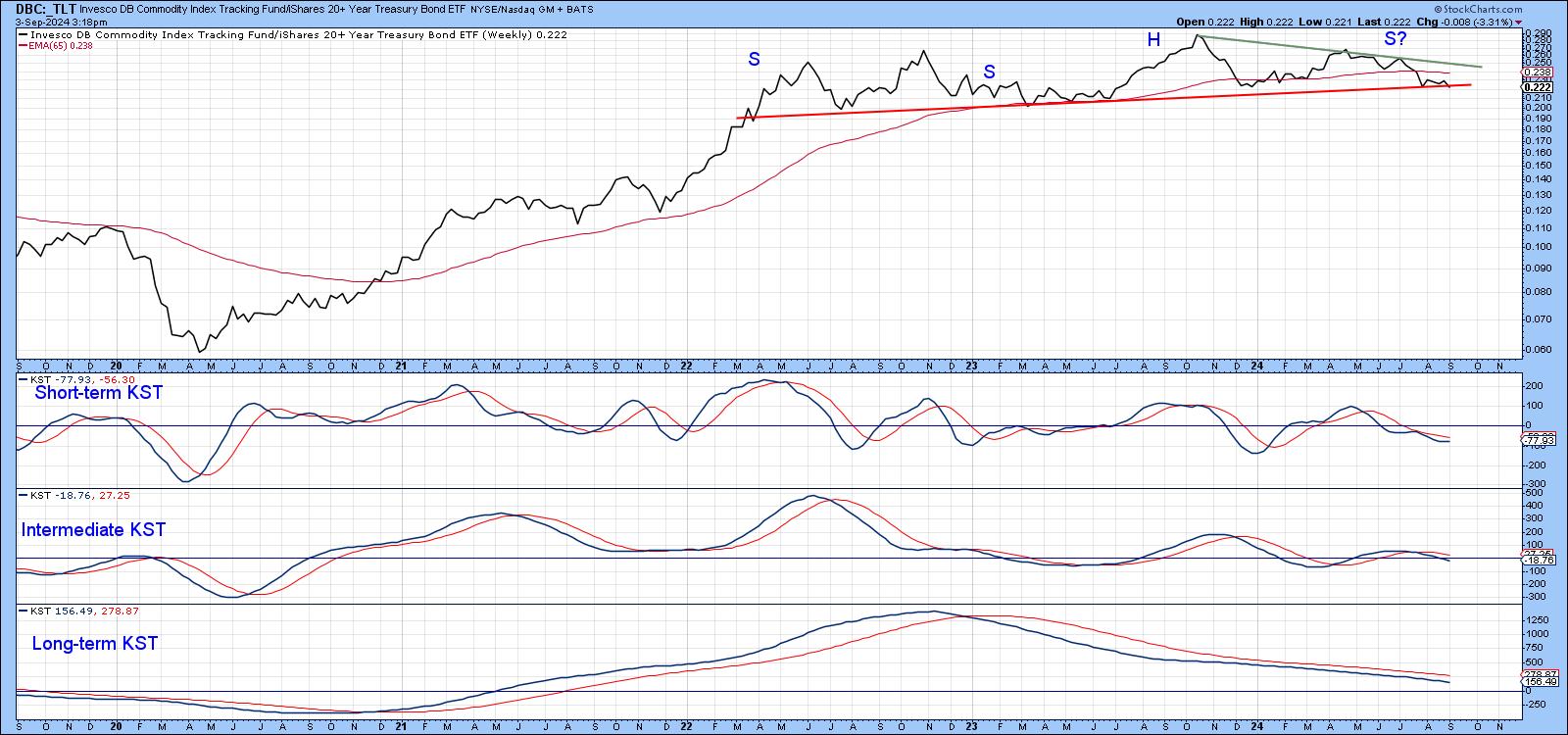
Chart 2 features the same relationship, but this time on a weekly basis. In this instance, the ratio has not yet broken down, although it is trading below its 65-week EMA. All three momentum indicators are in a deflationary mode, which suggests a downward resolution to the trading range. That view would only change in the event that the ratio is able to climb back above the green down trendline, joining the head with the right shoulder.
If we look at bond yields and commodity prices individually, the same impression is gained. Chart 3, for instance, features the 20-year yield. It has already broken down. That action is being supported by all three momentum indicators, none of which is particularly overstretched on the downside.
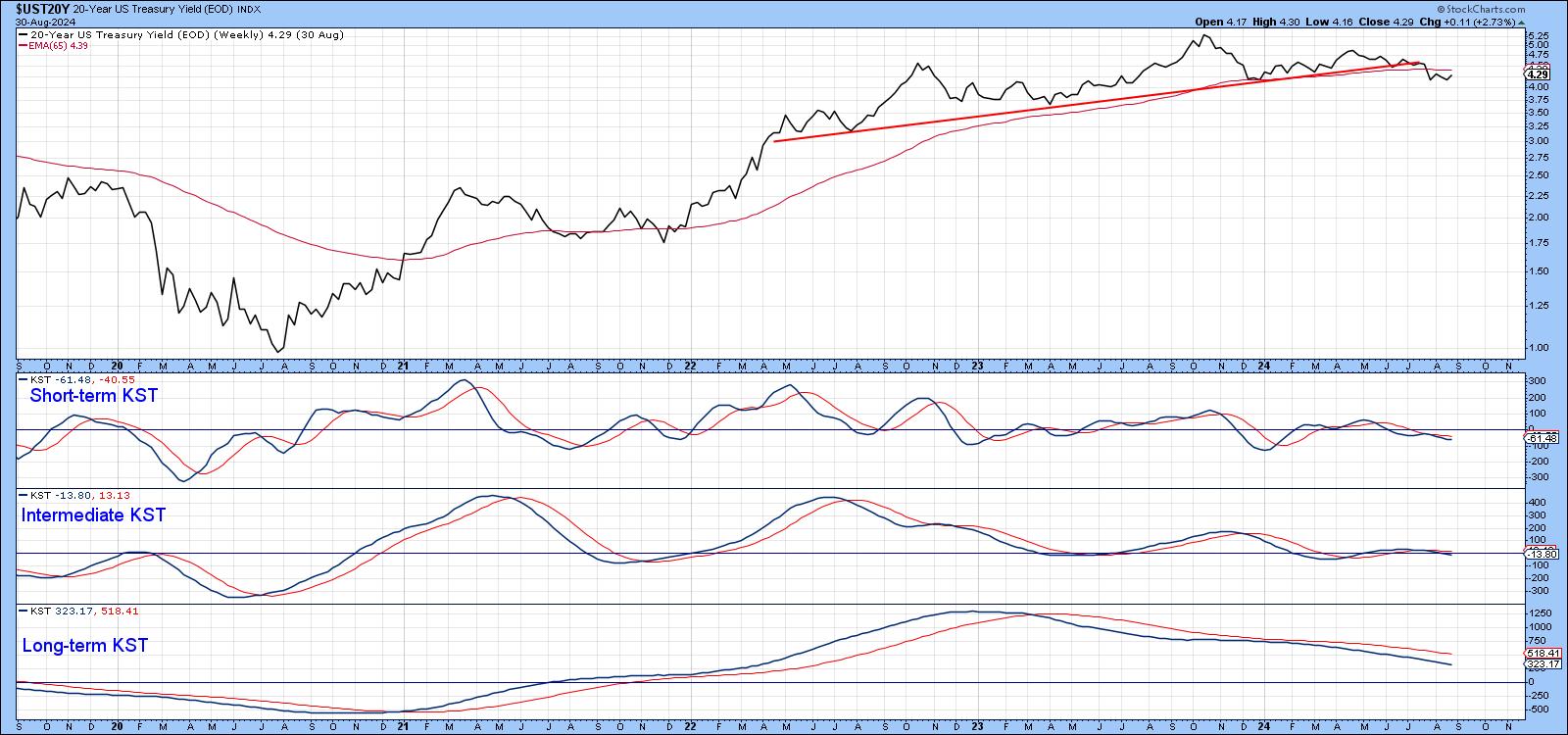
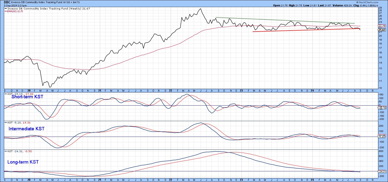
Chart 4 features the DBC itself, plotted on a weekly basis. The price, based on a Tuesday close, has already begun to edge below the red support line. Since all three KSTs are trading below their respective EMAs, the odds of a downside break are higher than an upward one above the green resistance line. That said, the short-term KST has started to turn up, meaning the probability of an upside resolution, while low, is still there.
Conclusion
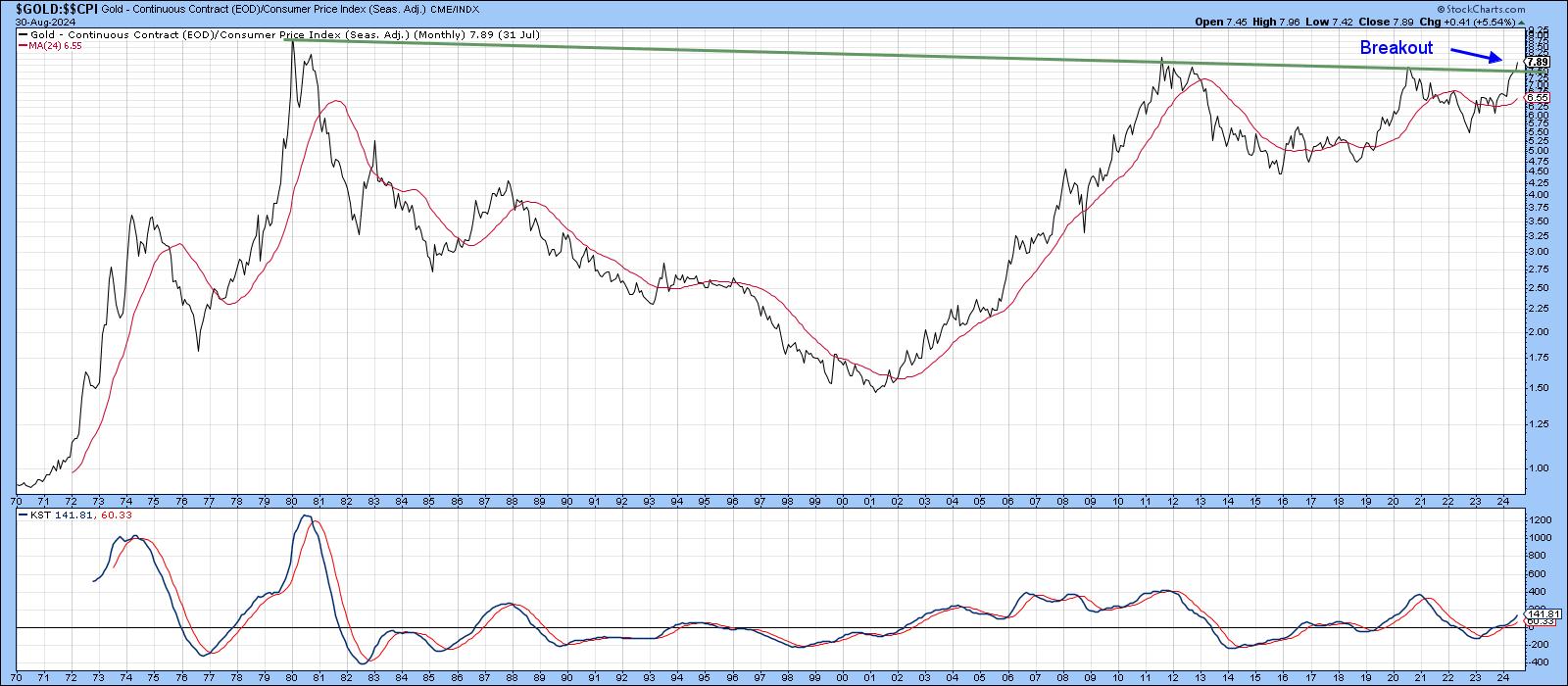
The charts look toppy from an inflationary point of view, but need further confirmation in that direction. Deflationary moves tend to be sharp and unexpected, which could well be the case in the current situation, as traders rush to factor in the new perceived reality. However, there are two reasons for expecting any yield decline to be brief. First, the secular trend is up, and contra-secular primary trends are less powerful. Second, gold prices invariably lead commodity prices and, as Chart 5 reveals, inflation-adjusted gold just cleared a 45-year resistance trendline. Don't forget, you can update any of these charts in the future simply by clicking on them.
Good luck and good charting,
Martin J. Pring
The views expressed in this article are those of the author and do not necessarily reflect the position or opinion of Pring Turner Capital Groupof Walnut Creek or its affiliates.


