The Next Big Move in Yields May Be Different Than You Think
Below, Chart 1 shows a weekly plot for the 30-year yield, where we can see a perfectly formed top whose completion was followed by a negative 65-week EMA crossover. At the time of the breakdown, there were few grounds for suspecting a false break. However, in the last couple of weeks the yield has crept back above its 65-week EMA again.

In technical analysis, we deal in probabilities and look for a number of indicators to be pointing in a similar direction before concluding that any breakdown was false. That pullback above the 65-week EMA counts as one piece of evidence that the breakout is questionable, as does the recent short-term KST buy signal. It's not by any means conclusive, however. For that we would need to see a Friday closing price above the two converging trendlines at around 4.6%. Right now, we should assume the break is genuine and lower yields lie ahead. That said, there are several technical factors worth following as they look ready to confirm the possibility a whipsaw may have taken place.
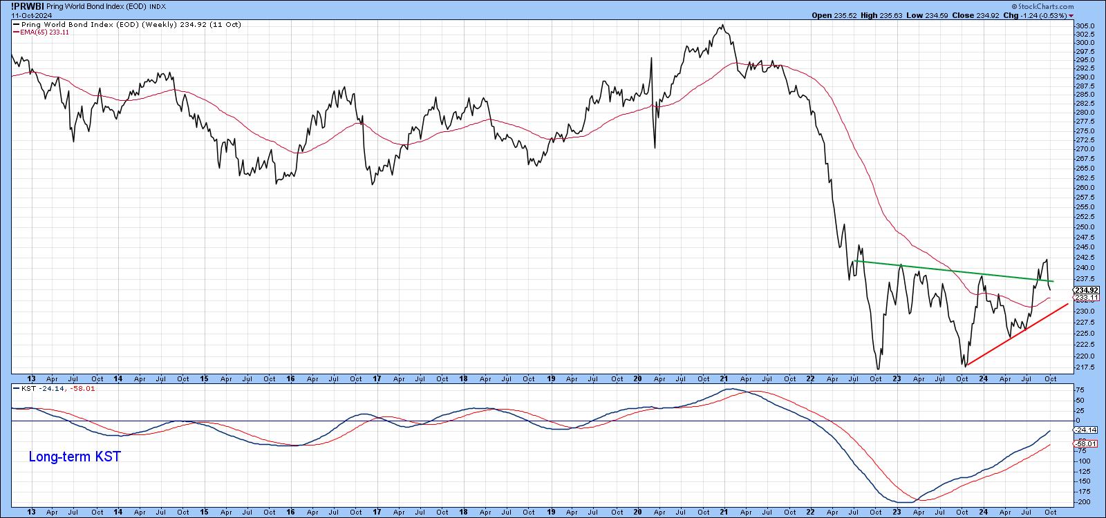
I'll get to those later, but Chart 2 features my World Bond Index (!PRWBI). It too looks like it may have experienced a false break. This series recently completed a base and was confidently marching higher. In the last few days, though, this price series has fallen back below the extended breakout trendline. That sort of action is not meant to happen, but, in order to call a false break, the Index would have to also drop below its 65-week EMA and, more importantly, its 2023-24 up trendline, currently around 230 (basis Friday NY close). Until that happens, I am assuming the break is valid. Incidentally, you can monitor this and other charts going forward by simply clicking on it as new data becomes available.
The Power of Cycles
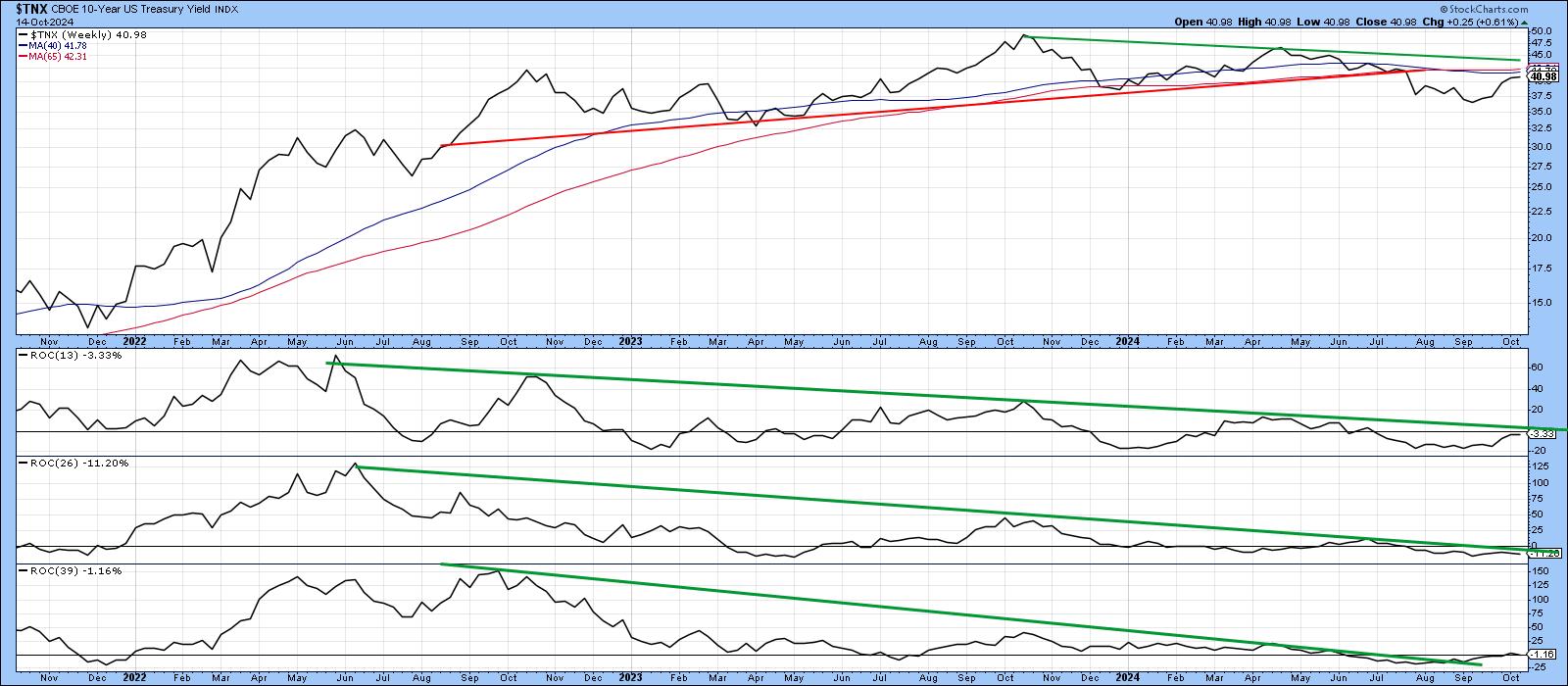
It is commonly understood that prices are determined by the interaction of numerous time cycles. The strongest moves tend to take place when they are all pointing in a similar direction. Chart 3 plots three widely spaced ROCs in an attempt to reflect several time cycles, the rule being that when it is possible to construct trendlines for each of these oscillators, as well as the price and all are violated, an above-average move usually follows. The chart clearly reflects the potential for such a setup. The emphasis is on "potential" because none of the four lines has yet been decisively breached.
Inflation/Deflation in the Bond Market
The middle window in Chart 4 features a ratio between inflation-protected and nominal bonds and compares it to the 10-year yield. The movements in both series are similar.
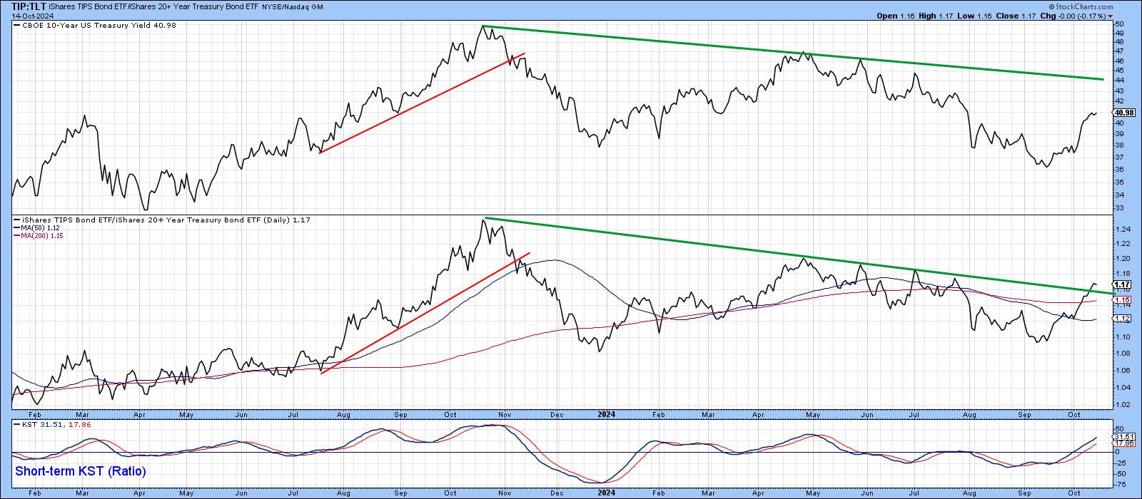
When investors show a preference for the inflation-protected ETF, this translates into a higher 10-year yield as nominal bond investors demand an even higher rate of return; they too fear inflation, but are not protected. When it is possible to construct meaningful trendlines for these two series and they are both violated, a worthwhile change in trend for the yield usually follows. The ratio penetrated its down trendline last week and appears to be leading the way. That's not sufficient evidence to conclude that the 10-year is moving higher, as we need the yield to confirm, but it is another piece of evidence telling us not to be complacent with expectations of lower yields.
Financials vs. Bonds
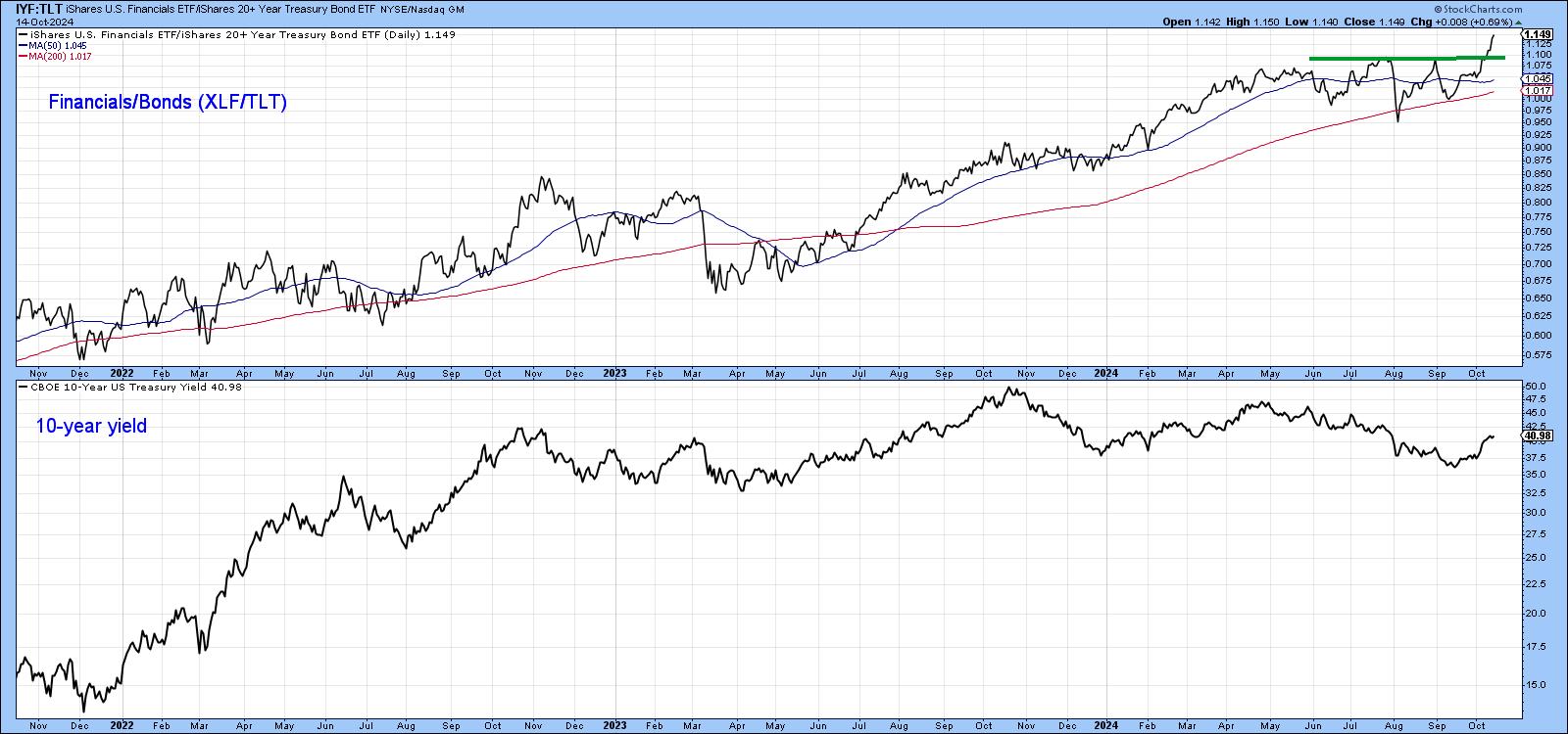
The ratio between the iShares Financial (IYF) and iShares 20-year Treasury (TLT) also reflects changes in confidence and moves in sympathy with the 10-year yield. Growing confidence occurs when investors bid up the prices of the relatively high-risk financials against those for the more conservative treasuries. Its recent upside break tells us investors are quite confident about the economy. When confidence firms, so, usually, do yields. Again, it's important to make sure that the 10-year yield agrees with an upside breakout of its own. The ratio's upside break though, is certainly a signal that rates are more likely to go up than down.
Inflation and Yields
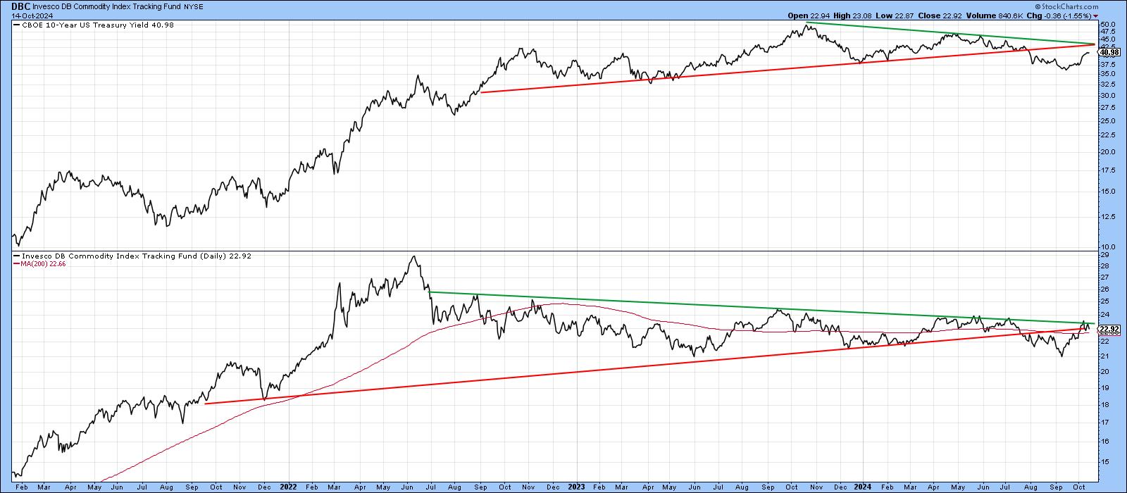
Chart 6 probably holds the key, as it compares the 10-year yield to the Invesco DB Commodity Fund (DBC). The DBC has also broken down, but has nevertheless managed to pull back to the red extended breakdown and green breakout trendline. Nothing to report at the moment, but this chart is well worth monitoring for possible future developments.
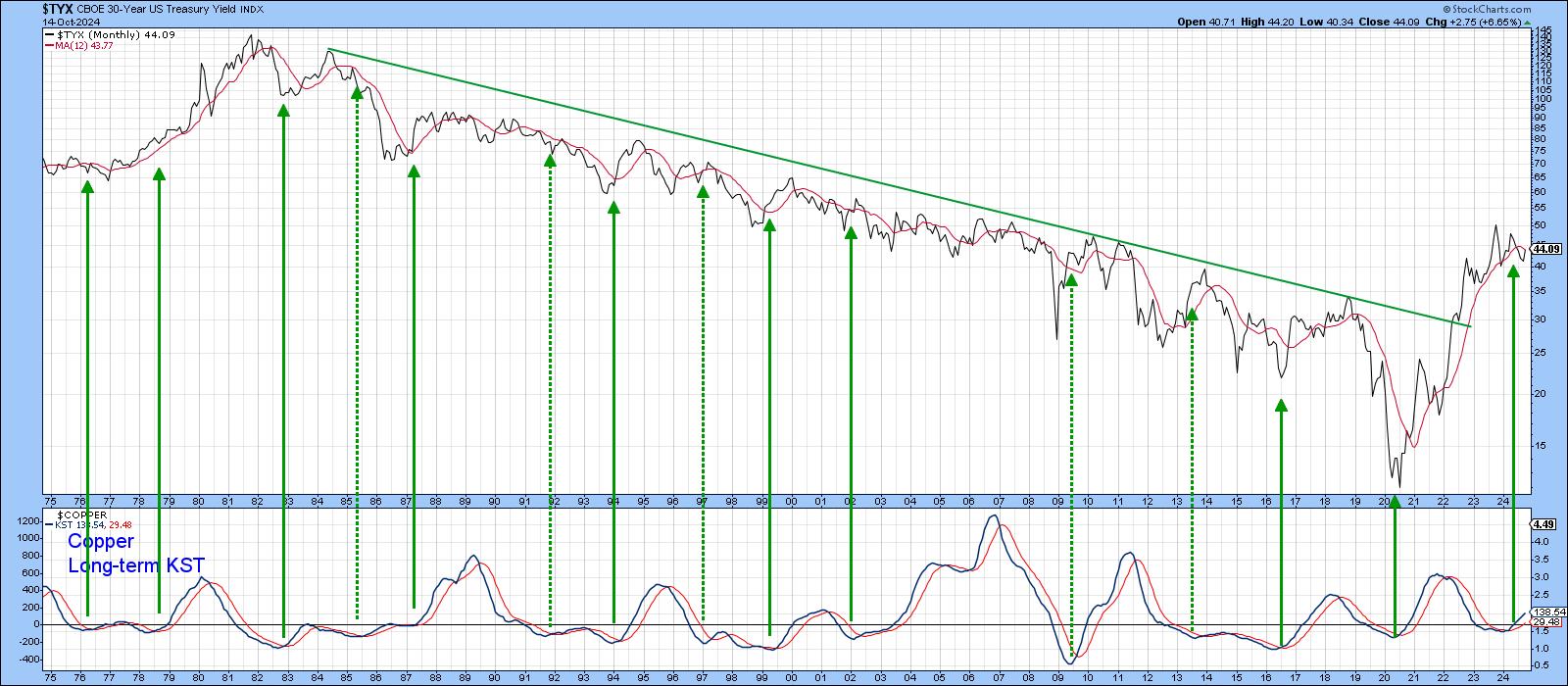
Finally, the long-term KST for copper has recently gone bullish. The arrows in Chart 6 show that most previous buy signals have been followed by a higher 30-year yield, especially when the secular trend was bullish, as was the case in the late 1970s. The violation of that green secular down trendline dating back to the early 1980s, along with other factors arguing in favor of a secular uptrend, suggests the recent copper momentum buy signal could well be the precursor of higher rates. Again, though, I am assuming the breakdown in yields is intact unless more evidence of a downside whipsaw comes to the fore.
Good luck and good charting,
Martin J. Pring
The views expressed in this article are those of the author and do not necessarily reflect the position or opinion of Pring Turner Capital Groupof Walnut Creek or its affiliates.


