A Significant Structural Change in the U.S. Stock Market May Be Underway

The ratio between the NYSE and S&P Composite could be in the process of breaking for the $NYA. You may not think that’s important but, in reality, it could herald some important structural changes. First, though, let’s take a closer look at this relationship to see what might be taking place.
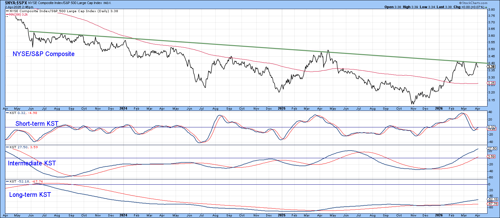
Our first chart plots the ratio between the NYSE and S&P 500 ($NYA:$SPX). This relationship is currently pressing just beneath a three‑year resistance trendline. That barrier carries considerable weight, not only because of its duration but because the ratio has failed roughly 10 times to overcome it since 2023. Its shallow downward slope further reinforces its technical importance, as slowly descending trendlines often act as durable ceilings.
Two developments make the current setup especially compelling.
First, all three KSTs are in a bullish mode, indicating that short‑, intermediate‑, and long‑term momentum are aligned in favor of an eventual upside breakout.
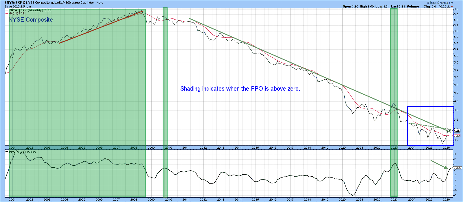
Second, Chart 2 reveals that the decline in NYSE relative performance has been in force all the way back to the financial crisis. The blue box highlights the action displayed in the previous chart, which can now be seen to represent only a small portion of that long‑term secular downtrend. As a result, a month‑end close above the dashed green resistance line would complete the 3‑year base and constitute a decisive violation of the entire secular down trendline that has governed NYSE underperformance for more than a decade.
Finally, the Percentage Price Oscillator (PPO) has tentatively poked its nose above its equilibrium line. We can’t place too much weight on this development since the previous two signals were disappointing. However, its positive crossover is not a negative at this point.
What Would a Reversal Favoring the NYSE Composite Imply?
If this turns out to be a genuine secular reversal, what are the principal implications? To answer it, we first need to have a better understanding of the composition of the two market averages.
The NYSE Composite ($NYA) represents all common stocks listed on the New York Stock Exchange, including ADRs, REITs, tracking stocks, and foreign listings. That’s roughly 2,800 companies in total. Approximately one‑third of its market capitalization comes from international companies.
The S&P 500, by contrast, is a curated universe of 500 predominantly U.S. large‑cap companies, with roughly 34.4% of its weight concentrated in technology. In recent years, the Index has largely been a story of a few giants — Nvidia (NVDA), Apple (AAPL), Microsoft (MSFT), Alphabet (GOOGL), Amazon (AMZN) — exerting disproportionate influence on its performance.
If the NYSE Composite were to outperform the S&P 500 on a sustained, multi‑year basis, the most direct implication is that these mega‑cap tech leaders would begin to underperform or, at a minimum, fail to outpace the broader market. With that in mind, we can examine the two most important downstream effects.
First Implication: Technology Underperformance
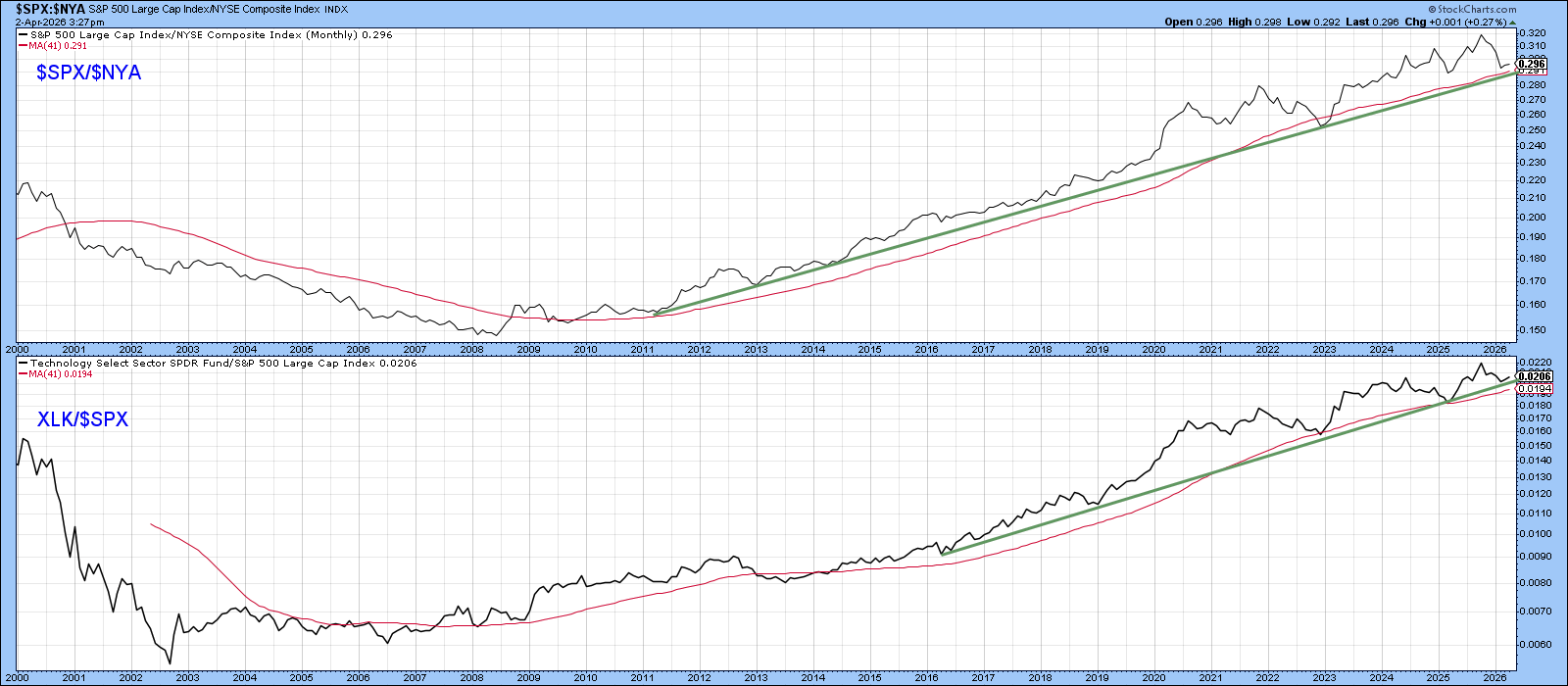
Chart 3 reverses the earlier comparison by plotting the S&P 500 relative to the NYSE Composite ($SPX/$NYA). Historically, when this ratio has been rising — signaling S&P leadership — the technology sector (XLK) has outperformed the S&P. This relationship has been consistent and persistent.
It follows that a reversal in the secular uptrend of the $SPX/$NYA ratio would likely usher in a long‑term phase of XLK underperformance relative to the S&P 500. In other words, if the NYSE begins a new structural leadership cycle, technology’s multi‑year dominance would almost certainly fade.
Second Implication: Superior Performance by Overseas Stocks
A second major implication stems from the NYSE Composite’s substantial weighting in ADRs. Because so many foreign companies are represented in the index, a period of NYSE outperformance also tends to coincide with superior relative action by foreign stocks.
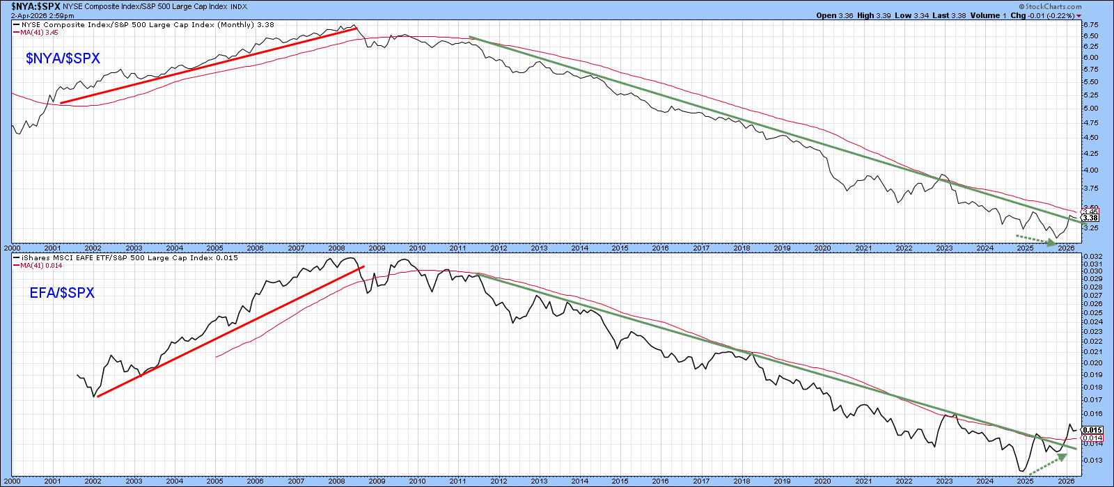
Chart 4 illustrates this clearly by comparing the $NYA/$SPX ratio with that for the Europe–Australia–Far East ETF relative to the S&P 500 (EFA/$SPX). It is evident that, most of the time, the two series move in close alignment.
What stands out now is that the EFA/$SPX ratio has already broken above its secular downtrend, diverging positively from the $NYA/$SPX relationship, a development highlighted by the two dashed green arrows.
The Bottom Line
The ratio between the $NYA and $SPX should be monitored closely for a possible secular turn. If so, it will likely signal superior relative performance for large-cap technology stocks at the expense of international equities.
Good luck and good charting,
Martin J. Pring
The views expressed in this article are those of the author and do not necessarily reflect the position or opinion of Pring Turner Capital Group of Walnut Creek or its affiliates. The Six Stages of the Business Cycle are followed each month in Martin Pring’s Intermarket Review.