StockCharts Insider: How to Use the RSI Bullish Range Scan to Find Strong Stocks
Before We Dive In…
Many traders pay attention to only two signals when using the Relative Strength Index (RSI): overbought and oversold. The problem is if you do it that way, you’re focusing on minor clues while missing the bigger picture.
Here’s something you might not know: you can often spot an uptrend and downtrend just by looking at the RSI—and that’s without even seeing the price chart. It all comes down to the range RSI travels in. This means you can spot bullish or bearish stocks by using the RSI as a filter. And when you see traditional overbought/oversold levels, you’re likely to find the start of strong moves, not just the end of them.
I’ll explain all of this, but first let’s have some fun with a little detective work.
Can You Spot Trend Clues Without Seeing Price?
Below is the RSI from a real stock over the period of a year and a half. No price chart. Just momentum. Can you find any clues as to what the trend is doing?
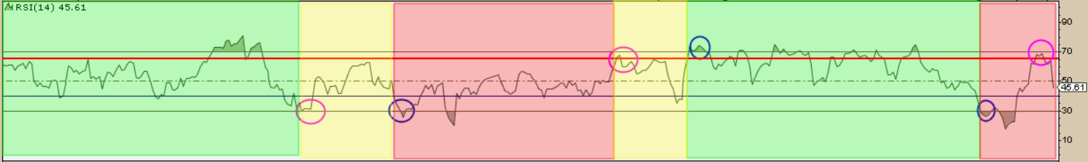
RSI Challenge 1
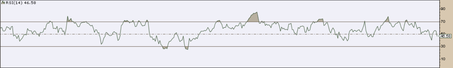
Questions:
- Was this stock largely in an uptrend, or range-bound?
- Was there a downtrend, and if so, where did it begin?
- If there was a downtrend, did it reverse; and if so, where?
I’ll give the answers shortly. For now, let’s try another one.
RSI Challenge 2
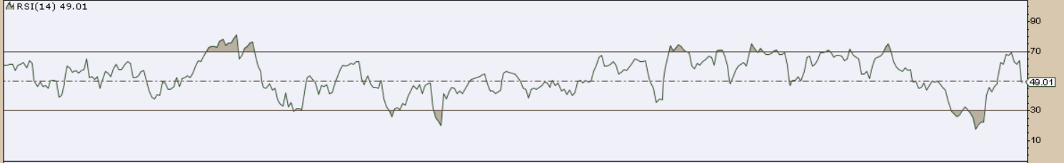
Questions:
- Was this stock largely range-bound, in an uptrend, downtrend, or both?
- If it consisted of both, how many uptrends and downtrends were there?
- Where did they begin and end?
Before we answer these questions, let’s learn a few principles from technical analyst Constance Brown’s book Technical Analysis for the Trading Professional.
Lesson: It’s All About Range
Constance Brown showed that RSI behaves differently depending on the trend.
- In uptrends, RSI usually holds in a bullish range, between 40–50 (lows) and rallies pushing 80+.
- In downtrends, RSI tends to stay in a bearish range between 55–65 (highs) and lows pushing toward 20–30.
The takeaway: Instead of focusing only on overbought or oversold levels, watch how high and how low RSI travels. Strong stocks keep momentum elevated, while weak ones either struggle to lift RSI, or they keep downward pressure constant.
And Now, the Answers
RSI Challenge 1 - Goldman Sachs Group, Inc. (GS)
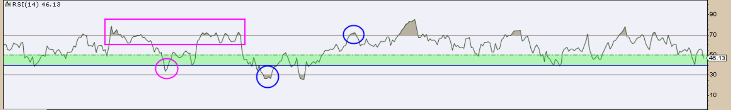
Looking only at RSI, momentum mostly stayed in a bullish range, telling us GS spent most of the last year and a half in an uptrend. A brief snag appeared when RSI slipped below 40 (magenta circle), but strength quickly returned as RSI repeatedly pushed above 70 (magenta rectangle).
A short downtrend developed when RSI later dropped toward oversold territory near 30, but it didn’t last long. Momentum soon climbed back above 70, signaling buyers had regained control and the uptrend resumed.
This is what it looks like with the chart.
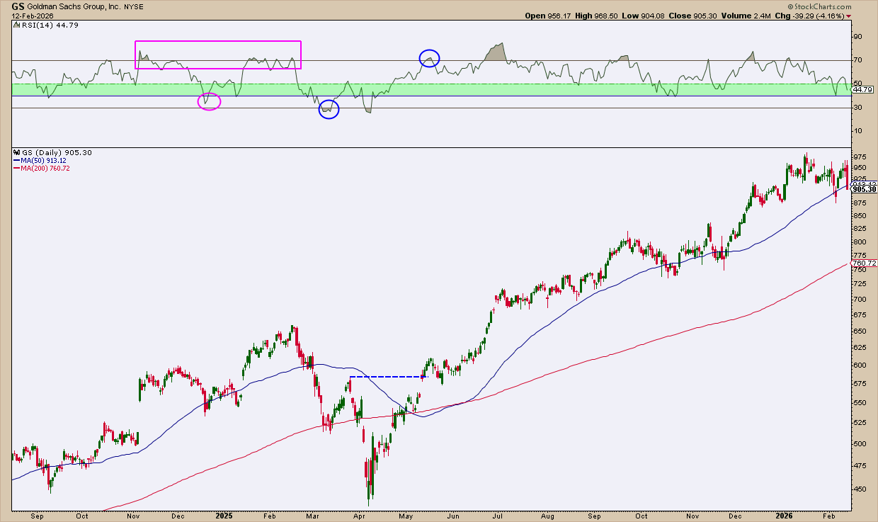
Notice how the RSI drop below the 30 line coincides with a drop below the 200-day simple moving average. When the RSI reversed, rising above 70, price had advanced above the 200-day SMA, breaking above the most recent swing high, marked by the blue dotted line.
Let’s take a look at the second challenge.
RSI Challenge 2 - Apple, Inc. (AAPL)
In this example, green shading marks an assumed uptrend, yellow shows consolidation or indecision, and red signals a downtrend. The added 65 line helps show where rallies tend to fail during bearish phases.
Reading RSI alone, AAPL stayed in an uptrend until momentum slipped below 40, putting that trend in doubt. Soon after, RSI dropped under 30, confirming a downtrend as momentum made another push into oversold territory.
Momentum then rebounded above 65, signaling a possible reversal, and RSI shifted back into a bullish range for a period. Another sharp drop below 30 later suggested a downtrend. But the subsequent push back above 65 throws that bearish read into question.
Here’s what it looks like with the chart.
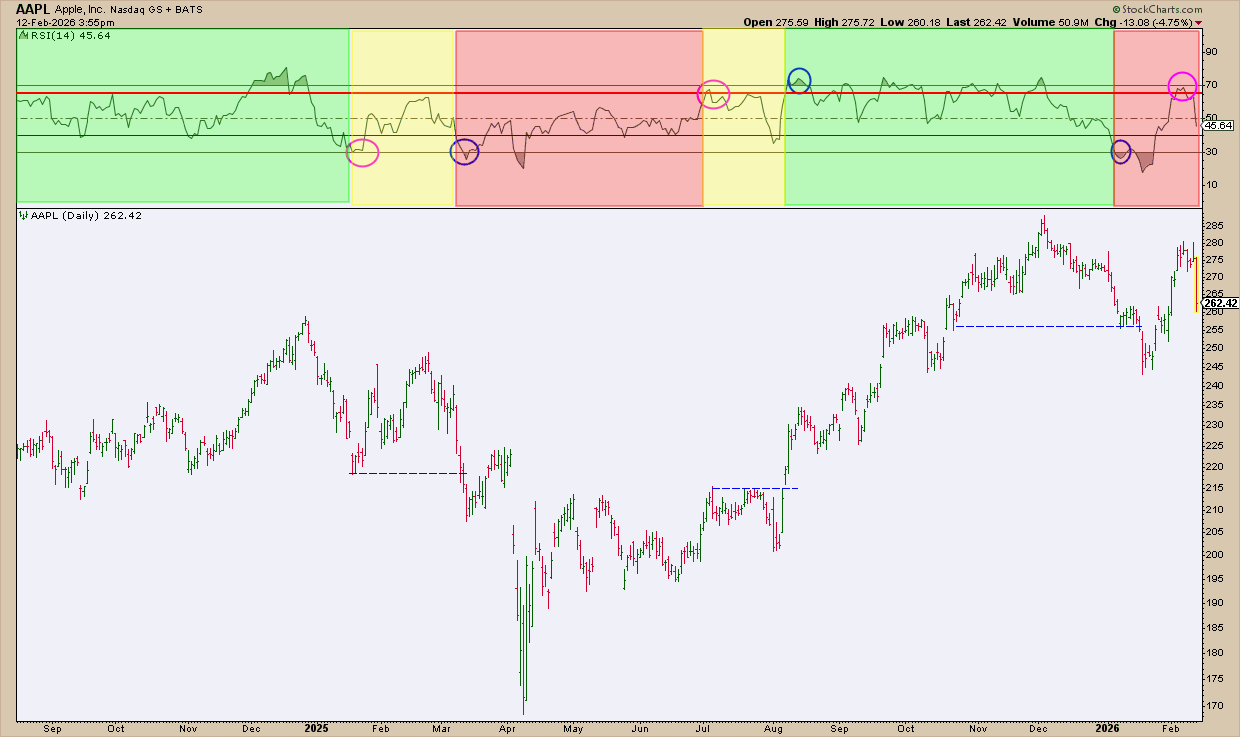
Notice how the RSI readings coincide with critical breakout levels (dotted blue lines) on the chart. Was the RSI reading minus the chart close to actual price action? Arguably so.
The main point: RSI range isn’t just descriptive, it’s an actionable filter.
The good news: Instead of hunting for these setups manually, you can find them with just a few keystrokes. Let’s talk about that next.
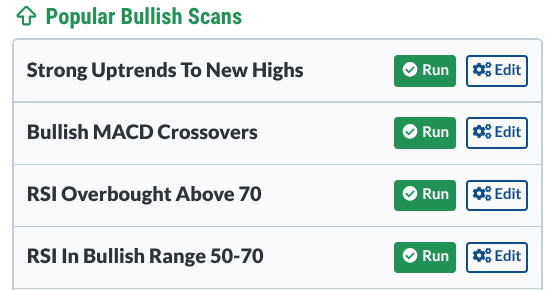
The RSI In Bullish Range 50-70 Scan
StockCharts has a scan called RSI In Bullish Range 50-70 in the StockCharts Sample Scan Library.
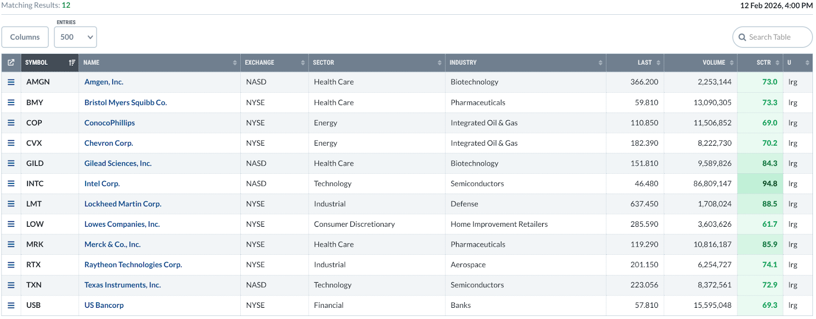
For this example, I added two filters:
- S&P 100 stocks only
- StockCharts Technical Rank (SCTR) above 60
In other words, I’m looking for mega-cap S&P stocks with strong technicals that are currently trading within the bullish RSI range of 50–70.
Here are the results.
Do this next: Try running the scan yourself and review the charts using RSI range rules first, before looking at price. You may be surprised how quickly strong trends start to stand out. If you like the scan, make it part of your routine. You’re bound to spot momentum leaders before they hit everyone else’s radar.
And That’s a Wrap
As you can see, there’s more to RSI than just overbought and oversold reversals. Once you start reading it by range instead of extremes, trends become much easier to spot. Add the scan to your workflow, and it’ll feel like momentum leaders are finding you instead of the other way around.


