StockCharts Insider: Market Breadth 101 — What Index Price Doesn’t Tell You
Before We Dive In…
When the S&P 500 makes a 1% move up, it feels like the market is exhibiting strength. But is it? Sometimes an index will rise because a handful of mega-caps are doing the heavy lifting. What you don’t see are the other stocks that are rolling over.
That’s where the value of market breadth comes in. There are several market breadth indicators, all giving you a different slice of participation. But each one asks the same question: how many stocks are joining the move?
What is a Breadth Indicator?
Imagine a tug-of-war contest, where the winning side is powered by a few strong players. What if the majority of mostly weaker players ditch? Without the breadth of participation on the winning side, the stronger players’ strength will eventually get sapped. The same principle applies to market indexes.
A breadth indicator measures the participation of individual stocks inside an index or market. Instead of tracking price alone, it tracks several angles of participation, including:
- How many stocks are advancing vs. declining
- How many stocks are issuing buy signals based on breakout conditions
- How many are making new highs vs. new lows
- How many stocks are above key moving averages
- Whether volume is flowing into stocks that are advancing or declining
In short, while price shows direction, breadth measures conviction.
Why You Shouldn’t Ignore Breadth
Remember our tug-of-war example above? Many modern indexes are heavily weighted toward a small group of giant stocks, meaning a few names can pull the whole index higher while the majority quietly stalls.
As you can imagine, this creates a problem. If the index goes up while the majority of stocks in them are going sideways or down, it makes the rally fragile.
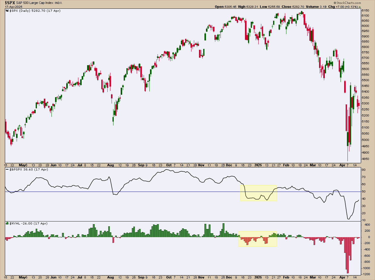
You can see an example of this in Figure 1. Look closely at where the rally pushes on into February 2025. There, price looks healthy. But breadth doesn’t.
Now look at the shaded regions in the Bullish Percent Index (BPI) and Net New 52-week Highs:
- BPI falling below 50 meant fewer than half the stocks were still on Point & Figure buy signals. That’s bearish territory. The majority had already flipped to sell signals.
- Net New 52-Week Highs dropping below zero told the same story from another angle: more stocks were hitting new lows than new highs.
Still, the $SPX muscled higher. But it was a narrow rally with weak participation. In the end, it didn’t hold. The broader market rolled over soon after, triggering a two-month decline.
The moral of the story: Breadth indicators help you see these (potential) conditions before they show up in price.
The Three Market States Breadth Helps Identify
Generally, breadth indicators help you spot three market states.
1 - Health trends
This is what you want to see. Lots of stocks are moving higher. New highs are increasing. Participation is rising with price. When you see this, the trend has real strength. So, when it pulls back, buying the dip is likely to work in your favor.
2 - Narrow leadership
The index is climbing but fewer stocks are doing the work. The headlines might still remain bullish, but the inner workings of the index show that stocks are starting to stall or roll over. This is the yellow flag you want to see. The trend is still intact, but it’s getting weaker. Risk is building up even if price doesn’t show it.
3 - Internal breakdown
This is where the cracks widen. Breadth falls apart and new lows start to outnumber new highs. The market’s bullish foundation is shifting. These conditions tend to show up before major declines (as in the example above).
Now, breadth may not tell you what will happen to price tomorrow, but it does warn you, quite clearly, that certain developments are stirring right now.
Which Breadth Indicators Should I Try?
If you check out StockCharts’ Market Indicators page, you’ll find several available to you. Here’s a quick take:
- Advance–Decline Line (AD Line): A running total that tracks whether more stocks are advancing or declining over time.
- Advance–Decline Percent: Shows how much of a group (like an index or ETF) is moving higher versus lower, in percentage terms.
- Advance–Decline Volume Line: Similar to the AD Line, but weighted by volume to show where trading activity is actually flowing.
- Advance–Decline Volume Percent: Measures how much of a group’s total volume is flowing into advancing stocks versus declining ones.
- Arms Index (TRIN): Compares price movement to volume flow to spot short-term buying or selling pressure.
- Bullish Percent Index (BPI): Tells you what percentage of stocks in a group are on Point & Figure buy signals, which is great for gauging internal strength.
- High–Low Index: A smoothed measure of how consistently stocks are making new highs versus new lows.
- High–Low Percent: Shows the balance between new highs and new lows within a group, expressed as a percentage.
- Net New 52-Week Highs: The difference between stocks hitting new highs and new lows; useful for spotting participation breakdowns.
- Percent Above Moving Average: Reveals how many stocks are trading above a chosen moving average.
- Record High Percent: Shows how dominant new highs are relative to new lows within a group.
In coming articles, we’ll cover a few indicators that are most commonly used or that I feel can give you a unique advantage when gauging trends. For now, check out a few yourself and try them on some charts.
And That’s a Wrap
The advantage of market breadth indicators is that they help you detect whether a move is being powered by the majority of stocks or propped up by a few big names. When participation is broad, trends tend to be healthier and more durable. But when it thins out, risk quietly builds up beneath the surface. The Insider view? Breadth is like a background check on price. An index may look strong, but breadth reveals whether that strength is widespread or borrowed time.