StockCharts Insider: Reading Offense vs. Defense with Key Ratios
Before We Dive In…
Ever wish you had a dashboard that flickers between “caution” and “go”? That’s what these Key Ratios are. Wall Street’s caution vs. go signal. They don’t offer trade signals, but they do give you a vibe check, helping you figure out if investors are leaning bold or skittish. In this Insider post, I’ll break down what each ratio is really saying, when to trust them, and when to take them with a grain of salt.
Key Ratios: The Market’s Offense vs. Defense Scoreboard
Scroll halfway down the Market Summary page and boom, you’ll find a panel called Key Ratios. If you’ve ever hovered over that little info icon and thought, “Huh?”, you’re not alone.
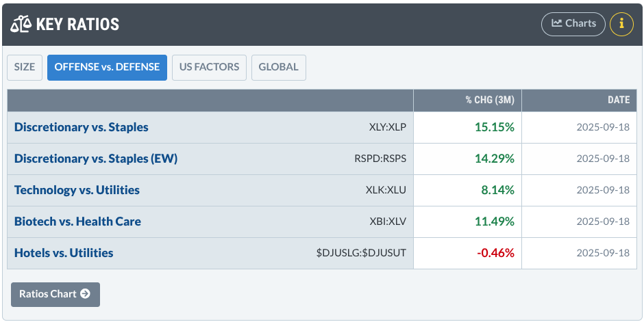
Here’s the Gist: These ratios are like the market’s mood rings. They compare offense (a.k.a. risk-on, bullish sectors like Tech or Consumer Discretionary) against defense (a.k.a. safe, bearish sectors like Utilities or Staples).
How to interpret the ratios:
- Ratios rising? The market’s strapping on its cleats and going on offense.
- Ratios falling? The market’s pulling back, playing defense, and hugging the sidelines.
Is it really that simple? Pretty much—but only if you keep the caveats in mind. That’s where today’s Insider lesson comes in: we’ll show you how to read these ratios with a sharper eye, plus share a few pro-level tips to supercharge your takeaways.
Reading the Market’s Mood with Key Ratios
As I said above, think of these ratios as the market’s mood rings.
To put it in the simplest terms, each ratio pits a “thrill-seeker” sector against a “safety-first” sector. If the thrill-seekers are winning, Wall Street’s in a risk-taking mood. If the safety crowd’s on top, investors are nervous and hiding out.
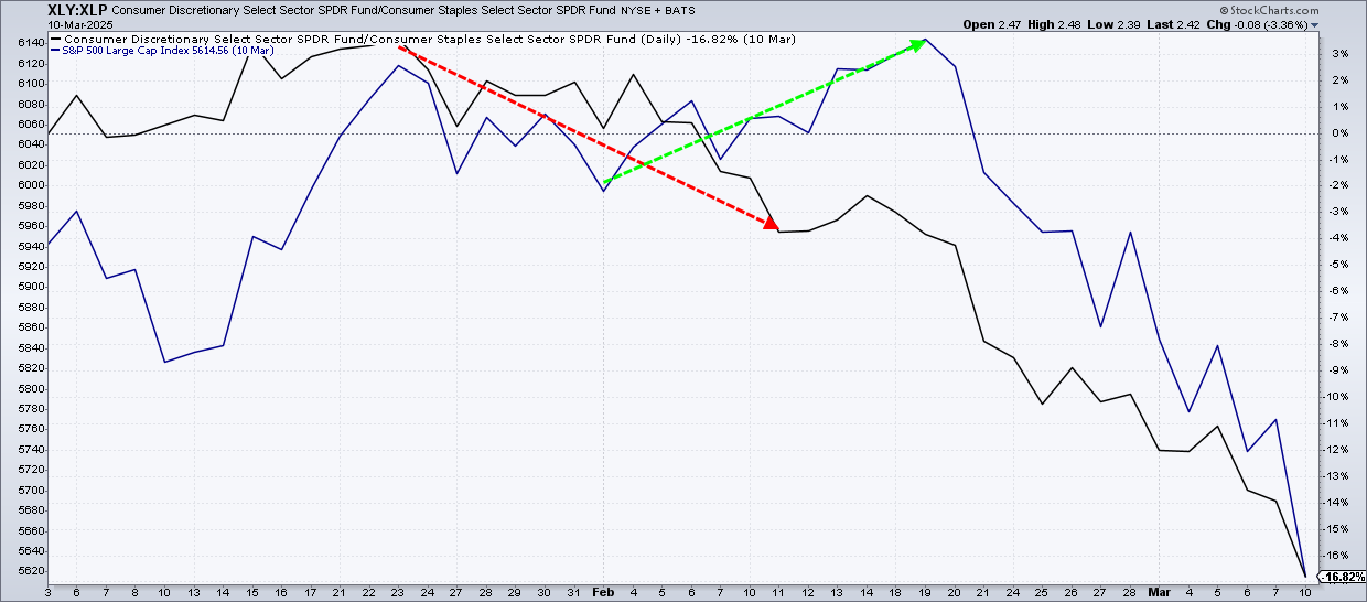
XLY:XLP – Shoppers vs. Survivors
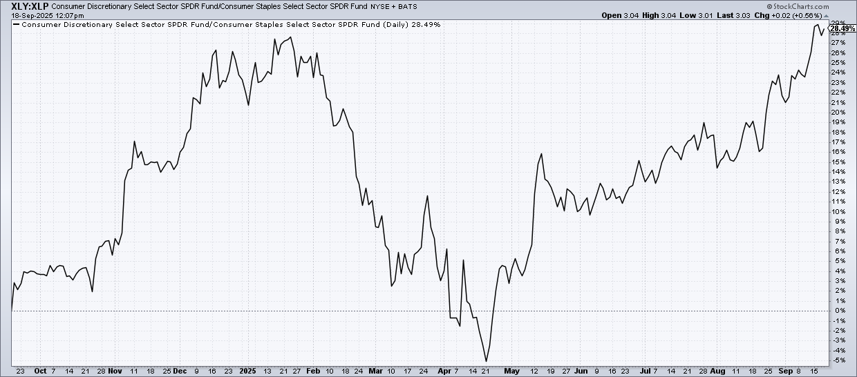
This pits Consumer Discretionary Select Sector SPDR Fund (XLY) against Consumer Staples Select Sector SPDR Fund (XLP). For XLY, think of companies like Amazon, McDonald’s, and Starbucks, all of which are the ETF’s top holdings. Compare that with XLP, which holds Walmart, Costco, and Procter & Gamble.
The rationale: When shoppers are splurging on online buys, burgers, and lattes, confidence in the economy is probably quite high. When people are spending on groceries, toilet paper and other essentials, people are playing low-key defensive.
Caveat time: A dropping XLY:XLP ratio typically means “risk-off,” but don’t jump straight to assuming “recession ahead.” Staples can shine in high-inflation or choppy markets too, and that can muddy the signal a bit.
XLK:XLU – Big Tech vs. Power Bills
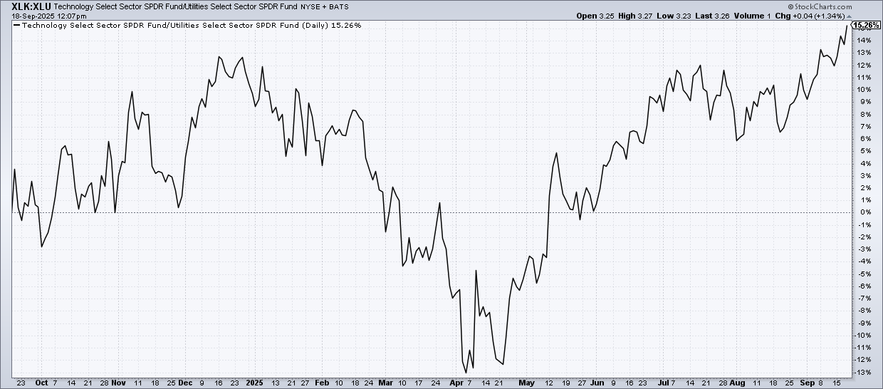
This ratio compares the Technology Select Sector SPDR Fund (XLK) with the Utilities Select Sector SPDR Fund (XLU).
The rationale: Tech is your exciting, high-octane growth driver. Utilities, on the other hand, are like a boring security blanket. If XLK is leading XLU, market optimism is running high. If the opposite is the case, investors are holding on to utilities stocks to keep warm in a less optimistic environment.
Caveat time: When the Fed hikes interest rates, this alone can ding tech stocks much more than stocks in the utilities sector. Sometimes this ratio reflects Fed policy reactions more than broad market sentiment.
XBI:XLV—Biotech Dreams vs. Big Health
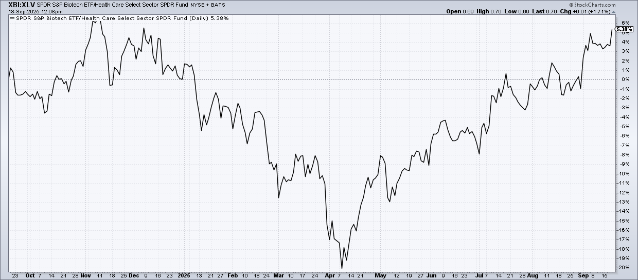
This ratio pits SPDR S&P Biotech ETF (XBI) against Health Care Select Sector SPDR Fund (XLV). Biotech is the cutting edge of emerging companies and technologies as well as moonshot drug trials. Big risk is a natural part of this industry’s landscape.
The rationale: A rising ratio means investors are speculating on the next big cure. A falling one means that they see standard healthcare may provide a more reliable return. Caveat time: Surprise FDA decisions or one blockbuster drug can swing this ratio wildly, so it’s not always a pure “sentiment” read reflecting the broader sector.
$DJUSLG:$DJUSUT – Hotels vs. Utilities
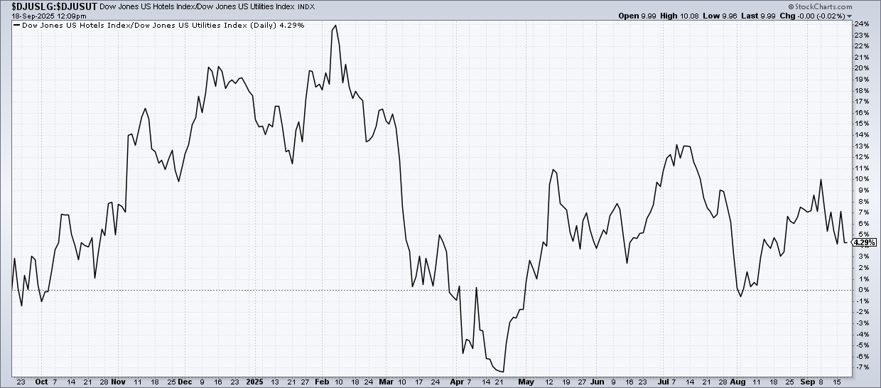
This compares the Dow Jones US Hotels Index ($DJUSLG) with the Dow Jones US Utilities Index ($DJUSUT). Industry-wise, it feels like apples vs. oranges, but sentiment-wise it clicks: splurging on vacations = risk-on, hiding out in utilities = risk-off.
The rationale: If people are going on vacations, hotel stays, and cruises, they’re probably not feeling jittery about the economy. Now, if they’re holding off on these leisure activities because of rising energy costs across the board, then people are not feeling adventurous, either with their leisure time or their money.
Caveat time: Hotels swing with oil prices and travel shocks, so treat them as one puzzle piece, not the whole picture.
Put it all together and what do you get? A quick pulse check on market confidence. But knowing the basics of how these ratios work is only half the game. Next up, let’s dig into some hacks to sharpen your edge.
Insider Takeaways: Level Up Your Ratio Game
Ratios in agreement: If one ratio is flashing “risk-on” while the others are moving in the same direction, that’s a strong sign of market conviction.
Overlay the S&P 500 behind the price: If you plot these ratios against the S&P 500, you might catch moments in which the ratios may be leading the market, tipping the market’s hand before it moves. In some cases, you may even find divergences, such as in the example below.
Zoom out to weekly charts: Weekly charts filter out the noise that’s often present in daily charts. A weekly chart will give you a bigger-picture perspective and allow you to see where longer-term sentiment is shifting.
And That’s a Wrap
Ratios won’t hand you a trade, but they’ll tell you if the climate is risk-on sunny or risk-off stormy. Treat them like a forecast: not perfect, but enough to suggest the right play before you enter the fray.


