StockCharts Insider: Tracking Active Manager Positioning with the NAAIM Exposure Index
Before We Dive In…
What if you could see how active money managers are actually positioned—not what they’re saying, but what they’re actually doing with real capital? At times, there can be a big gap between the two. There is a way to track that positioning. It may not capture every institutional investor, but it does reflect the real equity exposure of a defined group of active managers. And that insight alone might add some valuable context to your own trading or investing decisions.
It’s called the National Association of Active Investment Managers (NAAIM) Exposure Index. And today I’m going to explore this with you.
What is the NAAIM Exposure Index?
The NAAIM Exposure Index represents the average U.S. equity exposure reported by active investment managers who are members of NAAIM. How many member firms? Around 130. But the index reflects only those managers who respond to the weekly survey. Even NAAIM itself admits the sample is a small drop in the bucket of fund managers worldwide.
Still, it’s a useful snapshot of how tactical managers are positioned.
How is it Compiled and What Does it Reflect?
Each week, managers report their overall equity exposure after Wednesday’s market close. The data is compiled and the report is released on Thursday.
What the exposure levels reflect:
- 100% = fully invested long
- Above 100% = leveraged long
- 0% = market neutral (fully hedged or in cash)
- Negative values = net short
- Reported values have ranged from deeply net short (near –200%) to highly leveraged long (near +200%).
It’s often grouped with sentiment indicators, but this isn’t a “feelings” survey. It measures actual positioning decisions already made in client accounts.
However, the index is not a predictive indicator. Its main purpose is to provide insight into adjusted exposure. It’s context, not a trading trigger.
Where is it Bullish, Neutral, or Bearish?
First, the NAAIM represents a composite of different managers and trading/investing strategies. Some of them are placing short-term trades; others hold long-term positions. All of these differences are being crunched into a single, weekly data point. So, you have to carefully interpret positioning and what it might mean.
There are no hard rules here, but there may be a few ways to generally interpret what’s going on.
- Below 30 to 40 - Bearish Positioning Zone: You can assume that managers are defensive, and that risk appetite is low. Context matters, though. Is the market entering a bearish phase, or might this be late-stage fear before a bottom?
- Between 40 to 70 - Balanced Zone: There’s definitely participation, but it’s not aggressive. It’s a moderate range that can shift from lesser to more risk.
- Above 80 - Bullish Positioning Zone: Here, managers are heavily invested. The environment is risk-on, and participation has strengthened.
- Above 100? You’re likely looking at “leveraged long” positions. Confidence is extremely high, but might it be too high?
Let’s talk about extremes.
When Exposure Gets Extreme
Is the NAAIM Exposure Index a good contrarian indicator? It can be, but you have to be careful, as extremes don’t always indicate exhaustion. Let’s think through two scenarios.
When NAAIM Spikes Above 100
Managers are heavily invested. Possibly even leveraged. Confidence is high. That can mean that a powerful trend is underway, and that momentum is strong. You probably see lots of aggressive dip-buying.
But it can also mean that risk appetite is a bit stretched. It can signal that there’s less marginal buying power left. And in this scenario, vulnerability can increase if sentiment turns bearish.
Extremely high exposure doesn’t necessarily anticipate weakness. But if it coincides with extreme highs, it makes you wonder: if the big players and retail crowd are all-in, are there enough buyers left to push price higher?
When NAAIM Collapses Toward 20 or Lower
Now we’re looking at defensive positioning. Managers have reduced risk. Some may even have shorted the market. The macro conditions may give you a hint, so don’t ignore fundamentals.
But here’s the twist: if exposure, along with price, is already depressed, the market may be bottoming. When positioning is light at the bottom, it might not take much incremental buying to push markets higher. Again, it’s about gauging selling pressure within the larger context.
Buying the Dip?
Insider Tip #1: Dips below 60 and 40 present potential dip-buying opportunities in an uptrend.
This is not a systematic rule, but an observational one. In strong uptrends, a dip in the NAAIM Exposure Index below 60, and sometimes even below 40, doesn’t necessarily mean the bull run is over. Often, it simply reflects managers trimming exposure during a pullback. If the broader trend remains intact, those can indicate tactical dip-buying opportunities.
But here’s the catch: Everything depends on how you define the uptrend.
A 200-day SMA might flash warning signals if price temporarily dips below it. A Zig Zag indicator may ignore minor violations and preserve the larger swing structure. Other trend indicators might also flash different signals. You’re dealing with the same market, but different lenses.
Interpretation and context matter more than the raw number. It’s a highly interpretive process; more of an art than science. For example, take a look below.
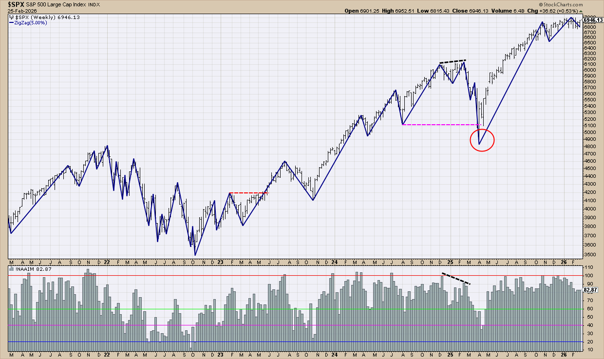
First, take a look at all of the readings above 100. These indicate strong bullishness, fully invested and possibly leveraged positions. But did they indicate “euphoria,” enough to signal a sizable reversal? Not really. In many cases, price kept climbing.
The more useful clue was the divergence (see black dotted line). When price pushed higher but exposure didn’t confirm, the warning preceded the deep correction that followed.
So what about those dips into the 60–40 zone—were they actually buyable? That depends on the trend. I’m using Zig Zag lines to mark major swing points. As long as price keeps making higher highs and higher lows, the uptrend is intact.
The June 2023 breakout (see red-dotted line) kicked off the primary uptrend. From there, most NAAIM dips below 60 and 40 lined up with solid buy-the-dip setups. The exception was March 2025. Price broke the prior swing low. The “structure” cracked. Although the uptrend eventually resumed, at that moment, the signal wasn’t clean.
Here’s What You Should Try
Experiment with the indicator. Test different trend gauges and study how exposure behaves during pullbacks and breakouts.
The twist is that the NAAIM index isn’t a timing tool. It’s a positional profile that can be used as a risk gauge. Ironically, when you treat it that way, while respecting the broader market context, your timing often improves anyway.
And That’s a Wrap
The NAAIM Exposure Index reveals how active managers are positioned. What matters is how exposure aligns, or diverges, from price structure. When positioning confirms the trend, momentum is likely to persist. When exposure doesn’t match the price structure, risk conditions may be shifting. When used as a positioning gauge rather than a timing trigger, NAAIM adds an important layer of context that keeps you on the smarter end of informed decision-making.


