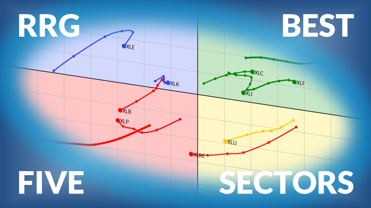
The Best Five Sectors This Week, #44
Key Takeaways
- Technology maintains its commanding lead in the sector ranking despite a 1.6% decline in the S&P 500.
- Healthcare emerges as the biggest gainer, jumping from sixth to fourth position.
- The top five presents an unusual mix – three offensive growth sectors paired with two defensive plays.
- Daily RRG shows technology on the right side while all other sectors cluster on the left, a rare and lopsided market structure.
Ranking Shifts and an Unusual Top Five
Last week's 1.6% decline in the S&P 500 triggered several notable shifts in the sector composition rankings. But the most striking observation remains the market's extreme tilt toward technology and the unusual defensive-offensive mix in the top five.
At Friday's close, technology held firm at the number one position. Consumer discretionary climbed from 3 to 2, pushing communication services down to 3rd. The biggest mover was healthcare, which jumped from sixth to fourth, the week's most significant gain. That move pushed utilities down from four to five and, as a result, industrials dropped out of the top five entirely, landing at position six.
Here's what makes this ranking particularly interesting. The market has been under some pressure, yet the top three sectors — technology, consumer discretionary, and communication services — are all growth-oriented, offensive sectors. Then, at positions four and five, we have healthcare and utilities, both considered defensive sectors. But the third defensive sector, consumer staples, sits at the bottom. It's a pretty rare mix for the top five in the sector ranking.
- (1) Technology - (XLK)
- (3) Consumer Discretionary - (XLY)*
- (2) Communication Services - (XLC)*
- (6) Healthcare - (XLV)*
- (4) Utilities - (XLU)*
- (5) Industrials - (XLI)*
- (7) Energy - (XLE)
- (8) Financials - (XLF)
- (9) Real-Estate - (XLRE)
- (10) Materials - (XLB)
- (11) Consumer Staples - (XLP)
Weekly RRG
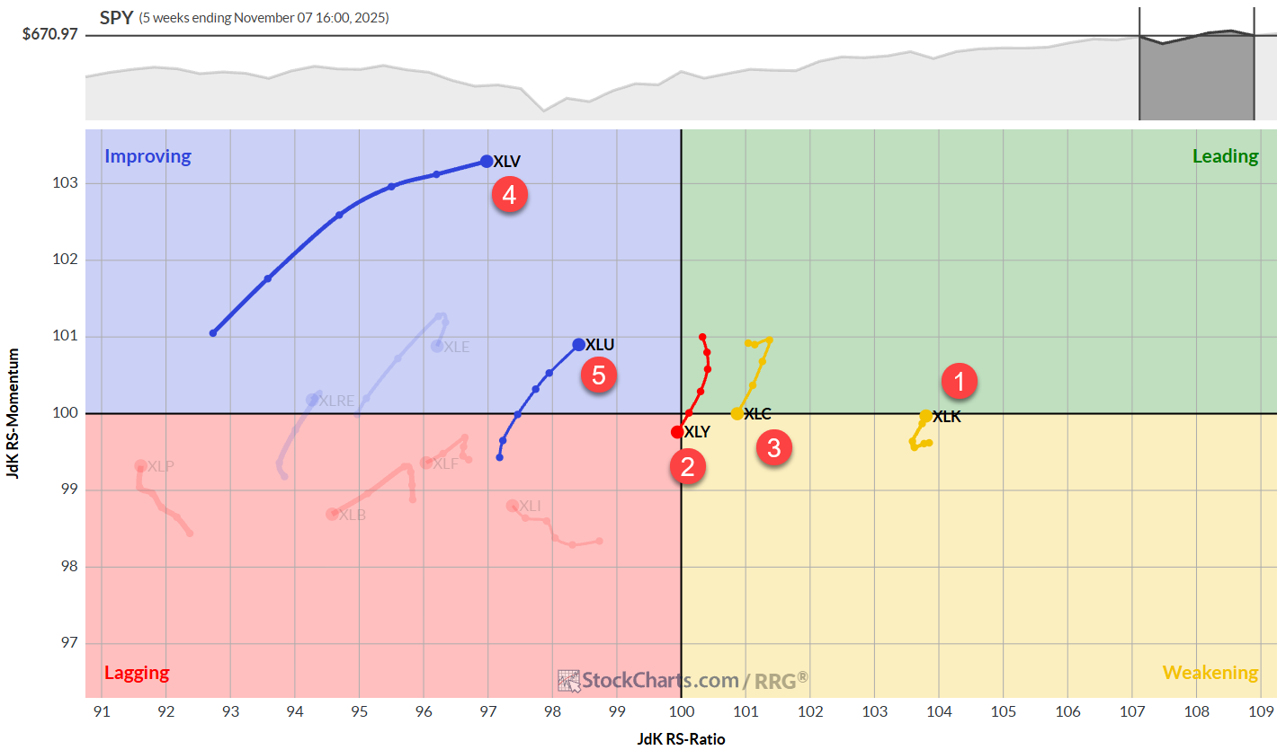
One thing remains crystal clear: technology is the leading sector. No portfolio manager can afford not to be invested in technology right now.
In the weekly RRG, technology sits all the way to the right inside, weakening and is poised to cross back into the leading quadrant. Consumer discretionary is moving into the lagging quadrant after a brief rotation through the leading quadrant. Communication services have dropped into the weakening quadrant and are also traveling at a negative heading. At positions four and five, healthcare and utilities are both traveling through the improving quadrant at a positive heading and honing in on the leading quadrant.
Daily RRG
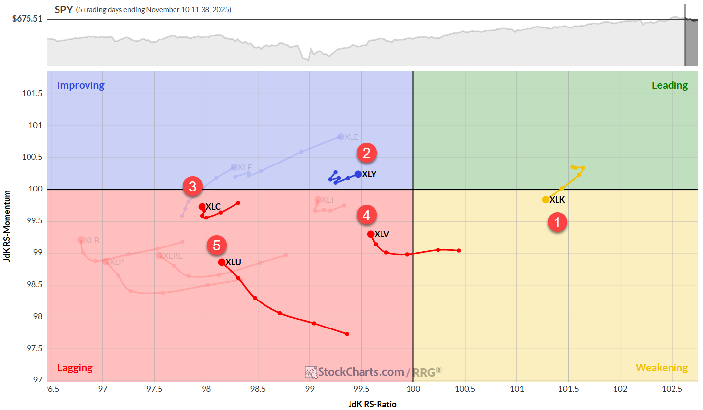
The daily RRG continues to show technology way on the right-hand side at the highest RS ratio reading. As a matter of fact, it is the highest ranking on the daily chart because all the other sectors are on the left-hand side. That's a pretty rare sight, and it shows you how lopsided this market is toward the technology sector.
Consumer discretionary is improving on the daily chart, moving towards the leading quadrant at a positive heading. Communication services has hooked back up while inside the lagging quadrant. The same goes for healthcare, also inside the lagging quadrant but starting to move higher. Utilities are gradually moving higher, but still losing on the RS ratio scale.
The combination of those weekly and daily tails makes for the top five sectors. And as you can see, a lot of them are still on the left-hand side or inside the lagging quadrant. The problem is that the other sectors, which are dimmed and not in the top five, are showing worse positioning on the RRG and even worse rotations.
Technology
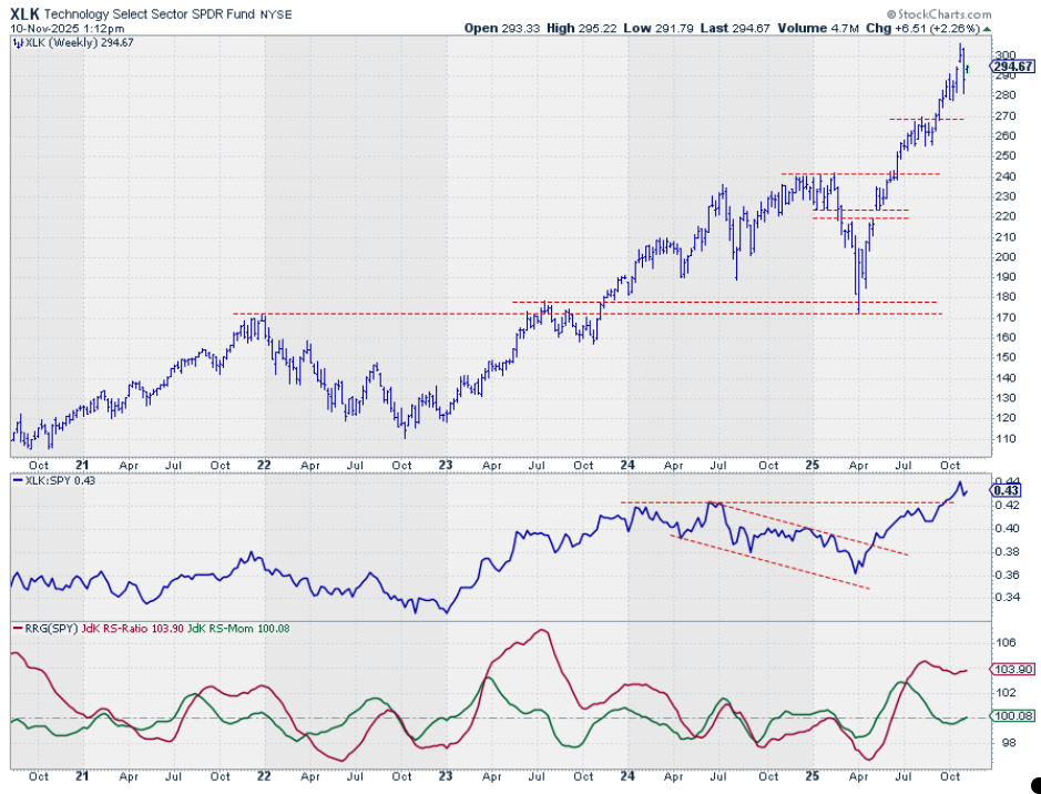
The technology sector remains in a very solid uptrend both in price and relative strength terms. The RRG lines have turned around, and they are now both rising again, putting the technology sector almost back into the leading quadrant.
Consumer Discretionary
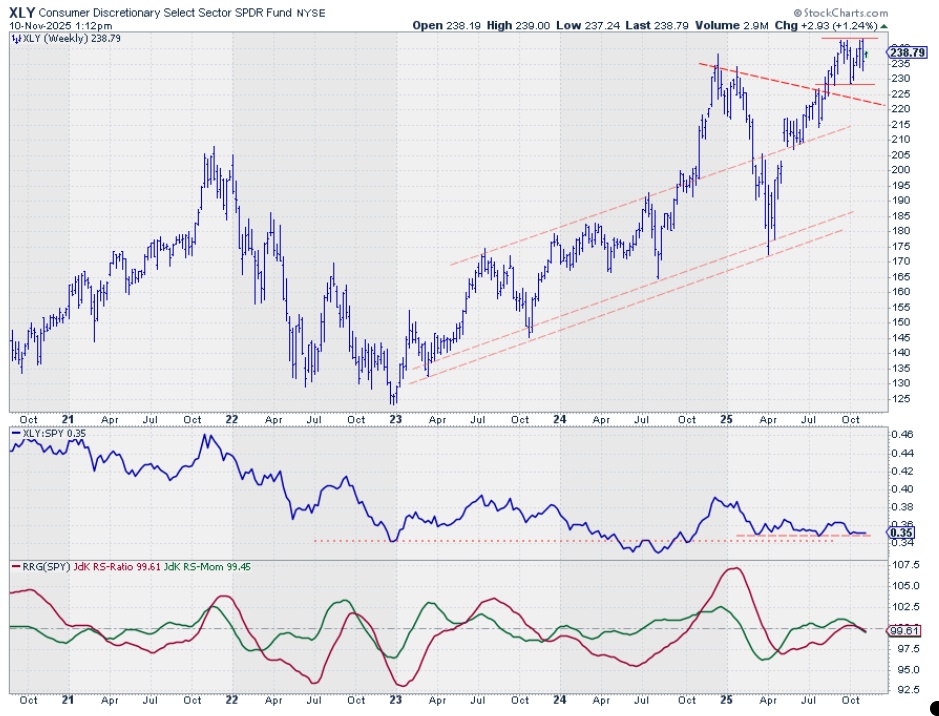
The second-ranking sector is still trapped in a trading range and has fallen back from a test of its overhead resistance. All in all, the uptrend remains intact, and a break above the previous highs would unlock further upside for consumer discretionary.
The fact that the relative strength line is holding up well at its support level is supportive. The problem is with both RRG lines, which are now almost on top of each other and moving lower, dragging the consumer discretionary sector into the lagging quadrant.
It would only be if the raw RS line can hold above its support level and turn the RRG lines back up that the outlook for the consumer discretionary sector could improve.
Communication Services
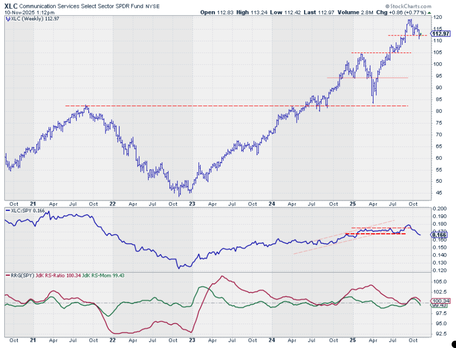
This sector, after setting a new peak a couple of weeks ago, now looks to be starting a new series of lower highs and lower lows. The raw RS line is deteriorating rapidly, and this is reflected in both RRG lines, which are now pointing lower.
XLC is holding just above its previous low around 113.
Healthcare
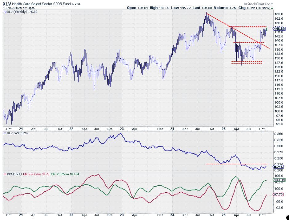
XLV is very close to testing its overhead resistance. When that breaks, that would be a very positive sign for the healthcare sector. That would also help the raw relative strength line, which seems to be putting in a lower low in terms of relative strength, while the RRG lines are picking up a lot of momentum.
When that momentum holds, it will eventually push the healthcare sector into the leading quadrant and make it one of the leading sectors.
Utilities
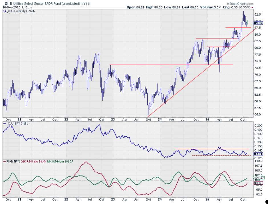
Utilities is now back in the top five after coming off its highs, but it's holding above support around 87.5 dollars. It's also keeping its upward trend, while raw relative strength is caught in a trading range but coming off the lows. That is causing both RRG lines to move higher, putting the utility sector inside the improving quadrant, traveling towards leading.
Portfolio Update
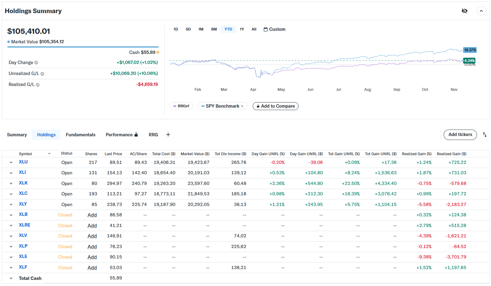
The gap between the portfolio performance and the S&P 500 continues to widen.
I previously addressed the main reason for this, the equal-weight approach in the portfolio vs the cap-weighted allocation in the benchmark (SPY). As promised, I have embarked on a journey to reconcile the rankings in the 43 articles that have been published so far. I then began working on a weighting scheme that would reflect the relative importance of the benchmark's sectors. This has led to a pretty big spreadsheet full of numbers, on which I plan to make a video explaining the approach.
As a teaser, I have added the performance graph based on the new weighting scheme below.
What a Difference a Weight Makes
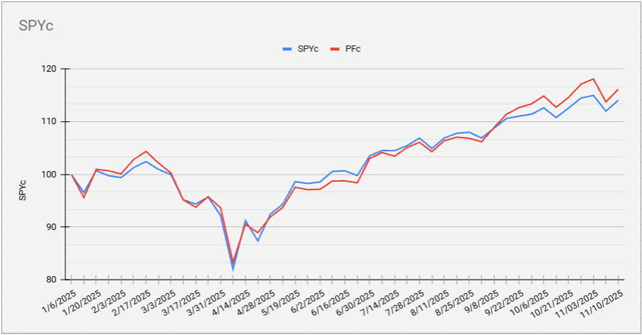
The blue line shows SPY's performance, and the red line shows the portfolio's performance under a cap-weighted allocation. This approach is now showing a 2% outperformance since starting this experiment.
#StayAlert, -Julius