Three Stocks That Could Benefit Most from Tariff Relief — If the Charts Agree

Despite the ongoing threat of tariffs in 2025, and with plenty of speculation that tariffs would weigh heavily on risk assets, the equity markets have remained quite resilient into Q4. Companies in certain sectors, such as Consumer Discretionary and Industrials, have remained in focus as they struggle to navigate through tariff announcements and potentially dramatic implications for their business models.
A Wall Street bank recently published a list of 10 stocks that were assumed to be directly affected by tariffs, having underperformed the S&P 500 soon after the initial announcement. These companies also saw their earnings estimates downgraded, implying that Wall Street analysts were anticipating further negative impact due to tariff pressures.
Now that we’re hearing discussion of tariffs potentially being unwound, it would make sense that these types of stocks could do quite well once this dark cloud of tariffs is lifted. With the removal of a huge barrier to growth and success, there could be plenty of upside potential. At the end of the day, however, I’m more interested in confirming a strong technical configuration to complement this potentially bullish macro driver.
I’ve always felt that research such as this needs to include much more meaningful charts to truly tell the story of the impact and outlook for these particular companies. So here are three of the stocks featured in the report, along with the charts that I feel could help investors understand a more complete picture of where these stocks may be headed.
Best Buy Co, Inc (BBY)
Out of all the charts featured on this list of tariff relief names, Best Buy is perhaps in the most constructive technical configuration. BBY has been pounding out a consistent pattern of higher highs and higher lows, and has recently pulled back to moving average support.
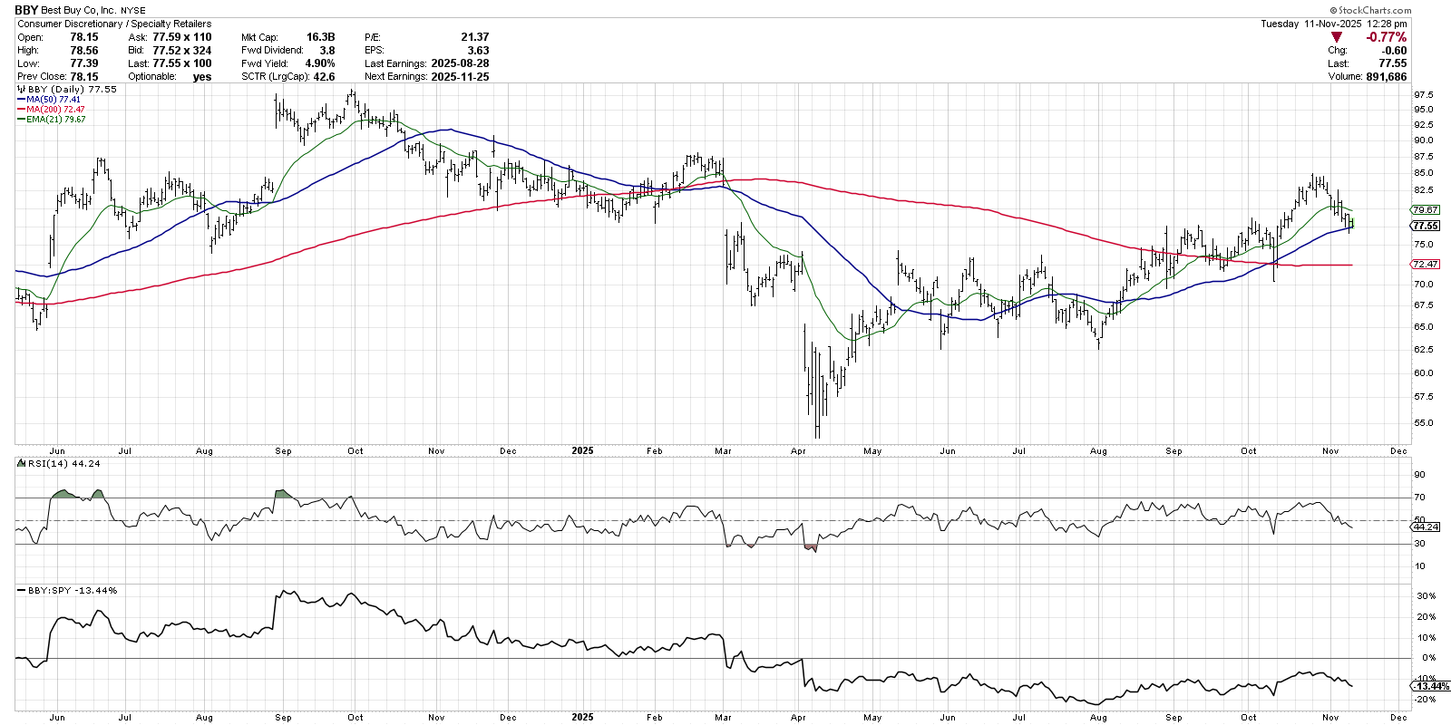
What strikes me most about this chart is the RSI, which has remained consistently in a bullish range since early May. As the price has been trending higher over time, the RSI has remained above the 40 level on any pullbacks. In the last two weeks, BBY has once again pulled back to an upward-sloping 50-day moving average as the RSI is approaching the 40 level.
While this could be another “buy the dips” opportunity for a stock in a consistent uptrend, I’m always watching the RSI to see if it’s able to remain above the crucial 40 level. If BBY fails to hold the 50-day moving average and the RSI pushes below 40, that could signal the end of this bullish trend phase.
Stanley Black & Decker Inc (SWK)
SWK is a great chart to review next, because it looked very much like BBY as it tested its own 50-day moving average in late September. Stanley Black & Decker did not hold its 50-day, unfortunately, and is now languishing below moving average resistance.
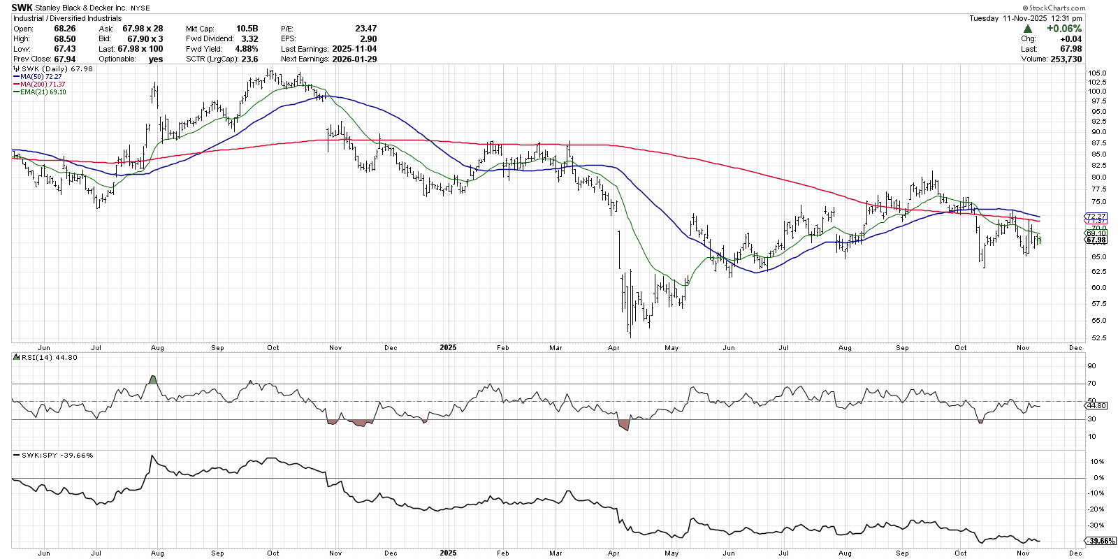
After plunging below the 50-day and 200-day moving averages in early October, SWK actually rallied back to test these moving averages from below. We can see that the RSI has remained below 50 since that breakdown of support. Quite simply, I’m looking for a break back above the 200-day moving average on improving price momentum. Only then would this broken chart validate the bullish case from tariff relief.
Nike Inc. (NKE)
The chart of Nike also seems to provide a perfect case study for using moving averages to confirm the trend. Over the summer, NKE retested its February 2025 high before breaking down below the 50-day and 200-day moving averages.
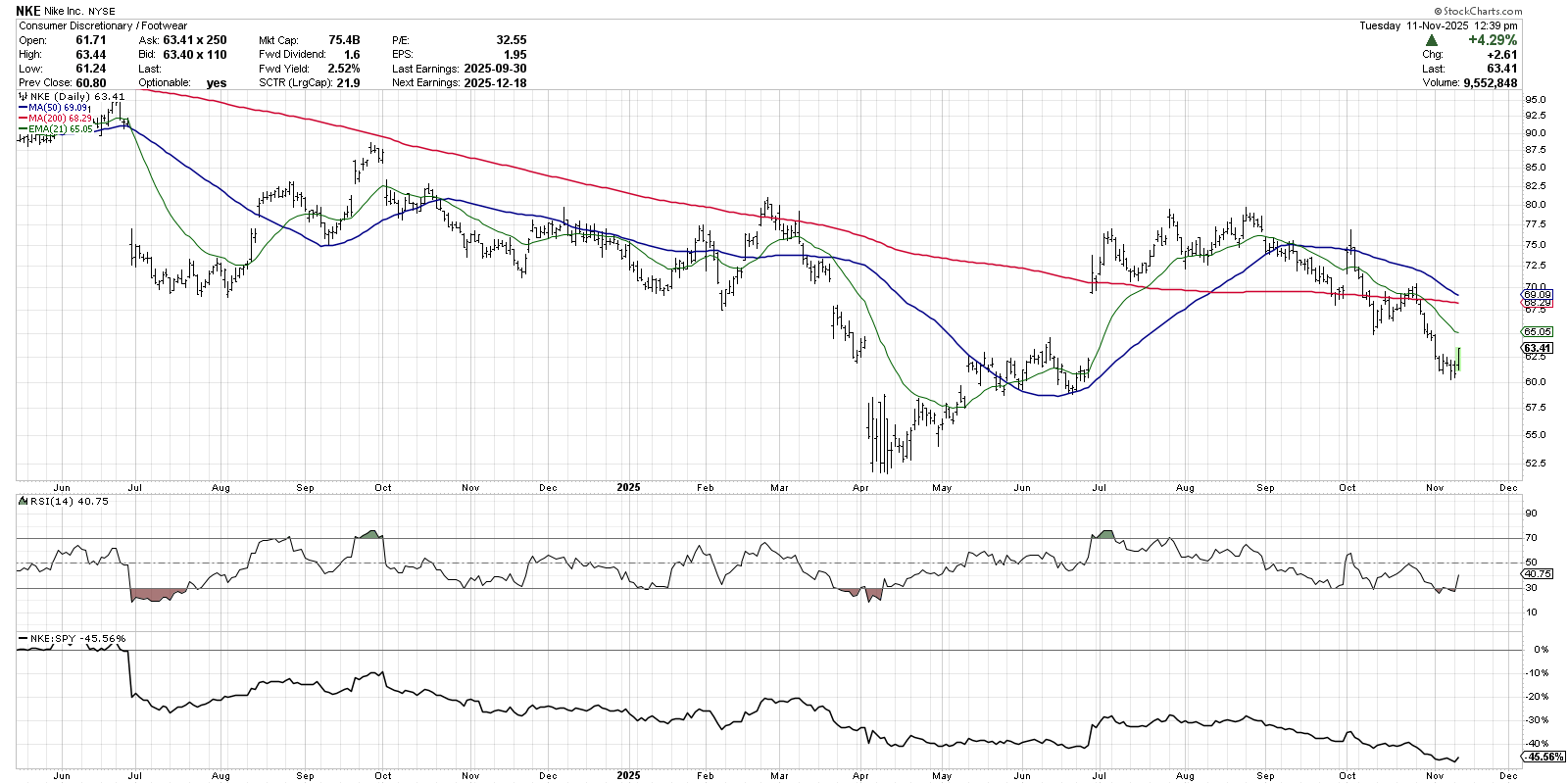
Nike bounced off the 200-day in late September, bouncing higher before flashing a bearish “shooting star” candle at the 50-day moving average. NKE then broke below the 200-day moving average in early October before rallying back and failing to eclipse the 200-day in late October.
Here we have a classic downtrend phase, with the price making a clear pattern of lower highs and lower lows. Only a higher low in price, combined with the RSI pushing back above the 50 level, would indicate an end to this distribution phase for this leading retail powerhouse.
To analyze these charts, I first created a new ChartList and then imported the list of tickers. I was then able to use the Summary report, Performance report, RRG graphs, and ChartList View to break down the list of charts and identify the best opportunities.
Want to learn more about how to use the StockCharts platform to analyze your own list of tickers? Check out my latest video on StockCharts TV!
RR#6,
Dave
P.S. Ready to upgrade your investment process? Check out my free behavioral investing course!
David Keller, CMT
President and Chief Strategist
Sierra Alpha Research
marketmisbehavior.com
Disclaimer: This blog is for educational purposes only and should not be construed as financial advice. The ideas and strategies should never be used without first assessing your own personal and financial situation, or without consulting a financial professional.
The author does not have a position in mentioned securities at the time of publication. Any opinions expressed herein are solely those of the author and do not in any way represent the views or opinions of any other person or entity.


