Time for an Easter Rally?

As expected, the market has pulled back in response to the spike in oil prices and the broader uncertainties emerging from the Middle East. What is more surprising is that the decline has not been deeper. Investors had every reason to lock in their strong 2025 gains and push prices lower, particularly given that several past energy shocks have ended in recession. Even so, many of the short‑term indicators I monitor have now reached the oversold extremes that have historically preceded a constructive two‑to-six‑week rebound.
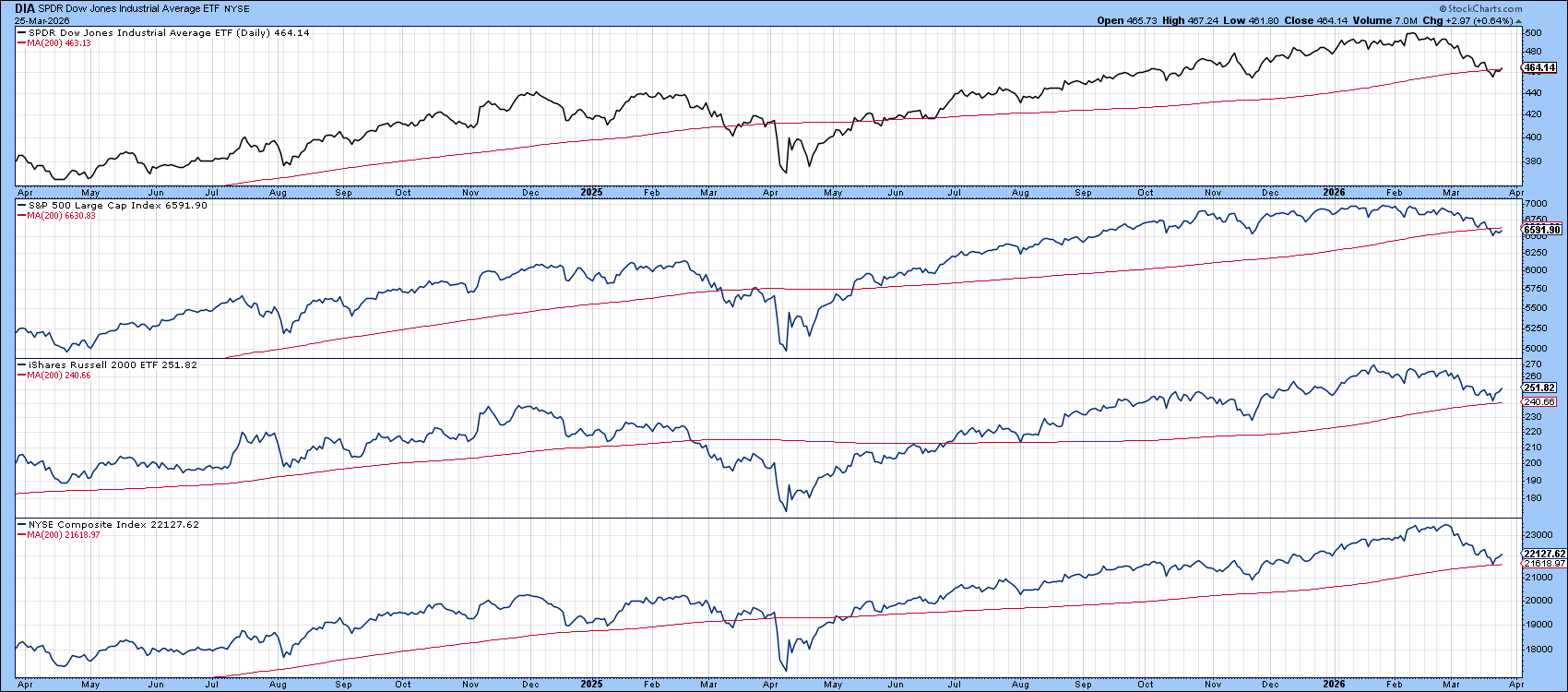
Chart 1 helps frame the situation, showing several major averages oscillating around their 200‑day MAs. The Russell 2000 and NYSE Composite have already bounced from this key benchmark, while the S&P, Dow Industrials, and NASDAQ Composite (not shown) are attempting to avoid a decisive downside violation. It is worth noting that the last time all these indexes slipped below their 200‑day MAs, back in March 2025, it marked the beginning of a more accelerated decline.
Two Sensitive Indicators Have Already Turned
Chart 2 highlights the McClellan Volume Oscillator for the NYSE. Because the raw series is quite jagged, the chart displays a 10‑day MA in black to clarify the underlying swings. Using the benefit of hindsight, the solid vertical lines mark occasions when the oscillator reached the dashed green oversold zone and then turned higher, moves that have typically been followed by rallies lasting at least two to three weeks, and in many cases considerably longer. Acknowledging that no indicator is flawless, the dashed lines identify the false positives.
The oscillator has now spent roughly a week below its oversold threshold. With the series already edging tentatively above its red 20‑day MA, the probability is high that it’s preparing to signal the onset of a new rally phase.
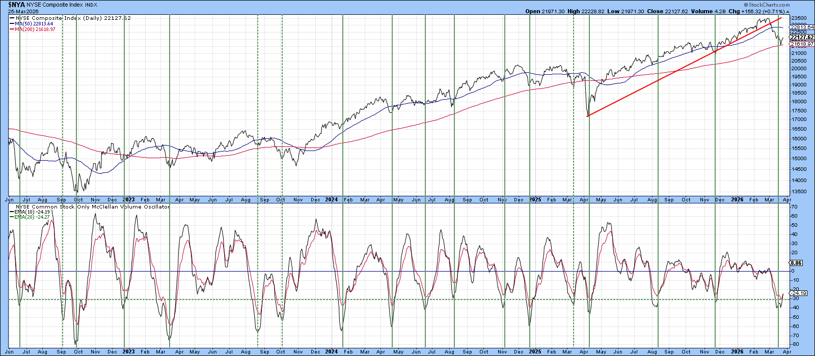
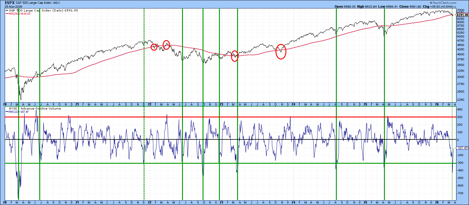
Chart 3 compares the S&P Composite with a 12‑day moving average of Advance‑Decline Volume, extending the perspective back to 2020. The chart reinforces the importance of the 200‑day MA for the S&P Composite (SPY). While there are occasional false crossovers (highlighted by the ellipses), the average has generally proven to be a level that deserves respect.
As noted earlier, the SPY is currently attempting to hold above this benchmark, and the A/D Volume series offers some encouragement. It recently fell decisively below its green oversold line and has since rebounded sharply above it. The vertical lines mark previous oversold reversals since 2020, all but one of which—that exception being late 2021—were followed by meaningful rallies.
NYSE Stocks Above 50-day Average
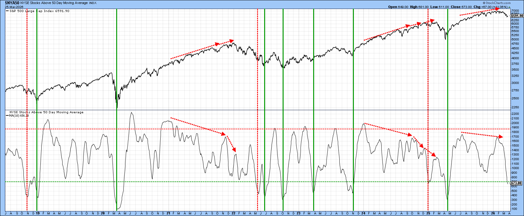
One of my preferred indicators is the percentage of NYSE issues trading above their 50‑day MA. As with the previous charts, the vertical lines mark occasions when the series reversed to the upside after dipping below the green dashed oversold zone. Because this indicator is plotted as a 10‑day MA of the underlying data, it turns more slowly, but also more deliberately, than the oscillators in Charts 2 and 3. As a result, it remains below the oversold threshold and continues to drift lower. It has therefore not yet generated a buy signal. Even so, if the reversals suggested by the oscillators in Charts 2 and 3 prove valid, the 50‑day series should eventually follow suit.
It is also worth noting that the major tops in 2022 and 2025 were preceded by a series of negative divergences, highlighted by the dashed red arrows. The most recent peak was accompanied by a similar discrepancy, but it was far less complex than the earlier patterns. That relative simplicity suggests that the current Iran War‑related correction is likely to be more contained than its two predecessors and that a new bull market high could be in the cards.
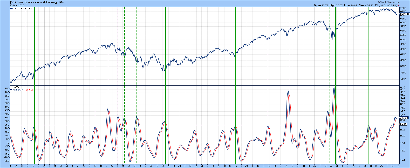
What Is the VIX Saying?
Chart 5 presents a daily KST of the VIX. Buy and sell signals occur when investor fear becomes intense enough for the indicator to reach or exceed the overstretched dashed horizontal line and then roll over. This method tends to work well in a bull market, but the dashed lines in 2022 remind us that false positives are a hallmark of a primary bear phase.
At the moment, the KST appears to be topping, but it has not yet reversed decisively enough to confirm that a peak is in place. Like the indicator in the previous chart, it remains a work in progress.
Bottom Line
Several reasonably reliable short‑term indicators have now flashed buy signals at a moment when the major averages are struggling to hold above their 200‑day MAs. A couple of additional oscillators have also reached their respective buying zones, and they will likely need a few more days before they can reverse and align with their more optimistic counterparts. If those signals do materialize and the market nevertheless fails to rally, that would represent one of the classic characteristics of a primary bear market.
Good luck and good charting,
Martin J. Pring
The views expressed in this article are those of the author and do not necessarily reflect the position or opinion of Pring Turner Capital Group of Walnut Creek or its affiliates. The Six Stages of the Business Cycle are followed each month in Martin Pring’s Intermarket Review.


