What Soaring Precious Metals Say About Inflation — And What They Don’t
Key Takeaways
- Record highs in gold and silver grab headlines, but inflation signals remain mixed.
- Bond market ratios and wage data suggest price pressures aren’t accelerating just yet.
- Jobs trends and technical Treasury yield moves may ultimately first determine whether real inflation reawakens.
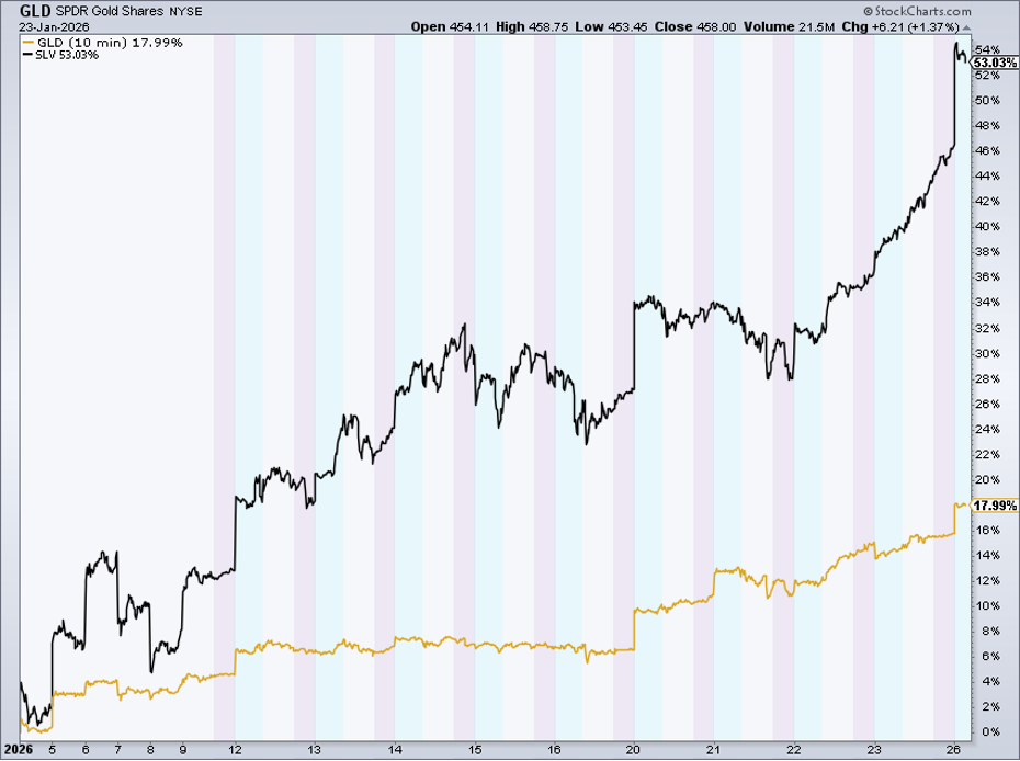
It’s Fed Week on Wall Street, the first of 2026. The FOMC meets as precious metals soar to record highs and global portfolio managers are as bullish as ever. On Monday, gold tagged $5,100 and silver scaled $110. Moves like that naturally lead some to believe that the inflation boogeyman will soon rear its ugly head.
But while it’s true that commodities are in full-blown rally mode, basic resources are not the true driver of higher consumer prices. Labor costs and shelter are what really matter, and both of those impactful macro variables are cooling their heels as official government data and private-sector gauges point to declining wage growth. What’s more, CPI shelter measures are notoriously lagged, likely overstating U.S. inflation. Just last weekend, Goldman Sachs noted that core PCE inflation net of tariffs is already close to 2%.
Inflation: Where It’s Seen and Where It Isn’t
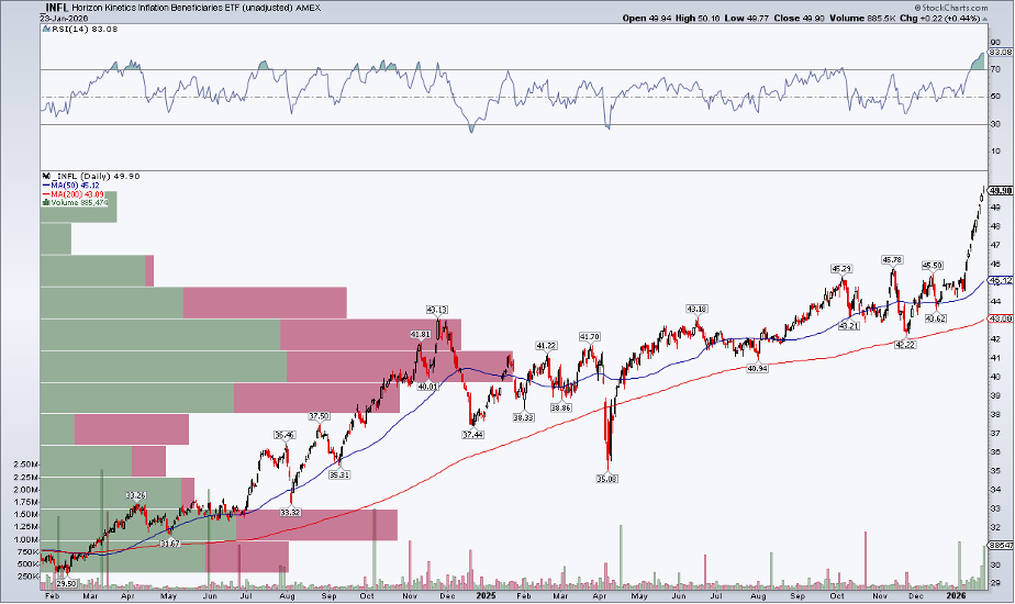
So why does all this matter for technicians and chart watchers? Getting the macro story right makes intermarket analysis more effective. On that note, one niche ETF caught my attention over the weekend: the Horizon Kinetics Inflation Beneficiaries Fund (INFL). Based on the name alone, you might assume this is pure play on inflation expectations, but that’s far from the case.
With roughly 36% allocated to global Energy stocks and 27% to Materials, INFL is really a resource-heavy ETF. And, to be clear, it’s been up all but one session so far this year and, with a clean breakout, is a powerhouse momentum idea. Once again, though, it’s easy to conflate bull markets in commodities with imminent inflation.
Here’s the Better Barometer—And It’s Technical
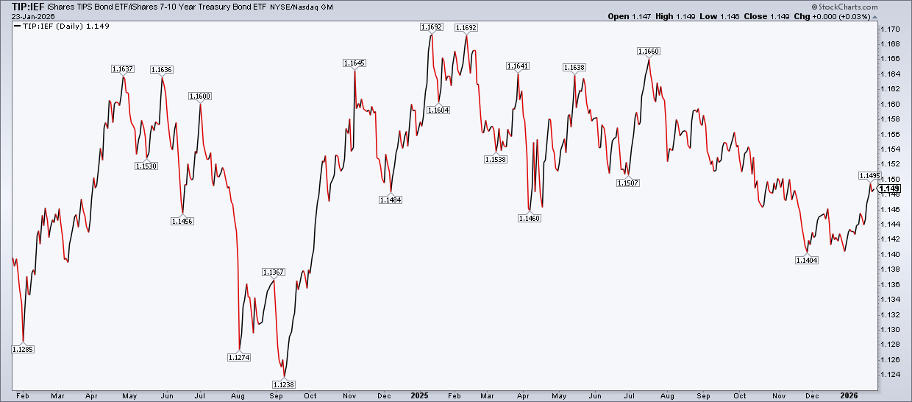
To better assess the inflationary backdrop, we can harness StockCharts’ ratio charts. I prefer to simply compare the iShares TIPS Bond ETF (TIP) to the iShares 7–10 Year Treasury Bond ETF (IEF). It’s your basic market-based inflation expectations gauge.
This was a snappy chart to post to social media in 2021 and 2022, when inflation was truly boiling over. These days? Not so much. Why not? Well, TIP:IEF has been sideways for the better part of the last four years. It peaked most recently just about 12 months ago, when similarly bullish vibes permeated global trading desks. Yes, there has been an uptick since the start of 2026, but the rally is by no means a technical breakout. So inflation is benign right now, the affordability crisis and skyrocketing precious metals prices notwithstanding.
What could disrupt that narrative and test the new Fed chair (whoever that may be)? The jobs situation.
Wage Growth, Other Labor Market Data Points Matter
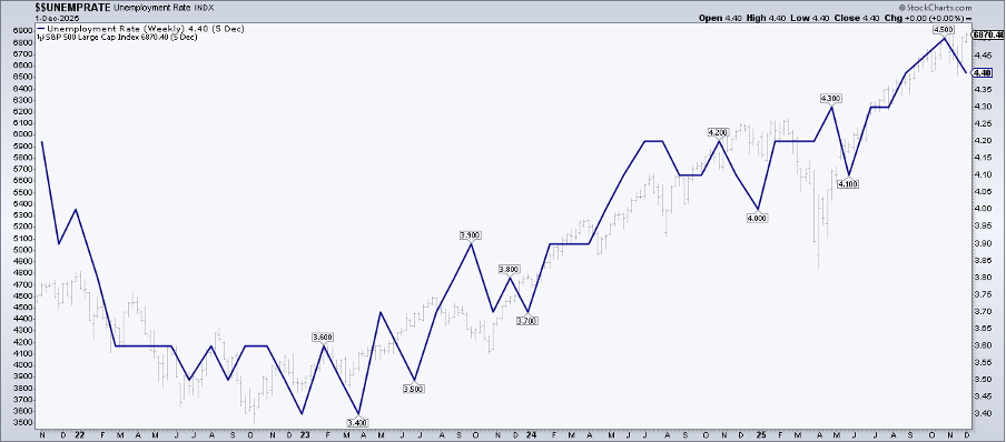
Last year, I highlighted how the unemployment rate and the S&P 500 had tracked in lockstep since the bear-market bottom in late 2022. That relationship could be cracking. The December nonfarm payrolls report revealed that the jobless rate dipped 0.16 percentage points to 4.375%. Wage growth also came in a tad hot, rising to a 3.8% year-over-year rate.
Still reeling from data irregularities stemming from the October–November government shutdown (and amid ongoing low survey response rates), economists weigh alternative wage data sources, which are broadly benign. Maybe the most respected view of labor costs is the Atlanta Fed’s Wage Growth Tracker, which is now at its lowest level since the middle of 2021. But if a trend develops in which unemployment falls and average hourly earnings tick up, then we could have a real inflationary scare (perhaps a “reflationary” scare is more apropos).
10-Year Yield: Former Resistance Becomes New Support? We’ll Know Very Soon.
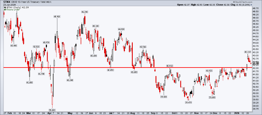
How does all this show up in price action and intermarket trends? Keep an eye on the bond market and its infamous vigilantes. Here, we are back to the scene of the crime, as we technicians are wont to say. The 4.20% mark was key resistance from September 2025 through the first half of this month.
A clean breakout amid the USA-for-Greenland chatter and Japan’s rate melt-up last Tuesday suggested a new sustained uptrend. That didn’t happen. The benchmark yield said hello to 4.31%, but then came back down to just about fill the January 20 gap.
If yields fail to hold 4.20%, it would suggest a false breakdown, underscoring that inflation was the previous cycle’s fear factor. A jump through 4.31%, though, would change the macro chessboard.
The Fed may have to contend with hiking interest rates rather than cutting them. And that opens a whole other can of economic worms, with President Trump resolute in seeing short-term rates slashed ahead of the midterm elections. Fasten your seatbelts and grab your political popcorn in the latter scenario.
Know the Charts. Apply the Charts.
Rather than guessing and playing 4-D chess, simply monitor the provided charts. Bookmark them. Revisit them each weekend (weekly charts are most important, of course).
The Bottom Line
It’s the Burl Ives market. Silver and gold are up 53% and 18% YTD, respectively. Commodities writ large are indeed moving the chains. Intuitively, it seems that inflation is a clear and present danger.
There’s more to consumer price trends, however — namely, wage growth trends and real-time shelter costs, as both are moderating and not accelerating. The Fed will likely be on hold this week and, no matter what word salad they conjure up, price action and chart breakouts and breakdowns are your best friends.
Disclaimer: This blog is for educational purposes only and should not be construed as financial advice. The ideas and strategies should never be used without first assessing your own personal and financial situation, or without consulting a financial professional.


