When Headlines Drive the Stock Market, Let Charts Lead the Way

Key Takeaways
- Create a list of charts to help provide a clearer, more objective view of the stock market.
- Stock market conditions are weakening, so stay cautious.
- A simple pre-market ChartList can help you stay focused and spot when conditions improve.
Let’s face it: the stock market is moving to the beat of the latest headline.
In times like these, it can feel almost impossible to make confident investment decisions. One moment, you’re thinking it’s time to reduce your equity exposure; the next, prices reverse and leave you second-guessing everything. That kind of back-and-forth can lead to what many of us know too well: analysis paralysis.
Instead of letting the headlines influence your decisions, it may be time to step back and let the charts tell you what’s going on.
Thursday’s price action is a great example of this tug-of-war. The S&P 500 ($SPX) started the day by breaking well below its 200-day Simple Moving Average (SMA). By the close, though, the index recovered and finished near the highs of the day, just slightly below the 200-day SMA. When the stock market sends these confusing signals, having a simple routine will help you remain calm and focused.
Pre-Market ChartList
This is a great time to take a step back and build a ChartList you can review before the market opens. It functions like a personal dashboard for navigating this uncertain environment. I’ve created a ChartList using many of the charts from the Market Summary page so that, within just a few minutes, I can get a clearer picture of what’s going on beneath the headlines.
Let me walk you through the charts I’m watching now.
Start With Sentiment: VIX and VVIX
When geopolitical tensions rise, I start by looking at the Cboe Volatility Index ($VIX) and the Volatility of VIX ($VVIX).
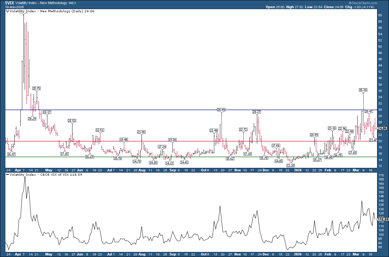
These indicators measure investor fear. Both are slightly elevated, but aren’t at extreme levels. Aside from a spike early this March, the last time the VIX indicated extreme fear was last April, when the S&P 500 last broke below its 200-day SMA.
S&P 500 and the 200-day SMA
Next, I'll look at the daily chart of the S&P 500 ($SPX).
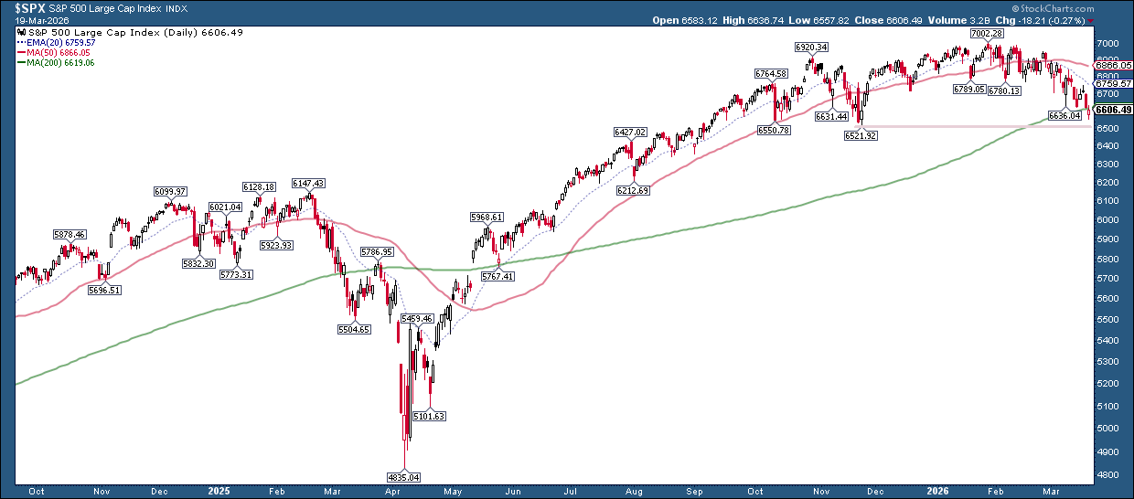
The index closed slightly below its 200-day SMA and is trending to the downside. Compare this with April 2025, which is when the VIX spiked. At that time, the S&P 500 dipped below its 200-day SMA in March, bounced back to the SMA, and then fell sharply.
This time, we’re seeing a rounding top forming since late 2025, with prices gradually grinding lower. Will the index be able to hang on to the support of its 200-day SMA, or will it drift down toward the next support level near the November low?
Although the S&P 500 is in a downtrend, on Thursday, it closed near the high of the day. Are there any signs of buyers coming in, or is the bias still bearish?
Look Beneath the Surface: Market Breadth
Market breadth indicators give you an idea of how much participation is behind a price move.
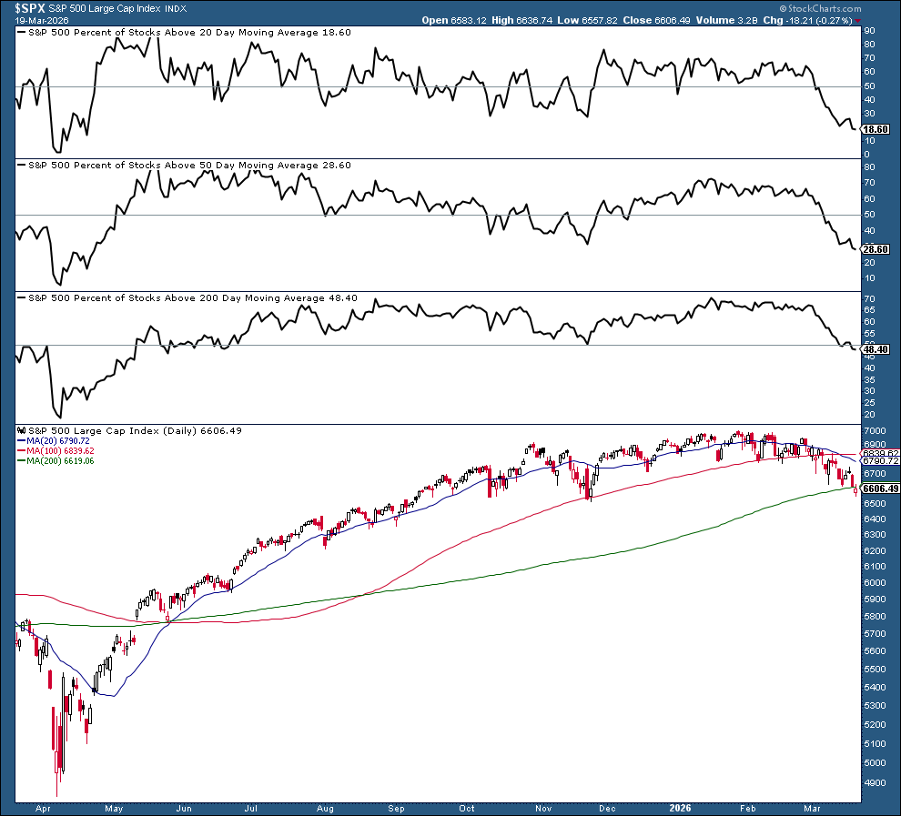
Right now, the percentage of S&P 500 stocks trading above their 20-, 50-, and 200-day moving averages is below 50%. That’s a sign of weakening breadth. For a healthier market, you’d want to see at least half the stocks trading above their 200-day MA.
Advancers vs. Decliners
Another quick check is to see how many stocks are rising versus falling. For that, I turn to the advancers vs. decliners market indicators.
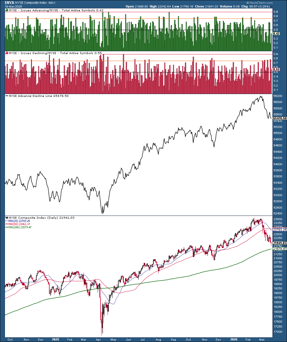
The decliners are outnumbering advancers, and the Advance-Decline line is trending lower. Both confirm what we saw in the breadth data, which is that the market’s breadth is weakening.
The McClellan Summation Index
For a broader view of the market, I like to include the NYSE McClellan Summation Index in my ChartList.
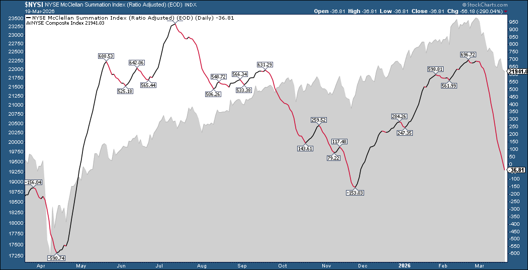
The indicator has dropped sharply since early March. It reached -36.81 after Thursday’s close. A break below -153.03, the November low, could mean further downside ahead.
Interest Rates Matter
Finally, I keep an eye on interest rates using the 10-Year Treasury Yield Index ($TNX).
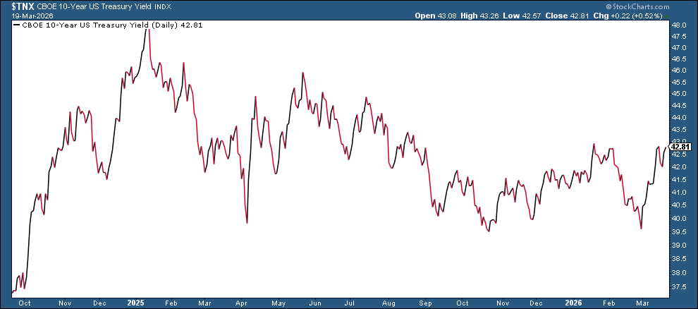
With ongoing geopolitical tensions and inflation still in the picture, rates may stay higher for longer, a point Fed Chair Jerome Powell reinforced on Wednesday.
Putting It All Together
The stock market isn’t in panic mode, but it is under pressure. And that can be more difficult to analyze than a sharp, panic-driven selloff.
If the VIX starts to spike, the S&P 500 struggles to stay above its 200-day SMA, market breadth continues to weaken, and if interest rates remain elevated, conditions could deteriorate further. On the other hand, the market may continue its slow grind lower.
When uncertainty is high, it helps to have a process. Building a ChartList with the charts like the ones above can help you stay focused and spot early signs of strength or further weakness.
If you’re not sure where to start, try adding the charts from this article to a new ChartList. Then customize them with charts you prefer to follow.
Disclaimer: This blog is for educational purposes only and should not be construed as financial advice. The ideas and strategies should never be used without first assessing your own personal and financial situation, or without consulting a financial professional.