MEMBERS ONLY
Roundup of Pair Trade Ideas from Sector Spotlight
by Julius de Kempenaer,
Senior Technical Analyst, StockCharts.com
Since November, I've had a recurring segment in each episode of Sector Spotlight on Pair Trading Ideas. Every show, I try to come up with a pair trade idea using Relative Rotation Graphs on various universes and on various timeframes.
These ideas were, and still are, practical examples...
READ MORE
MEMBERS ONLY
Two Changes to the Asset Allocation RRG Universe
by Julius de Kempenaer,
Senior Technical Analyst, StockCharts.com
People who follow the RRG Charts blog and my other articles in the ChartWatchers newsletter, as well as this Don't Ignore This Chart blog, will know that I like a top-down, structured approach to markets. The starting point for this approach is always the Asset Allocation universe, which...
READ MORE
MEMBERS ONLY
Sector Spotlight: (Re-)structuring the Asset Allocation Process
by Julius de Kempenaer,
Senior Technical Analyst, StockCharts.com
In this edition of StockCharts TV'sSector Spotlight, I cover a few questions that came in via the mailbag and used one of the questions to (re-)structure my asset allocation approach and visualize the investment pyramid.
This video was originally recorded on February 18th, 2020. Click anywhere on...
READ MORE
MEMBERS ONLY
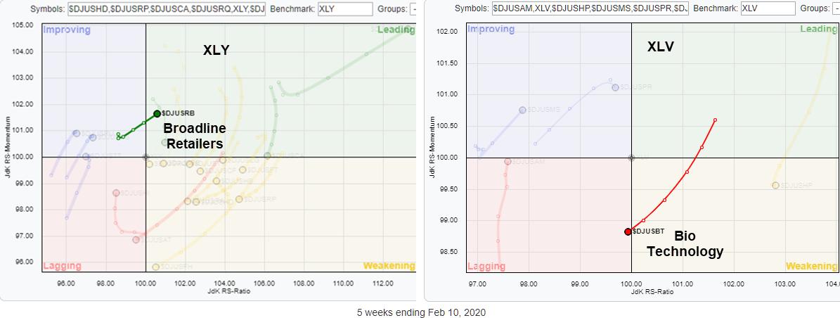
Picking Industries from Sectors with RRG
by Julius de Kempenaer,
Senior Technical Analyst, StockCharts.com
Two weeks ago, I wrote a ChartWatchers article titled "RRG Suggests Aggressive Trade Setup for XLY vs. XLV." In this article, I want to show you how you can take that idea one step further and, at the same time, answer a question on how you can easily...
READ MORE
MEMBERS ONLY
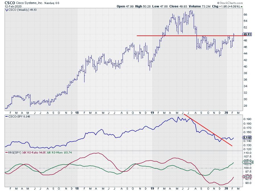
Opposite Rotations Suggest an Outperformance for CSCO over WMT in Coming Weeks
by Julius de Kempenaer,
Senior Technical Analyst, StockCharts.com
CSCO peaked in the first half of 2019. The first time at $ 56.30 in April and then again in July at $ 57.40. A typical failure to convincingly break above a previous high. From July onward CSCO moved lower to a low around $ 43 at the start of December....
READ MORE
MEMBERS ONLY
Sector Spotlight: Adding an Extra Benchmark to Your RRG
by Julius de Kempenaer,
Senior Technical Analyst, StockCharts.com
In this edition of StockCharts TV'sSector Spotlight, I discuss the current rotations for US sectors, then explain how to add a second(ary) benchmark to the RRG chart as a way of getting a more detailed analysis.
This video was originally recorded on February 11th, 2020. Click anywhere...
READ MORE
MEMBERS ONLY
RRG + Seasonality is a Very Powerful Combination!
by Julius de Kempenaer,
Senior Technical Analyst, StockCharts.com
It's a Puzzle
Regular readers of the RRG blog and my contributions to DITC and the ChartWatchers newsletter, as well as watchers of Sector Spotlight, will probably be aware of my recent research exercises to combine RRG with seasonality.
The reason for doing that lies in my belief...
READ MORE
MEMBERS ONLY
A Sharp "Hook" on the RRG and a Completed Wedge Suggest This Stock is Ready to Rally
by Julius de Kempenaer,
Senior Technical Analyst, StockCharts.com
While browsing through some RRGs, my eye fell on a rare rotation in the Financial sector.
AIG, on the daily RRG, was coming from leading through weakening and just hit the lagging quadrant a few days ago. Then, just yesterday, the stock "hooked" back aggressively, taking it from...
READ MORE
MEMBERS ONLY
Sector Spotlight: The Difference Between Price Ratios and RRG-Lines
by Julius de Kempenaer,
Senior Technical Analyst, StockCharts.com
In this edition of StockCharts TV'sSector Spotlight, I cover Asset Classes and Sectors using monthly charts, as usual given the start of the new month. After the break, I answer a question on the difference between a simple price ratio and the RRG-Lines.
This video was originally recorded...
READ MORE
MEMBERS ONLY
Is This Bullish or Bearish?
by Julius de Kempenaer,
Senior Technical Analyst, StockCharts.com
Earlier today, I was preparing for my weekly Sector Spotlight show on StockCharts TV (airing every Tuesday at 10:30am ET), and, as today is the first Tuesday of the month, that meant looking at monthly charts for Asset Classes and US sectors. This routine gives me a good (forced)...
READ MORE
MEMBERS ONLY
RRG Suggests Aggressive Trade Setup for XLY vs. XLV
by Julius de Kempenaer,
Senior Technical Analyst, StockCharts.com
The Relative Rotation Graph above shows the weekly rotation for US sectors against SPY (S&P 500). While the S&P 500 chart is deteriorating and seems to be going into a correction, there are two tails on the RRG that suggest an interesting trade setup. (I already...
READ MORE
MEMBERS ONLY
Are People Queueing Up For a Big Mac?
by Julius de Kempenaer,
Senior Technical Analyst, StockCharts.com
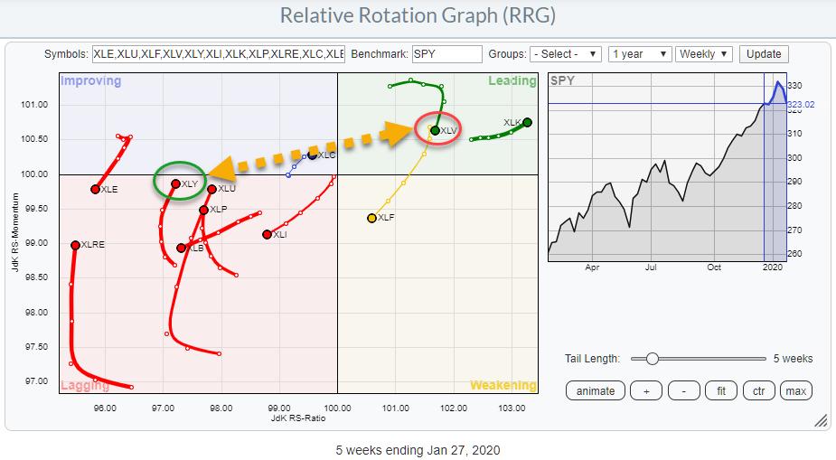
On the Relative Rotation Graph for US sectors (XLY), the Consumer Discretionary sector started to curl up and move higher while inside the lagging quadrant. After a weak performance against SPY for months, XLY started to improve on the JdK RS-Momentum scale a few weeks ago and, very recently, also...
READ MORE
MEMBERS ONLY
Sector Spotlight: BETA Helps You Find Sectors To Hide When Needed
by Julius de Kempenaer,
Senior Technical Analyst, StockCharts.com
In this edition of StockCharts TV'sSector Spotlight, I updated my spreadsheet for calculating the BETAs for all of the SPDR sectors. During the episode, I show users how to use this metric in combination with RRGs. This episode was originally recorded on January 28th, 2020.
Sector Spotlight airs...
READ MORE
MEMBERS ONLY
EA Sports: It's In The Game...
by Julius de Kempenaer,
Senior Technical Analyst, StockCharts.com
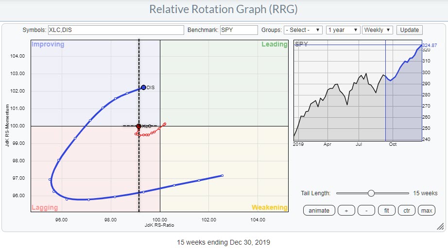
In a recent article in the RRG Blog titled "Is XLC taking over from XLK?", I identified the Communication Services sector as one of the potential new leading sectors in coming weeks. Currently, on the Relative Rotation Graph for US sectors, XLC is inside the improving quadrant, but...
READ MORE
MEMBERS ONLY
RRG Shows Money Rotating out of WBA into KO
by Julius de Kempenaer,
Senior Technical Analyst, StockCharts.com
In this week's episode of Sector Spotlight, I ran out of time to go over the pair trade idea that we usually have at the end of the show and I promised to write it up in an article. So here it is.
This idea was generated from...
READ MORE
MEMBERS ONLY
Sector Spotlight: Are RRGs "Useless" for Short-Term Trading?
by Julius de Kempenaer,
Senior Technical Analyst, StockCharts.com
In this edition of StockCharts TV'sSector Spotlight, I analyze the current rotations for US sectors and answer two questions from the mailbag. For one of those questions, I discuss the use of RRGs in short-term trading. This video originally aired on January 21st, 2020.
During the last few...
READ MORE
MEMBERS ONLY
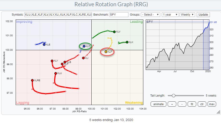
Is XLC taking over from XLF?
by Julius de Kempenaer,
Senior Technical Analyst, StockCharts.com
Here's a quick update for a rotation that caught my attention this morning.
Since the end of last year, XLF has started to give up on its leading role. JdK RS-Momentum started to decline and the tail began to roll over. Last week, XLF moved from the leading...
READ MORE
MEMBERS ONLY
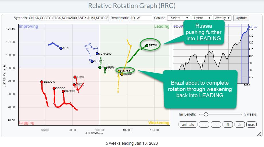
Brazil and Russia are Both Showing Promising Tails on Relative Rotation Graphs, But Russia Wins
by Julius de Kempenaer,
Senior Technical Analyst, StockCharts.com
In my last article for the RRG blog, I wrote about the process of how to get from an idea, whether based on RRG analysis or something else, to a position in your portfolio. That post was geared towards the observation that Growth stocks are outperforming Value stocks and focused...
READ MORE
MEMBERS ONLY
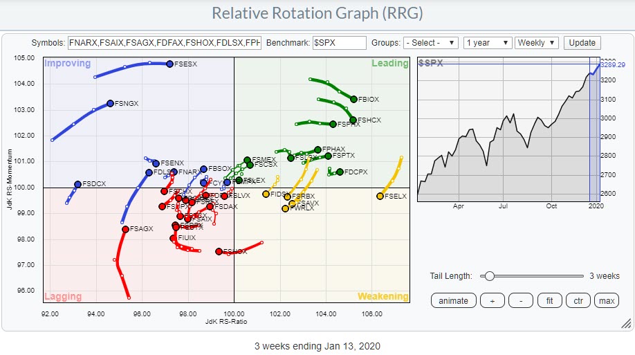
Are You Using Fidelity Funds in Your Portfolio? Here is the RRG
by Julius de Kempenaer,
Senior Technical Analyst, StockCharts.com
If you are using Fidelity Funds, a Relative Rotation Graph showing the movement of all these funds can help you find the ones that are offering potential (for outperformance). The image above shows such a Relative Rotation Graph, holding 39 Fidelity Select funds.
Going over the funds on this chart,...
READ MORE
MEMBERS ONLY
From a Trading Idea To a Position
by Julius de Kempenaer,
Senior Technical Analyst, StockCharts.com
In my last article for the Don't Ignore This Chart blog, which I write for on Thursdays, I wrote about the clear message that the rotation of Growth vs. Value is currently sending. As those are short articles meant to point to potentially interesting situations and usage of...
READ MORE
MEMBERS ONLY
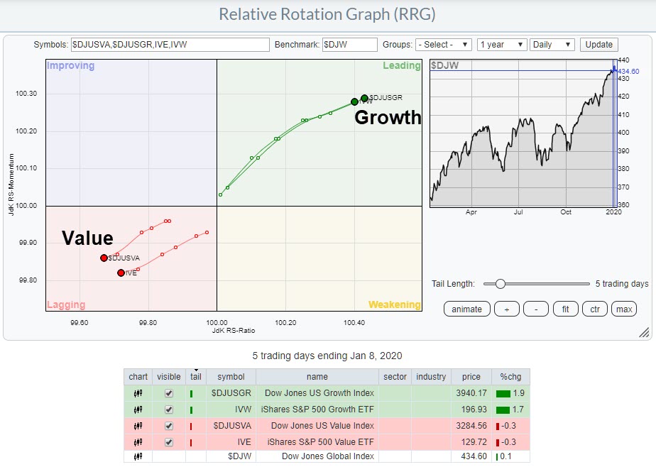
RRG Shows a Clear Winner for Growth vs. Value
by Julius de Kempenaer,
Senior Technical Analyst, StockCharts.com
Relative Rotation Graphs enable us to see beyond sectors or individual stock rotations; they can also be used to visualize differently-sorted market segments.
The RRG above illustrates growth vs. value stocks, a measure that often is also used to gauge the direction for the general market. In general, growth will...
READ MORE
MEMBERS ONLY
Sector Spotlight: Monthly Charts and a Look at Asset Allocation
by Julius de Kempenaer,
Senior Technical Analyst, StockCharts.com
In this edition of StockCharts TV'sSector Spotlight, I take a look at new monthly charts and asset allocation. Afterwards, I build more on the Seasonality visualization and interpretation that I started during last month. This video originally aired on January 7th, 2020.
Sector Spotlight airs weekly on Tuesdays...
READ MORE
MEMBERS ONLY
Will Disney Be the New Leader in Communication Services (XLC)?
by Julius de Kempenaer,
Senior Technical Analyst, StockCharts.com
XLC, the Communication Services Sector, is sending some mixed signals.
On the price chart, XLC convincingly cleared resistance at $51 in November, when it pushed above the horizontal boundary that ran over the highs (four in total) of 2018 and 2019.
That level was tested one more time as support...
READ MORE
MEMBERS ONLY
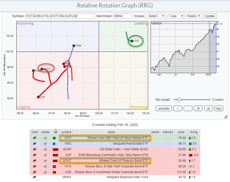
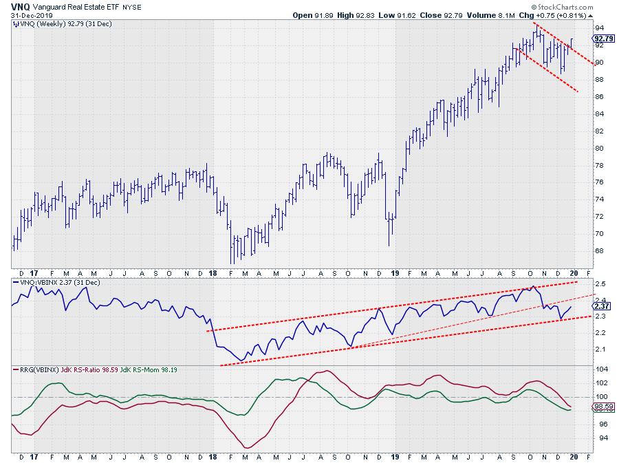
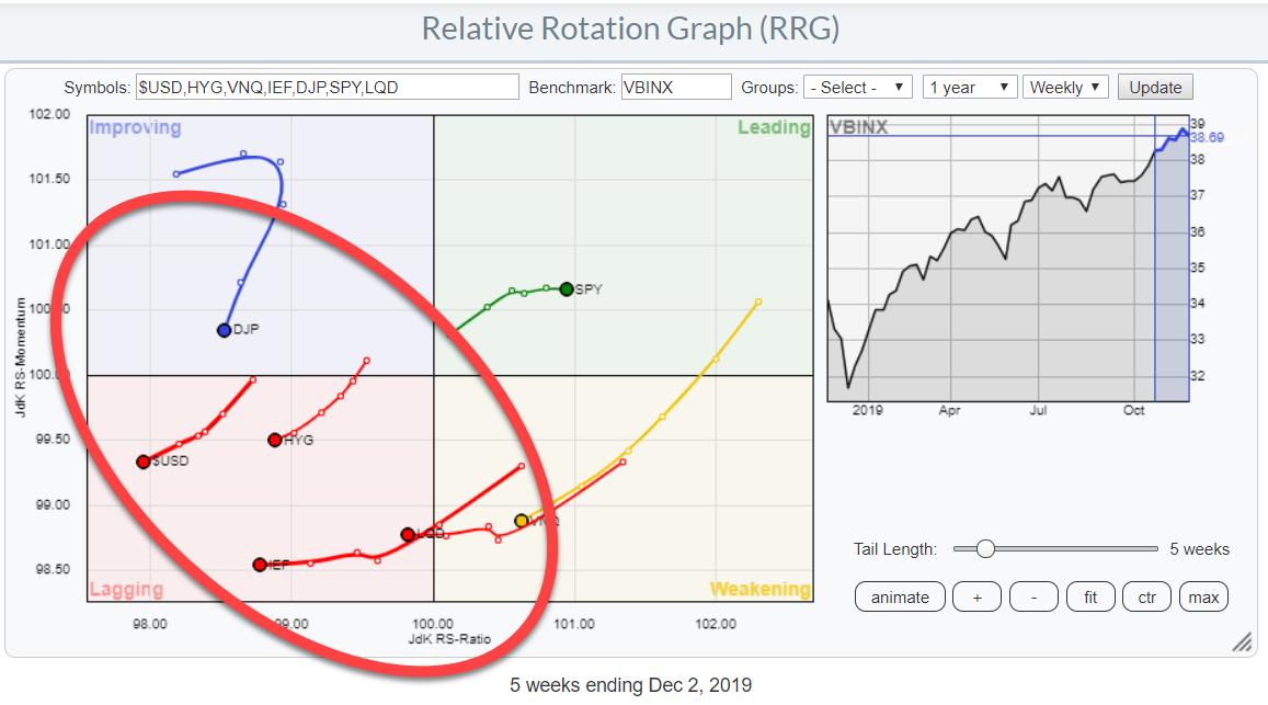
Is Real Estate Coming to Life Again?
by Julius de Kempenaer,
Senior Technical Analyst, StockCharts.com
Real Estate started to lose relative strength vs. VBINX in November, then crossed over into the lagging quadrant on the weekly Relative Rotation Graph in December. On the weekly RRG for asset classes, VNQ is still well inside the lagging quadrant and considered one of the weak(er) asset classes....
READ MORE
MEMBERS ONLY
Sector Spotlight: Plotting Seasonality for All Sectors in One Graph
by Julius de Kempenaer,
Senior Technical Analyst, StockCharts.com
In this edition of StockCharts TV'sSector Spotlight, I discuss a way to plot multiple seasonality patterns on one graph and combine them with the tails on a Relative Rotation Graph. This video originally aired on December 31st, 2019.
Sector Spotlight airs weekly on Tuesdays 10:30-11:00am ET....
READ MORE
MEMBERS ONLY
Is The Energy Sector Preparing For a Turnaround?
by Julius de Kempenaer,
Senior Technical Analyst, StockCharts.com
The RRG showing the Relative Rotation for US sectors has the energy sector inside the improving quadrant. Make no mistake, based on the JdK RS-Ratio reading, this is still the weakest sector in the S&P 500 - but things seem to be changing.
XLE crossed from weakening into...
READ MORE
MEMBERS ONLY
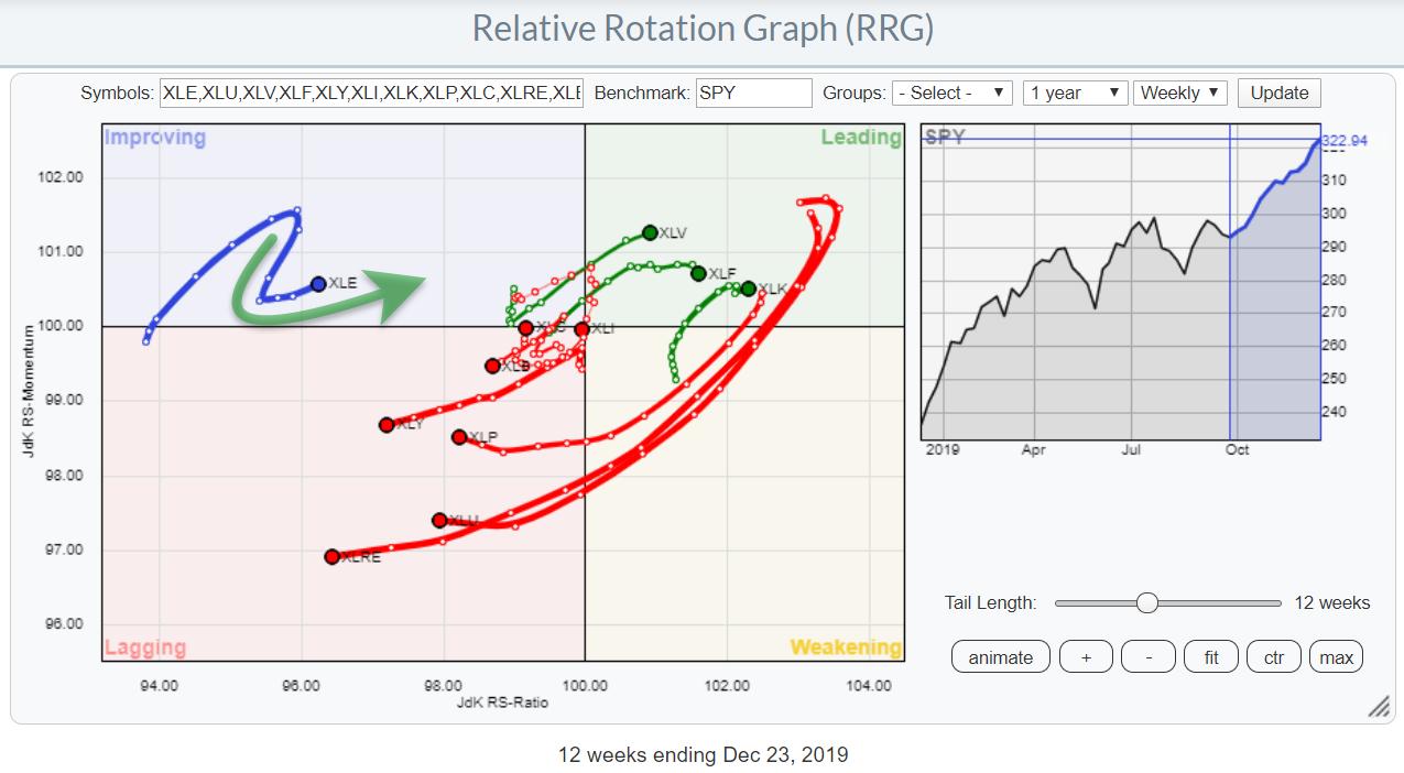
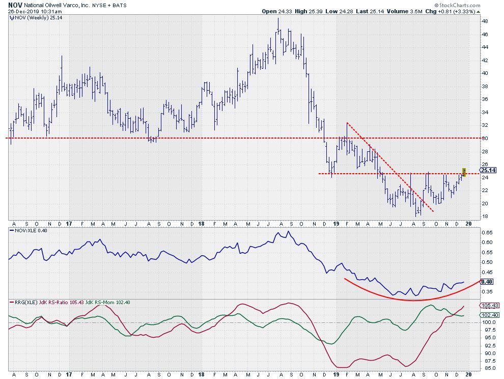
This Energy Stock is Turning Around
by Julius de Kempenaer,
Senior Technical Analyst, StockCharts.com
On the above Relative Rotation Graph, the Energy sector (XLE) hooked back towards a positive RRG-Heading while inside the improving quadrant. In terms of the JdK RS-Ratio, it is still the weakest sector, but things seem to be starting to improve.
Although the sector as a whole may not be...
READ MORE
MEMBERS ONLY
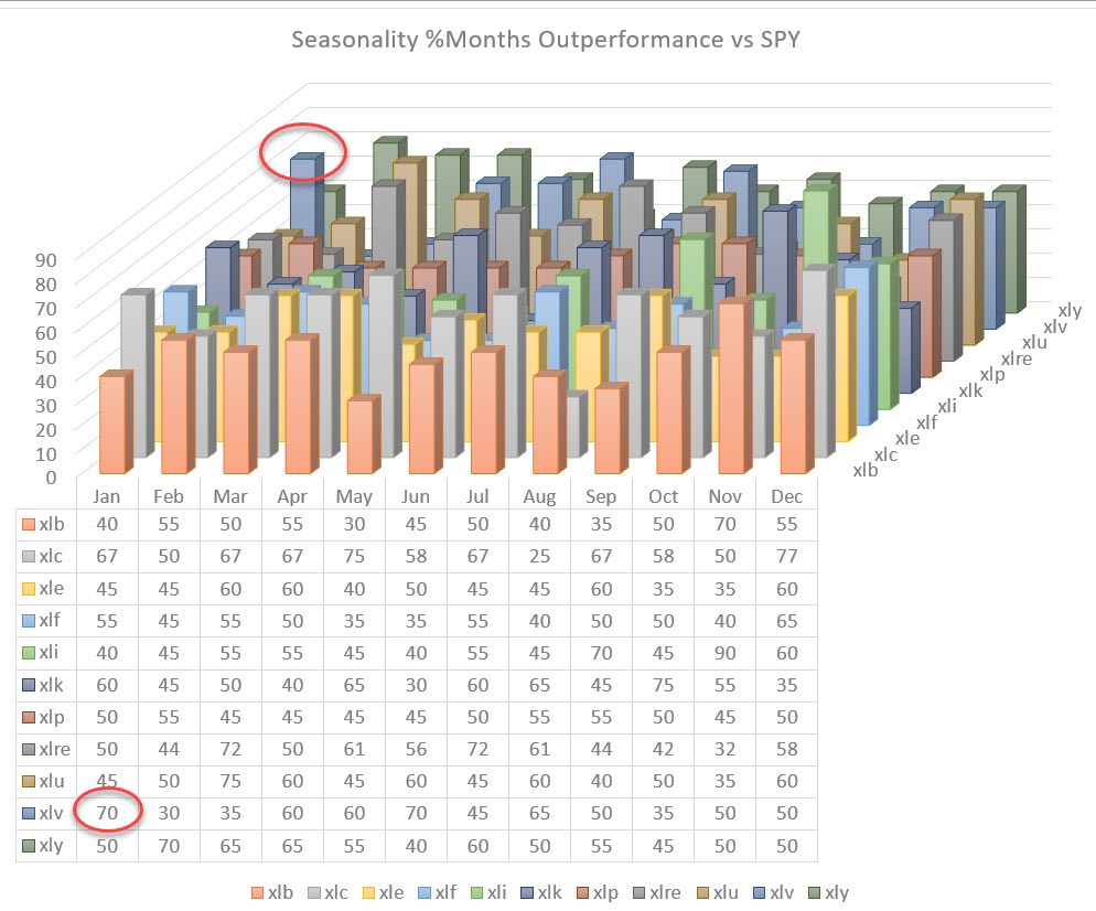
Slicing and Dicing Seasonality
by Julius de Kempenaer,
Senior Technical Analyst, StockCharts.com
I previously highlighted the chart below in this past Thursday's DITC article (12/19). But what does it mean?
What is it Showing?
This chart visualizes the collective seasonality of all 11 sectors in the S&P 500.
To get there, I collected the numbers from the...
READ MORE
MEMBERS ONLY
When You Enter 288 Numbers, This Is What You Get
by Julius de Kempenaer,
Senior Technical Analyst, StockCharts.com
But What is it Showing?
The chart above shows the collective seasonality of all 11 sectors in the S&P 500.
To get there, I collected the numbers from the seasonality chart (which is available on the site) for every sector and the S&P 500 over the...
READ MORE
MEMBERS ONLY
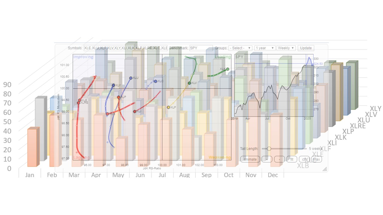
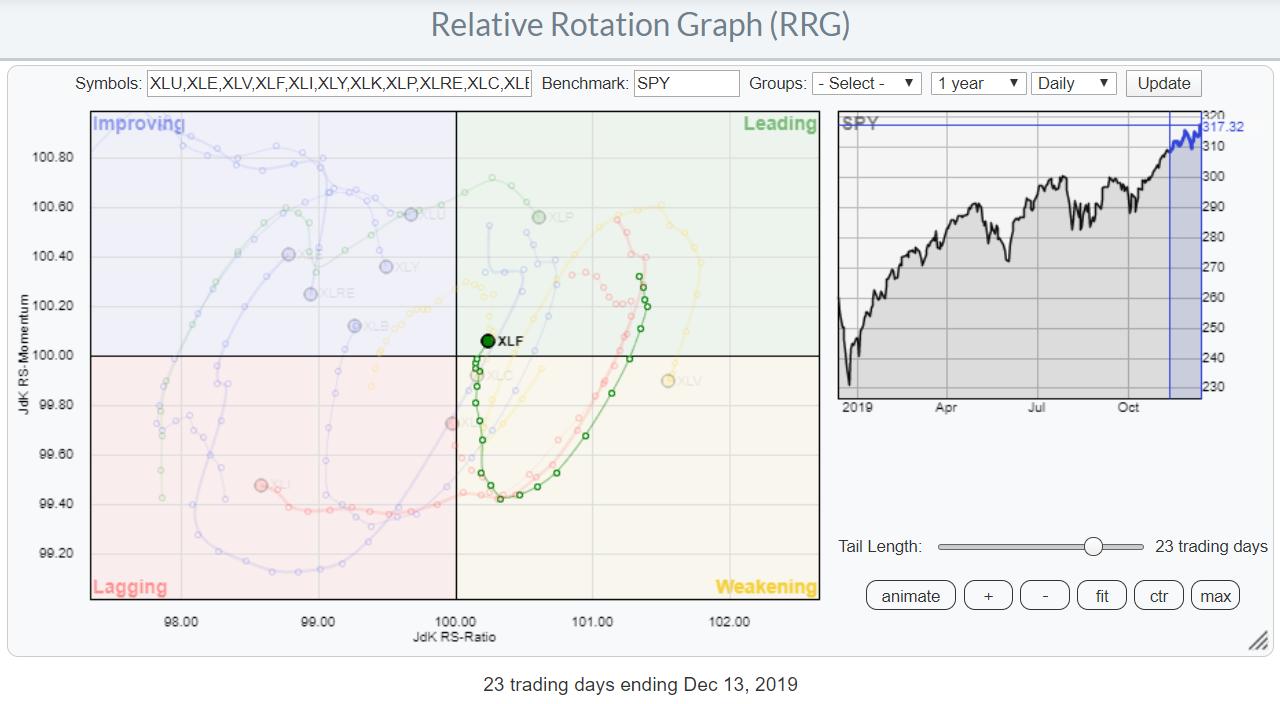
Focus on Financials
by Julius de Kempenaer,
Senior Technical Analyst, StockCharts.com
Above is the daily Relative Rotation Graph for US sectors, highlighting the rotation for the financials sector. On the weekly RRG, this sector is solidly inside the leading quadrant and continues to move further west into positive territory.
With the current rotation on the daily RRG moving from weakening back...
READ MORE
MEMBERS ONLY
Sector Spotlight: Looking at Rotations Inside the DJ Industrials
by Julius de Kempenaer,
Senior Technical Analyst, StockCharts.com
In this edition of StockCharts TV'sSector Spotlight, I present a short overview of relative trends in play for asset classes and US sectors. Afterwards, I take a deep dive into the rotations of the DJ Industrials index ($INDU) and identify a pair trade idea for this week stemming...
READ MORE
MEMBERS ONLY
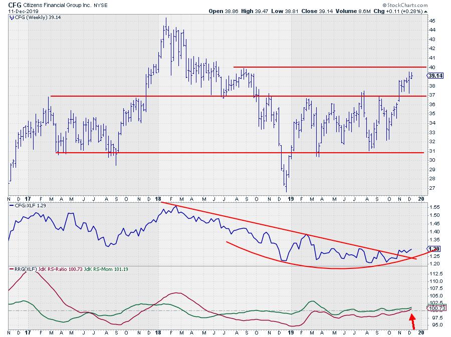
CFG Rotates into Leading Quadrant on RRG while Breaking Resistance on Price Chart
by Julius de Kempenaer,
Senior Technical Analyst, StockCharts.com
The financial sector is one of the stronger sectors at the moment. Opening up the Relative Rotation Graph showing the members of this sector against XLF (as the benchmark) shows a concentration of asset managers and banks with positive rotations that are either inside the leading quadrant or moving towards...
READ MORE
MEMBERS ONLY
Sector Spotlight: Sector Rotation Remains Bullish
by Julius de Kempenaer,
Senior Technical Analyst, StockCharts.com
In this edition of StockCharts TV's Sector Spotlight, I discuss the current sector rotation from a weekly and a daily perspective and take a closer look at Financials. A short-term pullback appears possible in the SPY.
This episode of Sector Spotlight originally aired on December 10th, 2019.
Sector...
READ MORE
MEMBERS ONLY
If a 100% Investment In Stocks is Too Much, Where Can You Find Diversification?
by Julius de Kempenaer,
Senior Technical Analyst, StockCharts.com
This article also appeared in our ChartWatchers newsletter (12/7).
Last Wednesday, I published an article in the RRG Charts blog titled "Stocks Remain The Only Asset Class Inside The Leading Quadrant Going into December". As the title suggests, that article primarily looks at the rotation for asset...
READ MORE
MEMBERS ONLY
Where Should You Go if You Don't Want to be 100% Invested in Stocks?
by Julius de Kempenaer,
Senior Technical Analyst, StockCharts.com
Last Wednesday, I published an article in the RRG blog titled "Stocks Remain The Only Asset Class Inside The Leading Quadrant Going into December". As the title suggests, that article is primarily looking at the rotation for asset classes, with an in-depth look into the long-term chart of...
READ MORE
MEMBERS ONLY
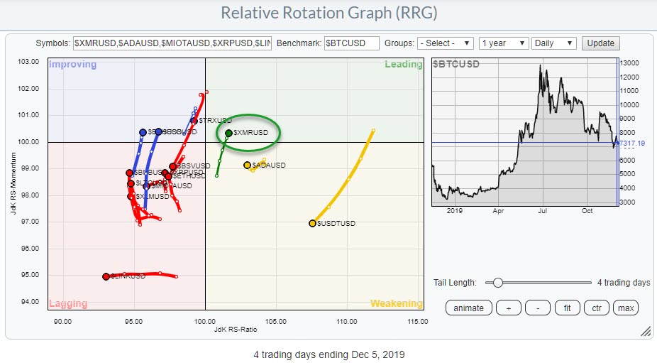
Keeping an Eye on Monero (XMR) as it Enters the Leading Quadrant on RRG
by Julius de Kempenaer,
Senior Technical Analyst, StockCharts.com
This week is Crypto Week! Well, at least it is on StockCharts TV. Thus, I figured it would also be a good idea to once again bring to your attention to the fact that we can run RRG charts for cryptocurrencies as well.
As a quick reminder, you can find...
READ MORE
MEMBERS ONLY
Sector Spotlight: A Look At Monthly Sector Charts and Pair Trades
by Julius de Kempenaer,
Senior Technical Analyst, StockCharts.com
In this episode of Sector Spotlight, I go over the completed monthly bars for asset classes and US sectors. Then, I present a new pair trade idea; for this video, I found one that comes from the Health Care sector.
This episode of Sector Spotlight originally aired on December 3rd,...
READ MORE
MEMBERS ONLY
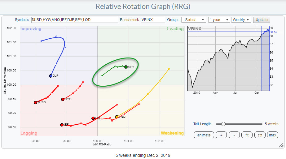
Stocks Remain the Only Asset Class Inside the Leading Quadrant Going into December
by Julius de Kempenaer,
Senior Technical Analyst, StockCharts.com
Asset allocation is the highest point in the investment decision pyramid. The decision to invest in Stocks or Bonds or other asset classes will have far more impact on the final return for an investor than the decision to select specific stocks.
Therefore, the Relative Rotation Graph showing the rotation...
READ MORE
MEMBERS ONLY
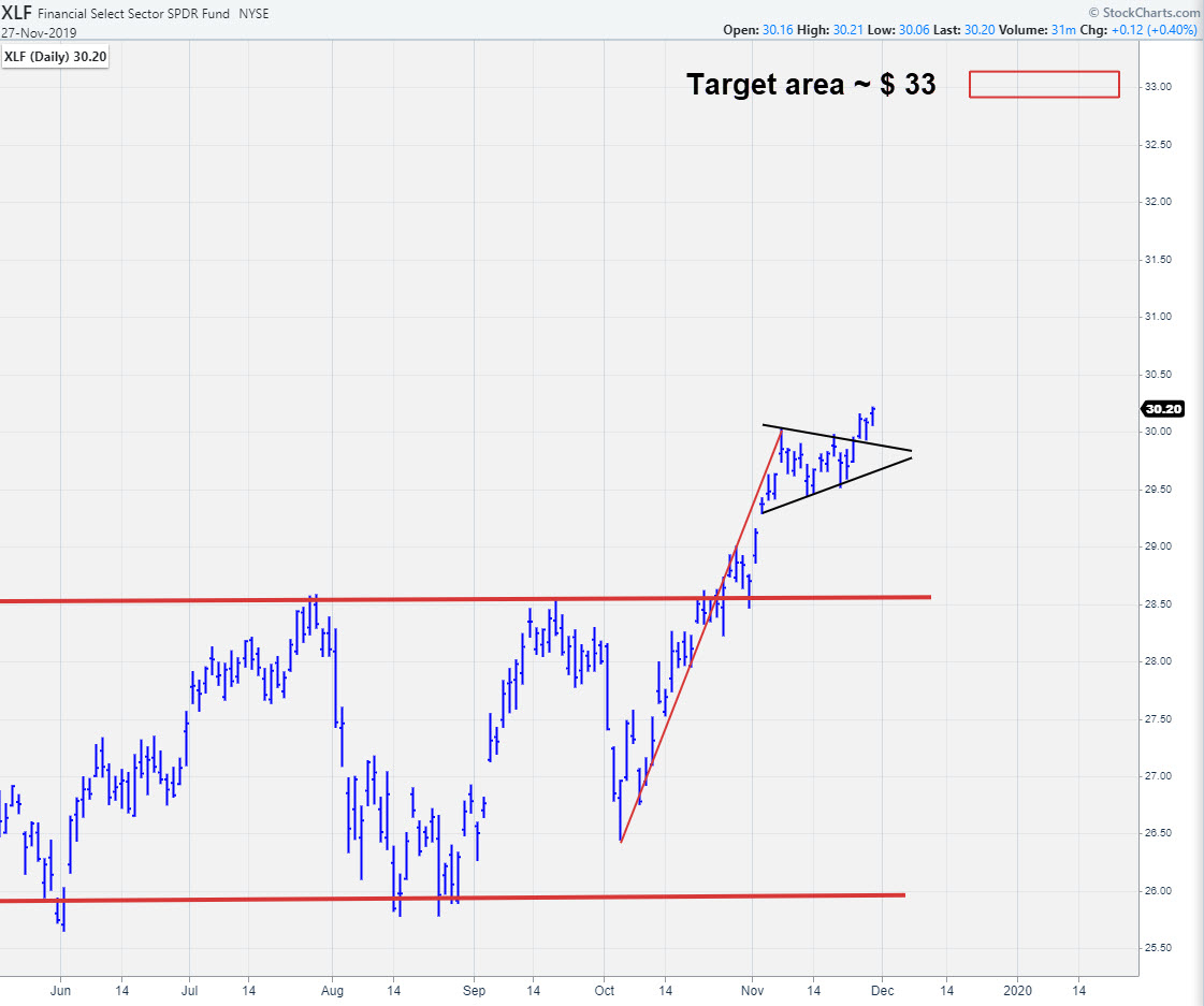
Completed Pennant in XLF Points to $33 Area
by Julius de Kempenaer,
Senior Technical Analyst, StockCharts.com
On the Relative Rotation Graph for US sectors, Financials are in good shape. They are inside the leading quadrant and, despite a little loss of momentum in the last week, still at a good RRG-heading.
Together with Technology and Industrials, Financials is a leading sector at the moment.
A Pennant...
READ MORE
MEMBERS ONLY
Sector Spotlight: Sector Rotation Continues in Favor of Tech and Financials
by Julius de Kempenaer,
Senior Technical Analyst, StockCharts.com
In this episode of Sector Spotlight, I take a look at current sector rotation and find that Tech and Financials are still the strong sectors in the US. From an international perspective, I also observe that the Indian $CNX500 index is definitely worth keeping an eye on.
This episode of...
READ MORE