MEMBERS ONLY
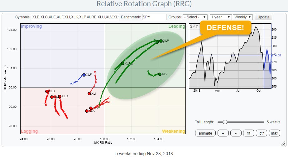
Market is still playing defense!
by Julius de Kempenaer,
Senior Technical Analyst, StockCharts.com
The recent rally of the S&P 500 index off the lows near 2600-2625 is nice but is it sustainable?
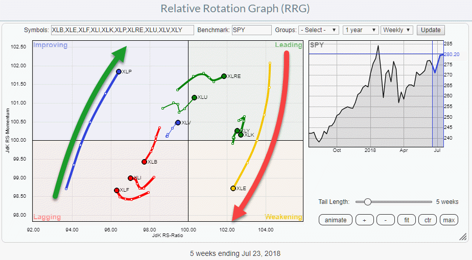
The Relative Rotation Graph above shows the rotation of the 11 SPDR sector ETFs against SPY and the message is very clear!
There is a clear split between the...
READ MORE
MEMBERS ONLY
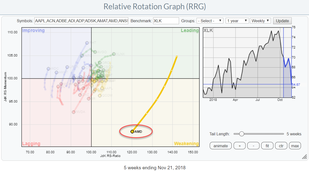
This Technology stock lost 50% of its value but is now hitting support levels.
by Julius de Kempenaer,
Senior Technical Analyst, StockCharts.com
The Relative Rotation Graph for the technology stocks in XLK (Technology select sector SPDR) shows one big outlier that recently went through a big rotation. It crossed from improving to leading in June then pushed to a JdK RS-Ratio value over 140 before rolling over. Three weeks ago the rotation...
READ MORE
MEMBERS ONLY
Plotting breadth indicators on Relative Rotation Graphs - Part I
by Julius de Kempenaer,
Senior Technical Analyst, StockCharts.com
In my contribution to last week's Chartwatchers newsletter, I mentioned my current experiment on using breadth indicators on a Relative Rotation Graph.
In this article, I want to take a look at a few of these setups side by side and see if there is indeed a leading...
READ MORE
MEMBERS ONLY
Experimenting with breadth on Relative Rotation Graphs
by Julius de Kempenaer,
Senior Technical Analyst, StockCharts.com
Various breadth indicators are used to analyze the underlying strength or weakness of a broad market index like the S&P 500 index or NYSE. Over the years a number of different breadth indicators have been developed and/or used in their work by well known technical analysts.
A...
READ MORE
MEMBERS ONLY
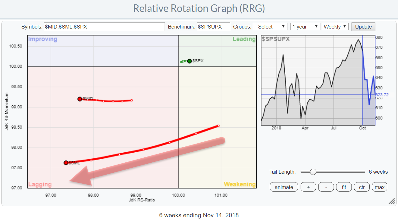
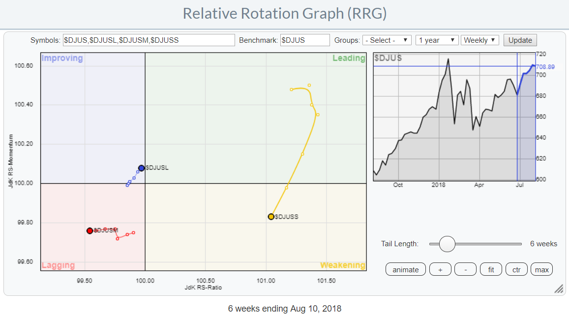
Small cap stocks are leading the market lower.
by Julius de Kempenaer,
Senior Technical Analyst, StockCharts.com
There are many indexes available to monitor and analyze the stock market. The S&P500, together with Daddy "Dow" being among the more popular ones.
But the S&P 500, although covering 500 stocks, is only looking at one segment of the total market. Only large-cap...
READ MORE
MEMBERS ONLY
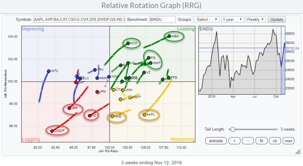
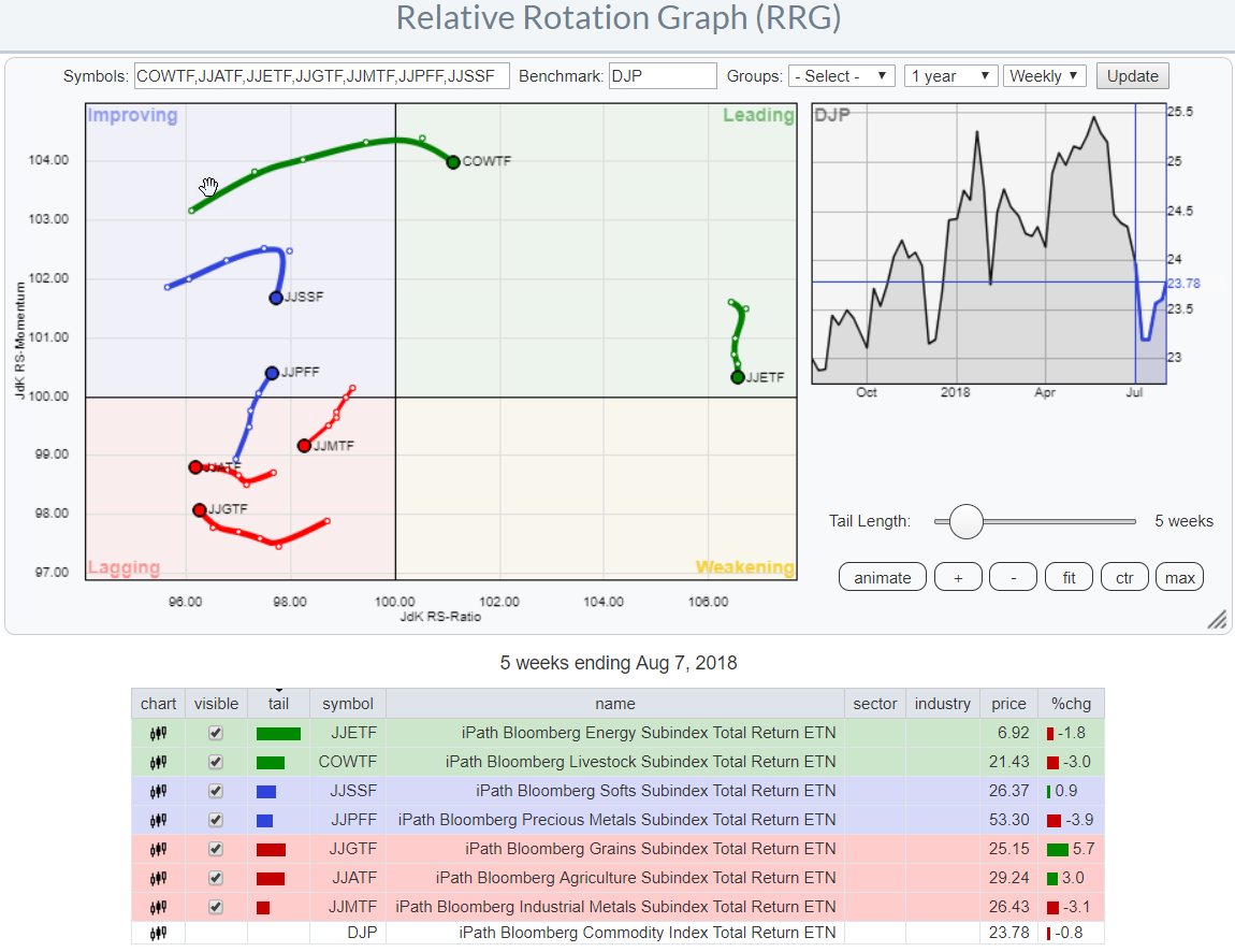
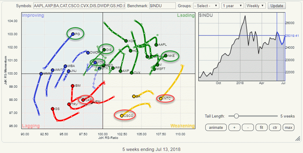
Using RRG to find some good and some not so good names inside the DJ Industrials index.
by Julius de Kempenaer,
Senior Technical Analyst, StockCharts.com
The relative rotation graph above shows the rotation of the 30 DJ Industrials stocks. Watching the interaction on the canvas, a few rotations catch the eye.
Inside the lagging quadrant IBM, HD, and DWDP are clearly moving deeper into negative territory. On the opposite side inside the leading quadrant, we...
READ MORE
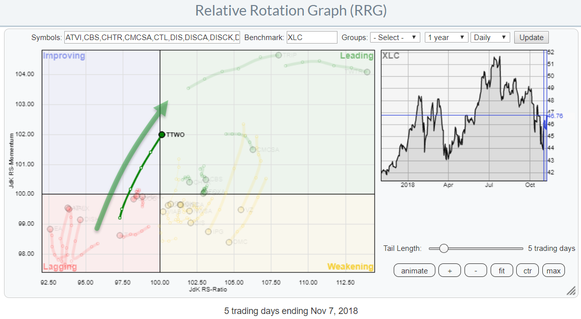
MEMBERS ONLY
It takes two to tango for TTWO
by Julius de Kempenaer,
Senior Technical Analyst, StockCharts.com
While browsing through some Relative Rotation Graphs, looking for DITC candidates, my eye fell on TTWO inside the Communications Services sector.
XLC itself is inside the weakening quadrant vs SPY but very close to the benchmark, meaning that the performance of the sector is very close to that of SPY....
READ MORE
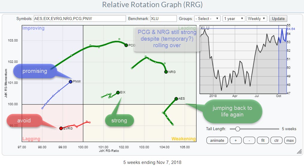
MEMBERS ONLY
Some utility stocks worth paying attention to
by Julius de Kempenaer,
Senior Technical Analyst, StockCharts.com
The relative rotation graph above shows a selection of stocks in the utilities sector. I have created this zoomed in version for better visibility. The fully populated RRG can be found here.
In this post, I will highlight a few of the stocks shown in the picture. As XLU is...
READ MORE
MEMBERS ONLY
Two stocks in the Consumer Staples sector that could offer shelter when needed.
by Julius de Kempenaer,
Senior Technical Analyst, StockCharts.com
In this blog post, I want to do a quick top-down analysis to arrive at a few stocks that could help investors to provide shelter in case the current hiccup in the market is ..... well a "hiccup."
The Relative Rotation Graph above shows the rotation of various asset...
READ MORE
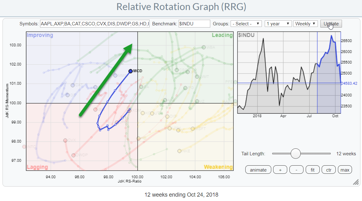
MEMBERS ONLY
Can I have some fries with that please?
by Julius de Kempenaer,
Senior Technical Analyst, StockCharts.com
On the Relative Rotation Graph holding the 30 stocks in the DJ Industrials index, McDonald's (MCD) is one of the names that pop up as potentially interesting. The stock is positioned inside the improving quadrant for a few weeks now and moving towards the leading quadrant at a...
READ MORE
MEMBERS ONLY
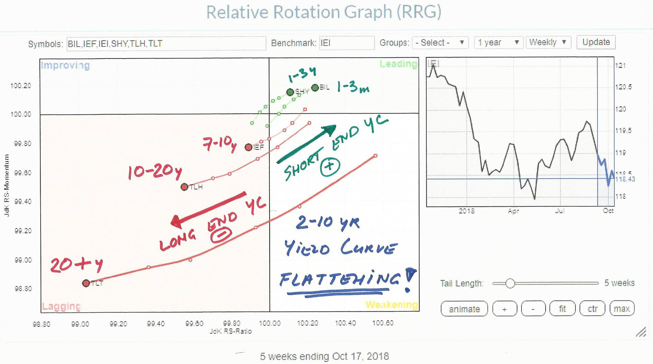
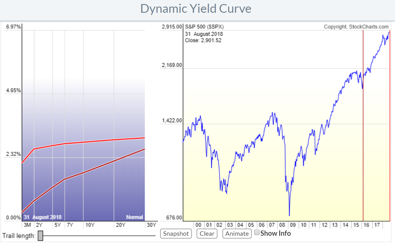
Is the bond market sending us a message?
by Julius de Kempenaer,
Senior Technical Analyst, StockCharts.com
When markets are in transition and the bigger picture needs our attention it is always good to keep an eye on the yield curve.
The absolute yield levels of the various maturities on the curve, starting at 3-Months all the way out to 20+ years are important to monitor. But...
READ MORE
MEMBERS ONLY
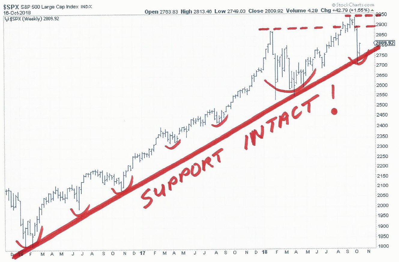
Markets are cracking. Is it just another dip or are we witnessing a bigger event in the making?
by Julius de Kempenaer,
Senior Technical Analyst, StockCharts.com
The general market conditions for the various major indexes have been commented on extensively by other commentators here on the site. There is no doubt that there is more rumble in the markets now than we have seen for a long time.
IMHO this makes it an interesting time for...
READ MORE
MEMBERS ONLY
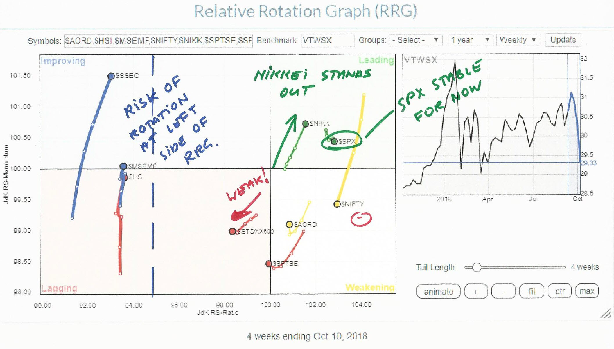
Japan against the rest of the world!
by Julius de Kempenaer,
Senior Technical Analyst, StockCharts.com
When markets around the world start to rumble it's usually a good exercise how all these moves compare against one another.
The Relative Rotation Graph shows the relative picture for a number of major world equity markets against the Dow Jones World Index as the benchmark.
The Indian...
READ MORE
MEMBERS ONLY
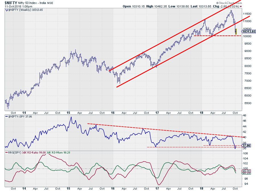
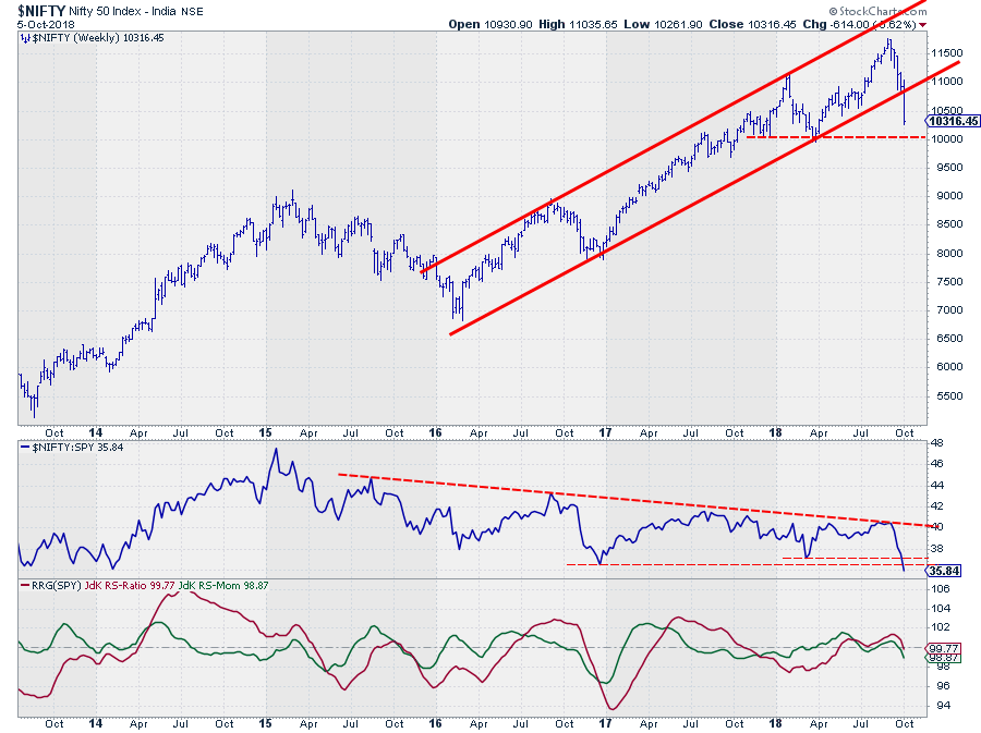
Break in $NIFTY re-shuffles sector rotation in India
by Julius de Kempenaer,
Senior Technical Analyst, StockCharts.com
This article is an extended and updated version of the article that appeared in last weekend's Chartwatchers newsletter.
The Indian $NIFTY Index dropped out of an almost three-year uptrend at the close of last week. The rising support line that started at the low in early 2016 did...
READ MORE
MEMBERS ONLY
NIFTY breaks trend. Pharma and IT show relative strength
by Julius de Kempenaer,
Senior Technical Analyst, StockCharts.com
The Indian $NIFTY Index dropped out of an almost three-year uptrend at the close of last week. The rising support line that started at the low in early 2016 did not manage to hold up and was clearly broken during last week's market action.
This move changes the...
READ MORE
MEMBERS ONLY
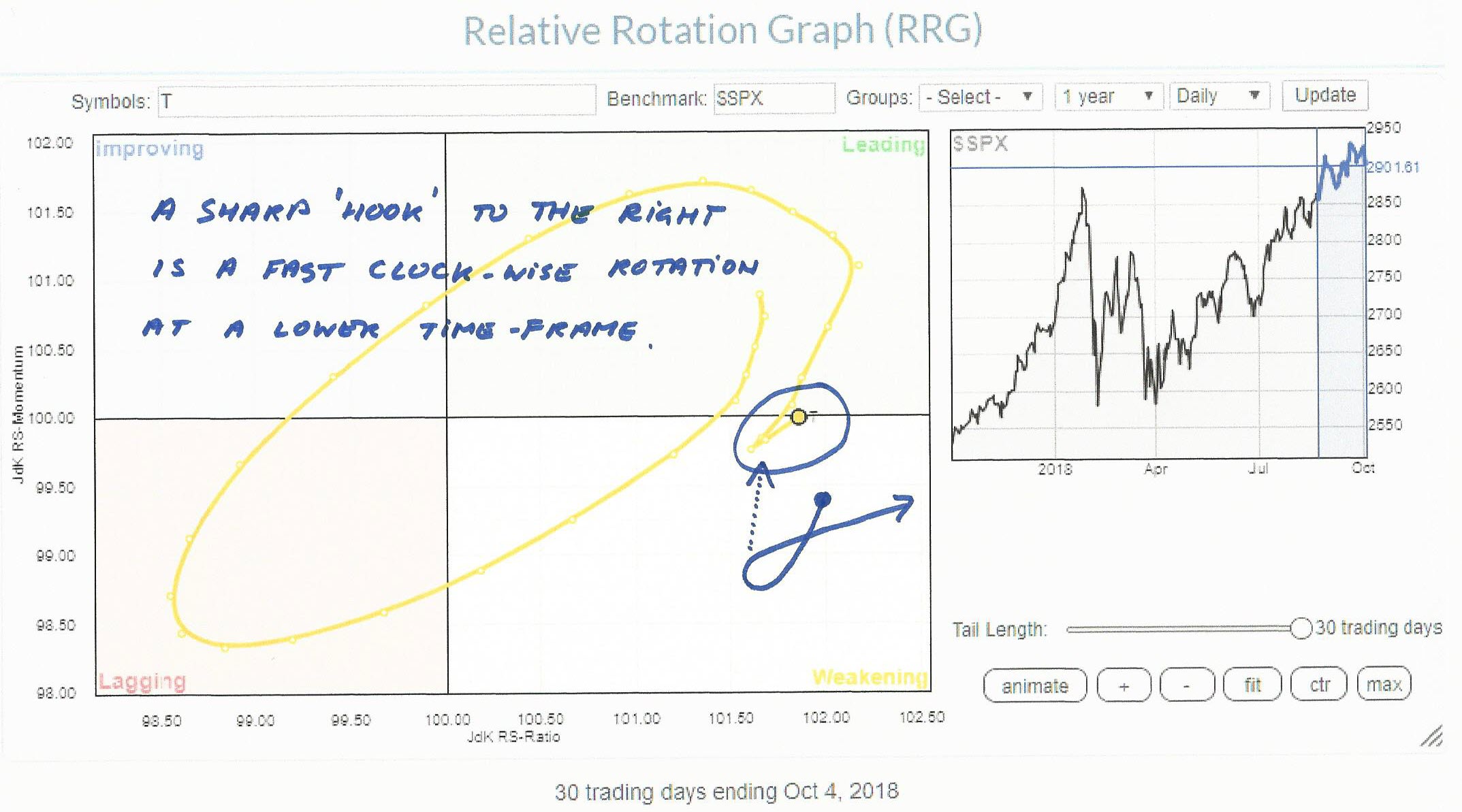
AT&T calling!
by Julius de Kempenaer,
Senior Technical Analyst, StockCharts.com
After yesterday's close (10/4) I ran a Relative Rotation Graph of the Top-10 Market Movers inside the S&P-500 index.
One of the names that popped up as potentially interesting was AT&T (T) as it is inside the improving quadrant and moving towards the...
READ MORE
MEMBERS ONLY
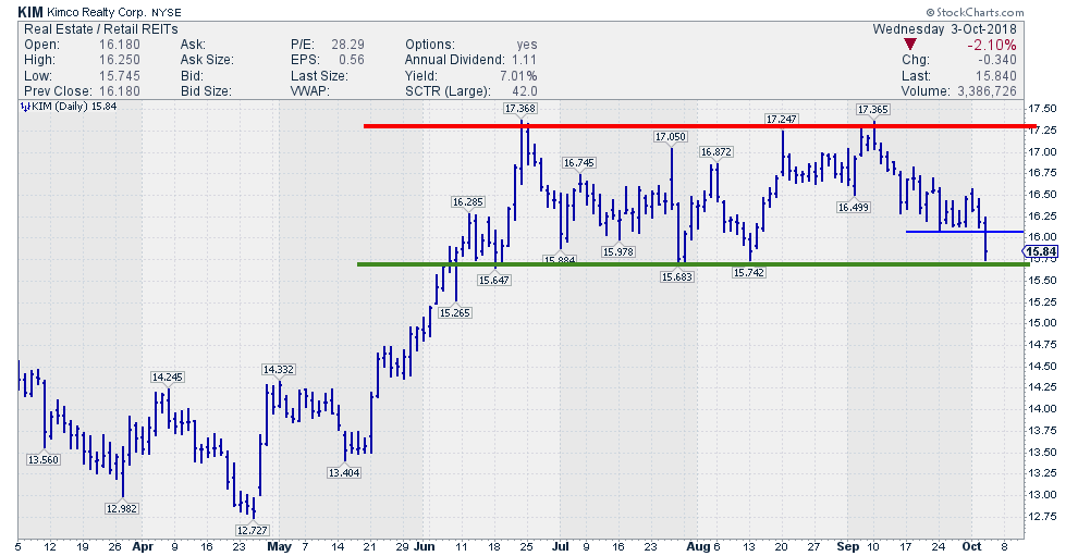
KIM at lower boundary of trading range
by Julius de Kempenaer,
Senior Technical Analyst, StockCharts.com
One of the names that popped up today on my alert for potential "Turtle Soup" setups is KIM. After opening up the chart for further inspection I noticed an interesting situation.
It is very clear that the stock is in a trading range since June. The upper boundary...
READ MORE
MEMBERS ONLY
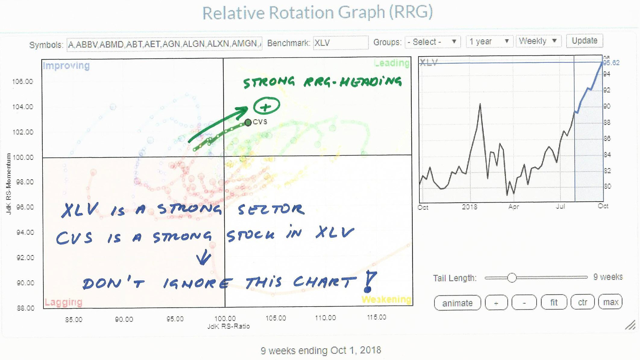
CVS: A healthy stock in a healthy sector
by Julius de Kempenaer,
Senior Technical Analyst, StockCharts.com
The Healthcare sector is getting a lot of attention lately. Not surprisingly as it is THE leading sector at the moment.
Yesterday when I was working on my most recent RRG blog, XLV made it to the headline. And for good reasons. At the moment it is the only sector...
READ MORE
MEMBERS ONLY
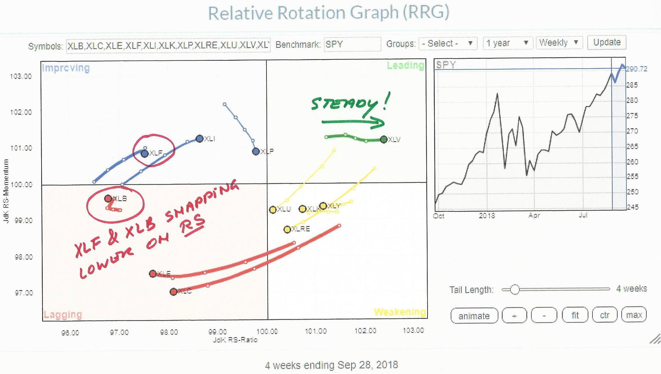
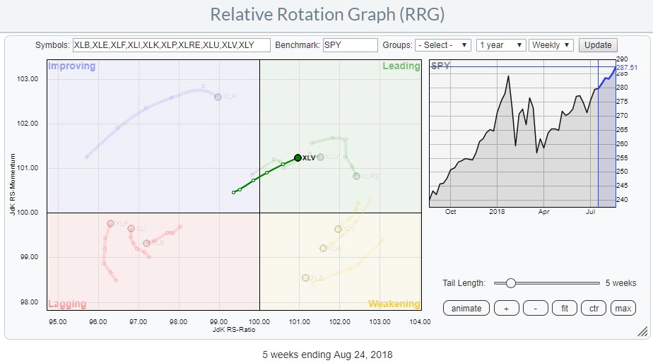
XLV continues strong in leading quadrant, XLF and XLB snap lower on Relative Strength
by Julius de Kempenaer,
Senior Technical Analyst, StockCharts.com
On the Relative Rotation Graph for US sectors, the Healthcare sector continues strong into the leading quadrant at a steady pace (RS Momentum). Two sectors that are showing a sudden weakness in relative strength, and therefore deserve our attention, are Materials (XLB) and Financials (XLF).
Summary
* Healthcare (XLV) moving further...
READ MORE
MEMBERS ONLY
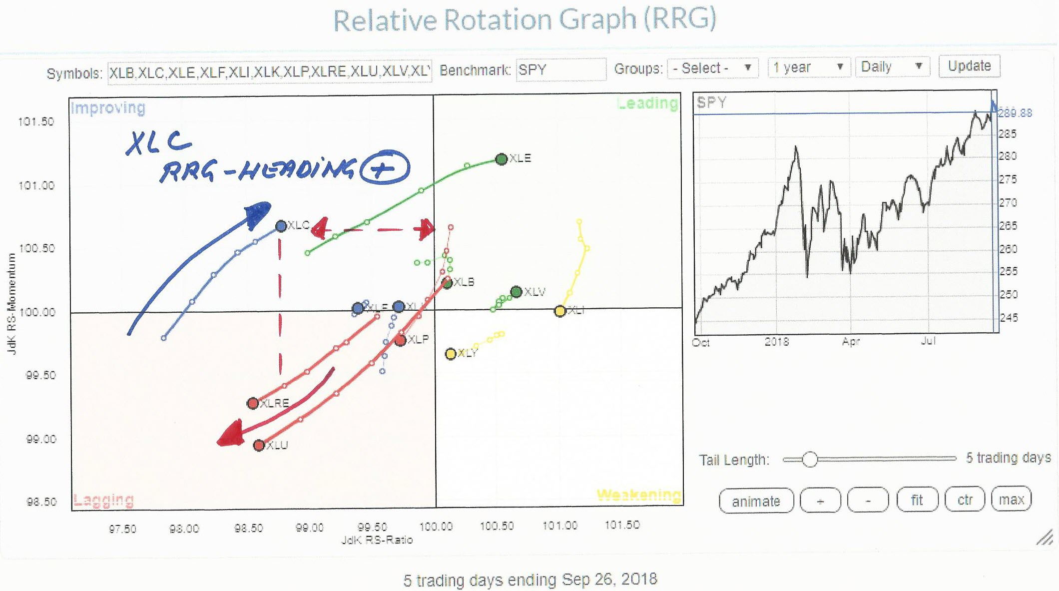
XLC recovering on Relative Rotation Graph, but for how long?
by Julius de Kempenaer,
Senior Technical Analyst, StockCharts.com
On the daily Relative Rotation Graph above, the new XLC sector is positioned inside the improving quadrant. XLC moved into the improving from lagging 5 trading days ago and is now heading higher on both scales at a positive RRG-Heading.
Measured on the JdK RS-Ratio scale (horizontal axis), XLC is...
READ MORE
MEMBERS ONLY
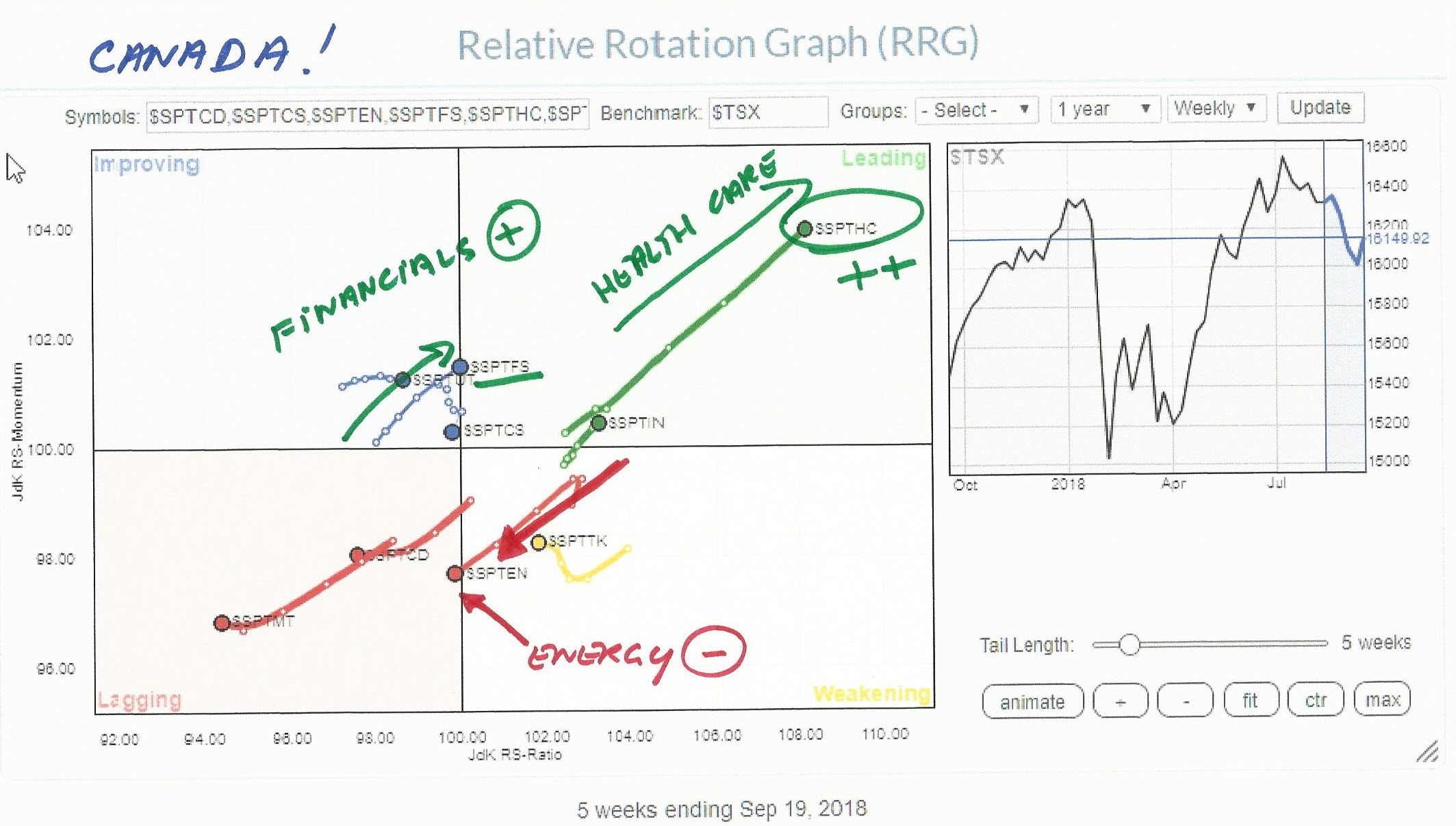
Canadian Health Care sector ($SPTHC) gunning for test of $ 155
by Julius de Kempenaer,
Senior Technical Analyst, StockCharts.com
The Relative Rotation Graph for Canadian sectors is showing a very distinct move for the Healthcare sector. It is inside the leading quadrant and powering further into it at a strong RRG-Heading at a very long tail. All ingredients for more strength ahead and worth a closer look on a...
READ MORE
MEMBERS ONLY
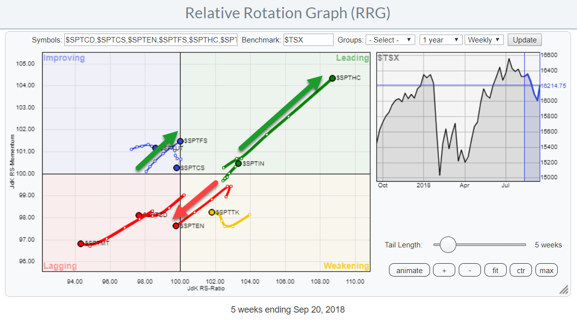
Canadian Healthcare and Financial Services winning over Energy
by Julius de Kempenaer,
Senior Technical Analyst, StockCharts.com
While browsing through some pre-populated RRGs on the site I stumbled upon the chart holding Canadian sectors.
What immediately triggered me was the sharp move of the Healthcare sector into the leading quadrant at almost 45 degrees which means that the sector is moving higher on both axes which is...
READ MORE
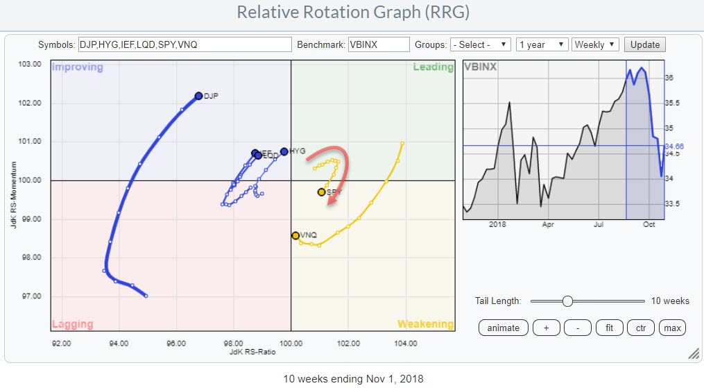
MEMBERS ONLY
Equities (SPY) is the only asset class inside the leading quadrant AND it is at a positive RRG Heading
by Julius de Kempenaer,
Senior Technical Analyst, StockCharts.com
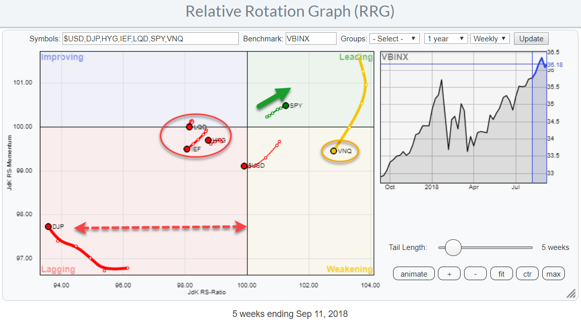
The Relative Rotation Graph shows the relative positions of various asset classes (ETFs) against VBINX, a Vanguard balanced index fund, as the benchmark.
The long tails for Real Estate and Commodities stand out, as well as the cluster of fixed income related asset classes inside the red oval.
The strongest...
READ MORE
MEMBERS ONLY
Equities (SPY) is the only asset class at positive RRG Heading
by Julius de Kempenaer,
Senior Technical Analyst, StockCharts.com
The Relative Rotation Graph shows the relative positions of various asset classes (ETFs) against VBINX, a Vanguard balanced index fund, as the benchmark.
The long tails for Real Estate and Commodities stand out, as well as the cluster of fixed income related asset classes inside the red oval.
The strongest...
READ MORE
MEMBERS ONLY
Combining RRG and the (dynamic) yield curve tool extended
by Julius de Kempenaer,
Senior Technical Analyst, StockCharts.com
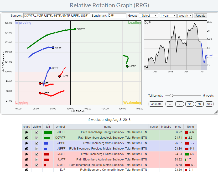
In one of my recent articles, I high lighted that Relative Rotation Graphs can do (much) more than just show equity sector rotation by showing how RRG can be used to analyze rotation among the different commodity groups against a broad commodity index.
This post expands on a recent article...
READ MORE
MEMBERS ONLY
Combining Relative Rotation Graphs and the (dynamic) yield curve tool
by Julius de Kempenaer,
Senior Technical Analyst, StockCharts.com
In one of my recent articles, I high lighted that Relative Rotation Graphs can do (much) more than just show equity sector rotation by showing how RRG can be used to analyze rotation among the different commodity groups against a broad commodity index.
In this post, I want to expand...
READ MORE
MEMBERS ONLY
PFE takes the lead in Health Care sector rotation
by Julius de Kempenaer,
Senior Technical Analyst, StockCharts.com
The Relative Rotation Graph shows the rotation of the Health Care sector over the last five weeks against SPY. The dimmed trails are the other US sectors.
The strong rotation from improving into leading at a steady positive RRG-Heading (0-90 degrees) suggests that further improvement against SPY is likely.
In...
READ MORE
MEMBERS ONLY
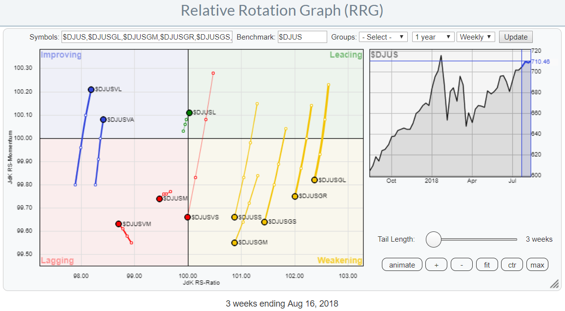
Capturing the US stock market from different angles using Relative Rotation Graphs
by Julius de Kempenaer,
Senior Technical Analyst, StockCharts.com
Instead of showing asset class rotation or sector rotation, Relative Rotation Graphs can also be used to show rotation among various market segments.
You have all seen or heard about a breakdown of the market in large-, mid-, and small-cap stocks. And maybe also the breakdown between growth and value...
READ MORE
MEMBERS ONLY
Value seems to be taking over from growth while small-caps are losing ground
by Julius de Kempenaer,
Senior Technical Analyst, StockCharts.com
Every now and then I run a Relative Rotation Graph showing the rotation of various size and value/growth indices for the US market. They (can) give good insights into what areas of the stock market are in favor and which ones are rotating out of favor.
At the moment...
READ MORE
MEMBERS ONLY
Relative Rotation Graphs can show (much) more than just equity sectors (extended)
by Julius de Kempenaer,
Senior Technical Analyst, StockCharts.com
Relative Rotation Graphs are a great tool to visualize equity sector rotation and they are probably most used for that purpose. However, there are many more areas where RRGs can be used to get a big picture view of what is going on among a group of securities or related...
READ MORE
MEMBERS ONLY
Relative Rotation Graphs can show (much) more than just equity sectors
by Julius de Kempenaer,
Senior Technical Analyst, StockCharts.com
Relative Rotation Graphs are a great tool to visualize equity sector rotation and they are probably most used for that purpose. However, there are many more areas where RRGs can be used to get a big picture view of what is going on among a group of securities or related...
READ MORE
MEMBERS ONLY
Relative Rotation Graph showing strong rotation from Energy (XLE) to Staples (XLP)
by Julius de Kempenaer,
Senior Technical Analyst, StockCharts.com
The current Relative Rotation Graph for US sectors is sending a very clear message for two sectors!
Money is flowing OUT of Energy stocks (XLE) and INTO Staples (XLP). The opposite rotation for those two sectors is almost jumping off the screen when you open up this RRG.
It is...
READ MORE
MEMBERS ONLY
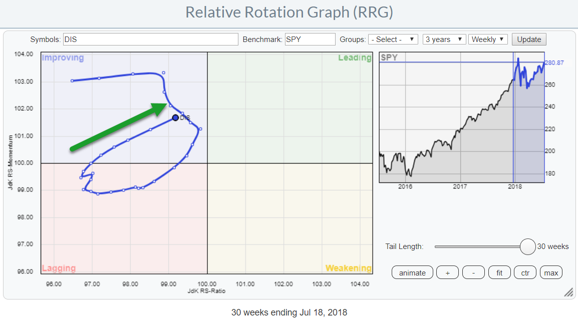
Is Walt Disney (DIS) ready to rumble?
by Julius de Kempenaer,
Senior Technical Analyst, StockCharts.com
While working on my previous article, one stock, in particular, drew my attention. I only casually addressed it in that article as I wanted to do a more extensive review separately.
We are talking about Walt Disney (DIS).
In this post, I will try to build a longer-term picture with...
READ MORE
MEMBERS ONLY
NKE poised for a further rally and outperformance vs $INDU
by Julius de Kempenaer,
Senior Technical Analyst, StockCharts.com
Watching the Relative Rotation Graph of the 30 Dow stocks, there are a few observations that can be made.
To begin with, there is a high concentration of stock inside the leading quadrant, including some mega-cap names like AAPL and MSFT and in the improving quadrant. The bottom half of...
READ MORE
MEMBERS ONLY
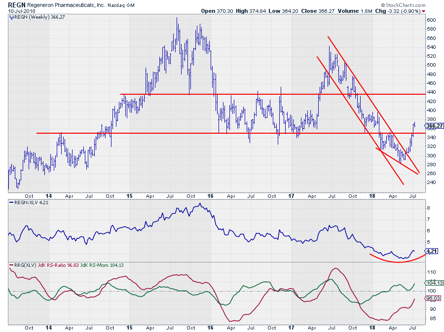
REGN reversing its downtrend?
by Julius de Kempenaer,
Senior Technical Analyst, StockCharts.com
On the Relative Rotation Graph that shows all members of the Health Care sector (XLV) against the XLV benchmark, REGN stands out in a positive way.
On the weekly RRG, the stock is positioned inside the improving quadrant, close to leading and moving at a strong RRG-Heading while the week-to-week...
READ MORE
MEMBERS ONLY
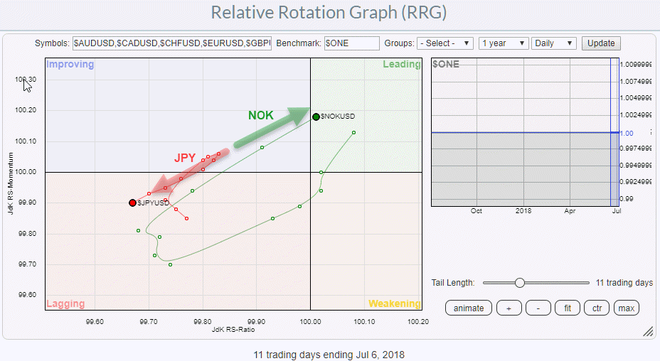
NOK/JPY, a FOREX pair trade from RRG
by Julius de Kempenaer,
Senior Technical Analyst, StockCharts.com
Relative Rotation Graphs are not only used to look at sector-rotation or help with asset allocation decisions but can also help you to pinpoint potential forex trades.
Most currency traders are short-term orientated so the RRG above is a daily chart showing the rotation of the Norwegian Krone and the...
READ MORE
MEMBERS ONLY
It's hard to believe but some markets are (starting to) outperform(ing) the US...
by Julius de Kempenaer,
Senior Technical Analyst, StockCharts.com
This is an extended version of the recent RRG article in Chartwatchers "Checking out the land down under on a Relative Rotation Graph".
Even if your investment portfolio is tied to a specific country or region it makes sense to keep an eye on developments around your geographical...
READ MORE
MEMBERS ONLY
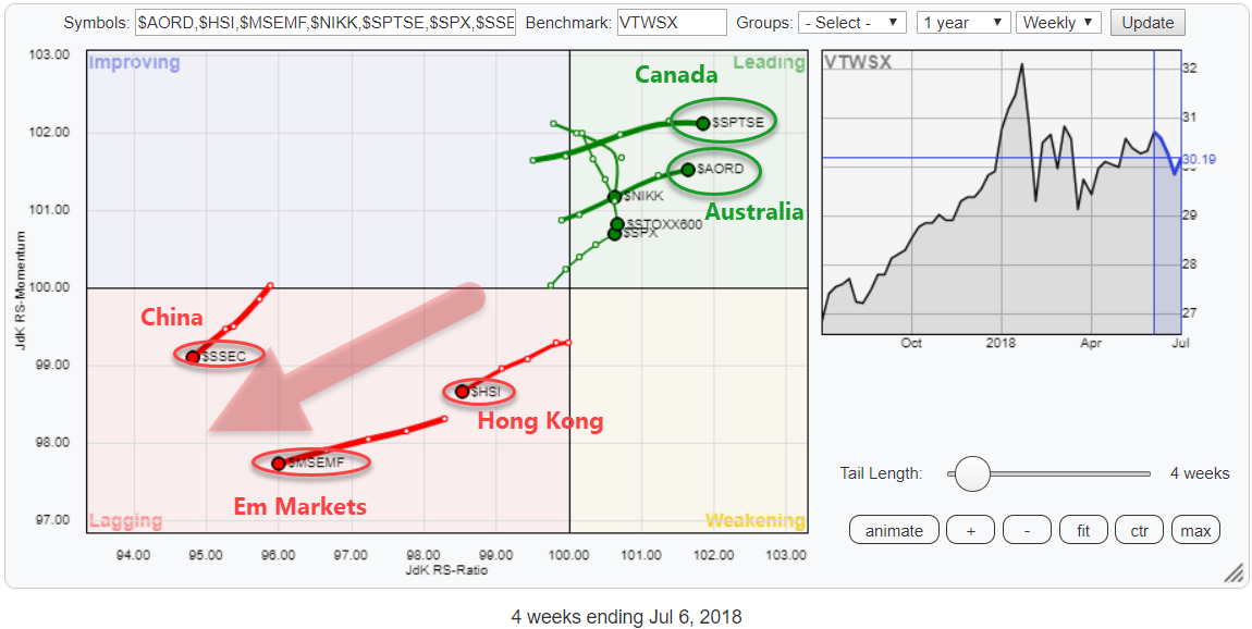
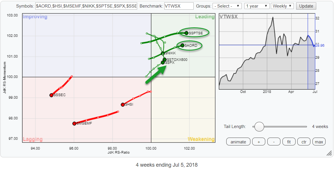
Checking out the land down under on a Relative Rotation Graph
by Julius de Kempenaer,
Senior Technical Analyst, StockCharts.com
On the Relative Rotation Graph above I have grouped a selection of world equity market indices, mainly some big regions, and put them against the Vanguard Total World Stock Index (VTWSX) as the benchmark.
What immediately grabs our attention, or at least mine is the fact that this selection is...
READ MORE
MEMBERS ONLY
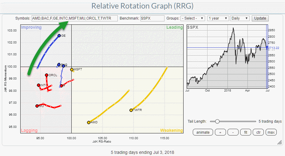
I just picked GE from the Relative Rotation Graph of most active stocks in the S&P 500
by Julius de Kempenaer,
Senior Technical Analyst, StockCharts.com
A good start of the day, at least for me is to go to the StockCharts.com dashboard and look at the Top 10, most active, market movers, in the S&P 500 index. The table gives a quick idea of what has happened the previous day.
From there...
READ MORE
MEMBERS ONLY
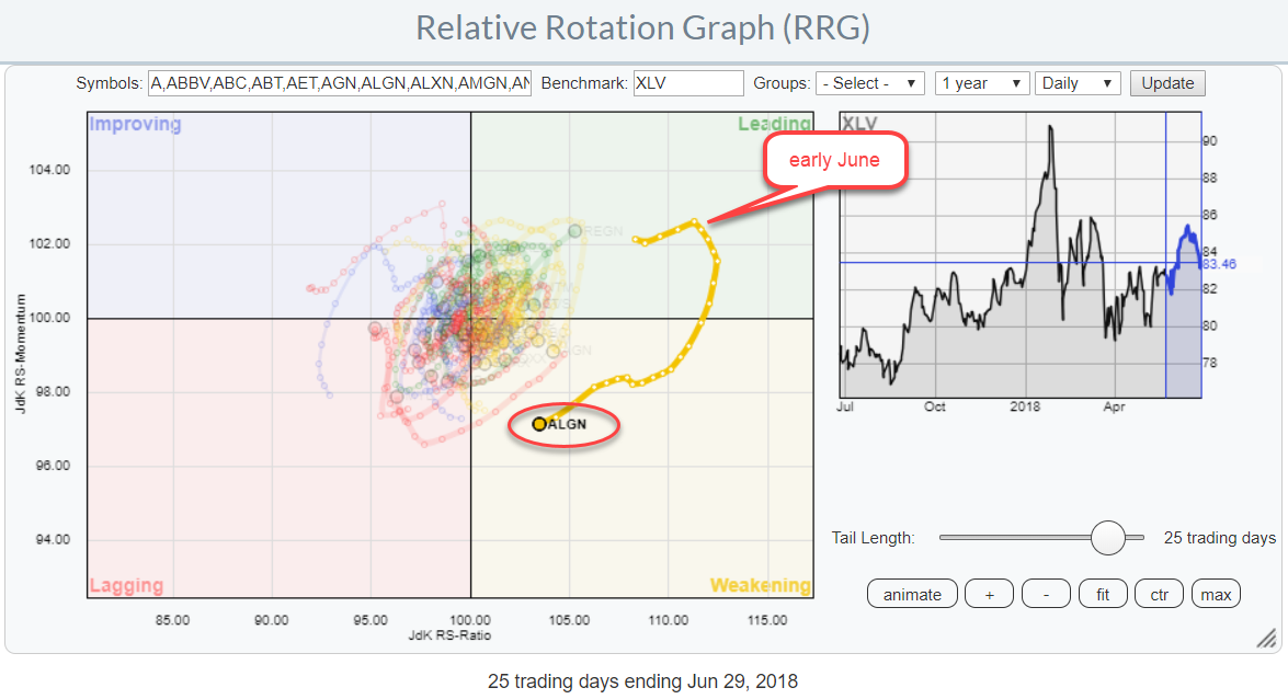
Wide rotation for ALGN on RRG
by Julius de Kempenaer,
Senior Technical Analyst, StockCharts.com
This (DAILY) Relative Rotation Graph shows the rotation of the Health Care stocks against their XLV benchmark.
One stock really stands out because of its wide rotation.
ALGN crossed over into the leading quadrant, from improving, last May and sharply moved higher on the price chart since then while building...
READ MORE