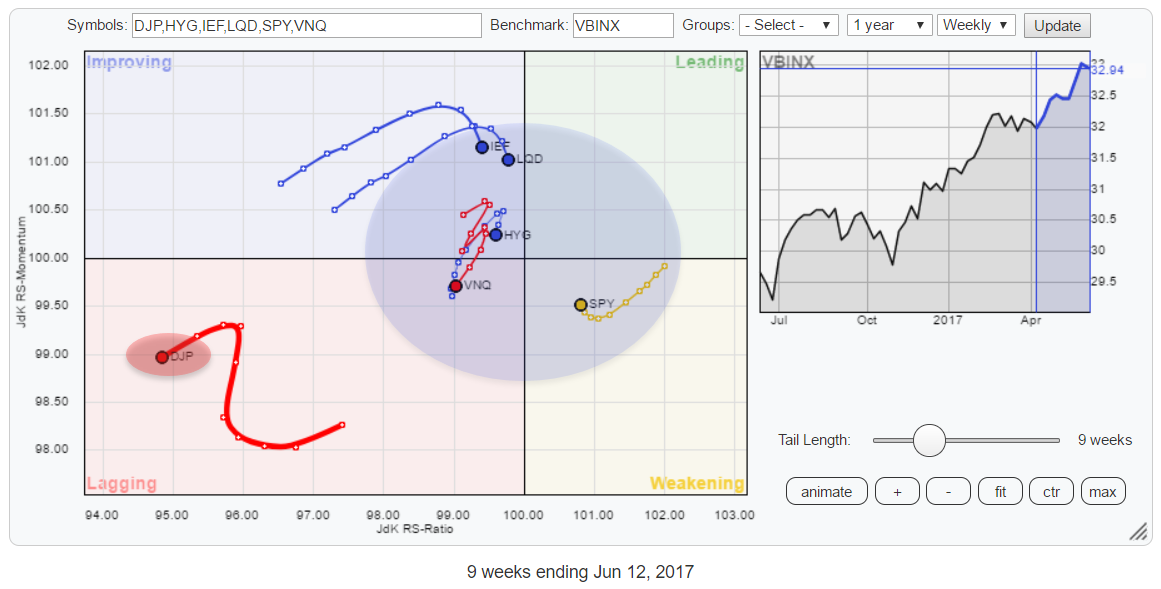
MEMBERS ONLY
Commodities completely detached from other asset classes and equities picking up over bonds again
by Julius de Kempenaer,
Senior Technical Analyst, StockCharts.com
This Relative Rotation Graph for Asset Classes shows Commodities (DJP) far away in the bottom-left corner of the chart, completely detached from the others.
At, by far, the lowest readings on the JdK RS-Ratio axis, DJP moved higher on the JdK RS-Momentum axis for a few weeks but recently turned...
READ MORE
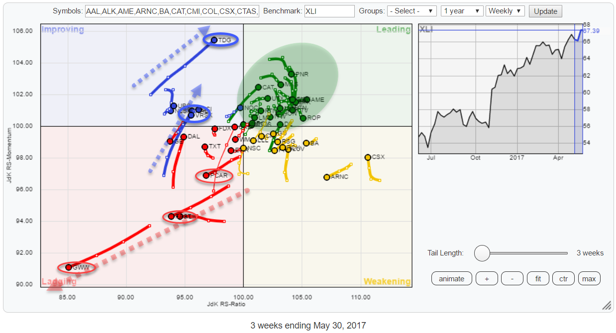
MEMBERS ONLY
Are you looking at Industrial (XLI) stocks? ..Maybe you should.
by Julius de Kempenaer,
Senior Technical Analyst, StockCharts.com
This Relative Rotation Graph holds the top 50 (based on market cap) members of the S&P 500 Industrials sector index (XLI). This sector accounts for just over 10% of the S&P 500 market cap and is the fifth largest sector in this index. At the moment...
READ MORE
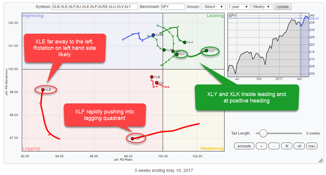
MEMBERS ONLY
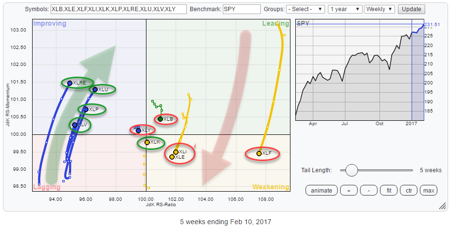
Will Technology (XLK) continue to lead the market higher?
by Julius de Kempenaer,
Senior Technical Analyst, StockCharts.com
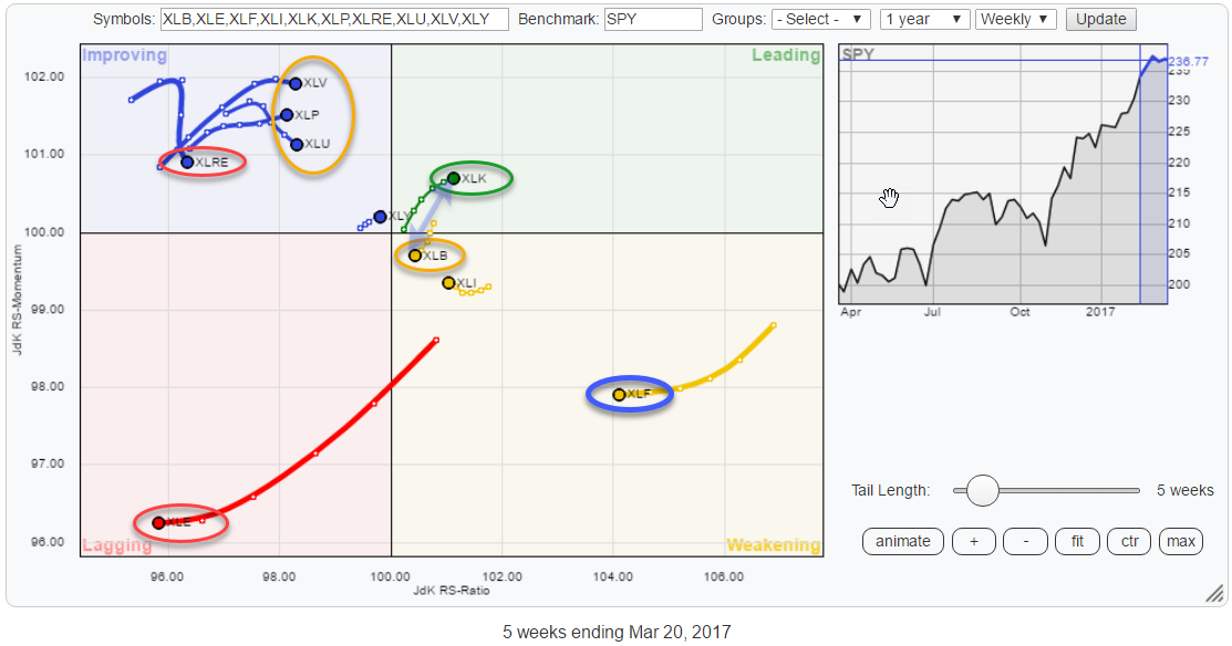
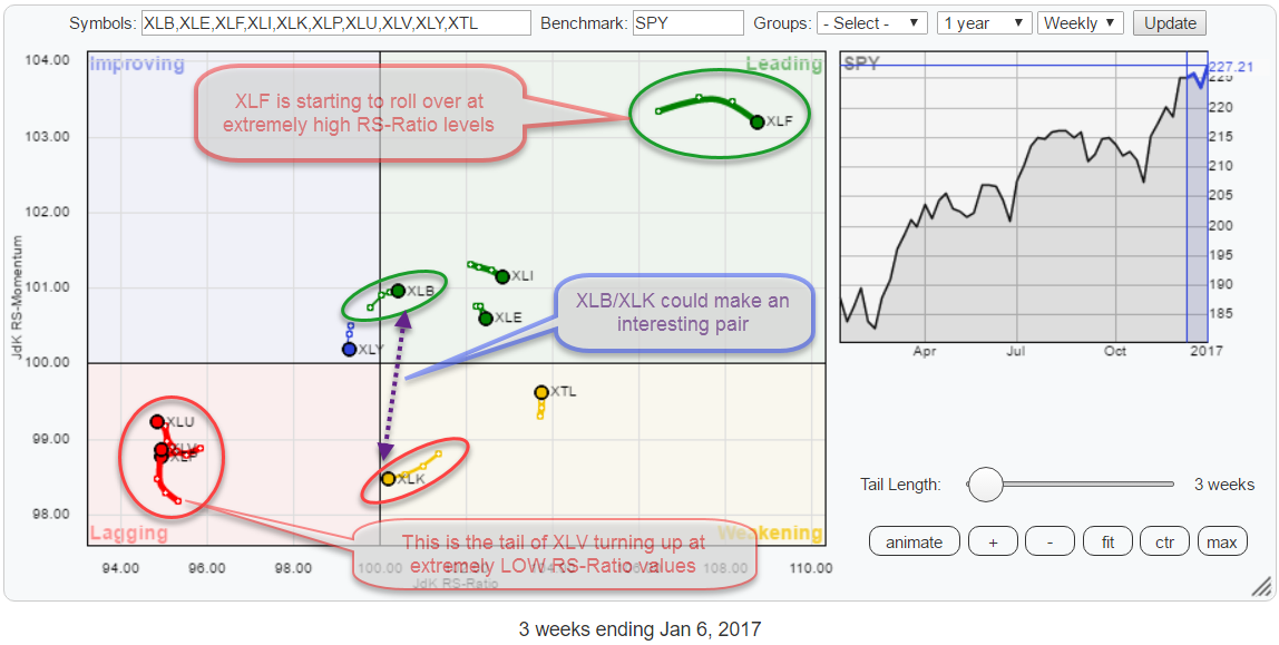
The Relative Rotation Graph for US sectors shows four sectors with rotational patterns that catch the eye and deserve a further investigation.
Inside the lagging quadrant, these are Energy (XLE) and Financials (XLF) and inside the leading quadrant, I am looking at Technology (XLK) and Consumer Discretionary (XLY).
The balance...
READ MORE
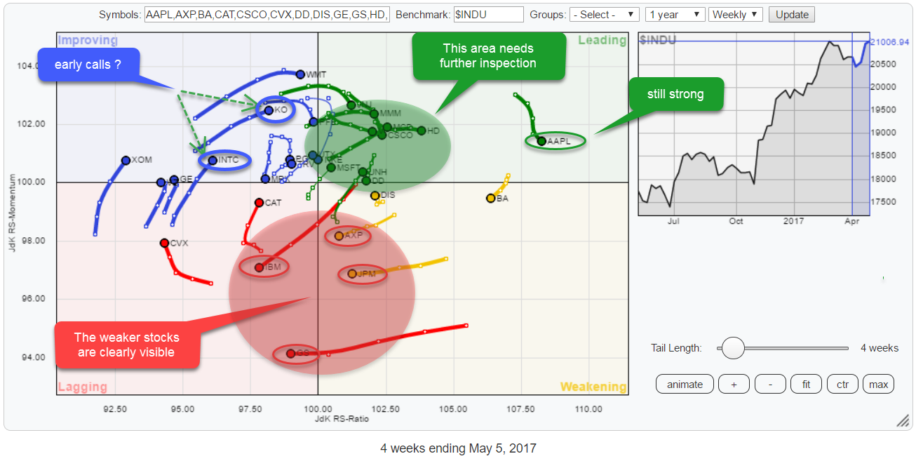
MEMBERS ONLY
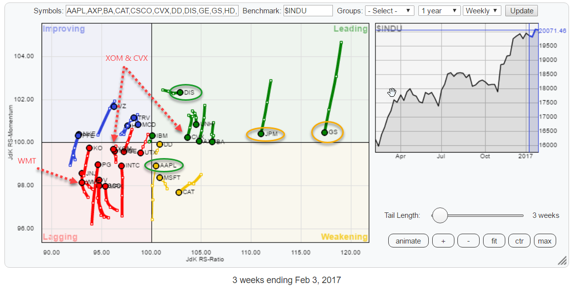
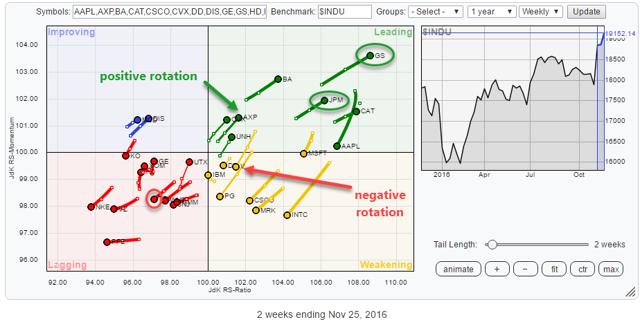
Tech stocks inside $INDU looking good on RRG but avoid IBM and financials.
by Julius de Kempenaer,
Senior Technical Analyst, StockCharts.com
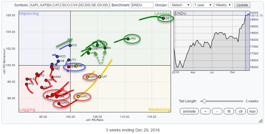
The Relative Rotation Graph for the 30 DJ Industrials (INDU) stocks once again presents us with some interesting insights.
From the picture above we can read that AAPL is still the strongest stock in this universe with the highest JdK RS-Ratio reading and still inside the leading quadrant. Inside the...
READ MORE
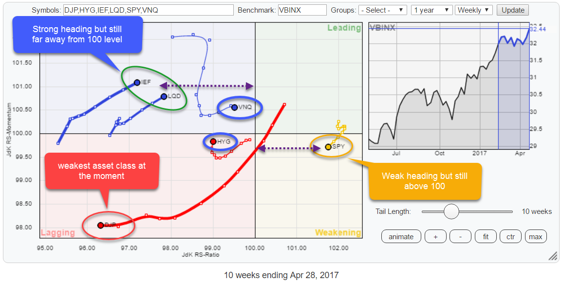
MEMBERS ONLY
No asset class in leading quadrant on RRG but SPY still strongest!
by Julius de Kempenaer,
Senior Technical Analyst, StockCharts.com
The Relative Rotation Graph for asset classes shows that not a single category is inside the leading quadrant at the moment and only one asset class, equities (SPY), is on the right-hand side of the plot.
The quick take from this reading is that only SPY, asset class equities, is...
READ MORE
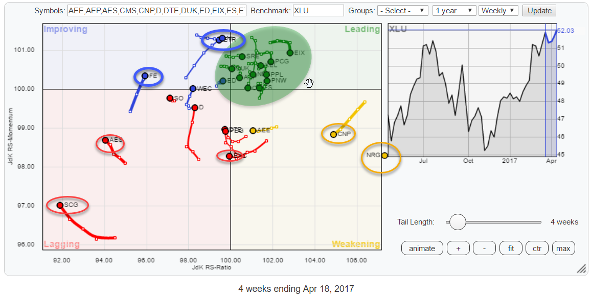
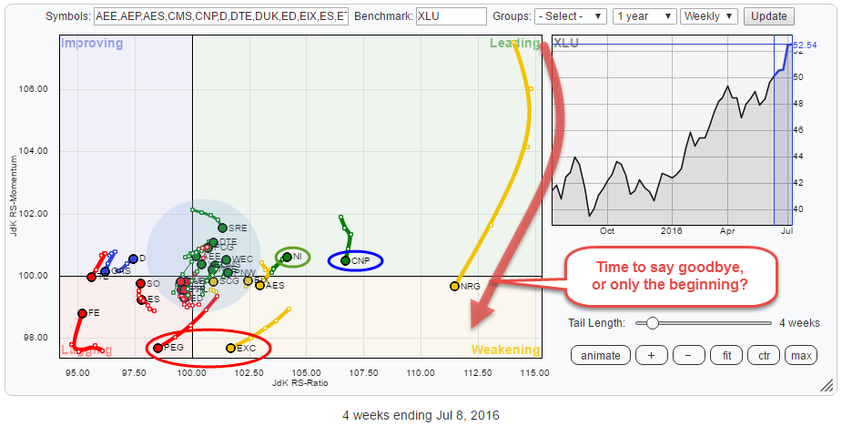
MEMBERS ONLY
Utilities (XLU) moving into leading quadrant, what are the strongest (and the weakest) stocks for this sector?
by Julius de Kempenaer,
Senior Technical Analyst, StockCharts.com
The Relative Rotation Graph above holds the stocks that, together, make up the Utilities sector index (XLU).
The keen observer may notice that there is one stock, NRG, positioned in the "gutter" of the chart. This is done on purpose as NRG is so far out to the...
READ MORE
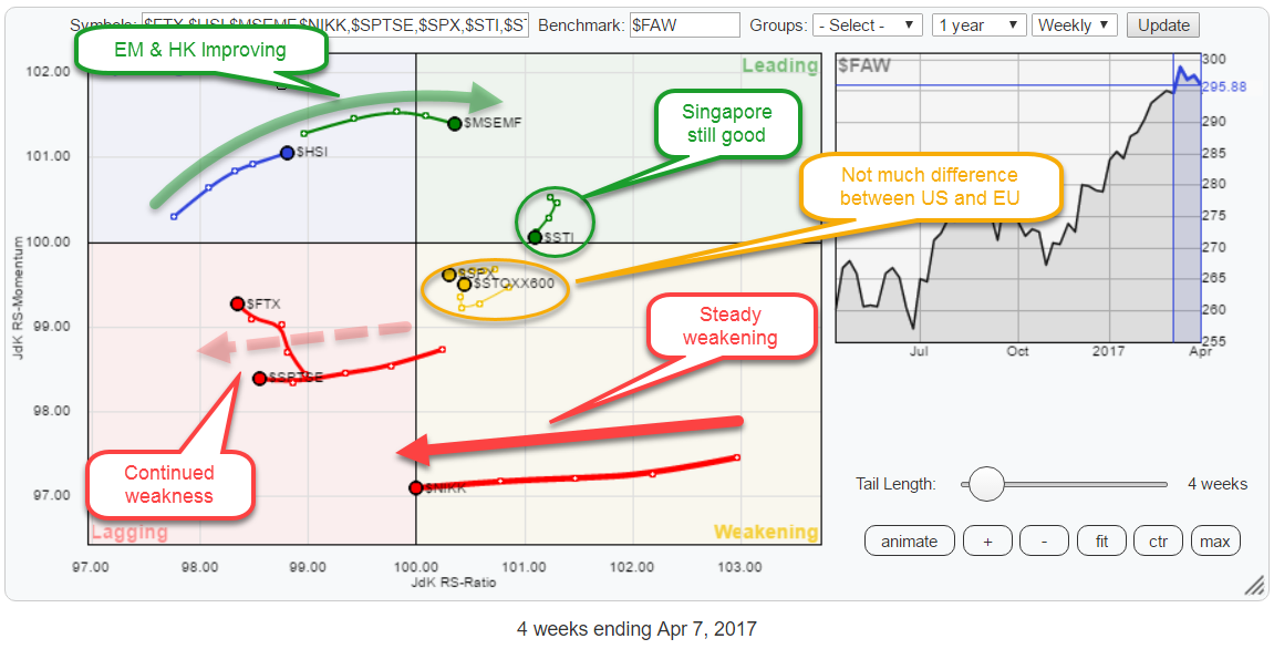
MEMBERS ONLY
RRG suggests favoring Europe over US and Hong Kong over Japan
by Julius de Kempenaer,
Senior Technical Analyst, StockCharts.com
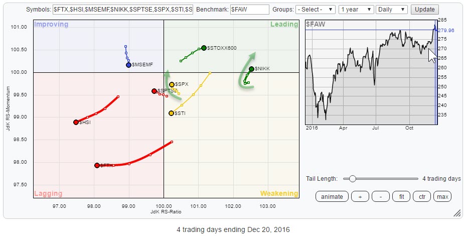
The Relative Rotation Graph above holds some the major world market indices and compares them to the FTSE all world index ($FAW) as the benchmark.
Straight from the RRG above we can make a few interesting observations.
Starting in the lagging quadrant, we find continued weakness for China ($FTX) and...
READ MORE
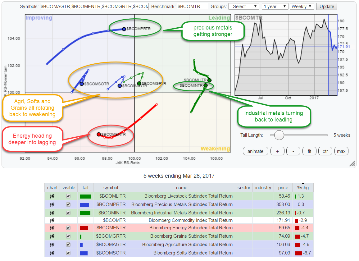
MEMBERS ONLY
Precious metals shining on Relative Rotation Graph
by Julius de Kempenaer,
Senior Technical Analyst, StockCharts.com
Most of the time Relative Rotation Graphs are used to visualize stock-related universes but please "Don't Ignore the fact" that RRGs can be used to visualize the rotation of any universe that holds comparable securities.
In the chart above I have plotted the rotations for all...
READ MORE
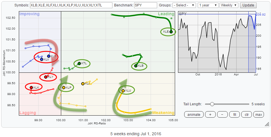
MEMBERS ONLY
Three breaks and you're out .....
by Julius de Kempenaer,
Senior Technical Analyst, StockCharts.com
This post looks at the rotation of US sectors again. The Relative Rotation Graph above holds the ETFs that track the performance of US sectors.
Pretty much immediately the attention goes out to the Energy sector (XLE) and the Financials sector (XLF) as they stand out because of the length...
READ MORE
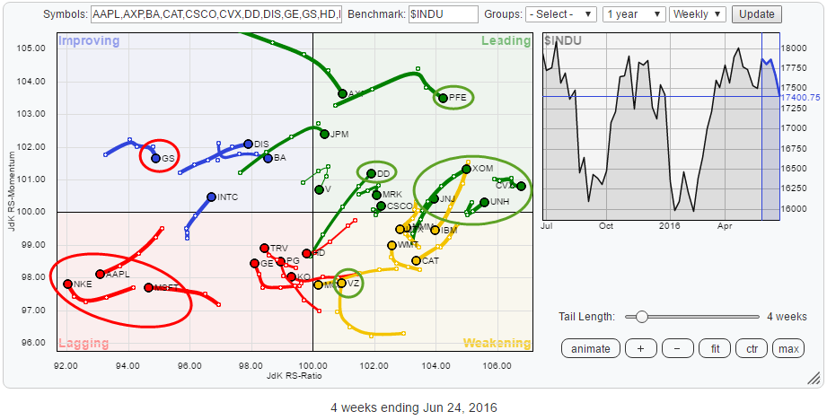
MEMBERS ONLY
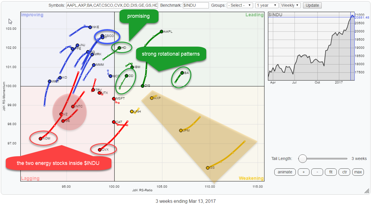
There are two Energy stocks inside $INDU.....
by Julius de Kempenaer,
Senior Technical Analyst, StockCharts.com
... And they both show very weak rotations on the Relative Rotation Graph of the DJ Industrials components.
XOM rotated negatively while inside the lagging quadrant and CVX just crossed over into the lowe-left part coming from weakening. These are the two names to avoid in this universe.
They are closely...
READ MORE
MEMBERS ONLY
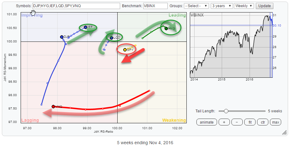
Double divergence building up in SPY:IEF ratio and commodities need another rotation through lagging.
by Julius de Kempenaer,
Senior Technical Analyst, StockCharts.com
Summary
* Opposite rotations for Equities and Bonds on both weekly and daily RRGs
* Rapid weakening of commodities over past six weeks
* Current positioning of SPY suggests some short-term weakness before resuming trend
* IEF in consolidation pattern after breaking long-term uptrend
* Double divergence in SPY:IEF ratio points to potential corrective...
READ MORE
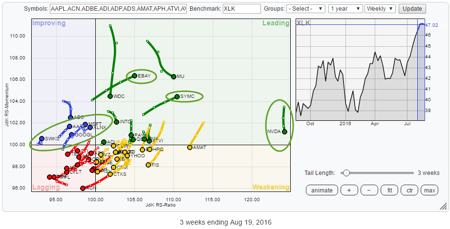
MEMBERS ONLY
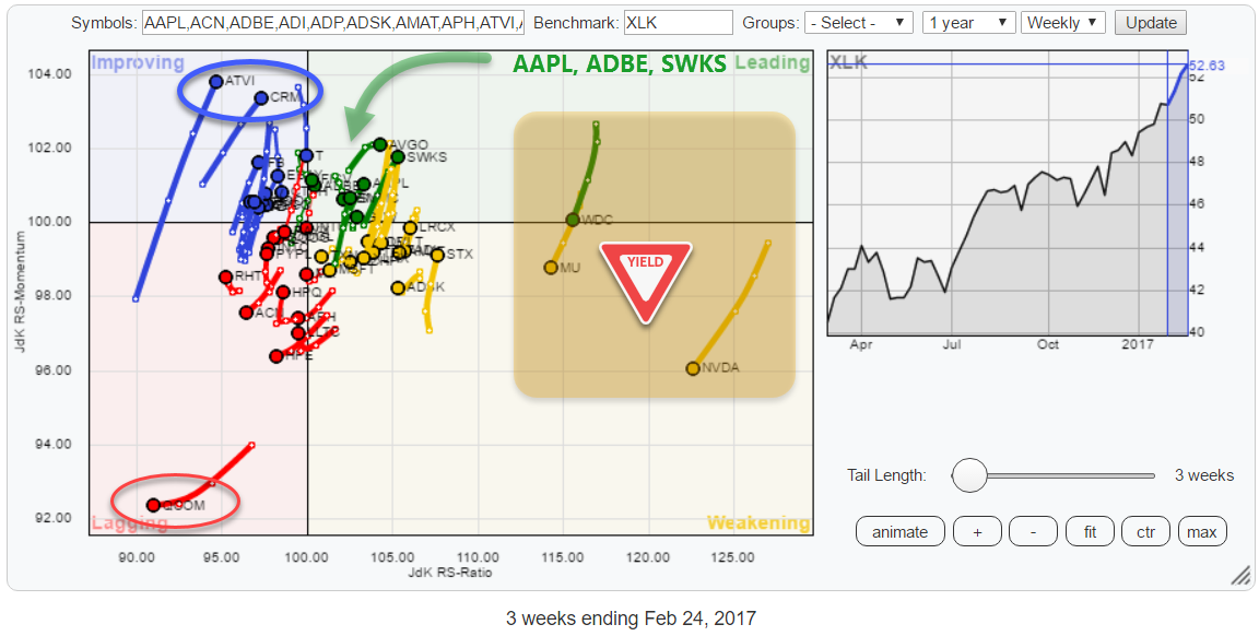
Bye bye NVDA, WDC, MU and Hello, ADBE, AAPL, SWKS
by Julius de Kempenaer,
Senior Technical Analyst, StockCharts.com
Summary
* XLK only sector inside leading quadrant for S&P 500 universe
* QCOM nosediving inside Lagging quadrant
* NVDA rapidly losing its top position within the sector
* WDC tracking MU lower into the weakening quadrant
* GLW providing excellent example of stable uptrend (price and relative)
* ADBE pushing into leading from...
READ MORE
MEMBERS ONLY
Sector rotation from Energy to Utilities, market in transition
by Julius de Kempenaer,
Senior Technical Analyst, StockCharts.com
Summary
* NO sectors inside the lagging quadrant and only one in leading
* Sector rotation suggests market in transition
* Financials continue to loose ground vs Healthcare
* Technology picking up against Materials
* Sector rotation from Energy to Utilities starting to shape up
Quick scan
A first look at the Relative Rotation Graph...
READ MORE
MEMBERS ONLY
AAPL starting to lead technology sector rotation again
by Julius de Kempenaer,
Senior Technical Analyst, StockCharts.com
Summary
* Inside Financials, money is shifting from GS & JPM to V
* AAPL turning back up towards leading quadrant, makes it leading stock in technology
* XOM and CVX confirm weak rotation for Energy sector
* Opposite rotations for DIS and WMT inside Staples sector
Quick scan
The Relative Rotation Graph above...
READ MORE
MEMBERS ONLY
RRG shows money flowing into commodities!
by Julius de Kempenaer,
Senior Technical Analyst, StockCharts.com
The Relative Rotation Graph holding a number of asset class ETFs is showing a strong push of commodities (DJP) into the leading quadrant. Together with Real Estate (VNQ), these two asset classes are showing the most powerful headings in combination with the longest tails.
They deserve a further investigation.
Summary...
READ MORE
MEMBERS ONLY
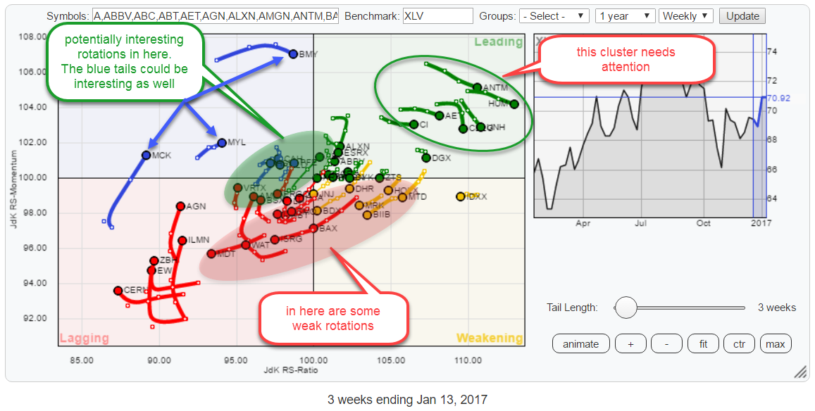
Is JNJ the pink elephant in the XLV room?
by Julius de Kempenaer,
Senior Technical Analyst, StockCharts.com
The Relative Rotation Graph above holds the constituents of the XLV (Health Care) ETF. In this post, I want to follow up on my previous article which pointed at the potential rotation from Financials into Health Care and take a look at the relative rotation of individual stocks that make...
READ MORE
MEMBERS ONLY
Rotation from Financials into Health care? Two sectors at extremes.
by Julius de Kempenaer,
Senior Technical Analyst, StockCharts.com
The Relative Rotation Graph below holds the sector ETFs that make up the S&P 500 universe and uses the S&P 500 index ETF (SPY) as its benchmark in the center of the graph.
Four rotational patterns, two pairs, capture my attention when I look at this...
READ MORE
MEMBERS ONLY
Tech stocks losing IT
by Julius de Kempenaer,
Senior Technical Analyst, StockCharts.com
From July to November of this year Tech stocks have dominated the performance of the Dow Jones Industrials Index ($INDU) but then came November!
The Relative Rotation Graph of all DJ Industrials stocks below shows the rotational pattern of all $INDU members with a three-week tail.
The recent weakness for...
READ MORE
MEMBERS ONLY
US equities are good, Japanese are better - for now.
by Julius de Kempenaer,
Senior Technical Analyst, StockCharts.com
The Relative Rotation Graph above holds a number of (world) equity indices compared to the FTSE all world index as the benchmark, using daily data. For those of you who are following my regular RRG blog, this means a shorter-term view than you are used to from me.
The rotations...
READ MORE
MEMBERS ONLY
What the ....happened in the week ending 11 November?
by Julius de Kempenaer,
Senior Technical Analyst, StockCharts.com
My last article on asset allocation was posted just before election day (11/8), and I was not happy about the rotation for equities against bonds...
What a difference a week makes.
The relative rotation graph above shows the rotation of various asset classes, represented by ETFs, over the past...
READ MORE
MEMBERS ONLY
Put some focus on the materials sector (XLB) but be aware of which stocks to avoid.
by Julius de Kempenaer,
Senior Technical Analyst, StockCharts.com
Last weeks RRG blog looked at the sector ETFs that make up the S&P 500 index. Materials, the XLB ETF, came out as one of the, more promising, sectors on its way to the leading quadrant.
In this post, I will look into the individual stocks that make...
READ MORE
MEMBERS ONLY
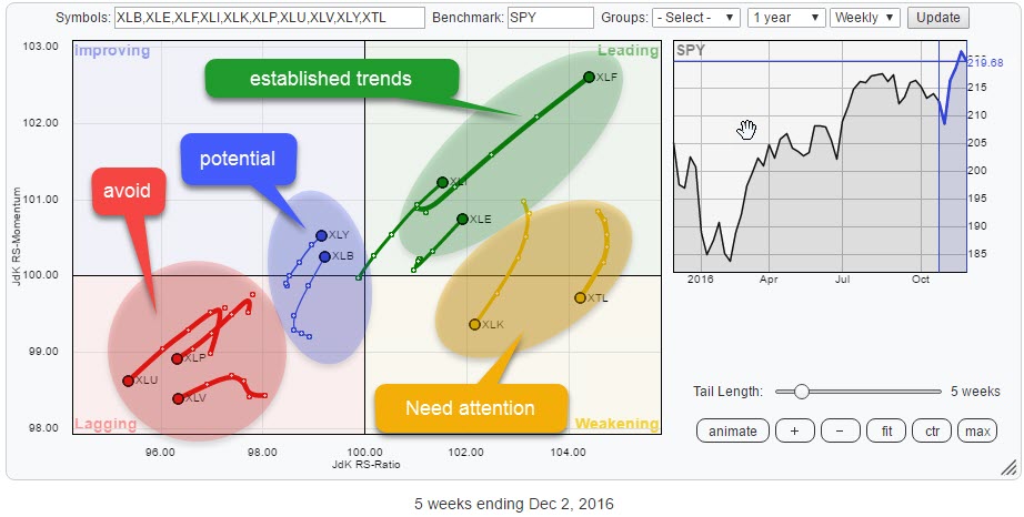
Very clear rotational picture in US sectors! Watching XLE, XLI and XLB for opportunities
by Julius de Kempenaer,
Senior Technical Analyst, StockCharts.com
The Relative Rotation Graph above shows the rotational picture for US sectors. For a change the rotations are well defined and clearly visible, which immediately raises the question; " For how long?"
I will try to answer the question, but no-one ever said it was easy.. ;)
Summary
* Well defined...
READ MORE
MEMBERS ONLY
Financials are leading but they are not all equally good
by Julius de Kempenaer,
Senior Technical Analyst, StockCharts.com
After the dust has settled, it is time to assess what is going on under the hood.
The above Relative Rotation Graph holds the 30 Dow Jones Industrials components. As usual, they are fairly evenly spread out over the canvas of the RRG plot.
From the RRG of the US...
READ MORE
MEMBERS ONLY
How to use Relative Rotation Graphs to monitor your portfolio.
by Julius de Kempenaer,
Senior Technical Analyst, StockCharts.com
As (many of) you may know my fellow commentator Arthur Hill lives in Belgium. That makes him, geographically, my closest StockCharts.com colleague.
On Tuesday 8 November, indeed election day, the Amsterdam chapter of the MTA (Market Technicians Association) had Katie Stockton of BTIG over as a guest speaker for...
READ MORE
MEMBERS ONLY
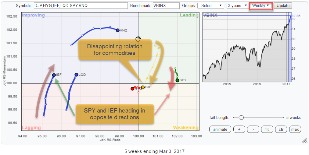
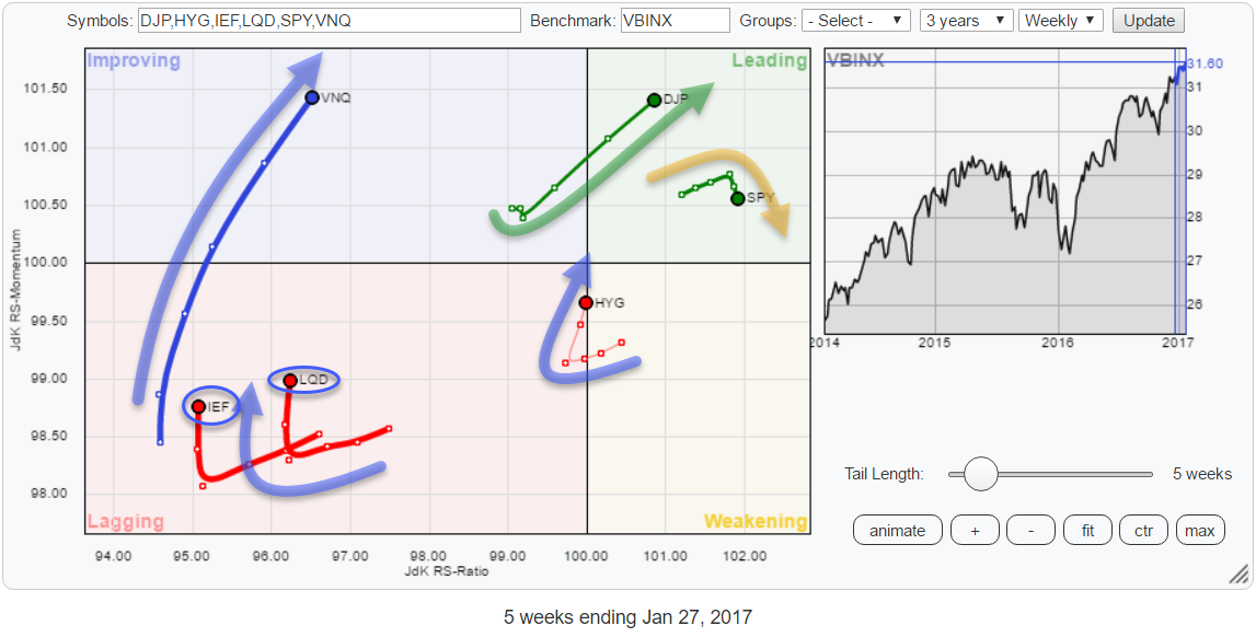
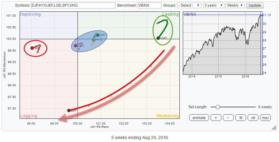
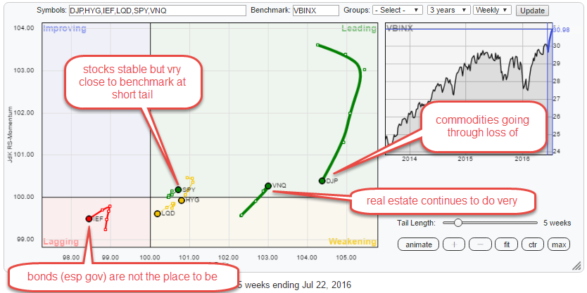
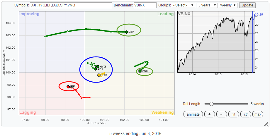
Bond market charts look horrible but they show positive rotation on RRG
by Julius de Kempenaer,
Senior Technical Analyst, StockCharts.com
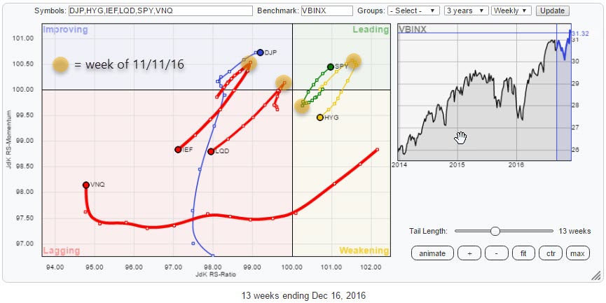
The Relative Rotation Graph above shows the rotation of various asset classes against VBINX, a balanced index fund holding 60% in equities and 40% in bonds.
The current rotational picture is highlighting a pretty clear rotational picture for various (groups of) asset classes.
The most important observation is that all...
READ MORE
MEMBERS ONLY
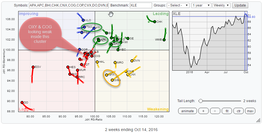
Energy stocks on the run, watch APA & APC
by Julius de Kempenaer,
Senior Technical Analyst, StockCharts.com
Quick scan
The Relative Rotation Graph above shows the rotation of the various members of the S&P Energy sector against XLE as a benchmark.
As usual, there are some good and some not so good names found on the plot. Inside the weakening quadrant, NFX and SWN are...
READ MORE
MEMBERS ONLY
Addressing RRG - Feedback and questions from ChartCon 2016
by Julius de Kempenaer,
Senior Technical Analyst, StockCharts.com
From a 100 degrees in beautiful Napa, via 70 degrees in Boston and New Hampshire, back to 50 and dropping in Amsterdam.
That pretty much sums up the excitement level that surrounds my ChartCon 2016 experience of last month!
Btw. In case you are wondering, the stop-over in Boston was...
READ MORE
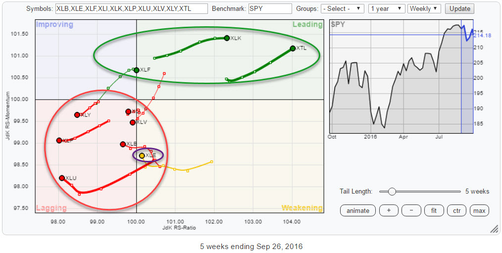
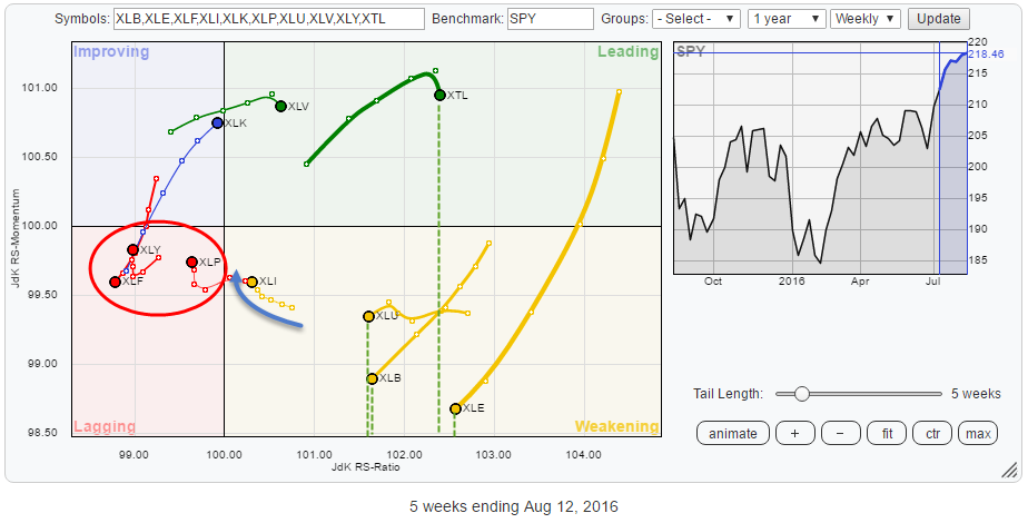
MEMBERS ONLY
6 out of 10 sectors rotating in(to) lagging quadrant
by Julius de Kempenaer,
Senior Technical Analyst, StockCharts.com
The Relative Rotation Graph above shows the sector rotation for ten US sector ETFs. The new REITs sector ETF is not included yet due to a lack of historical data points.
The immediate catch on the RRG above is the separation of XLK and XTL in the leading quadrant while...
READ MORE
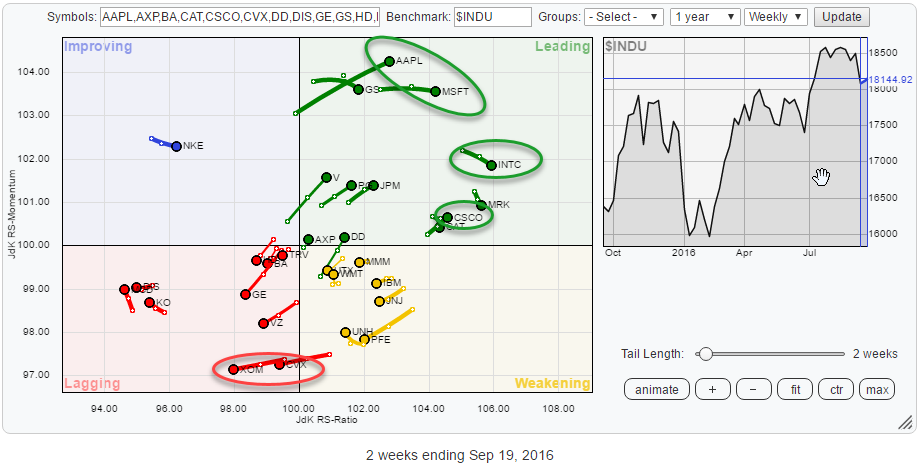
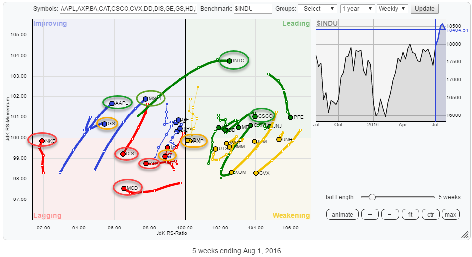
MEMBERS ONLY
Tech stocks dominate sector rotation but broader market at risk
by Julius de Kempenaer,
Senior Technical Analyst, StockCharts.com
The Relative Rotation Graph below holds the components of the Dow Jones Industrials index vis-à-vis the $INDU index.
The one observation that immediately stands out to me is the domination of technology stocks inside the leading quadrant. AAPL, MSFT, INTC, and CSCO are all positioned well inside the top right-hand...
READ MORE
MEMBERS ONLY
Bonds under pressure and SPY no longer beating international equity markets
by Julius de Kempenaer,
Senior Technical Analyst, StockCharts.com
On the Relative Rotation Graph below, the rotation of various asset classes is shown against the Vanguard Balanced Index Fund (VBINX).
The single one tail that immediately stands out is the one of DJP (Commodities). Then there are IEF (Government bonds) on the far left inside the lagging quadrant and...
READ MORE
MEMBERS ONLY
Facebook (FB) not able to keep up with XLK
by Julius de Kempenaer,
Senior Technical Analyst, StockCharts.com
The technology sector, as represented by XLK, started to show some positive sector rotation over the past month and last week managed to crossover from the improving quadrant to the leading quadrant on the weekly Relative Rotation Graph.
Reason enough to check out the relative technical conditions for the stocks...
READ MORE
MEMBERS ONLY
Strong rotation for Technology but SPY is still lacking fuel
by Julius de Kempenaer,
Senior Technical Analyst, StockCharts.com
To surrender or not to surrender? That's the question!
After a nice run up in the S&P 500, I started to worry about its ability to push higher when resistance levels coming off previous highs started to act up. At, more or less, the same time,...
READ MORE
MEMBERS ONLY
Tech stocks starting to look cool again, Financials not so much... yet!
by Julius de Kempenaer,
Senior Technical Analyst, StockCharts.com
Over the past few weeks, I have argued in some my posts that the state of sector rotation would not back a strong rise for the general market. The "defensive" sectors were simply too strong compared to the, more, cyclical sectors which are usually needed to push a...
READ MORE
MEMBERS ONLY
Real Estate shines, Stocks are still good, US stocks are even better.
by Julius de Kempenaer,
Senior Technical Analyst, StockCharts.com
The Relative Rotation Graph below shows the rotation for various asset classes (through ETFs) against the Vanguard Balanced Index fund (VBINX) on a weekly basis.
The picture is pretty conclusive for some asset classes but less so for others. Zooming in on the daily time-frame, usually, helps to add a...
READ MORE
MEMBERS ONLY
Utility stocks are boring .... really?
by Julius de Kempenaer,
Senior Technical Analyst, StockCharts.com
On the Relative Rotation Graph of the S&P economic sectors (GICS I), Utilities is one of the leading sectors as measured by the JdK RS-Ratio.
As described in my last RRG blog on US sectors, the fact that Utility stocks and Staples are leading the current sector rotation,...
READ MORE
MEMBERS ONLY
Staples and Utilities in the lead, what does that tell you?
by Julius de Kempenaer,
Senior Technical Analyst, StockCharts.com
Over the past few weeks markets, in general, experienced a lot of volatility and a lot of comments have are focussing on the general state and direction of the broader market indices around the world. In my last blog about US sector rotation, the conclusion was that the relative rotation...
READ MORE
MEMBERS ONLY
BrExit did not stop VZ from breaking to new highs
by Julius de Kempenaer,
Senior Technical Analyst, StockCharts.com
When you look at the Relative Rotation Graph (below) holding the members of the Dow Jones Industrials index without knowing what date the snapshot was taken you would not be able to tell that a major historical event had just happened....
Obviously, I am talking about the surprising outcome of...
READ MORE
MEMBERS ONLY
How to show "currency rotation" on a Relative Rotation Graph.
by Julius de Kempenaer,
Senior Technical Analyst, StockCharts.com
Currencies or Forex are a strange beast in financial markets. The FX market is the biggest in the world with trillions of dollars (worth) traded around the clock but no central marketplace. There is no such thing as the 'New York Currency Exchange' or the 'European Currency...
READ MORE
MEMBERS ONLY
Commodities (DJP) on the move?
by Julius de Kempenaer,
Senior Technical Analyst, StockCharts.com
The rotational pattern of the various asset classes on a Relative Rotation Graphs is showing interesting patterns at the moment. The RRG below holds a number of ETFs that cover Equities, Government Bonds, Corporate Bonds, High Yield Bonds, Real-Estate and Commodities. The benchmark is VBINX, the Vanguard Balanced Index Fund...
READ MORE
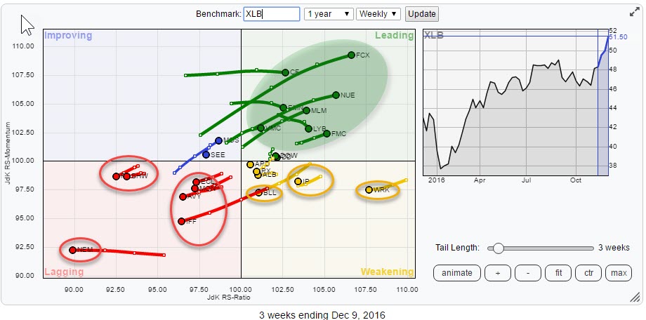
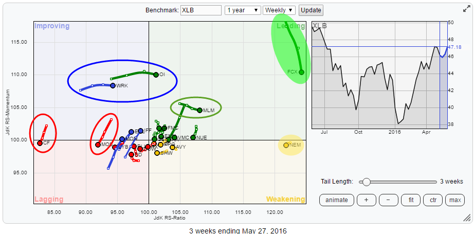
MEMBERS ONLY
FCX and NEM drive Materials (XLB) sector. Next up; FMC
by Julius de Kempenaer,
Senior Technical Analyst, StockCharts.com
The Relative Rotation Graph below holds the constituents of the Materials sector (XLB) and shows the relative rotation of these stocks against XLB. FCX and NEM stand out on this chart, way out to the right, indicating that they are the two stocks with the strongest relative trends at the...
READ MORE