MEMBERS ONLY
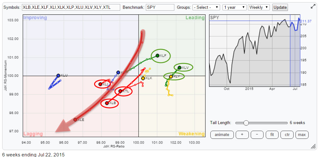
US sector rotation on the move, not supporting a rise in $SPX
by Julius de Kempenaer,
Senior Technical Analyst, StockCharts.com
The last RRG blog on US sector rotation dates back to late March, about six weeks ago. Since that post "Bad health (care) for XLV" some of the rotations in play continued while others were not able to maintain their expected rotational paths and moved the other way....
READ MORE
MEMBERS ONLY
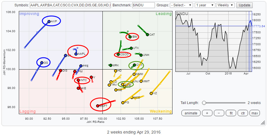
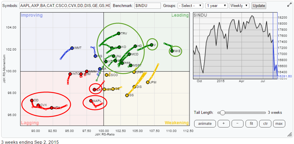
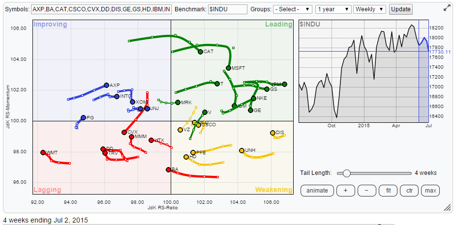
Trouble in Tech but opportunities in Energy
by Julius de Kempenaer,
Senior Technical Analyst, StockCharts.com
This Relative Rotation Graph holds the constituents of the Dow Jones Industrials Average ($INDU) and shows the position and movement of their relative trends against $INDU and each other.
In this article, I will focus on the movements in the technology- and the energy sectors and briefly touch on financials....
READ MORE
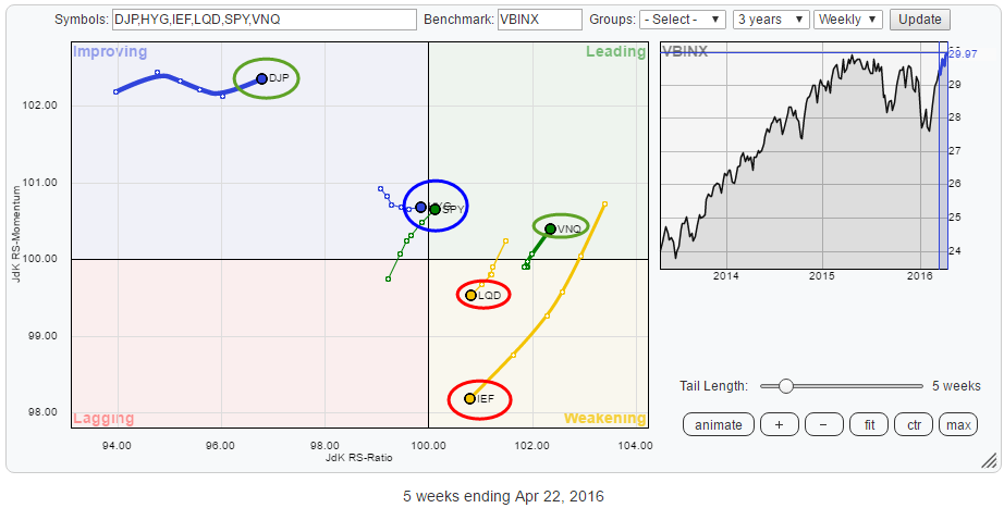
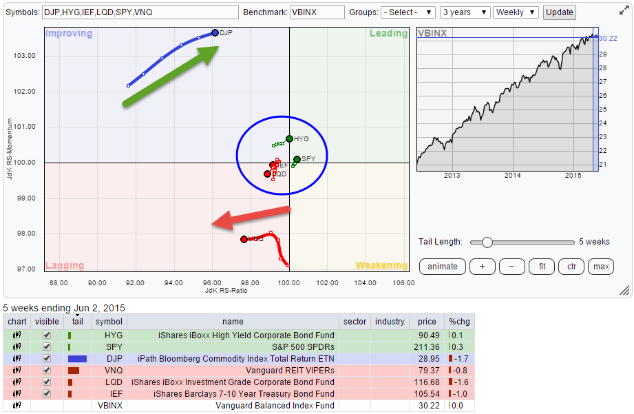
MEMBERS ONLY
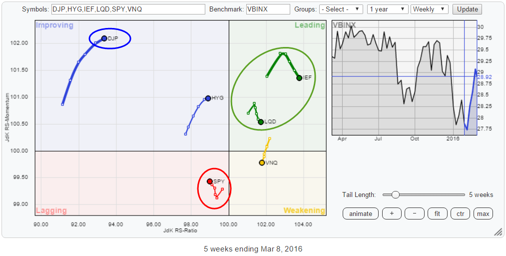
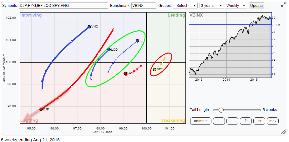
Strong rotation for commodities, SPY and IEF (ratio) under threat
by Julius de Kempenaer,
Senior Technical Analyst, StockCharts.com
The Relative Rotation Graph below shows the rotational picture for a number of asset classes, based on ETFs, against the Vanguard Balanced index fund on a weekly basis. For some of these asset classes, the equivalent picture on a daily basis is confirming but for others it is contrarian. Or...
READ MORE
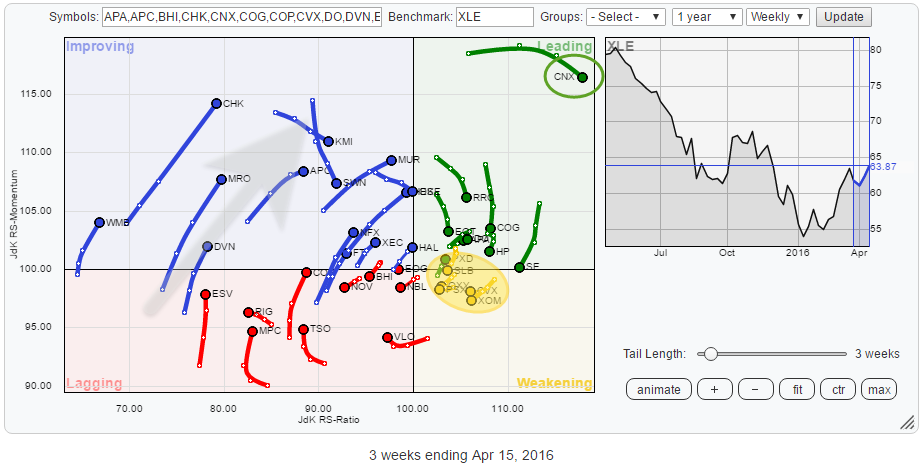
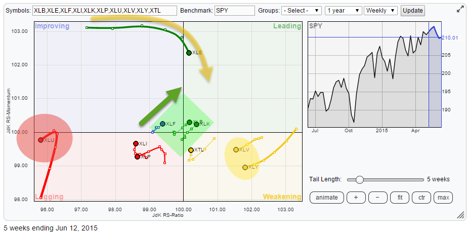
MEMBERS ONLY
Bottom fishing in the Energy sector..
by Julius de Kempenaer,
Senior Technical Analyst, StockCharts.com
The energy sector has been a very poor performing sector for a very long time. However, on the Relative Rotation Graph for US sectors (ETFs), XLE is now way up inside the improving quadrant and heading right towards leading. This makes it a good sector to dissect on an individual...
READ MORE
MEMBERS ONLY
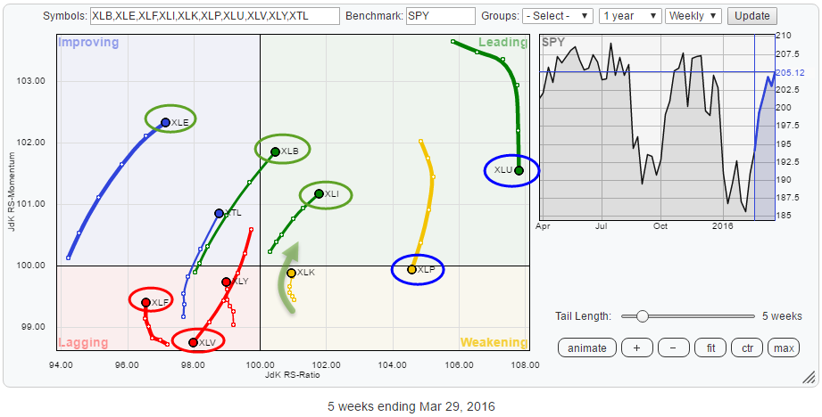
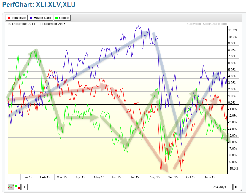
Bad Health (care) for XLV
by Julius de Kempenaer,
Senior Technical Analyst, StockCharts.com
The Relative Rotation Graph for US sectors shows us the relative movement of the various sectors against the benchmark (SPY) and against each other and in this way visualizes the current sector rotation in the US equity market.
The RRG below shows the ETFs covering the major sectors of the...
READ MORE
MEMBERS ONLY
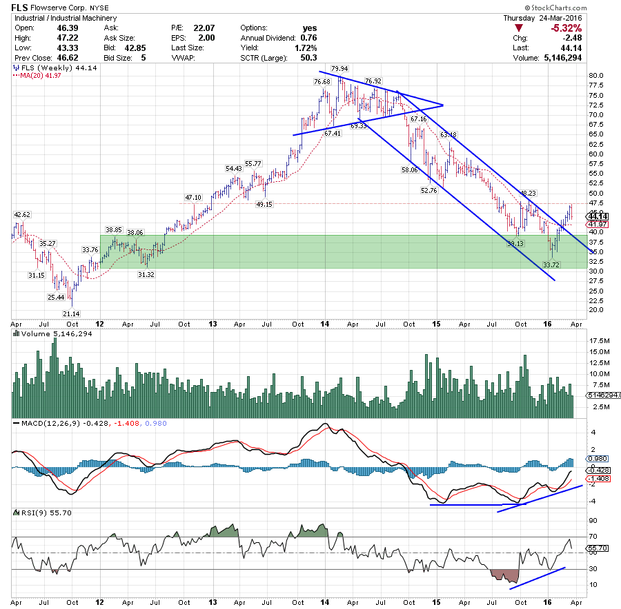
Getting in (f)LOW(serve)
by Julius de Kempenaer,
Senior Technical Analyst, StockCharts.com
FLS is a stock that has been pretty much off the radar for two years as a potential long candidate, but this looks to be changing now!
After breaking out of an almost perfect symmetrical triangle in 2014, FLS trended lower until the beginning of this year, when a low...
READ MORE
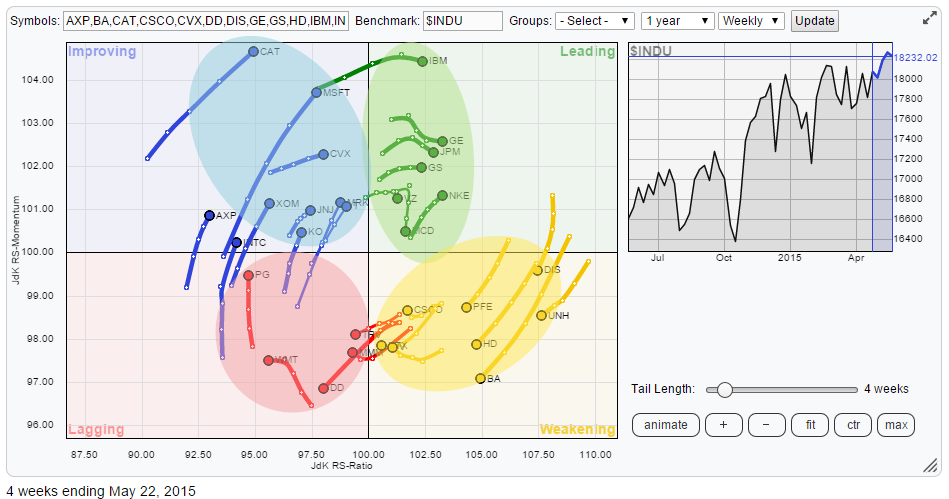
MEMBERS ONLY
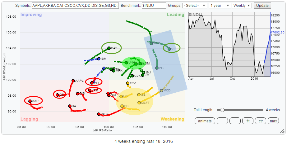
Weak relative rotation for PFE, CAT expected to keep on truckin'
by Julius de Kempenaer,
Senior Technical Analyst, StockCharts.com
The Relative Rotation Graph above holds the 30 stocks that make up the Dow Jones Industrials Index ($INDU). The rotational patterns of the individual stocks vary widely. The RRG shows you where the opportunities are but, maybe even more important, also shows you the threats.
Summary
* VZ leads the (relative)...
READ MORE
MEMBERS ONLY
Something cooking in commodities?
by Julius de Kempenaer,
Senior Technical Analyst, StockCharts.com
We live in interesting times... or maybe I should say: We live in confusing times.... Because, really, markets are throwing some serious curve balls here and there. It is time to look at some asset class rotations again.
The Relative Rotation Graph shows the rotation of a number of asset...
READ MORE
MEMBERS ONLY
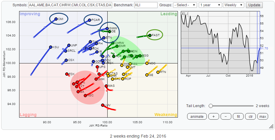
Stock rotation inside Industrials (XLI) sector
by Julius de Kempenaer,
Senior Technical Analyst, StockCharts.com
The Industrials sector, XLI, itself is positioned near the center of the Relative Rotation Graph holding all the sector ETFs that make up the S&P 500 index. This means that XLI is moving more or less in line with the S&P 500 and that there is,...
READ MORE
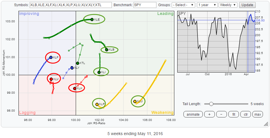
MEMBERS ONLY
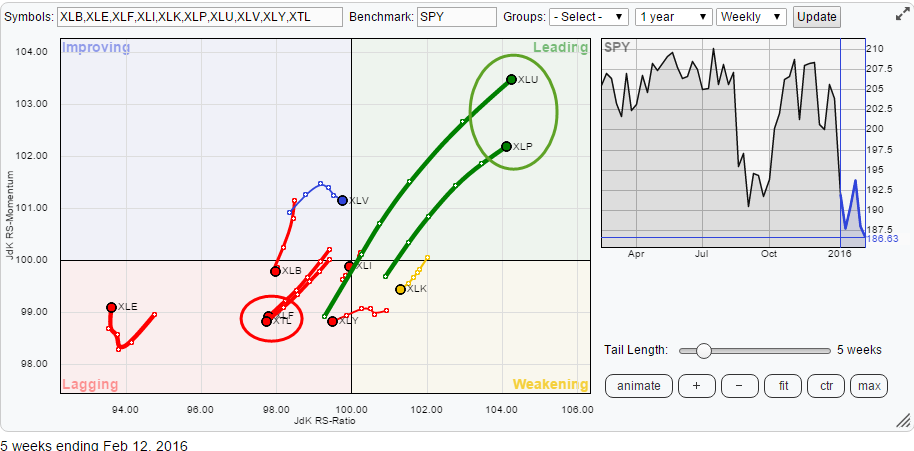
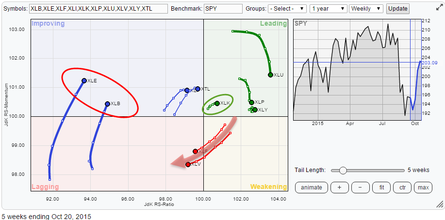
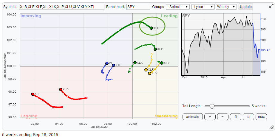
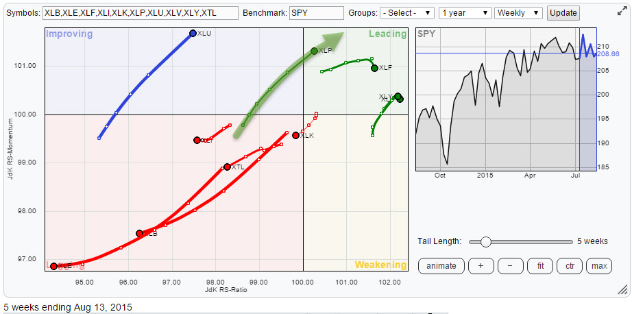
Strong sector rotation inside S&P 500 suggests more weakness in Financials
by Julius de Kempenaer,
Senior Technical Analyst, StockCharts.com
Since the beginning of the year, the internal characteristics of the S&P 500 universe are characterized by strong sector rotation. The Relative Rotation Graph below shows the sector rotation over the past five weeks. A few sectors are standing out and worth a further inspection.
Summary
* XTL expected...
READ MORE
MEMBERS ONLY
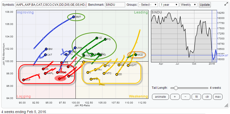
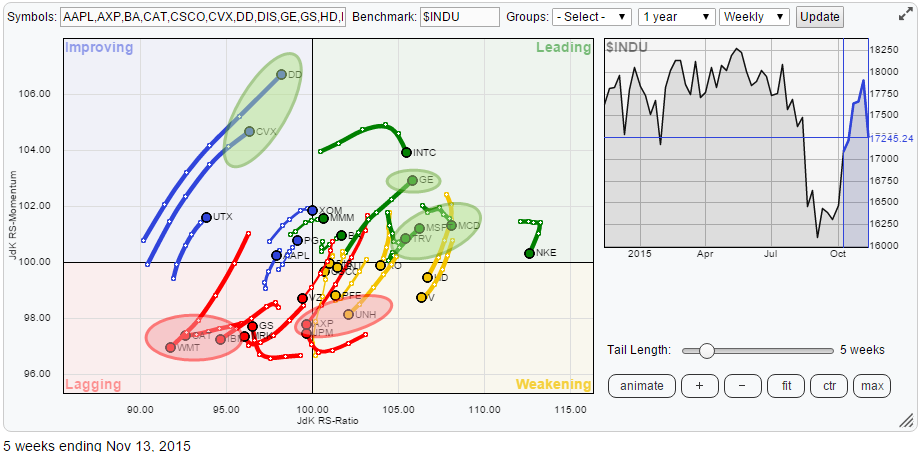
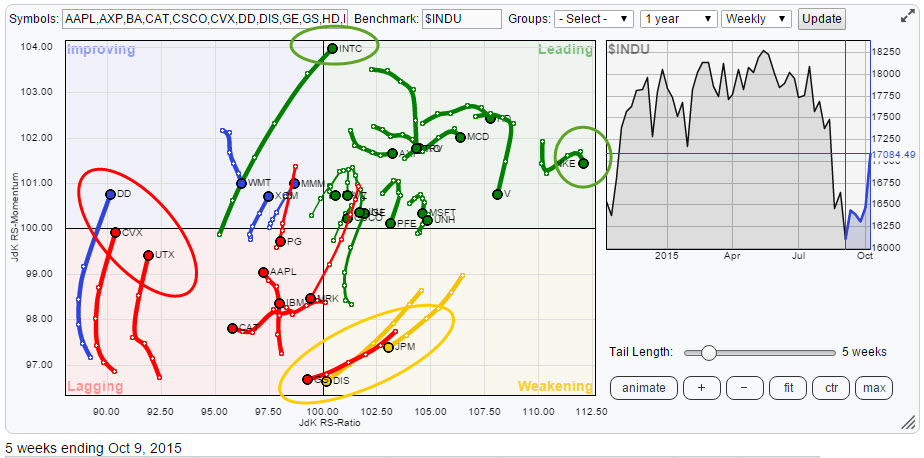
Trouble in DIS(neyland) and renewed energy for XOM
by Julius de Kempenaer,
Senior Technical Analyst, StockCharts.com
Over the past few days I have been looking at the Relative Rotation Graph of the 30 Dow stocks and its individual charts, and quite frankly I don't even know where to begin. Big swings all over the place, from +6% in DD to -9% in MSFT and...
READ MORE
MEMBERS ONLY
Price target for SPY at $ 165 ?
by Julius de Kempenaer,
Senior Technical Analyst, StockCharts.com
Big bounces all over the place, not just in equities. In this article I want to take a look at relative rotation at an asset class level, of course, using an RRG lens.
The Relative Rotation Graph below shows the relative trends in play for several asset classes over the...
READ MORE
MEMBERS ONLY
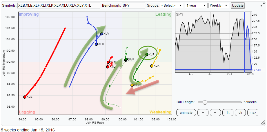
Picking stocks inside XLP
by Julius de Kempenaer,
Senior Technical Analyst, StockCharts.com
The sector rotation inside the S&P 500 index is getting more and more pronounced.
The Relative Rotation Graph holding the sector ETFs that make up the entire S&P 500 index clearly shows the recent improvement for Health Care (XLV), Utilities (XLU) and Consumer Staples (XLP). I...
READ MORE
MEMBERS ONLY
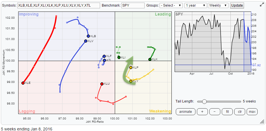
Price targets for SPY based on the relative strength of XLP.
by Julius de Kempenaer,
Senior Technical Analyst, StockCharts.com
Wow, what a start of the new year! Increased volatility sounds like an understatement.
In my previous blog on sector rotation in the US equity market, the Consumer Staples sector (XLP) popped up as potentially interesting, especially in relation to its counterpart consumer discretionary. Since the start of the new...
READ MORE
MEMBERS ONLY
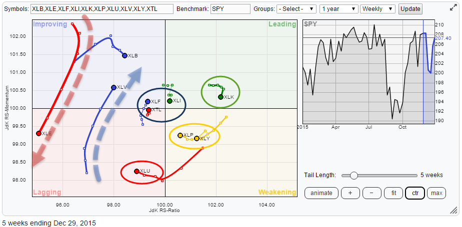
Staples or Discretionary?
by Julius de Kempenaer,
Senior Technical Analyst, StockCharts.com
The Relative Rotation Graph for US sectors is once again showing us some interesting rotational patterns at the moment. Clearly XLE is showing us a very long tail moving from improving back to lagging again. Then there are XLU, XLV and XLB also showing long tails but sending different messages....
READ MORE
MEMBERS ONLY
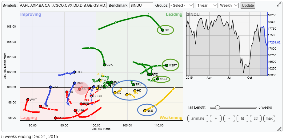
AAPL up to no good?
by Julius de Kempenaer,
Senior Technical Analyst, StockCharts.com
The Relative Rotation Graph with the Dow Jones Industrials stocks once again shows some interesting moves. There are a few long tails that catch my attention for a quick inspection but in this article, I want to pay a closer look at some stocks with remarkably short tails. One of...
READ MORE
MEMBERS ONLY
What does a stock with an RS-Momentum value of 105 equate to in respect of time?
by Julius de Kempenaer,
Senior Technical Analyst, StockCharts.com
Last week I received a question from a StockCharts.com user on RRG charts via e-mail. Usually, I try to answer such questions in 1-1 fashion by replying to the particular email. Most of the time this involves pointing to information on Relative Rotation Graphs that is already present in...
READ MORE
MEMBERS ONLY
Asset class rotation: it depends on the time-frame
by Julius de Kempenaer,
Senior Technical Analyst, StockCharts.com
Summary
* Commodities keep tanking
* Bond related asset classes weakening
* Equities leading on weekly- but weakening on daily time-frame
* US equities continue to lead international equity markets
* Chinese market coming back into play
Quick scan
A quick look at the Relative Rotation Graph holding a number of asset class ETFs, comparing...
READ MORE
MEMBERS ONLY
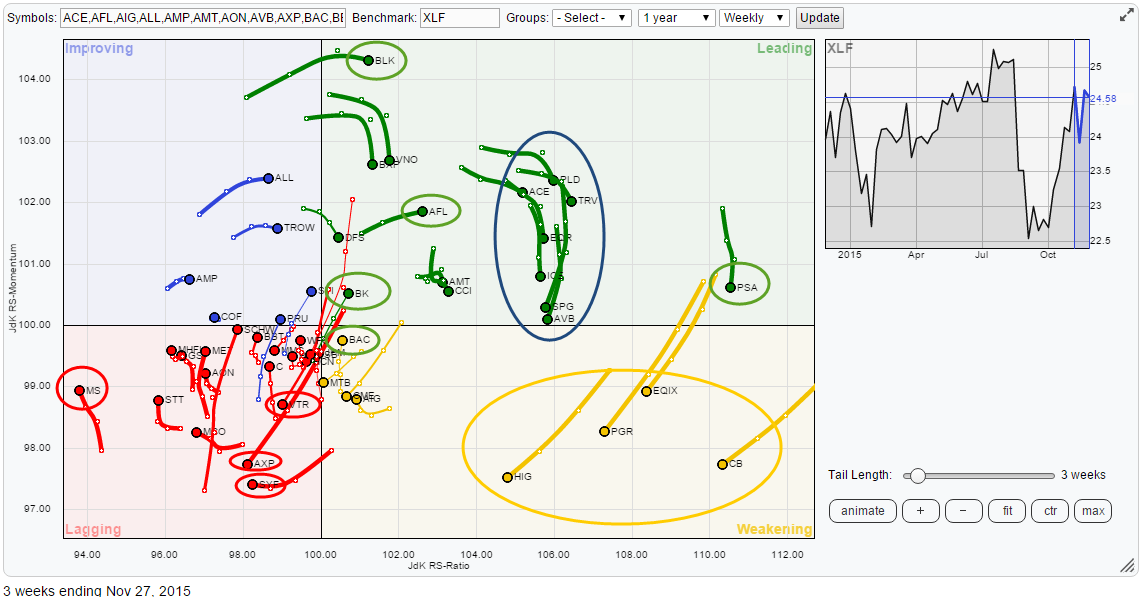
Strong rotation for AFL within the financials universe (XLF)
by Julius de Kempenaer,
Senior Technical Analyst, StockCharts.com
Summary
* MS weakest stock in the universe
* Don't chase PSA
* AXP continues to nose-dive
* VTR accelerating into lagging quadrant
* BK ready to break higher
* AFL offering opportunities
In my previous blog, we looked at sector rotation in the US based on the traded (State Street) ETFs. The headline...
READ MORE
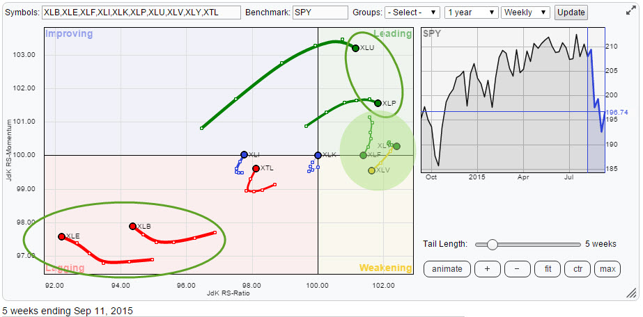
MEMBERS ONLY
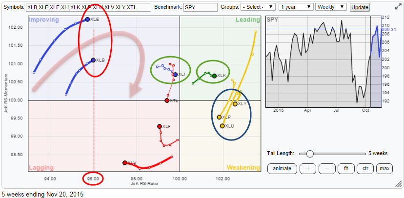
Negative sector rotation expected for XLE and XLB
by Julius de Kempenaer,
Senior Technical Analyst, StockCharts.com
Summary
* XLE and XLB expected to turn back to lagging quadrant again
* XLI improving further towards leading
* XLK holding up well inside positive territory
* XLP and XLU both weakening but wider rotation for XLU
* XLF bottoming out in relative trading range?
Quick scan
The Relative Rotation Graph above shows the...
READ MORE
MEMBERS ONLY
Big stock rotation among Dow Jones Industrials members
by Julius de Kempenaer,
Senior Technical Analyst, StockCharts.com
Summary
* Big rotation among members of the Dow Jones Industrials Index
* DD came to life surprisingly strong
* CVX and UTX still expected to rotate back down again to lagging quadrant
* WMT, CAT and IBM all moving further into the lagging quadrant confirming their relative weakness
* UNH and AXP entering the...
READ MORE
MEMBERS ONLY
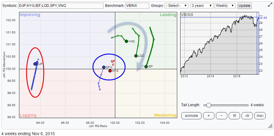
S&P Leading International Equity Rotation
by Julius de Kempenaer,
Senior Technical Analyst, StockCharts.com
Summary
* Commodities threatening to break down yet again
* Bond rally starting to fade already, halting turn for the better
* S&P 500 leading in international equity rotation
Quick scan
The Relative Rotation Graph above holds a number of asset class ETFs while using VBINX (Vanguard Balanced Index fund) as...
READ MORE
MEMBERS ONLY
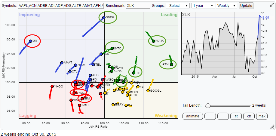
Inside the Technology Sector Rotation
by Julius de Kempenaer,
Senior Technical Analyst, StockCharts.com
Summary
* Information Technology standing out in S&P universe
* Weak rotation for HPQ, SYMC and IBM
* MU not expected to reach leading quadrant
* NVDA, ATVI and FIS show stable relative uptrends
* Opportunities for INTC, SNDK and MSFT
Information Technology positioned for strong sector rotation
My previous article already highlighted...
READ MORE
MEMBERS ONLY
Watch technology (XLK) for positive sector rotation
by Julius de Kempenaer,
Senior Technical Analyst, StockCharts.com
Summary
* Health Care (XLV) catching a cold as it is rolling over
* Financials (XLF) at crossroads, needing to unlock one of two scenarios in coming weeks
* Energy and Materials gaining relative momentum inside the improving quadrant, but follow-through is questionable
* Utilities, Staples and Discretionary stable inside the leading quadrant
* Information...
READ MORE
MEMBERS ONLY
Intel (INTC) power inside!
by Julius de Kempenaer,
Senior Technical Analyst, StockCharts.com
In my recurring cycle of blog subjects, it is time to take a look at the components of the Dow Jones Industrials index again.
Once again there is a lot to see on the Relative Rotation Graph for this universe. We have GS, JPM and DIS nose-diving into the lagging...
READ MORE
MEMBERS ONLY
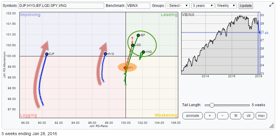
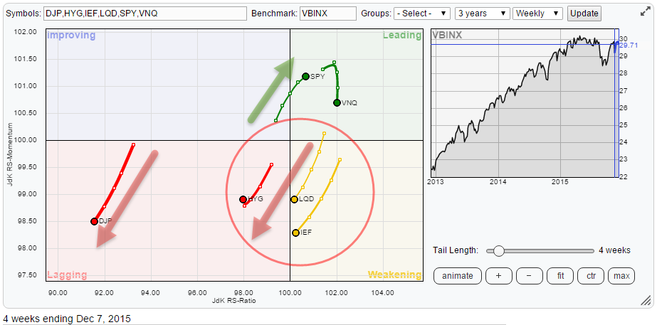
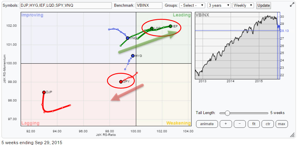
Bonds are taking over!
by Julius de Kempenaer,
Senior Technical Analyst, StockCharts.com
The Relative Rotation Graph below shows the trends in relative strength for a number of asset classes against the Vanguard Balanced Index Fund (VBINX). The most important message sent by this chart is the opposite move of equities (SPY) versus bonds (IEF and LQD) indicating that the Equity / Bond ratio...
READ MORE
MEMBERS ONLY
Don't like SPY ? Utilities may have something to offer....
by Julius de Kempenaer,
Senior Technical Analyst, StockCharts.com
The chart of the S&P 500 index ($SPX) or its ETF equivalent (SPY) has popped up in almost every blog article on the site over the past few weeks/months and the vote has been almost unanimous : It's not looking good! From an absolute point of...
READ MORE
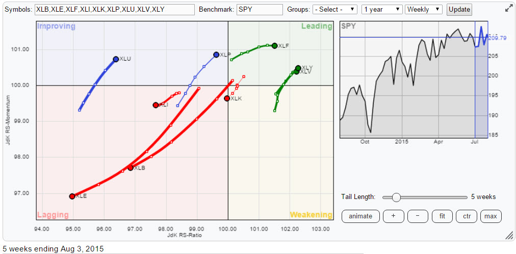
MEMBERS ONLY
Steady Staples in the leading quadrant
by Julius de Kempenaer,
Senior Technical Analyst, StockCharts.com
Despite wide swings in the US equity market the Relative Rotation Graph of sector ETFs will help you keep an eye on current sector rotation and point to favourable and less favourable sectors for the coming period.
Initial observations
A quick scan of the above Relative Rotation Graph immediately reveals...
READ MORE
MEMBERS ONLY
Get a burger at MCD and help the stock stand out from the crowd
by Julius de Kempenaer,
Senior Technical Analyst, StockCharts.com
This article takes a look at the relative rotation of the members of the Dow Jones Industrials ($INDU) index. On the relative rotation graph below all members are plotted against $INDU. I will highlight and discuss some of the charts that show up on the RRG as "worth having...
READ MORE
MEMBERS ONLY
Ok, SPY is falling .... now what ?
by Julius de Kempenaer,
Senior Technical Analyst, StockCharts.com
Wow, there's a lot going on in the markets and some big shifts seem to be under way in asset class rotation as well as in (international) equity markets rotation. Relative Rotation Graphs may help you get a handle to put all this movement into (relative) perspective. Let&...
READ MORE
MEMBERS ONLY
Dissecting the Consumer Staples sector via XLP
by Julius de Kempenaer,
Senior Technical Analyst, StockCharts.com
The top-level Relative Rotation Graph holding the nine S&P sectors clearly shows you which sector rotation is in play at the moment.
If I look at the rotation of the various sectors on this RRG chart, XLP, the Consumer Staples Sector, is catching my eye. The sector is...
READ MORE
MEMBERS ONLY
How to Set Up RRGs Holding Sector Constituents
by Julius de Kempenaer,
Senior Technical Analyst, StockCharts.com
One of the subjects covered in this blog on a regular basis is the relative rotation (sector rotation) in the US equity market. The data, ticker symbols, that I use for the analysis are the nine ETFs from the SPDRS family, provided by State Street Global advisors. SPDR actually stands...
READ MORE
MEMBERS ONLY
Energetic move for XLE!
by Julius de Kempenaer,
Senior Technical Analyst, StockCharts.com
On the Relative Rotation Graph holding the 10 SPDR sector ETFs comparing them to the S&P 500 index there is one sector standing out .... big time that is!! I am talking about XLE here, the Energy select sector SPDR.
Initial observations
As you can see on the RRG...
READ MORE
MEMBERS ONLY
Combining AA and International equity markets
by Julius de Kempenaer,
Senior Technical Analyst, StockCharts.com
As I am writing this I am on holiday in Greece and overlooking the Ionian sea. A good time to clear the head and get some fresh thoughts. As it's also almost a year since I started writing my RRG-Blog here on StockCharts.com, and I still enjoy...
READ MORE
MEMBERS ONLY
Tech & Energy are losing their power supply
by Julius de Kempenaer,
Senior Technical Analyst, StockCharts.com
As usual the 30 members of the Dow Industrials index are fairly evenly spread out over the Relative Rotation Graph, highlighting the good, the bad and the ugly ! Before moving into further detail I'll give you a bit of a head start saying that some technology stocks are...
READ MORE
MEMBERS ONLY
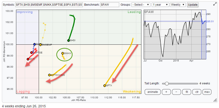
If you can't stand the heat, get out of the (Asian) kitchen!
by Julius de Kempenaer,
Senior Technical Analyst, StockCharts.com
International stock markets continue to show us big rotations on the Relative Rotation Graph. The picture below holds a number of international stock market indices in comparison with the FTSE all world index ($FAW).
click the chart for the live RRG
Initial observations
Following the headline of my previous blog...
READ MORE
MEMBERS ONLY
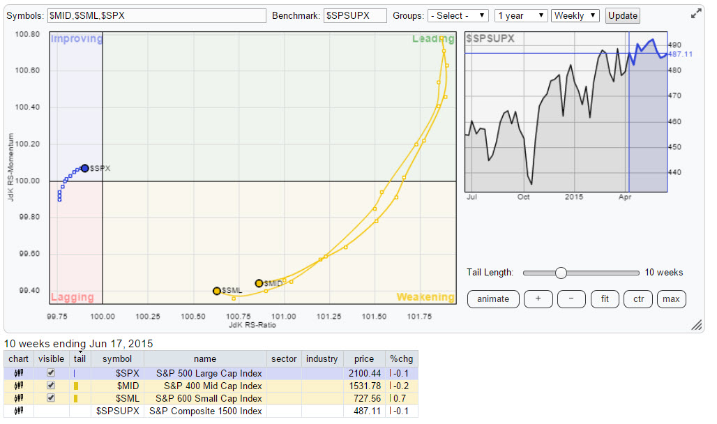
Using RRG on size indices
by Julius de Kempenaer,
Senior Technical Analyst, StockCharts.com
In last Tuesday’s (6/15) webinar with Arthur Hill I presented a Relative Rotation Graph based on size indices and how this can be used to focus attention to a specific part of the broader market. You can re-play the recording of this webinar here.
One of the most...
READ MORE
MEMBERS ONLY
Financials and Technology .... really ?
by Julius de Kempenaer,
Senior Technical Analyst, StockCharts.com
The Relative Rotation Graph of US sectors (10 ETFs) is showing some interesting sector rotation going on at the moment.
Initial observations
Glancing over the RRG above continues to show Energy (XLE) and Utilities (XLU) "standing out", as in "far away from the mean", like they...
READ MORE
MEMBERS ONLY
Equities likely to out-perform (government) bonds.
by Julius de Kempenaer,
Senior Technical Analyst, StockCharts.com
On the Relative Rotation Graph holding a number of Asset Class ETFs in comparison to the Vanguard Balanced Index fund, the opposite moves of commodities and REITs continue to attract attention.
Initial observations
The opposite moves in Commodities (DJP), heading higher on the JdK RS-Ratio axis at positive relative momentum,...
READ MORE
MEMBERS ONLY
Think 'twice' before buying 3M
by Julius de Kempenaer,
Senior Technical Analyst, StockCharts.com
The 30 stocks that make up the Dow Jones Industrials index are more or less evenly spread out over the Relative Rotation Graph below.
There is a group of stocks that has entered the leading quadrant a few weeks ago and which are establishing solid relative up-trends including the stocks...
READ MORE