Two Bullish Inter-Asset Relationships that Could Signal the Next Bear Market

Major stock market moves are driven primarily by investors discounting future economic trends, as they buy in anticipation of a recovery and sell when a recession is perceived to be on the horizon.
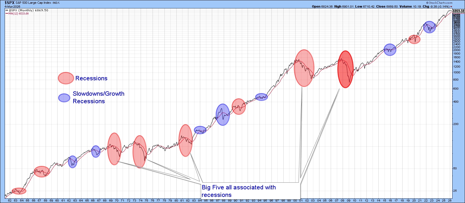
In this respect, Chart 1 highlights the principal recessions and slowdowns since the early 1950s. Each was associated with a full-fledged or mini-bear market. Usually, the more severe the economic contraction, the larger the bear.
Coming into last weekend, several of the leading economic indicators I follow had begun to turn up, hinting that a renewed trend of growth was in the cards — green shoots as Ben Bernanke so aptly put it in 2009. Parts of February’s ISM report reaffirmed that view. The big question now is whether this promising outlook will prevail or be derailed by higher energy prices and other negative by-products of a prolonged Iran war. That, of course, is unknowable. Nonetheless, it may be possible to obtain some clues going forward by observing the behavior of two inter-asset relationships.
The lower window of Chart 2, for example, plots the Stock/Commodity ratio using the S&P 500 versus the CRB Composite. At the beginning of the cycle, stocks initially outperform commodities since the latter are still declining due to tail end effects of the slowdown or recession. As the recovery picks up steam, both asset classes rise, but stocks, anticipating faster economic growth, outperform. Eventually, capacity constraints put sufficient upward pressure on commodity prices, leading equity investors to worry that consumers will become discouraged and the economy turn down.
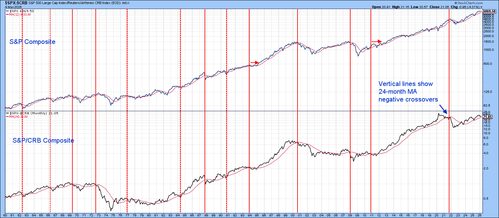
An important inflection point occurs when the ratio between stocks and commodities begins to roll over. In that respect, the vertical lines show when it drops below its 24-month MA.
All the major bear markets since the mid-1960’s have been signaled this way. Unfortunately, the four signals identified with dashed lines occurred after most of the decline in the S&P Composite had already taken place, proving that this approach is not infallible. The ratio has recently weakened but is still above its MA and therefore still positive.
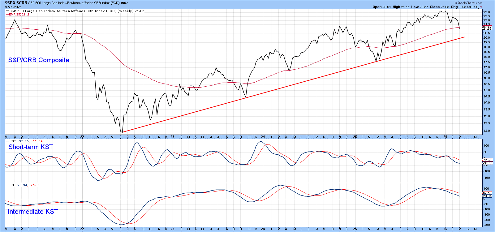
Chart 3 focuses on the more recent picture, where it's evident that the ratio is currently around its 65-week EMA, having fallen about halfway towards its 2022–2026 bull market trendline. The two momentum indicators are in a declining trend, which implies a test of the up trendline is still in the cards.
Another clue as to whether the Stock/Commodity relationship is likely to experience a bear market is provided by KST sell signals. Previous instances are identified with solid red arrows in Chart 4. False positives are denoted with dashed ones. The KST peaked in late 2024, but this turned out to be a false positive, as the S&P responded with a rally. This momentum indicator has spent the last few months trying to rally and is currently very close to its nine-month MA. Any way you look at it, the stock/commodity relationship is finely balanced and therefore more sensitive than normal to unexpected changes in the economy.
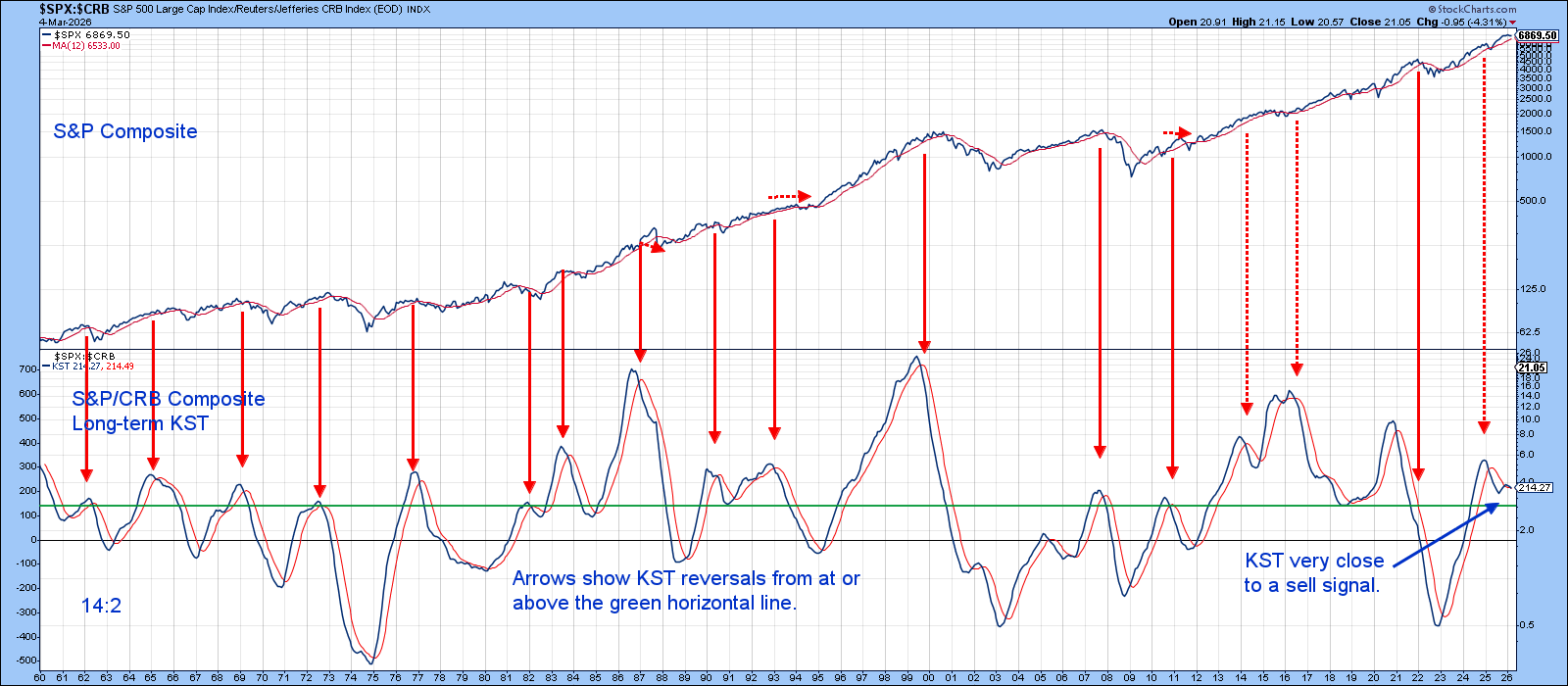
Chart 5 features another important inter-asset relationship: that between stocks and bonds. A rising ratio is bullish because it hints that equity investors believe monetary policy, as reflected in bond prices, is sufficiently accommodative to stimulate the economy. When this relationship turns down, it means investors are unimpressed with the economic outlook and lose their enthusiasm for stocks. The Stock/Bond ratio has been rising steadily since 2020 and has remained above its 12-month moving average throughout. It has also managed to hold above its bull market trendline, all of which is positive. That said, the long-term KST has been falling for some time, the vertical lines showing that previous KST MA crossovers have mostly been followed by periods of volatility or price decline.
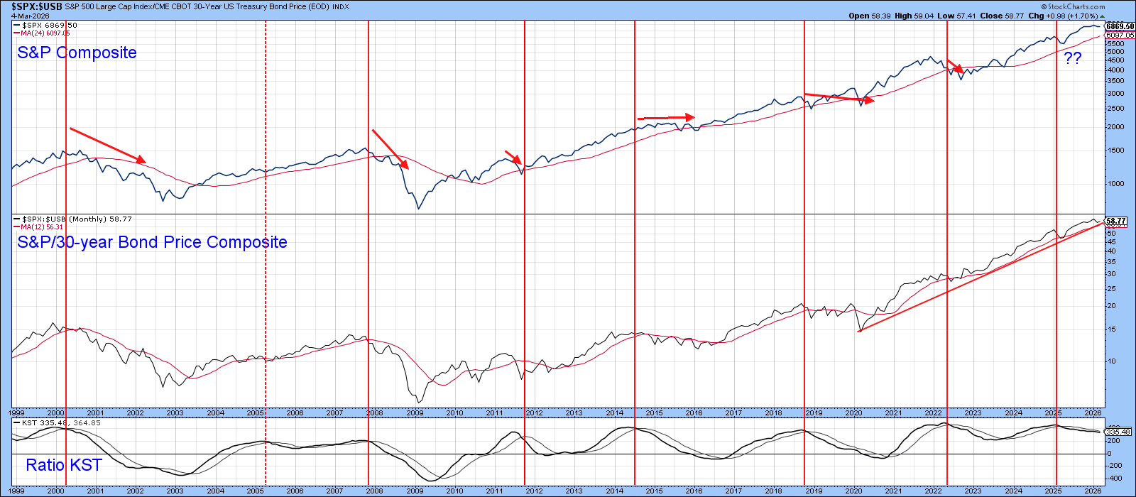
Chart 6 shows recent action in greater detail. The key here lies at the 55 level (basis Friday close) since that is where the trendline and 65-week EMA are currently residing. A test of it looks likely, as both momentum indicators are in corrective mode and the short-term KST has diverged negatively with the ratio itself.
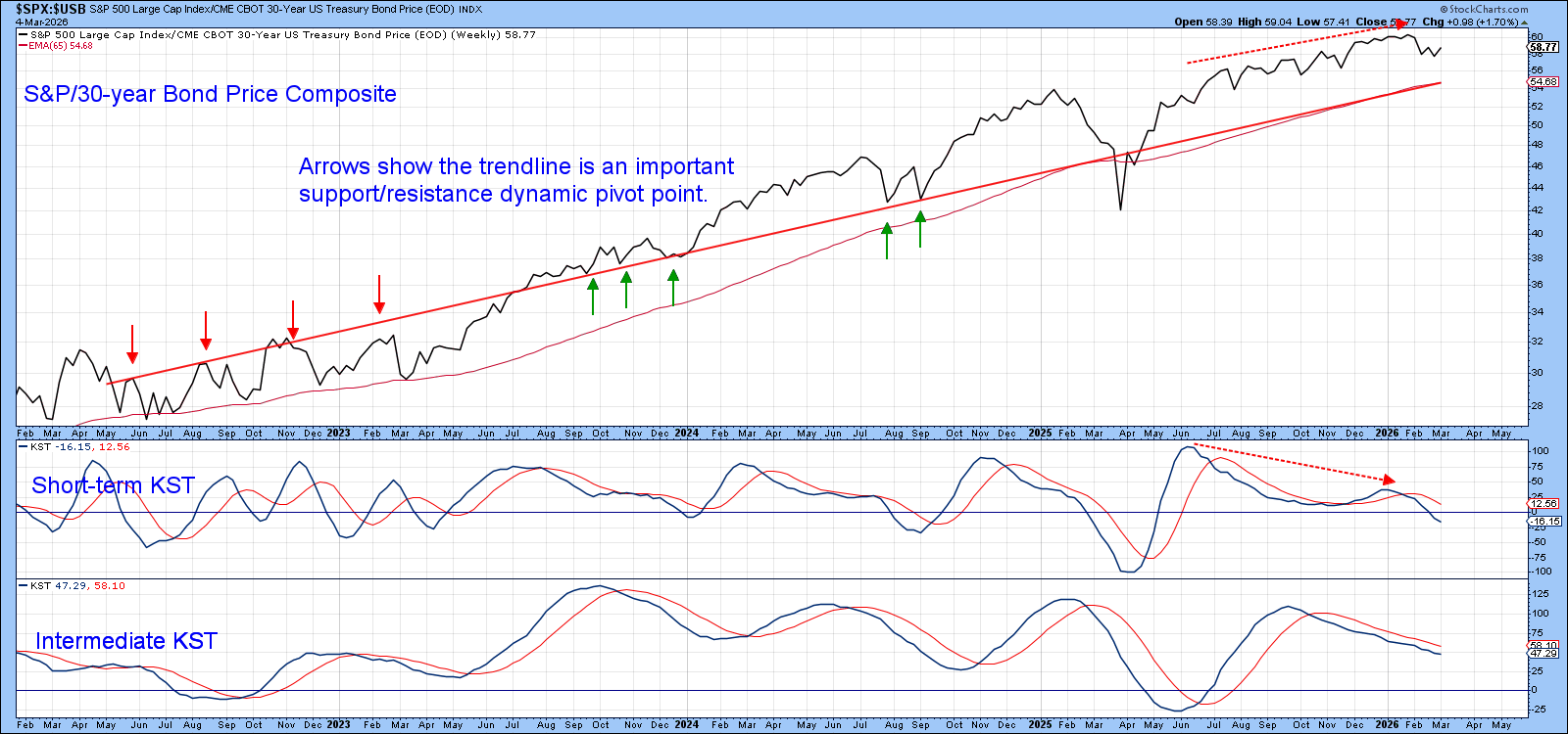
Until that 55 level is taken out and the Stock/Commodity ratio turns bearish, it’s steady as she goes!
Good luck and good charting,
Martin J. Pring
The views expressed in this article are those of the author and do not necessarily reflect the position or opinion of Pring Turner Capital Group of Walnut Creek or its affiliates.