StockCharts Insider: How DecisionPoint's Four Condition Charts Talk to Each Other
Before We Dive In…
In the last article, we covered the Trend part of the DecisionPoint Market Scoreboard. The scoreboard has four segments, and they’re meant to be read together. But each segment is already technically rigorous. If you’re new to it, you might find yourself confused.
So, today, we’re going to tackle the Market Conditions segment. This has four charts, each of which is already packed with technical information and different sets of indicators. The trick here is to figure out how they “talk to one another” and how to read across all four. This way, you’ll avoid confusion.
To use an analogy, we’re not going to zoom in on any one chart. That’s what ChartSchool is for. We want the big picture. We want to see what the scoreboard was designed to show us.
Meet the Four Condition Gauges
The Market Condition segment features four charts.They’re split into two pairs, and each pair has a different job.
The first pair consists of these charts:
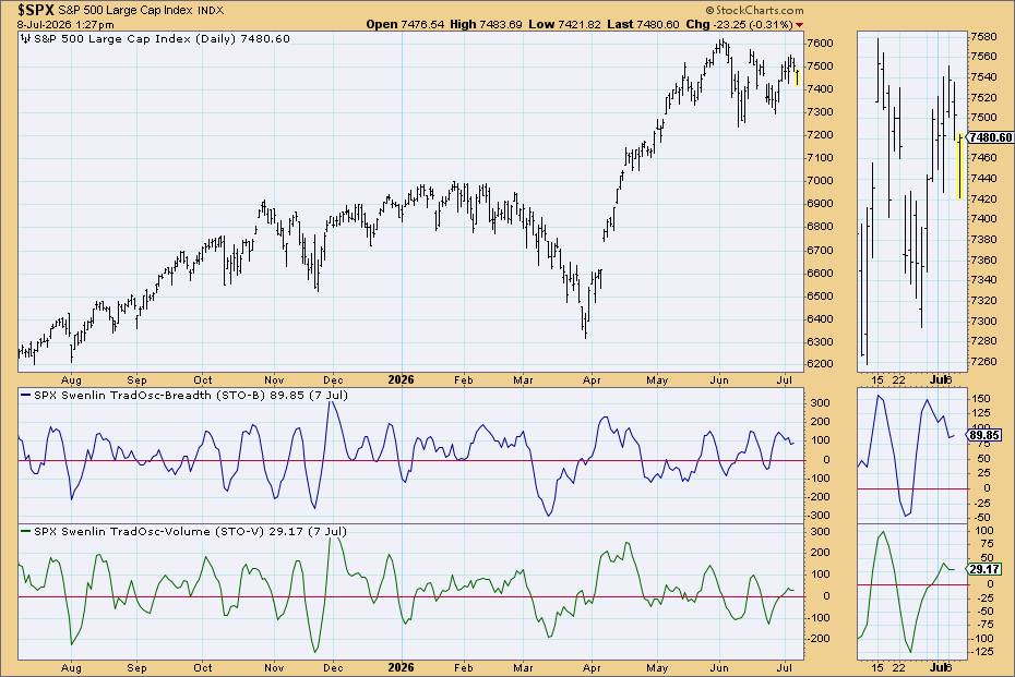
- The Short-Term Oscillators chart includes STO-B and STO-V, the “twitchier” oscillators set to a daily scale.
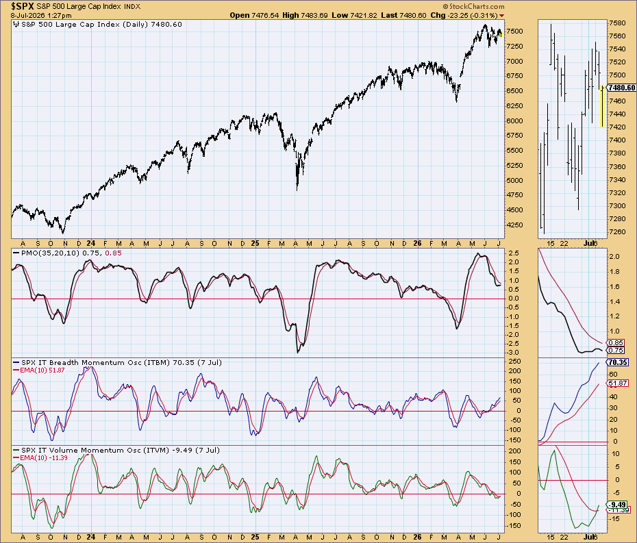
- The Intermediate-Term Oscillators chart features PMO, ITBM, and ITVM, the slower, smoothed-out cousins of the above, set to a weeks-to-months scale.
The second pair features the following:
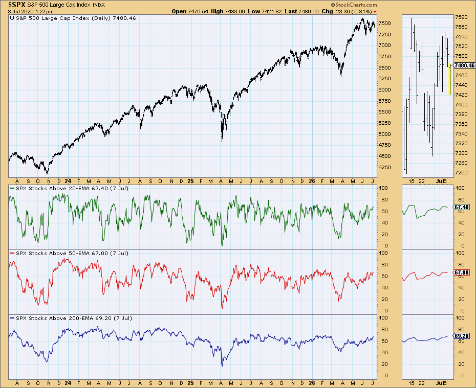
- The Stocks Above Their 20/50/200-day EMA chart shows participation in percentage terms of how many stocks are along for the ride up.
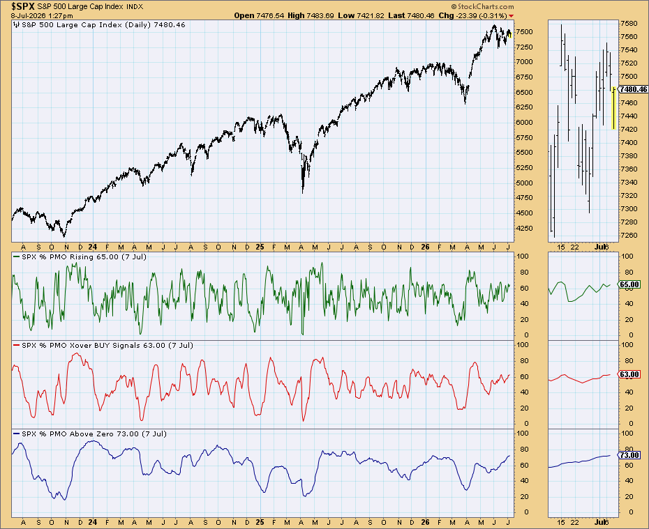
- The PMO Signal Analysis chart includes %PMO Rising, % PMO Crossover Buy, and % PMO Above Zero indicators, a breakout of sorts that shows the percentage of stocks meeting different PMO criteria.
There’s a wrinkle here. The PMO shows up twice, but in different forms. In the Intermediate-Term Oscillators chart, it’s there to show how far momentum has stretched. On the PMO Signal Analysis chart, it shows the percentage of stocks meeting different PMO criteria. So you have the same oscillators doing different jobs. This trips people up, but, hopefully, the difference in function is now clear.
Pair 1 - Two Views of the Same Coastline
Let’s tackle the short-term vs. intermediate-term charts.
To go back to our analogy, we’re looking at the same coastline from two different zoom levels. Take a close look and you’ll see every wave, all rising, cresting, and breaking at different cycles. That’s your Short-Term Oscillators chart, the small stuff. Day-to-day fluctuations that resolve in a matter of days.
Zoom out in your timeframe and the waves disappear. You see the tide, or one big wave. That's your Intermediate-Term Oscillators chart. It tells you whether the bigger wave (the water against the shore, so to speak) is going in or out.
These might give you different interpretations. You can have short-term movement register as overbought while the longer-term momentum is still rising. It’s just what happens when you look at different timeframes. Still, it's all valuable info.
It’s also why "overbought" and "oversold" can't stand alone. They need to be viewed relative to timeframes. A short-term overbought signal means price might be a little stretched by days. But an intermediate-term overbought signal means it’s stretched by weeks or months. They indicate different scenarios. Now keep this in mind as we move on to the second pair of charts.
Pair 2 - Who's Actually in the Water
While the first pair looks at how stretched price might be from two timeframes, the second pair tracks participation.
Take Stocks Above Their 20/50/200-day EMA chart. It’s like a headcount. What if a few stocks are falling below their 20-day while most are above the 50-day and 200-day? What are we looking at? A pullback? A reversal? While this indicator won’t answer that right away, it’ll confirm either scenario once you run a more extensive analysis.
Now let's look at the PMO Signal Analysis chart. Remember it from the last chart? There are now three of them, restructured like the EMA chart: as a percentage of stocks. Instead of indicating decreasing or increasing strength relative to a zero line, it measures the percentage of stocks with rising PMO readings, PMO crossover buy signals, and above the zero line. Quite a bit more extensive.
They also work at different clock speeds. % PMO Rising is the fastest. % PMO Crossover Buy is steadier and less volatile; a longer-term signal. % PMO Above Zero, meanwhile, is the slowest and most longer-term of the three. So, even here, you’re zooming in and out.
StockCharts Insider Tips: Reading the Combos
This is where things get interesting. On their own, each pair tells you something specific to their design. But together, they provide a strong indication as to whether a move is real or running on fumes.
Insider Tip #1: Distinguish Short-Term Noise from Intermediate-Term Waves.
If STO-B or STO-V is flashing overbought or oversold but the Intermediate-Term Oscillators haven't budged, don't read too much into it. It’s likely the tide hasn't turned. This, of course, can be an opportunity for a trade entry, or to add to your position.
Insider Tip #2: Short-Term is Rising, but the Intermediate Isn’t Confirming.
This can trip-up a lot of traders. It feels like a recovery. STO-B ticks higher, and you’re tempted to call the bottom. But if ITBM and ITVM disagree, the bigger internal pressure hasn't turned. Bounces like this tend to be shallow, or fail outright, until the intermediate-term catches up.
Insider Tip #3: Prices are steady while the % Above EMA Declines.
This is an early tell. And unless you’re looking at the EMA panels, it’s a sneaky condition. Breadth is thinning before price reveals what’s happening internally.
There are plenty more examples that I’m sure you’ll come across. Much of it will center around the pairs or individual indicators/oscillators disagreeing with one another. There’s nothing wrong with that, BTW. It’s the kind of nuance you need to more closely evaluate what’s happening.
Sometimes you get clean signals, bullish or bearish. Other times, the most useful these panels can tell you is that there isn’t a clean signal right now. If you think about it, indecision is itself a valuable signal.
And That’s a Wrap
The DecisionPoint Market Condition segment basically gives you two pairs of indicators that give you answers to both how stretched everything is and how many people are participating in the move. Line them up and you get a much closer read on what’s happening. We’ve covered the DecisionPoint trend segment. Now, this one gives you a peek into the internals. Next up: Breadth.