Is it Time for Financials to Take a Breather?

Pretty much all the long-term trend indicators for financials are in a positive mode. The Financial Select Sector SPDR ETF (XLF), for instance, is currently trading above its 12-month MA, with its bull market up trendline stretching from all the way back in 2020.
The Dow Jones US General Financial Index ($DJUSGF) in Chart 1 also suggests that a few cracks are starting to appear, as the long-term KST has been in a negative trend for most of this year. The solid arrows tell us that most KST sell signals have been followed by or associated with some type of decline or trading range. The dashed arrow in 2005 indicates a false negative. I have dashed the latest arrow because the bearish KST has not yet had much of a negative effect either.
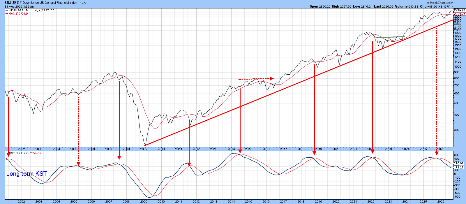
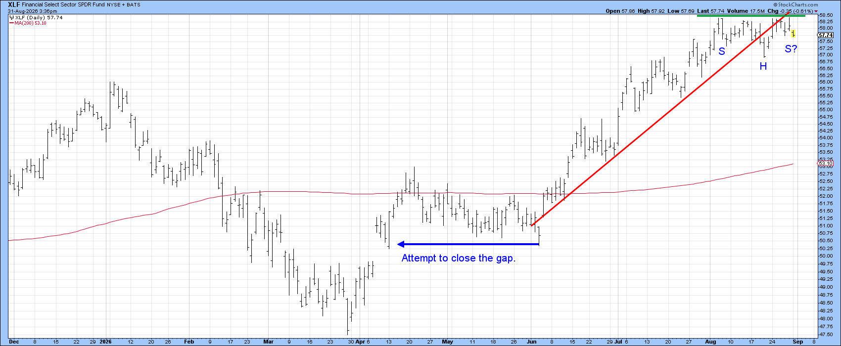
Chart 2 covers the action in 2026, where we can see that the post-June up trendline has been violated, suggesting some kind of corrective action may lie ahead. The other possibility is that the action of the last five weeks will turn out to be a consolidation reverse head-and-shoulders pattern. We are therefore left with a question of two possibilities. Will financials take a breather by correcting over the course of the next few weeks, or will they ignore the up trendline in Chart 2 and complete the head-and-shoulders pattern? The next three charts are hinting at a corrective direction.
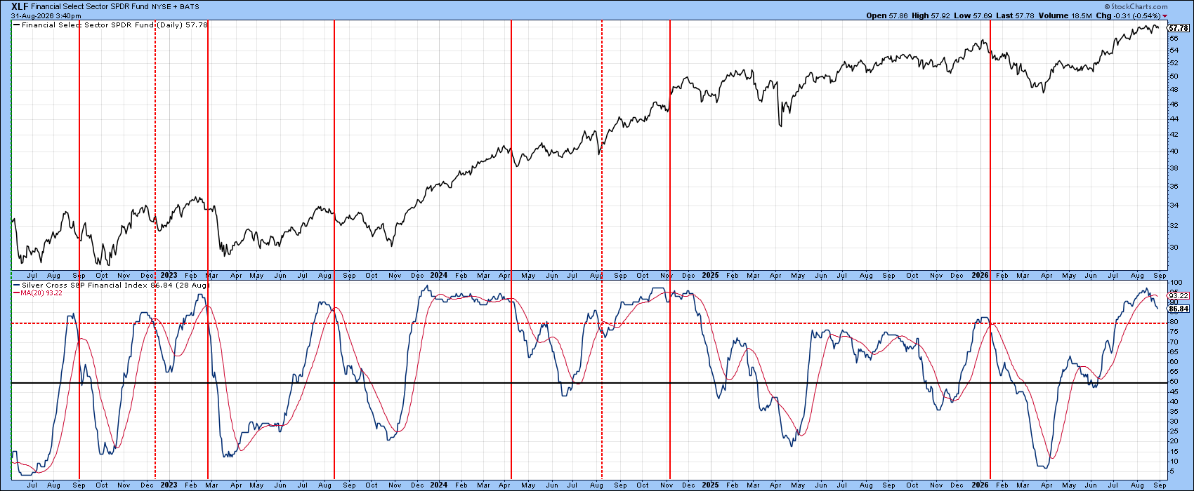
First, some of the breadth indicators are in an overbought condition. In that respect, the percentage of financial stocks sporting a positive silver cross, that being when a stock’s 20-day MA is trading above its 50-day, has reached an extreme reading and begun to reverse.
Chart 3 shows that most previous reversals since 2022 have been followed by a correction. While some of these signals didn’t prove to be that accurate, an extreme reversal is certainly more likely to result in a correction than if the indicator is trading at a neutral reading.
While some indicators are pointing to a short-term overbought condition, others are indicating a narrowing participation. Chart 4, for instance, features a 10-day MA of the daily advance/decline ratio for financials. The four red lines highlight periods when the price touched a new high, yet the oscillator was barely trading above its equilibrium point. In the first three instances, this narrowing breadth was followed by a short-term sell-off. The fourth happened recently and has yet to come down with a verdict.
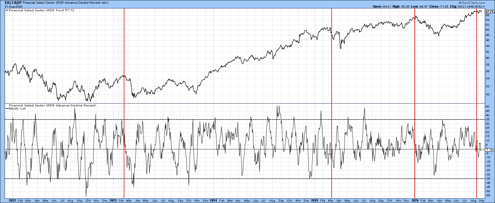
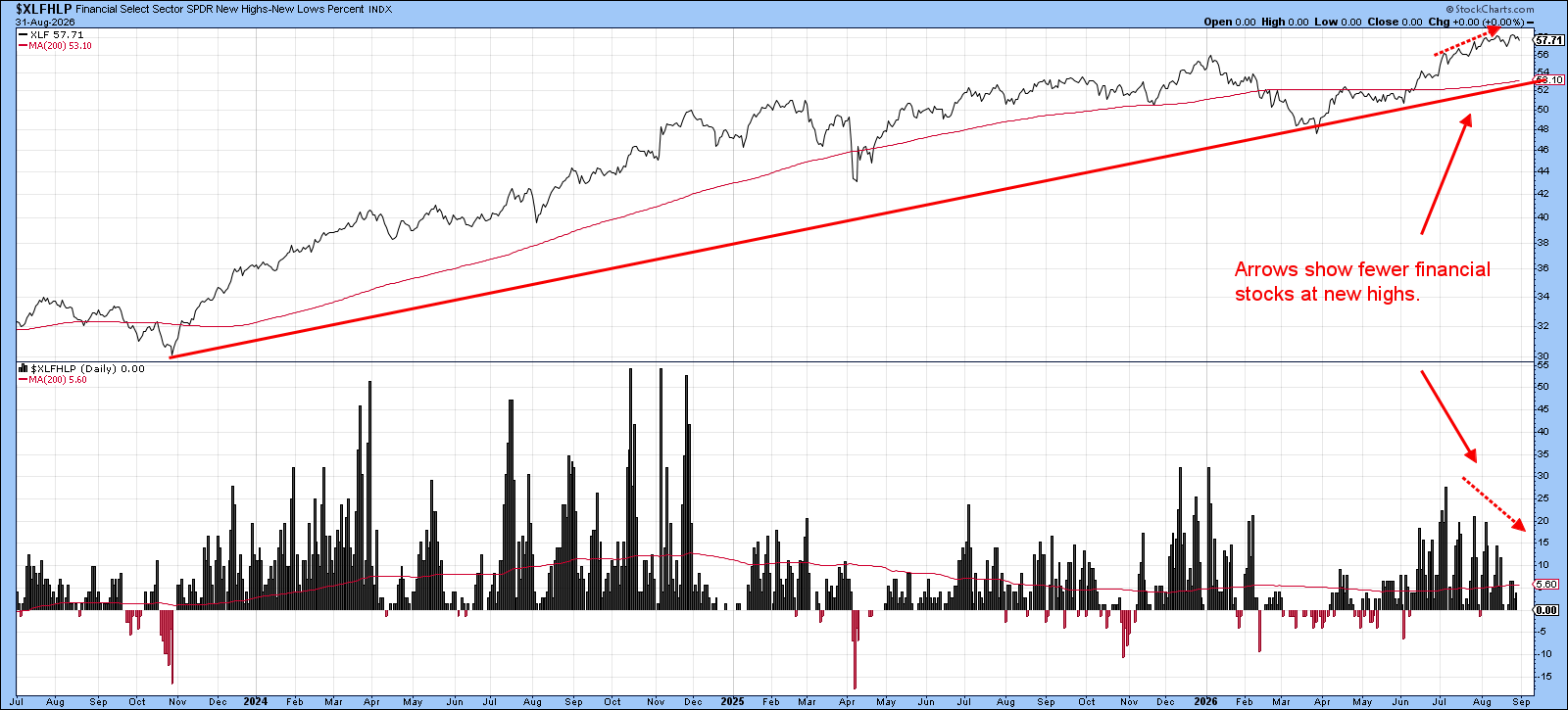
Chart 5 monitors the net number of financial stocks reaching new highs. The dashed-red arrows point out that the XLF has been working its way higher in recent weeks, yet the number of its components participating in the move has been dropping.
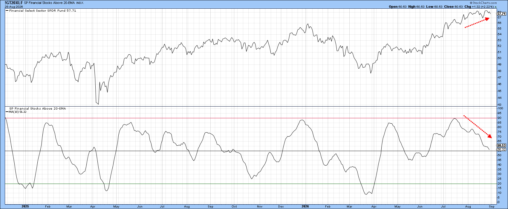
A similar narrowing of participation story is being painted by the percentage of financial stocks trading above their 20-day EMAs. As the price has been moving higher, this indicator has been slipping (see Chart 6). Once again, participation has been narrowing.
The Bottom Line
For the most part, long-term indicators remain aligned in a bullish mode. However, the recent violation of an uptrend line, coming at a time when conditions are overbought and participation has been narrowing, argues in favor of a correction rather than an immediate move to new highs and completion of the consolidation inverse head-and-shoulders pattern.
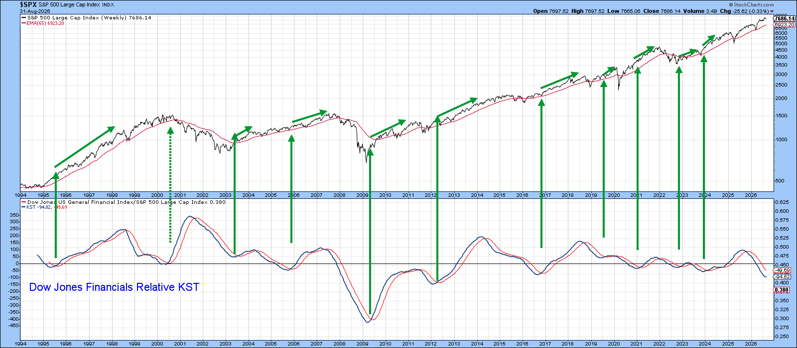
Nevertheless, the longer-term stakes remain high. Chart 7 shows that the KST for relative financial performance is now oversold. If it can arrest its recent decline and reverse to the upside, history and the accompanying green arrows suggest that a significant extension of the post-2020 bull market could follow.
Good luck and good charting,
Martin J. Pring
The views expressed in this article are those of the author and do not necessarily reflect the position or opinion of Pring Turner Capital Group of Walnut Creek or its affiliates. The Six Stages of the Business Cycle are followed each month in Martin Pring’s Intermarket Review.