StockCharts Insider: Hidden ChartList Tools That Give You a Sharp Advantage
Before We Dive In…
When you buy a home, you don’t just look at the price and the staged pictures. You check everything from the neighborhood down to the foundation. Yet even though you wouldn’t evaluate a house from just one angle, traders often do exactly that with stocks, relying on just one chart and a couple of indicators. But that won’t tell the full story.
This is where ChartLists come in. Hidden inside each list is a menu that lets you analyze the same group of stocks from multiple angles quickly and easily. The advantage is simple: You can see the market in ways that many traders never do. And while no tool guarantees an edge, the traders who see the most often understand the market the best.
Why ChartLists Are More Than Watchlists
Most of us use ChartLists like watchlists. That’s how most other lists were initially designed. But ChartLists have evolved beyond the typical watchlist model and become an analysis hub. Its menu unlocks multiple analytical perspectives.
Let’s suppose you are following the Magnificent Seven. That’s already included in your ChartList. Click on the View As button, and here’s what pops up:
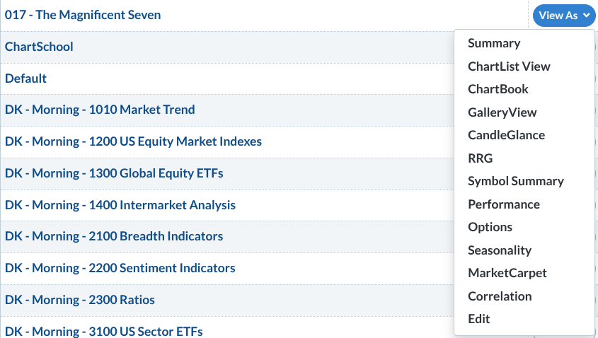
Notice The Magnificent Seven list on the top left and the View As menu on the right. These aren't hard to find, but they’re easy to overlook. Let’s analyze them from an Insider’s perspective.
Visualizing the Market
Insider Tip #1: Use Gallery View to fine-tune and see the big picture at the same time.
With Gallery View, you can see price action on an intraday, daily, weekly, and point & figure (P&F) chart. This lets you do several useful things: fine-tune your entries, avoid accidentally countertrend trades, find key breakout levels, separate real trends from market noise, and distinguish pullbacks from trend reversals.
Insider Tip #2: Use CandleGlance to instantly spot market leaders.
Remember our Magnificent Seven example? Well, take a look at this:
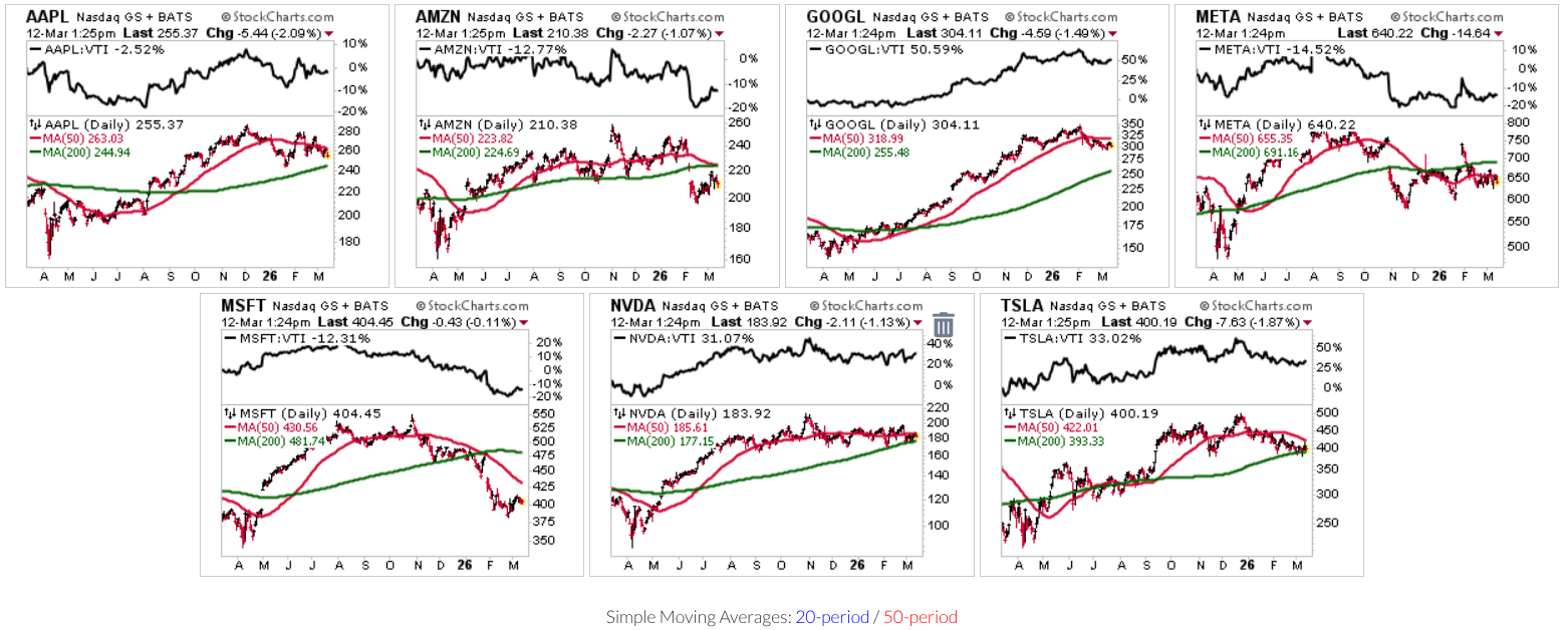
CandleGlance is one of the fastest ways to scan an entire ChartList. Instead of opening charts one by one, you get a grid of mini charts that typically includes the 50-day and 200-day moving averages, allowing you to easily assess trend direction.
But there’s another powerful feature—a ratio chart versus Vanguard Total Stock Market ETF, a broad proxy for the U.S. stock market. Sometimes the more important question isn’t whether a stock is going up or down, but if it’s beating the broader market.
CandleGlance answers these questions in mere seconds.
Insider Tip #3: Watch leadership rotate in real time with Relative Rotation Graphs (RRG).
RRG lets you see an angle that other tools simply don’t. It shows you the path market leadership has taken, and where it appears to be heading next (relative to the S&P 500).
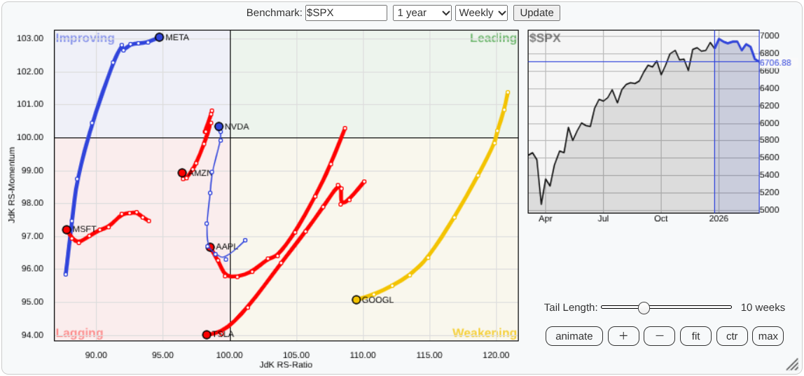
There are four regions: Leading, Weakening, Lagging, and Improving. Which category do the stocks in your ChartList occupy, and where do your leaders appear to be heading next?
RRG is extremely valuable for portfolio positioning, tracking any kind of rotation, and anticipating market leaders. Instead of studying charts one by one, RRGs let you see the entire competitive landscape in one picture.
Reading the Data
Insider Tip #4: Step away from the chart for a moment and check the data.
Not all traders rely 100% on technical or fundamental data. Some want to check both. They want loads of technicals, but they also care about EPS, beta, earnings, dividends, etc.
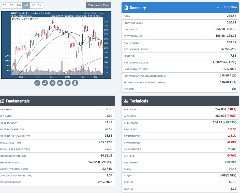
And why not? It gives you an angle that you can’t see using charts alone. That’s what Symbol Summary is for. Think of it as a 360-degree intelligence briefing before you dive deeper into the charts.
Insider Tip #5: Let the Performance tool reveal consistent strength and momentum shifts.
The Performance view shows returns across multiple timeframes, from one day to one year.
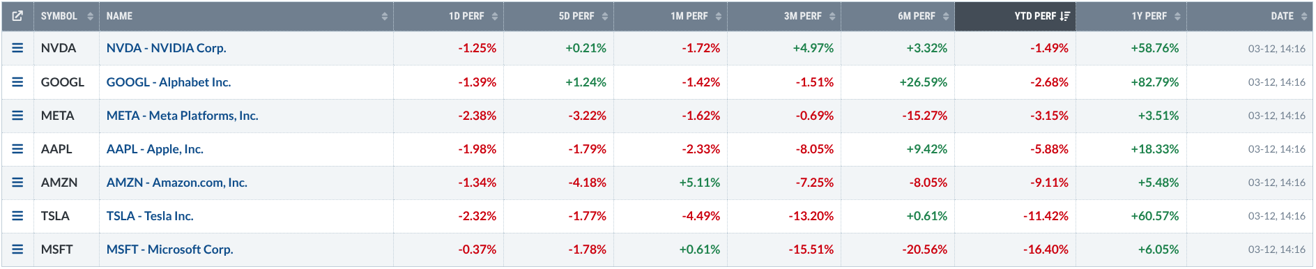
Stocks performing well across several periods signal consistent strength. But when short-term returns begin diverging from longer-term performance, it can hint that momentum is starting to pick up, or fade away.
Insider Tip #6: Sometimes the better trade is in the Options.
Before pulling the trigger on the stock, check the Options view. The option chain can reveal alternative ways to take the trade, from calls and puts to a wide assortment of advanced strategies. Additionally, though, options help you see how traders are positioning. It shows you where traders are betting (or hedging), where strikes are clustered, and where activity is concentrated. In other words, it gives you an additional market intelligence angle.
Transform What You're Seeing
Insider Tip #7: Check seasonal tendencies!
Now here’s an angle that’s completely different from everything else. Seasonality can hint at what a stock tends to do this time of year.
The Seasonality view shows how a stock has historically performed across the calendar. Zoom out to study longer-term patterns, or compare a stock’s seasonal tendencies against a benchmark like the S&P 500 Index.
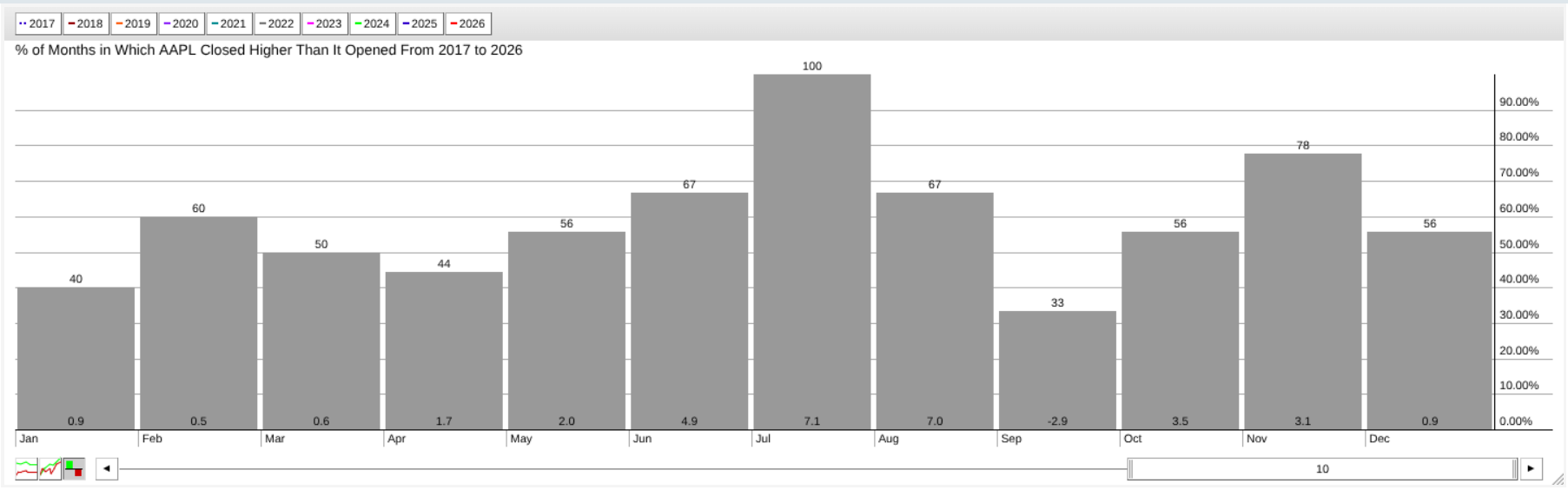
Look at the chart above and notice how AAPL has closed up 100% in July over the last 10 years. Also, notice how the average return in July is around 7%. A good month to trade?
Now, you know that history doesn’t always repeat itself. But when current price action starts lining up with those historical tendencies, it adds a layer of context that you can exploit if you identify it ahead of time.
Insider Tip #8: Transform your list into a heat map with MarketCarpets.
MarketCarpets turn an entire market or watchlist into a color-coded heat map. Each square represents a security, and the colors can be based on price performance, technical indicators like RSI, SCTR, or breadth measures such as up-days minus down-days.
Here’s the advantage: Instead of analyzing stocks one by one, you can see strength/weakness, emerging trends, and spot outliers at a glance. This can reveal opportunities that a traditional chart-by-chart approach might miss.
Other Features
There are other features which I haven’t covered, mainly because these are what I found most unique in the ChartList menu. But you might find the other features to be just as or even more valuable. So, try them all to see which tools best work with your approach.
Again, this is all about experimenting with and customizing the features to give you an advantage in your analysis, trading, and investing.
Try This With Your Own ChartList
Open one of your existing ChartLists and experiment with a few different views:
- Start with CandleGlance to quickly scan trend direction.
- Switch to RRG to see how leadership is rotating.
- Then check the Seasonality to identify stocks that have historically performed well in the coming months.
Do all charts agree? Do you see divergence? Now check the Symbol Summary to see if the fundamental picture supports what you see, or if it’s signaling to you that something’s a bit off.
This simple exercise will show you the usefulness of ChartLists’ extended menu; namely, informing you about a given market but from multiple angles.
And That’s a Wrap
Charts will tell you a story, but they rarely tell the whole story. That’s the advantage of ChartList. It’s an analysis dashboard, not just a watchlist. Use it alongside the menu features and you’ll get multiple perspectives: trend, leadership, momentum, positioning, seasonality, and market structure. When it comes to markets, the more angles you can see, the better your decisions. So open it up. Explore the tools. And start looking at the market like an Insider.