Three Indicators to Watch In Case the Market Falters

In late March, I argued that the technical backdrop was primed to launch a rally. The market did not cooperate immediately, with prices slipping to a new low a few days later. Since then, however, equities have staged an almost uninterrupted advance. For the S&P Composite ($SPX), that rebound has been strong enough to carry the index back to a new all‑time high. By contrast, the Dow Industrials ($INDU) and NYSE Composite ($NYA) remain some distance from such record territory. The key question now is whether this broad advance still has room to run or whether it’s approaching its limits.
My first observation is that, in general, it’s wiser to assume that a standoff will ultimately resolve in the direction of the primary trend. In this case, the major averages remain above their 12‑month moving averages and breadth remains constructive, with the NYSE A/D Line holding above its key moving averages. Perhaps more important in the current environment is the market’s ability to rally despite what can fairly be described as atrocious news. If bad news cannot push prices lower, what will?
Even so, the market is undeniably stretched on the upside, and several primary‑trend indicators have begun to roll over, making further upside progress more challenging. In that respect, there are three indicators I am monitoring closely that could offer valuable clues about whether the advance is sustainable.
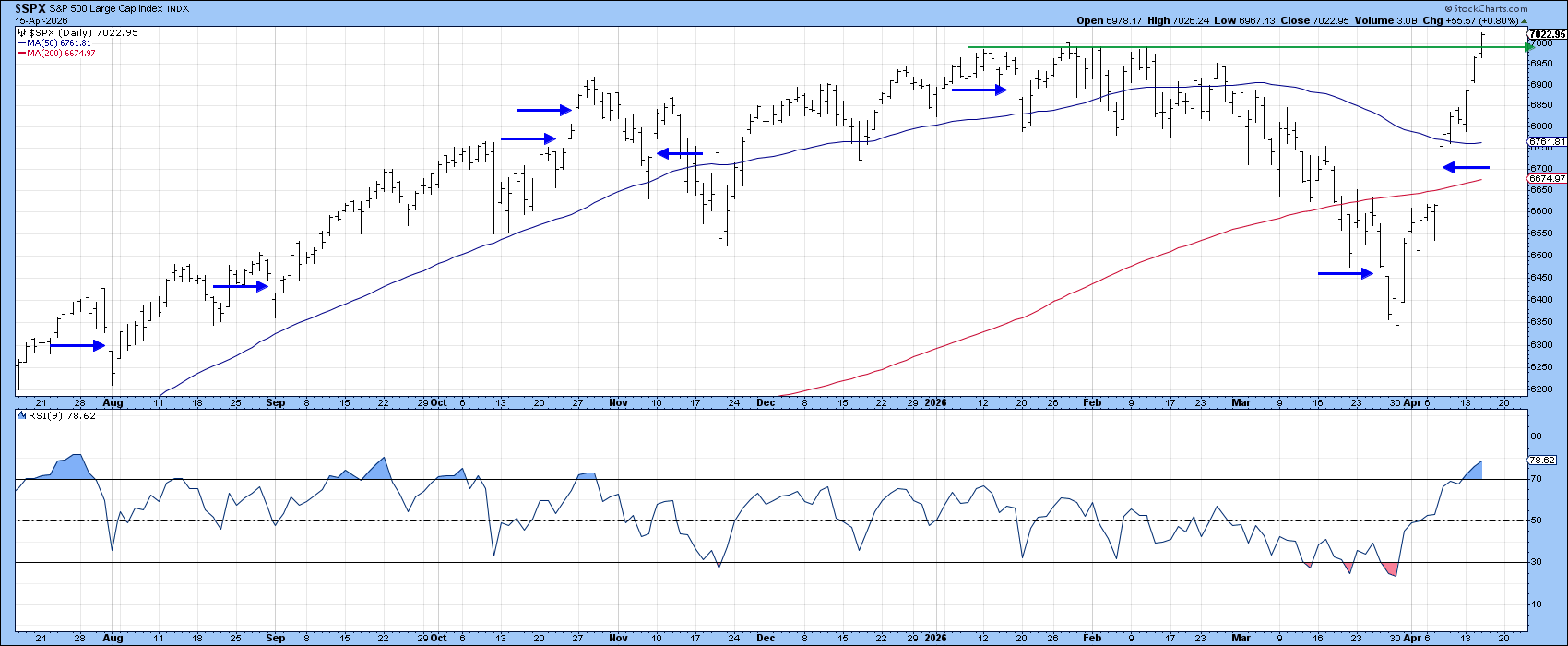
Before turning to those, let's look at Chart 1, which highlights a notable development: the S&P registered a large upside gap earlier this month. Gaps represent emotional points on the chart and are almost invariably filled at some stage as the market revisits those emotions. The horizontal blue arrows show previous gaps that were eventually filled. This latest one propelled the index above its 50‑day and 200‑day moving averages in a single surge. Unfortunately, there is no reliable way to determine how long it will take for any specific gap to be filled, but it's something worth keeping in mind.
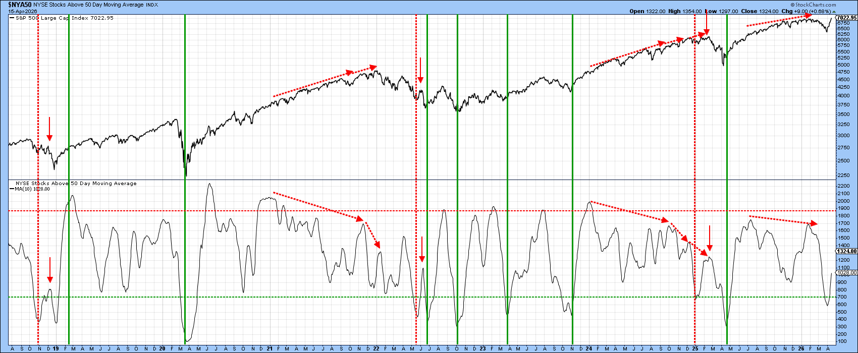
NYSE Bullish Percentage
Chart 2 features a 10-day smoothing of the percentage of NYSE stocks above their 50-day MA. It’s rallying from an oversold position right now, and I am assuming it will continue to move higher, as is usually the case following an oversold reversal. That said, I think it needs close monitoring, as there have been three instances since late 2018 when a bounce off an oversold bottom was followed by a premature downside reversal and new stock market lows. These setups have been flagged by the three sets of downward-pointing red arrows. Such action, were it to happen, would also set up a second negative divergence in a similar pattern to that indicated by the dashed red arrows in 2021 and 2024.
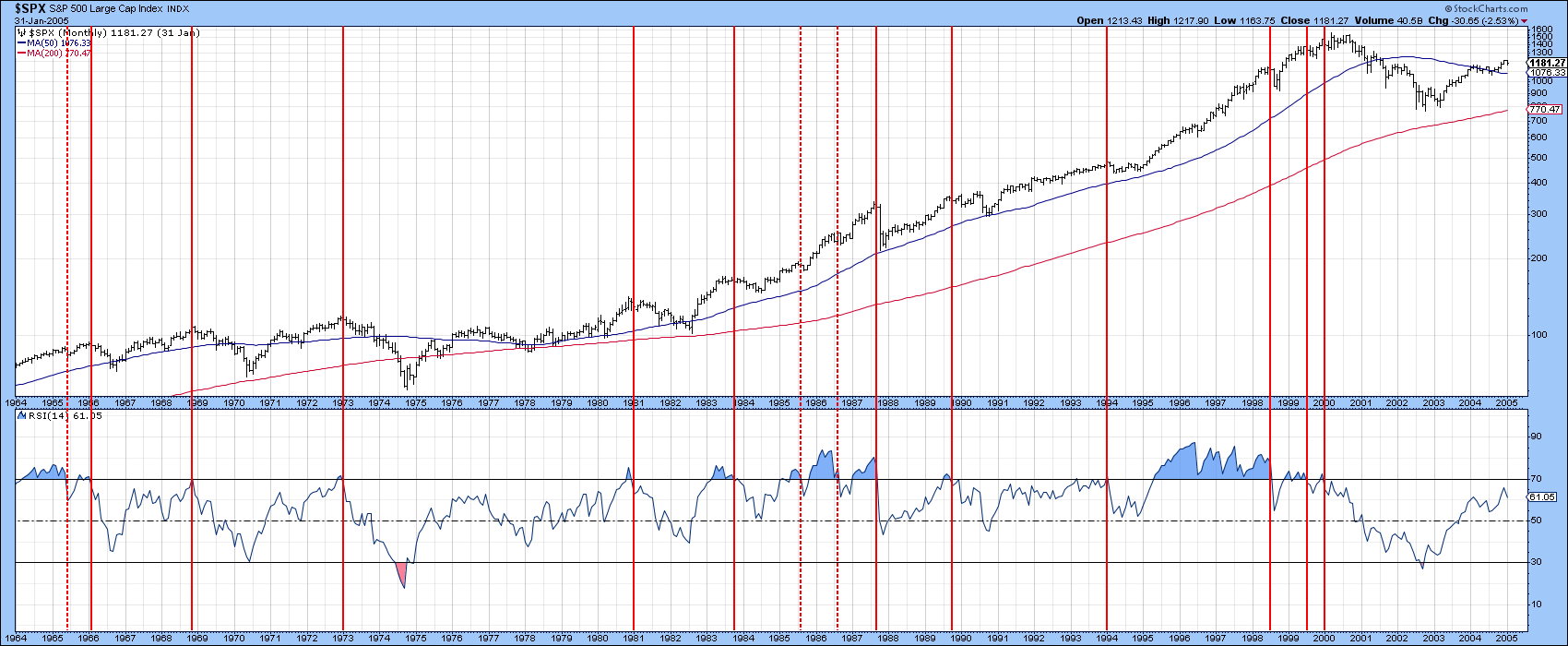
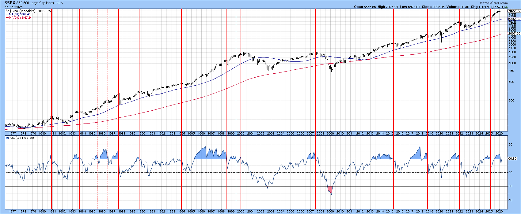
The S&P Composite and 14-Month RSI
One of the indicators that has historically provided consistently reliable sell signals for the S&P is its 14‑month RSI. In Charts 3 and 4, the red vertical lines mark periods when the RSI has rolled back below the overbought zone on its way toward a more neutral reading. Chart 3 covers the 1964–2005 period, while Chart 4 highlights more recent behavior. The chart shows that the RSI has already issued a downside signal and is now attempting to push back above the overbought threshold. If it succeeds, that would argue for additional strength over the next several months. If it instead rolls over and drops to a new 2026 low, that would represent a far more cautionary development.
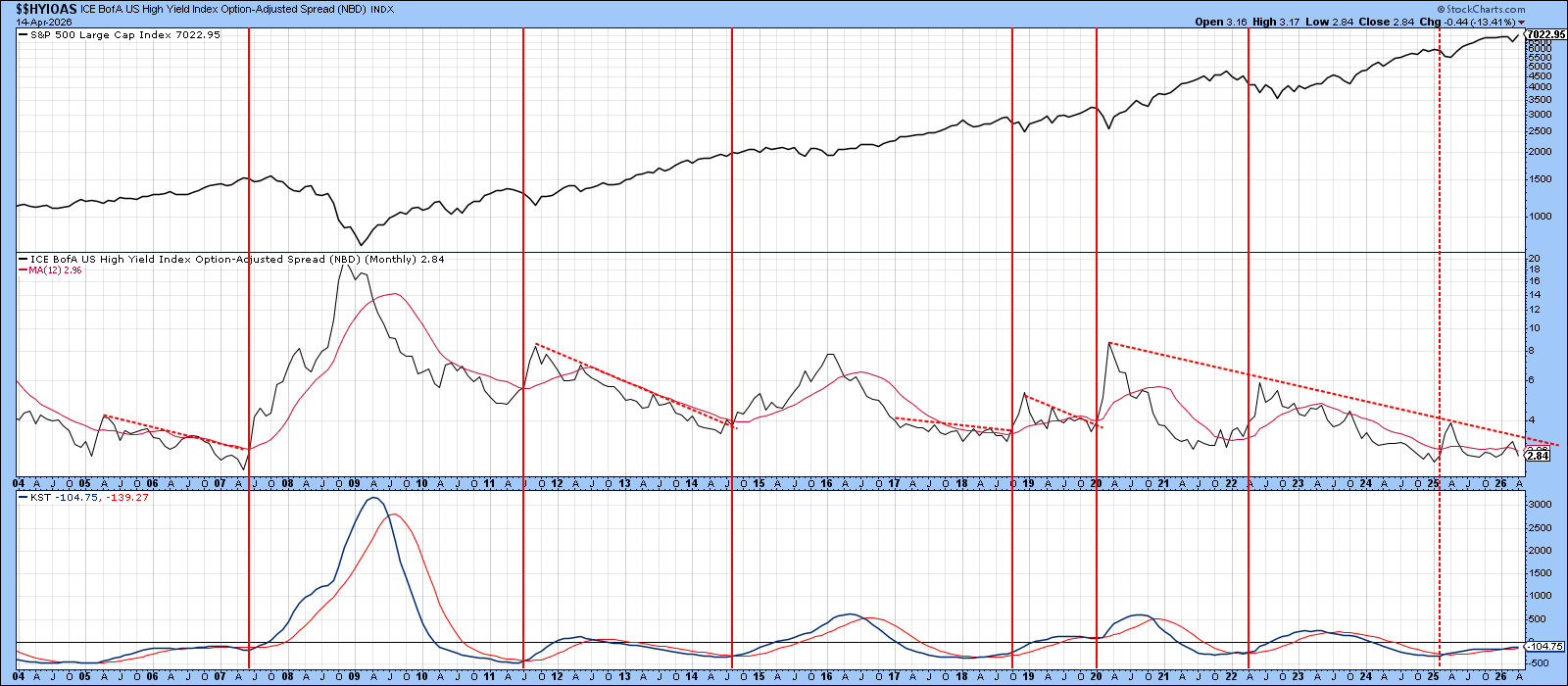
A Key Credit Spread
Chart 5 features the ICE BofA US High Yield Option‑Adjusted Spread (OAS), a key financial indicator that measures the risk premium demanded for holding non‑investment‑grade corporate bonds. In simple terms, a rising spread reflects deteriorating confidence and is typically bearish for equities, while a declining spread signals improving sentiment.
There have been seven occasions in which it has been possible to draw a meaningful down trendline on this indicator. When those trendlines have been violated, the break has usually coincided with an equity decline of varying magnitude. At present, the indicator remains at a subdued and somewhat complacent level, but it would not take much of an emotional shift in the credit markets to push it above its seven‑year down trendline. Should that occur, it would represent a notable warning that risk appetites are beginning to erode.
Good luck and good charting,
Martin J. Pring
The views expressed in this article are those of the author and do not necessarily reflect the position or opinion of Pring Turner Capital Group of Walnut Creek or its affiliates. The Six Stages of the Business Cycle are followed each month in Martin Pring’s Intermarket Review.