Commodity Battle Lines Are Being Drawn

Commodities have posted impressive gains since the beginning of the decade, but investors are now faced with an important question: Does the bull market still have room to run?
Chart 1 highlights four commodity indexes, all of which are currently trapped between converging trendlines. The red support lines carry weight because they are longer established and have been validated by numerous touchpoints. A collective break below these levels would seriously undermine the bullish primary trend. Conversely, a decisive breakout above the green resistance lines would indicate that the consolidation phase is ending and that the broader commodity bull market is reasserting itself.
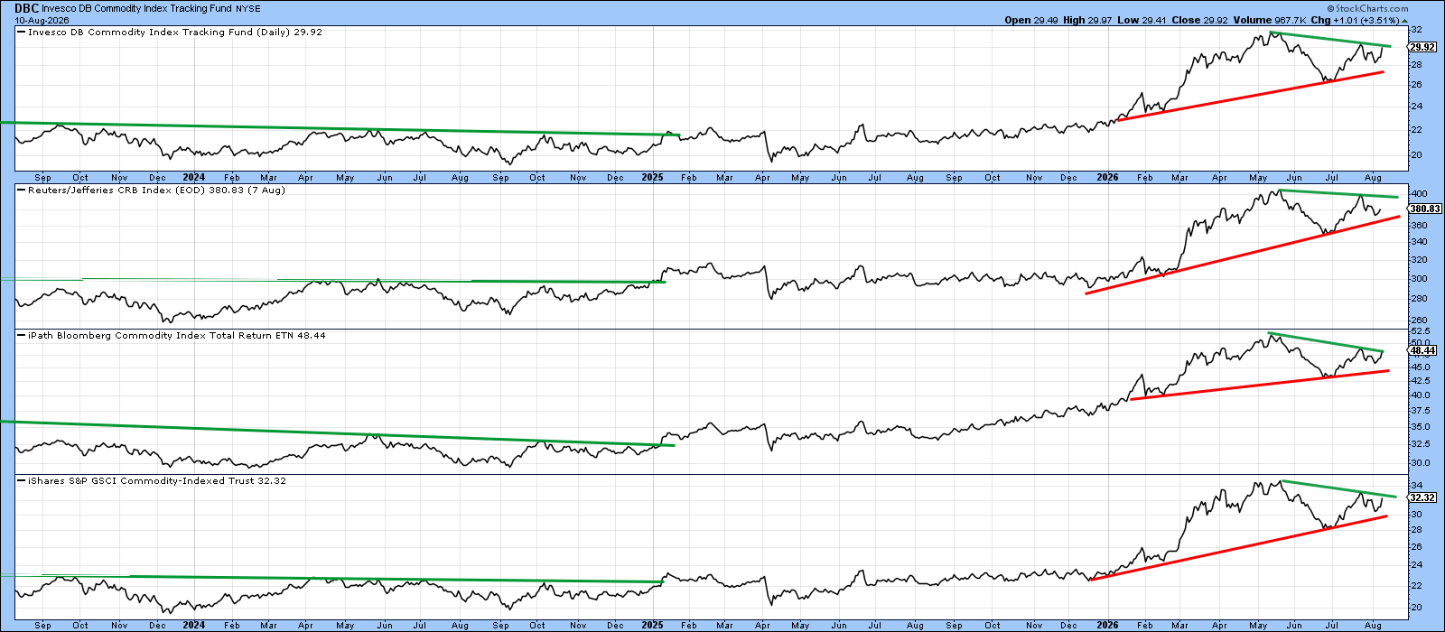
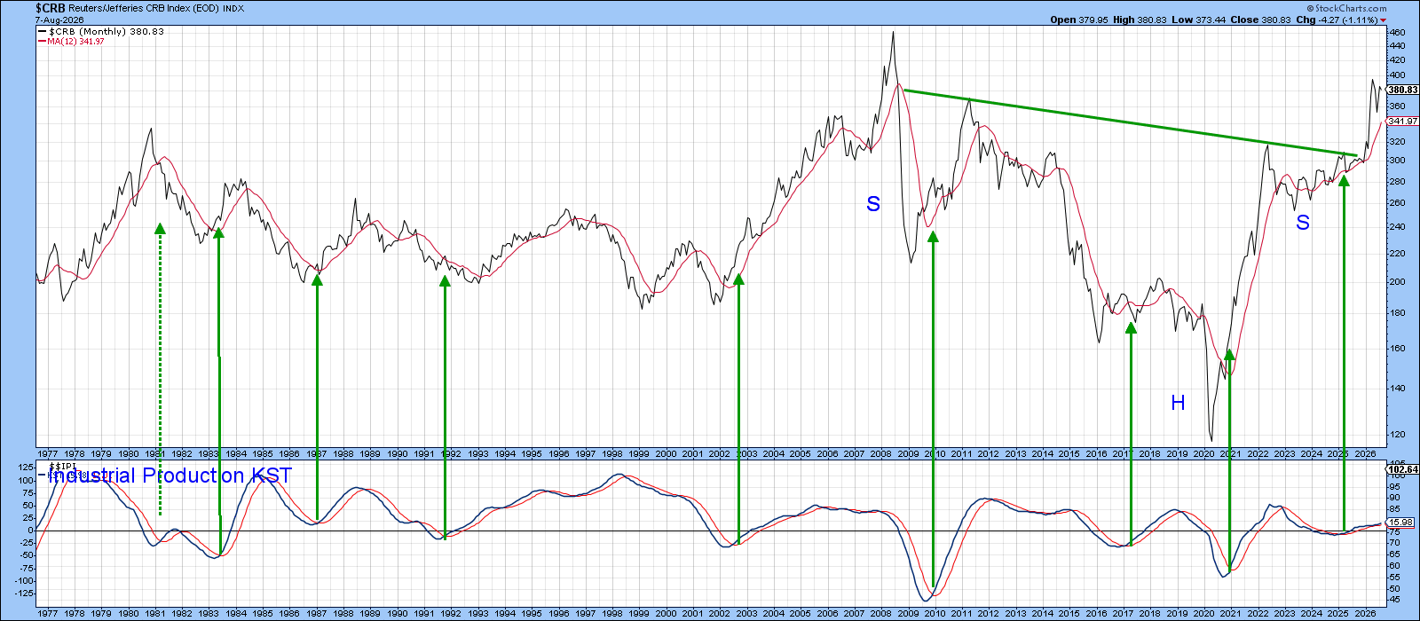
Chart 2 suggests that an upside breakout is the more likely outcome for two reasons. First, the long-term Know Sure Thing (KST) for industrial production remains in a clear uptrend. The green arrows illustrate that periods of positive economic momentum have generally been accompanied by strength in commodity prices. More importantly, industrial production is a coincident economic indicator, while several leading indicators, including future capital spending plans and the ISM New Orders Index, continue to point higher. Taken together, this evidence suggests that industrial production, and by extension commodity prices, still have room to advance.
The second piece of bullish evidence comes from the CRB Composite ($CRB), which recently completed a multi-year inverse head-and-shoulders pattern. Viewed in that context, the 2026 rally appears to represent only the first leg of the advance typically associated with a major long-term breakout, implying that the broader commodity bull market may have considerably further to run.
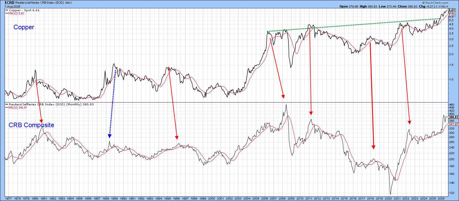
Another piece of bullish evidence comes from copper, which has historically exhibited a strong tendency to lead the CRB Composite at major bull market peaks. This relationship can be seen in Chart 3, where the red lines connecting corresponding turning points slope to the right, indicating that copper typically peaks ahead of the broader commodity market. Admittedly, the relationship is not perfect, as illustrated by the dashed blue line, but it has been sufficiently consistent to suggest that a new high in copper is often followed by one in the CRB Composite. Consequently, copper's recent multi-decade breakout provides additional evidence that the broader commodity complex has yet to reach its cyclical peak and that higher prices probably lie ahead.
What Does the Stock Market Have to Say?
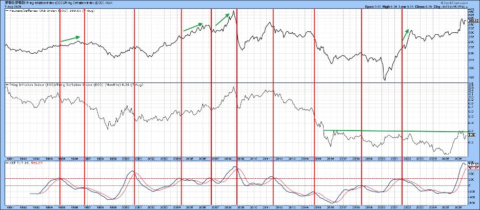
Chart 4 offers a more nuanced assessment. The center panel plots the ratio of an index representing stocks that tend to benefit from rising commodity prices against one that typically outperforms during disinflationary or deflationary periods. The vertical lines identify occasions when the ratio's KST reaches a peak. Historically, roughly half of these signals have coincided with major peaks in the CRB Composite, whilst the remainder have been followed by firmer prices. As a result, the current signal is concerning, but far from decisive.
Commodity Sensitive Currencies Also Weigh In
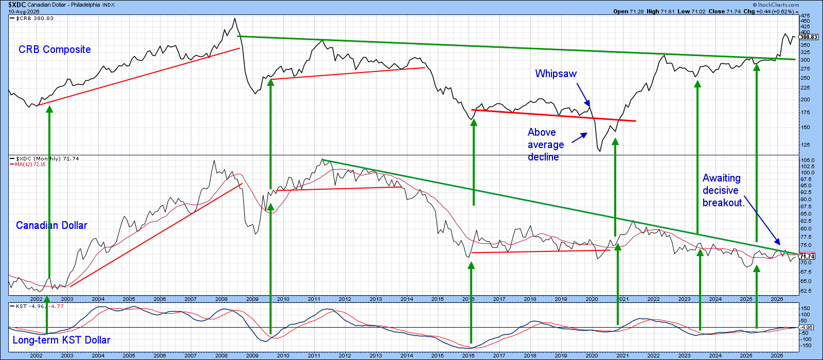
Chart 5 highlights the close relationship between commodity prices and the resource-sensitive Canadian dollar. The arrows show that KST buy signals for the currency have historically been followed by meaningful advances in the commodity complex. At present, however, the Canadian dollar finds itself at a critical technical juncture, with both price and momentum finely balanced.
A decisive rally above its secular down trendline would trigger a powerful KST buy signal and, based on past experience, significantly increase the odds that the CRB Composite is poised for another leg higher.
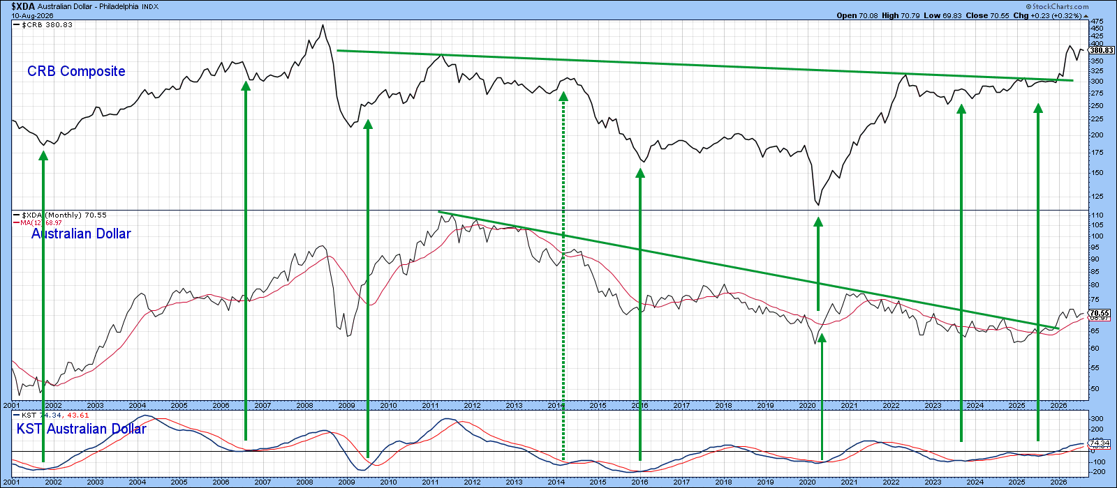
Interestingly, Chart 6 indicates that the Australian dollar, which shares many of the Canadian dollar's resource-driven characteristics, has already broken above its comparable downtrend line and generated a bullish signal. If the Canadian dollar follows suit, it would add yet another piece of evidence supporting the case that commodity prices have yet to reach their cyclical peak.
The Bottom Line
The technical evidence for commodities is mostly long-term bullish. However, there are a couple of potential flaws, reinforcing the importance of monitoring the key support and resistance levels highlighted in Chart 1. A breakout in either direction is likely to provide a decisive clue regarding the commodity market's next major move.
Good luck and good charting,
Martin J. Pring
The views expressed in this article are those of the author and do not necessarily reflect the position or opinion of Pring Turner Capital Group of Walnut Creek or its affiliates. The Six Stages of the Business Cycle are followed each month in Martin Pring’s Intermarket Review.