3 Strong Charts From 3 Very Different Sectors

My process for finding strong charts is built on routines that help me monitor market conditions and focus on trend changes. As an investor, I consider this routine framework essential to maintaining strong “situational awareness”. So when a viewer of my daily market recap show issued an informal challenge to find a strong chart in each of the 11 S&P 500 sectors, I was thrilled to take the challenge.
Not surprisingly, some of the sectors, like Technology, made the process fairly simple. The biggest challenge was picking just one great chart among many! For other sectors, such as Financials and Utilities, it was a challenge to identify even one decent chart in the group.
Here are three of the 11 stocks I selected, along with some unique technical characteristics demonstrated on each chart. I hope this exercise not only helps you surface some compelling technical setups, but also reinforces the value of having a disciplined process for market awareness!
Financials: Robinhood Markets (HOOD)
While most major banks have rotated into a clear distribution phase, Robinhood stands out in that it appears to have completed a cup-and-handle pattern. HOOD pulled back to resistance around $120 in July and then, after a July pullback, retested that resistance again in September.
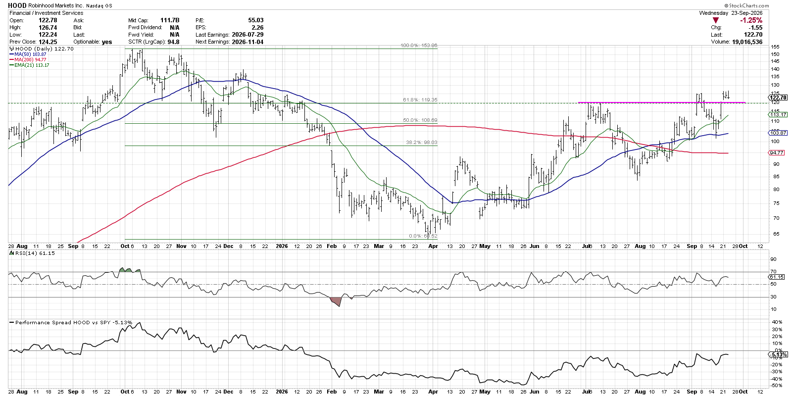
With a push back above the $120 level this week, HOOD appears to have completed this bullish rotation. On top of that, the recent upswing also propelled the stock above a 61.8% retracement of the October 2025 to March 2026 bearish trend. With the stock breaking above a “confluence of resistance” on bullish momentum, HOOD could mount a retest of the 2025 peak.
Materials: Nucor (NUE)
The Materials sector was another one where it proved to be quite a challenge to identify constructive charts, but Nucor was one name that stood out because of a clear consolidation pattern. With steadily lower highs and a static support level at $240, the chart has formed a descending triangle pattern.
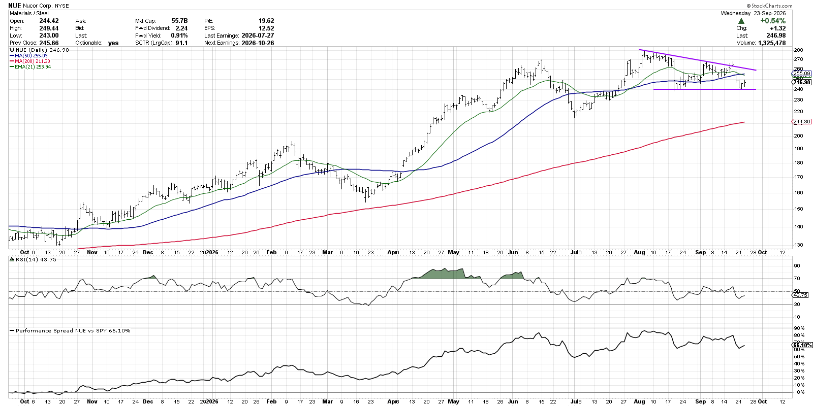
Now, while the descending triangle usually resolves to the downside, a break above the upper trendline boundary can signal a bullish move with further upside potential. On the latest retest of support around $240, the RSI once again held the 40 level. While I’m not seeing any bullish breakout just yet, this is one of those charts where I set up a price alert on StockCharts and let the platform tell me when the trigger has been achieved.
Communication Services: Meta Platforms (META)
We’ve discussed Meta Platforms often in our work, as I would argue it remains one of the best within my Dave’s Dirty Dozen list of leading growth stocks and ETFs. And while the chart remains in a position of technical strength, despite some shooting star candles in recent days, it’s the action after all the price gaps that makes this a great chart to analyze.
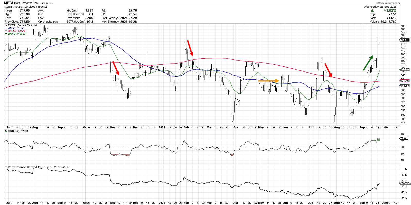
META gapped back above its 200-day moving average earlier in September and followed that bullish gap with a steady move higher. This additional demand, even after the upside gap, represents strong buying power and reason for optimism. Sure enough, the stock eventually made a new three-month high and has remained strong into this week.
Look at some of the previous gaps over the last 12 months, and you will find that most of the time the price has moved lower after an upside or downside gap. Back in January, the stock gapped higher after an earnings release, but then sellers came in strong to push the price back lower. In October 2025, a downside gap was followed by further selling pressure, suggesting a lack of willing buyers even despite the suddenly discounted price.
How did I hone in on some of the strongest charts in each of the 11 S&P 500 sectors? I actually started with the StockCharts SCTR rankings, which allowed me to focus on charts demonstrating strong momentum characteristics. And while I didn't always select the highest rated name in each sector, the SCTR lists definitely gave me an effective starting point to what ended up being an enjoyable process of discovery!
RR#6,
Dave
P.S. Ready to upgrade your investment process? Check out my free behavioral investing course!
David Keller, CMT
President and Chief Strategist
Sierra Alpha Research LLC
marketmisbehavior.com
https://www.youtube.com/c/MarketMisbehavior
Disclaimer: This blog is for educational purposes only and should not be construed as financial advice. The ideas and strategies should never be used without first assessing your own personal and financial situation, or without consulting a financial professional.
The author does not have a position in mentioned securities at the time of publication. Any opinions expressed herein are solely those of the author and do not in any way represent the views or opinions of any other person or entity.