Did the Stock Market's First Domino Just Fall?

Key Takeaways
- A breach above 3.5% of the CPI ROC threshold suggests a headwind for equities.
- Market breadth is weakening beneath the surface as major indexes keep hitting new highs.
- Technology is a key driver, but XLK's bearish outside bar hints at buyer exhaustion.
Long-term trends are notoriously slow to shift. Reversing them demands considerable time and effort. As a technician, I strive to let the weight of the evidence guide my decisions rather than my emotions.
Right now, that evidence still points upward, but, with rising interest rates and inflation increasingly in the picture, the landscape has grown more uncertain. This has me wondering whether we may have already seen the first domino fall.
Chart 1 frames this concern by plotting the CPI-deflated S&P 500 ($SPX) alongside the 12-month Rate of Change (ROC) of the CPI. The critical reference point is the horizontal red line at 3.5%. Historically, this level has served as the dividing line between inflation the market can tolerate and inflation that begins to cause damage. The vertical lines approximate each time this threshold has been crossed, and the red arrows above the Index highlight that equities tend to come under pressure in the aftermath.
The degree of pain varies from cycle to cycle, shaped by the underlying economy and the severity of the inflationary episode. Markets have also been known to delay their reaction, as we saw in 2022, but the pattern is consistent: once the ROC breaks above 3.50% and continues rising, inflation becomes a headwind for stocks.
As Chart 1 indicates, the breach occurred back in April. Updated figures are due out this Wednesday, so click the chart and save it to one of your ChartLists. You can view an enlarged and refreshed version once the StockCharts database has been updated.
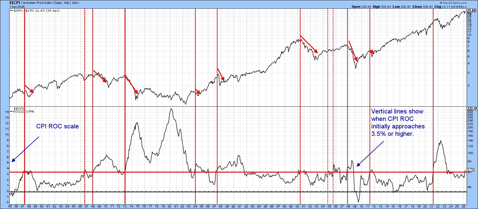
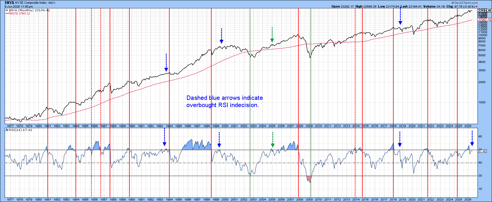
Chart 2 puts the NYSE Composite alongside its 14-month Relative Strength Index (RSI), with vertical red lines marking negative overbought crossovers, most of which have historically preceded some form of decline. The dashed arrows capture periods of overbought indecision, which tend to resolve into sideways, range-bound trading rather than a clean directional move.
Earlier this year, the RSI turned bearish, but it has since bounced back into overbought territory. This development points more toward consolidation than a clear breakout in either direction. The chart stops well short of calling a top, but the message is clear enough: the favorable risk/reward that characterized the earlier stages of this cycle has quietly eroded, and this is not the environment to be caught off guard.
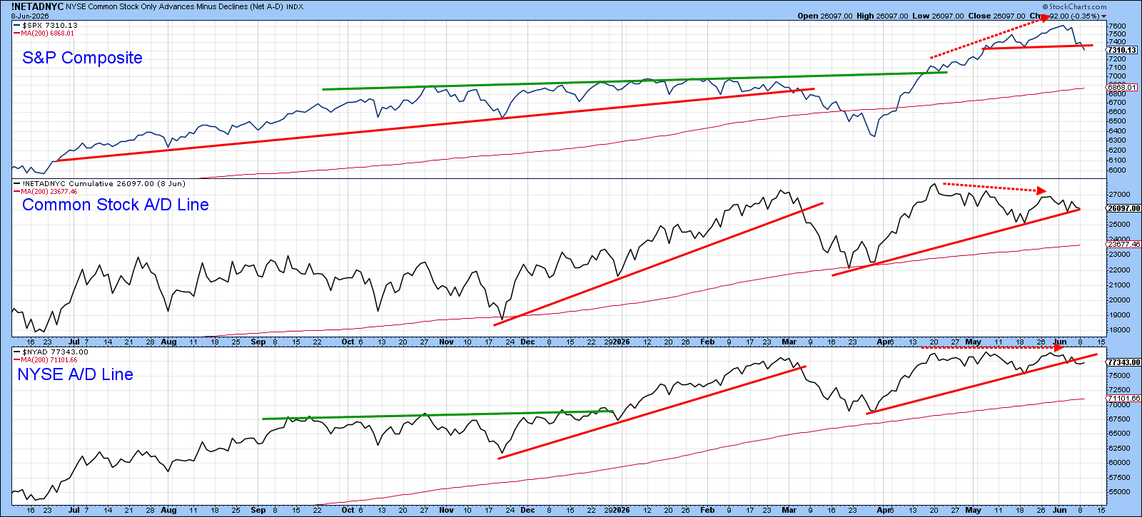
The next few charts shift our focus to the nearer-term picture. Chart 3 does this by placing two A/D Lines alongside the S&P 500, and what it reveals is a quiet but meaningful disconnect. While the headline numbers paint an impressive picture thanks to strength in the Technology sector, neither breadth indicator has managed to confirm the early June all-time high — a subtle but important crack beneath the surface.
Should this divergence persist, it would serve as a warning that the rally is running on a narrowing base rather than broad market participation. For now, it registers as a yellow flag. A red one would require the violation of all three rising red trendlines.
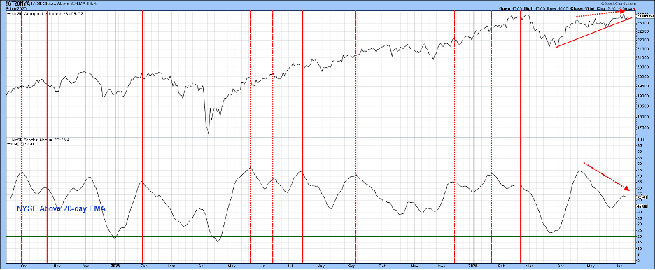
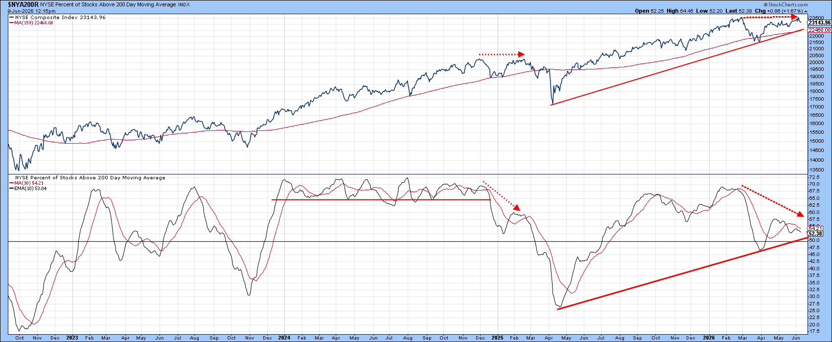
Charts 4 and 5 dig a little deeper into the breadth picture. Chart 4 sets the $NYA against the percentage of stocks trading above their 20-day EMA, and the reading raises some eyebrows. Despite the index pushing to a fresh intraday high last week, the indicator barely managed to clear the 55% threshold, a sluggish showing that leans bearish on its face.
The counterargument, however, is that such a subdued reading leaves room for the indicator to build from here and potentially fuel a meaningful rally. Both interpretations have merit, but my attention is drawn more to Chart 5, which tracks the percentage of NYSE stocks trading above their 200-day moving average, a broader and arguably more telling measure of underlying market health.
The reason for that focus is straightforward. This indicator has been quietly deteriorating even as the index has continued to climb, a divergence that deserves attention. That said, divergences indicate vulnerability, but it's mandatory for them to be confirmed by some kind of price trend confirmation.
Consequently, until the index itself breaks down, the signal remains a warning rather than a verdict. In the current setup, that confirmation would come in the form of a breach of the rising trendline and the 200-day moving average, two levels that happen to converge in the same neighborhood, around 22,500. That is the line in the sand worth watching.
To round things out, it's no secret that the recent rally has been largely a technology-driven story, and the three breadth charts drive home just how narrow that advance has been.
Chart 6, however, zeroes in on something more immediate, namely that the XLK printed an outside bar last week. Factor in the week before and there is a reasonable case to be made that this outside bar also formed the second leg of a two-bar reversal pattern. Whichever way you frame it, last week's price action carries the unmistakable scent of buyer exhaustion.
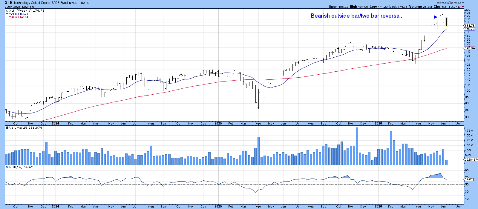
Outside bars are expected to cast a shadow over price action for roughly 5 to 10 bars, which, in this case, is measured in weeks. This one carries added weight for a couple of reasons. First, it follows a sharp, extended rally, making the setup ripe for profit-taking. Second, the bar itself is notably wide, reflecting a fierce tug-of-war between buyers and sellers, one that the sellers won decisively, as evidenced by the close printing right at the low.
As always, it is important to experience some kind of confirmation. In this case, a violation of the 10-week MA at $170 appears appropriate.
With a record-setting IPO expected in a few days, the scene could well be set for a significant peak in technology. Perhaps we have just seen the first domino drop?
Good luck and good charting,
Martin J. Pring
The views expressed in this article are those of the author and do not necessarily reflect the position or opinion of Pring Turner Capital Group of Walnut Creek or its affiliates. The Six Stages of the Business Cycle are followed each month in Martin Pring’s Intermarket Review.