Is It Time to Issue a Red Card for the Gold Bull Market?

Gold has enjoyed an exceptional run over the past several years, but no trend persists indefinitely. With the price beginning to show early signs of fatigue, this is an appropriate moment to ask whether a primary bear market is developing. Before turning to the technical evidence, it’s helpful to step back and consider the broader commodity‑cycle backdrop, because that context frames what would be reasonable to expect from gold at this stage.
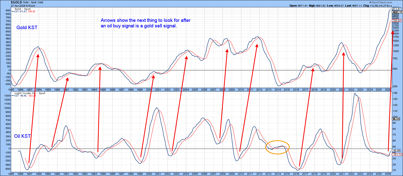
Historically, the commodity complex follows a fairly consistent chronological sequence: gold leads copper, and copper leads oil. The logic is straightforward. Gold discounts future inflation and therefore tends to turn ahead of the broader commodity complex. Copper bottoms next as early‑cycle restocking takes hold—construction, electrical equipment, and appliance demand all respond quickly when economic conditions begin to stabilize. Oil, by contrast, is driven by late‑cycle forces such as transportation, freight, petrochemicals, and broad consumer activity, so its momentum typically turns last.
Chart 1 plots long‑term smoothed momentum for both gold and oil. The right‑slanting arrows highlight the historical pattern: once oil momentum bottoms, the next major event to anticipate is a downturn in gold. Since oil momentum has only recently completed its bottoming process, it is entirely consistent, within the logic of the commodity cycle, to expect gold’s KST to peak at any time.
That said, the lead–lag relationships are not perfectly uniform. The ellipse in Chart 1 reminds us that the timing varies from cycle to cycle, and the turning points don’t always follow the textbook sequence precisely. For that reason, we cannot specify the exact month in which gold’s long‑term momentum will peak. What we can say is that the conditions are now in place for a reversal, and the burden of proof has shifted toward the idea that gold is vulnerable to a primary trend change.
Two Indicators That Reflect Bubble‑Line Conditions
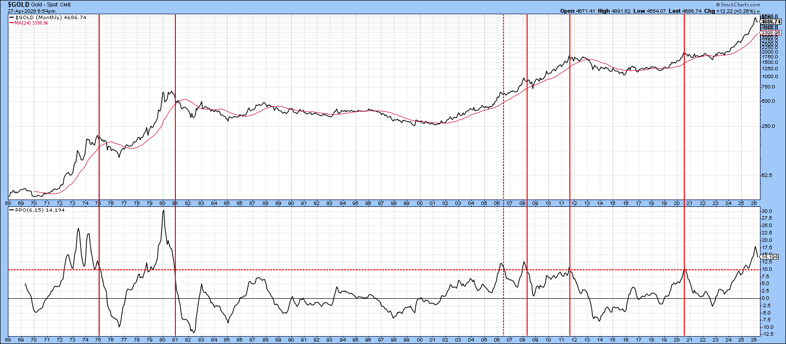
Chart 2 features a monthly PPO using the 6‑ and 15‑month parameters. Historically, sell signals are triggered when the oscillator pushes above its overbought zone and then re‑crosses back below it. The PPO has already begun to roll over sharply, but it has not yet fully broken back through the overstretched zone. Given the degree of prior upside momentum, it would take a powerful renewed surge in price to prevent that breakdown from occurring.
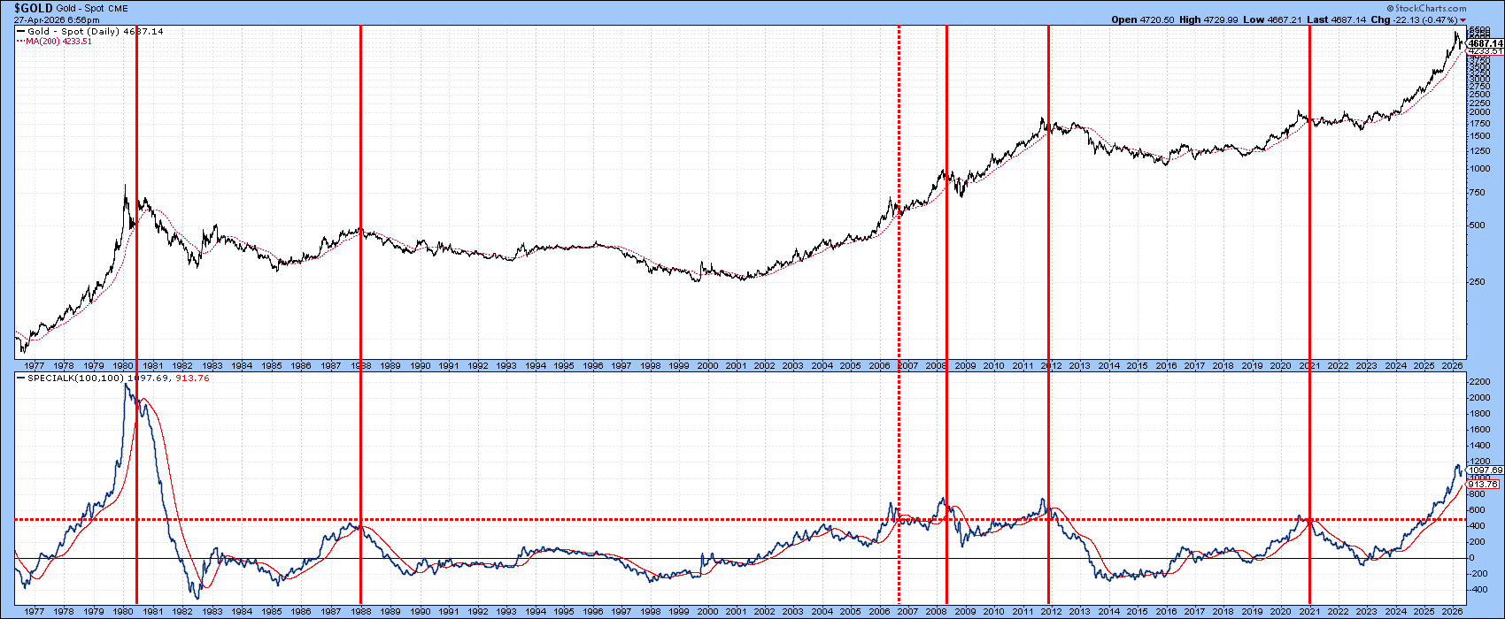
A similar message comes from the Special K in Chart 3. It remains marginally above its signal line, but the vertical lines highlight previous instances when crossovers from extreme levels have marked important peaks. The setup is in place; the trigger has simply not yet been pulled.
Silver Looks Terrible
Whenever the 18‑month ROC for any market (excluding volatile equities) reverses from a position above +200%, it has historically signaled a major peak, one that typically is not exceeded again for roughly 15 years. Chart 4 shows that this indicator has just reversed from such a level for the fourth time in 50 years. Two of those instances marked secular peaks; the earliest one marked a primary trend reversal and an unusually brief re-capture period.
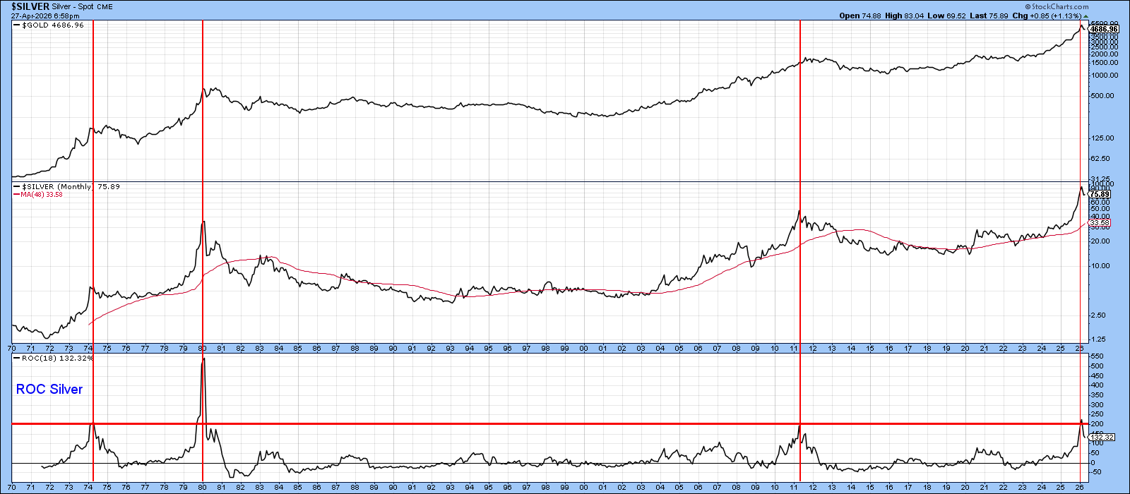
The upper window plots the gold price, and the trajectories of gold and silver remain closely aligned. Importantly, all three prior ROC reversals, though triggered by silver, also “worked” for gold. The latest signal, therefore, carries negative implications well beyond the gray metal.
Gold and Gold Shares
Chart 5 highlights several actionable setups for the SPDR Gold Shares ETF (GLD) and the VanEck Gold Miners ETF (GDX). Both appear to be forming potential head‑and‑shoulders tops. A key takeaway is that the neckline and the 200‑day MA for GDX converge near $81, creating a critical support zone. For GLD, the neckline lies near $415, with secondary support at $400, at the March low.
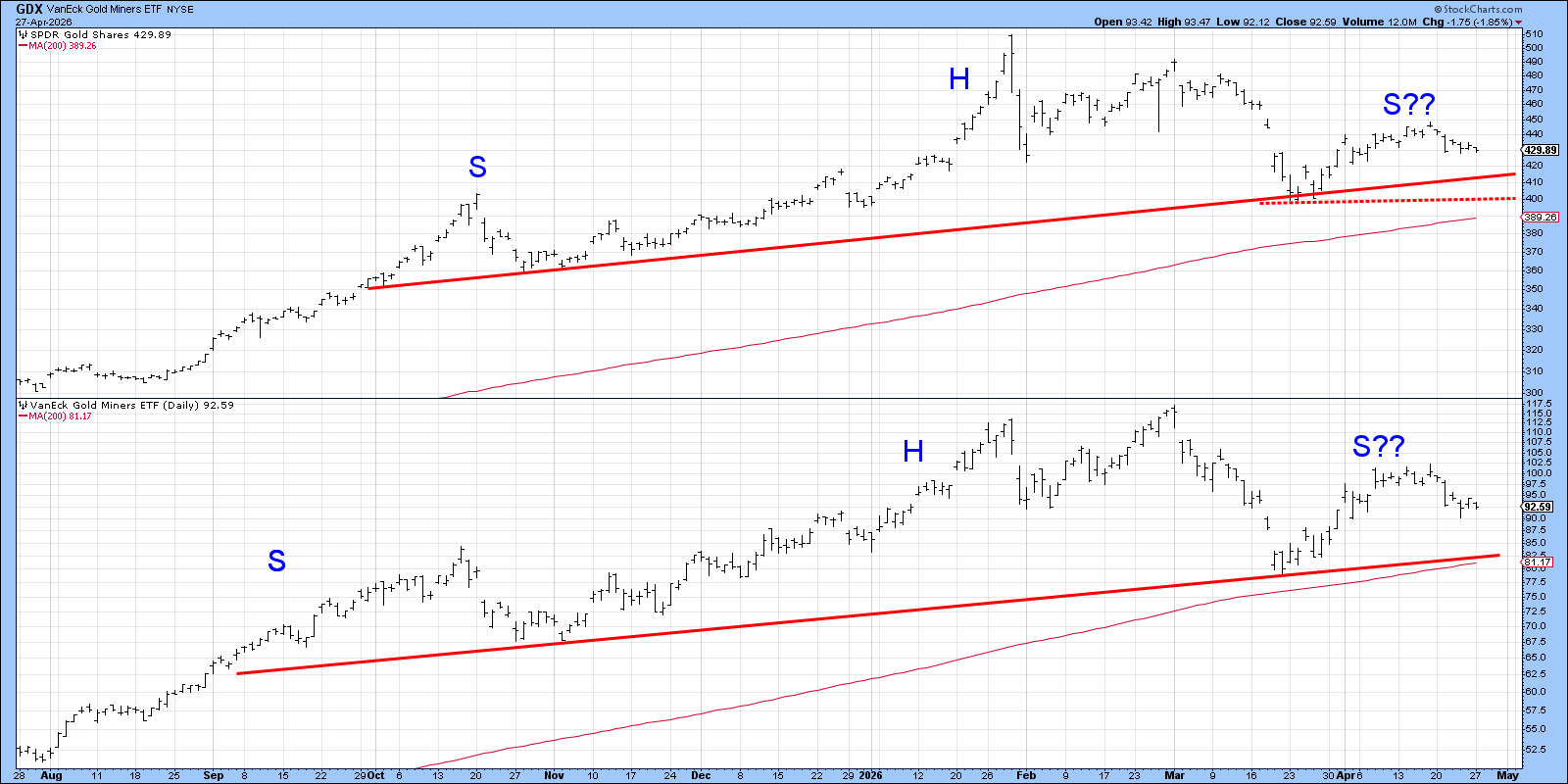
Bottom Line
A yellow flag has clearly been raised. But if GLD violates and holds below $415, this referee will have little hesitation in reaching for red.
Good luck and good charting,
Martin J. Pring
The views expressed in this article are those of the author and do not necessarily reflect the position or opinion of Pring Turner Capital Group of Walnut Creek or its affiliates. The Six Stages of the Business Cycle are followed each month in Martin Pring’s Intermarket Review.