The S&P 500 May Look Strong, But the Market Beneath It Does Not

The S&P 500 ($SPX) appears to be finishing the week strong, trading back out of a bull flag pattern and threatening new all-time highs. Despite this strong price action, though, momentum has remained fairly anemic.
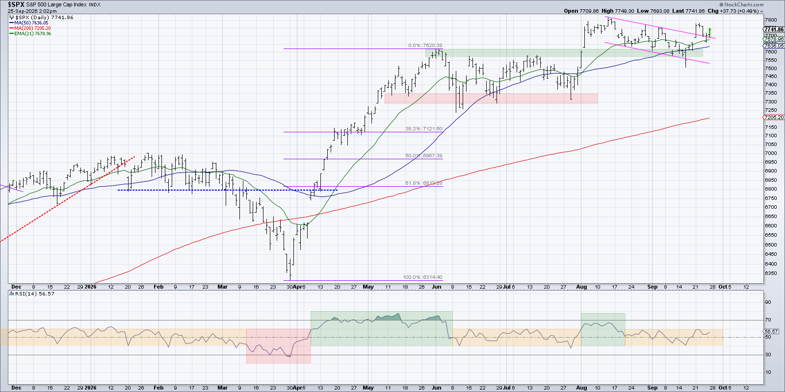
The Relative Strength Index (RSI) has remained in a neutral range for the last six weeks, fluctuating between 40 and 60 since mid-August. The S&P 500 is turning back higher, but it’s worth noting that the benchmark is pretty much right where it was in early August!
If the price had stalled and breadth indicators were strengthening, I would probably argue that the market is much stronger than it seems. Unfortunately, in recent weeks, market breadth indicators are weak and getting weaker.
Today we’ll break down three key breadth indicators, reveal their latest trends and shifts, and discuss what we would need to see to become much more constructive about the equity benchmarks into October.
Advancers-Decliners has been trending lower
As we’ve noted often on our daily market recap show, the advance-decline data has been generally bearish of late. We’ve seen several days this week where decliners outnumber advancers by a two-to-one or even a three-to-one ratio. This has caused the cumulative advance-decline lines to establish bearish trends.
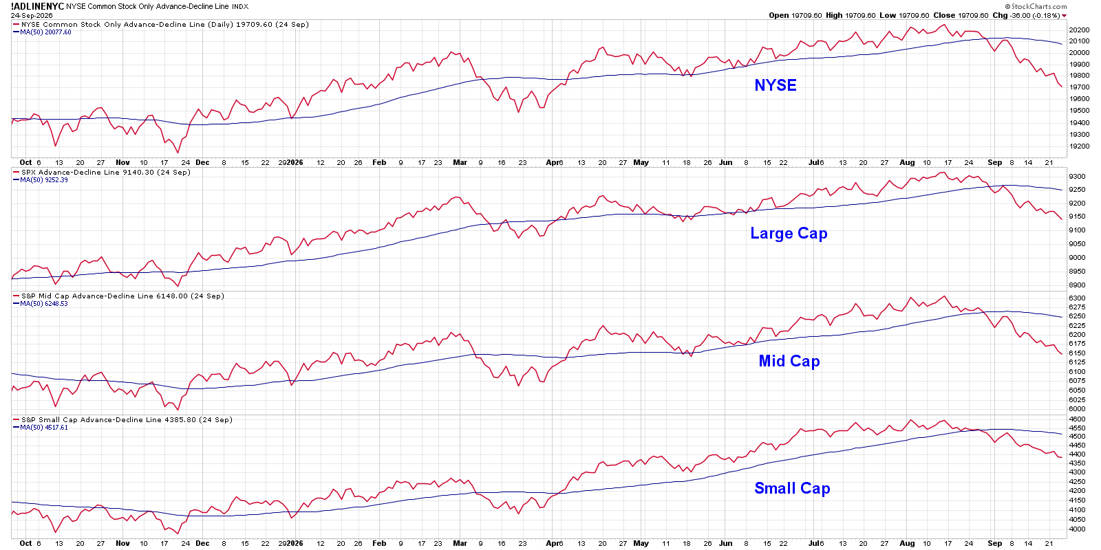
All four of the advance-decline lines shown in the above chart broke down below their 50-day moving averages toward the end of August. Through the month of September, they have all established clear downtrend phases of lower highs and lower lows.
The McClellan Oscillator, derived from the NYSE advance-decline data, also shows the strength of the downtrend in breadth readings.
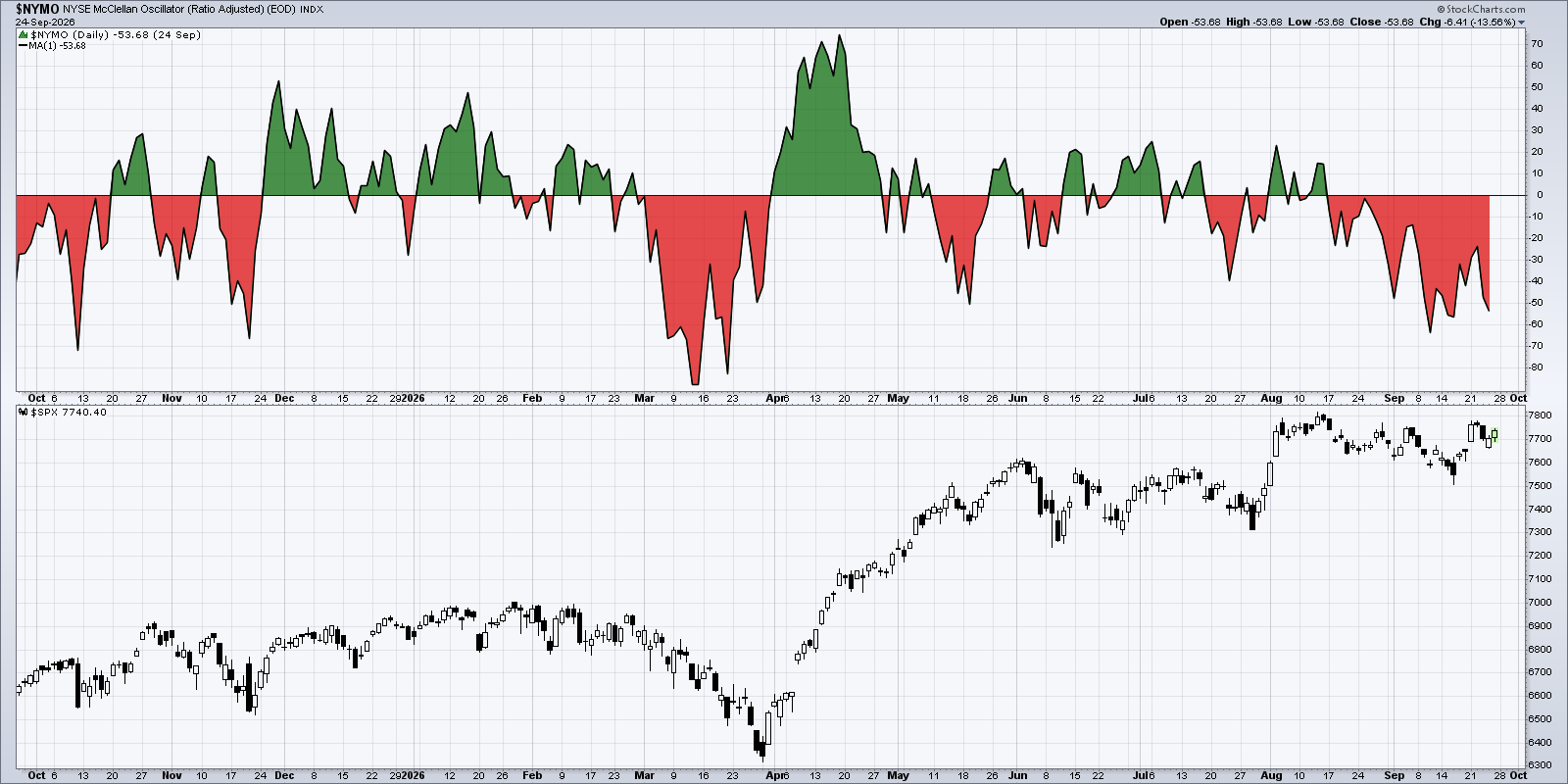
Earlier this month, the McClellan Oscillator reached its lowest reading since March 2026. One notable difference is that the S&P 500 was already in a clear downtrend phase as the breadth indicator began to turn quite negative. More recently, we’ve been seeing the McClellan Oscillator go to almost the same bearish extreme, even though the S&P 500 has not really broken down in any meaningful way.
The strength in mega-cap growth stocks has basically been skewing the S&P 500 and Nasdaq 100 indexes to appear much stronger than the performance of individual stocks would imply. Here’s the equal-weighted S&P 500 (RSP) versus the regular cap-weighted S&P 500 (SPY).
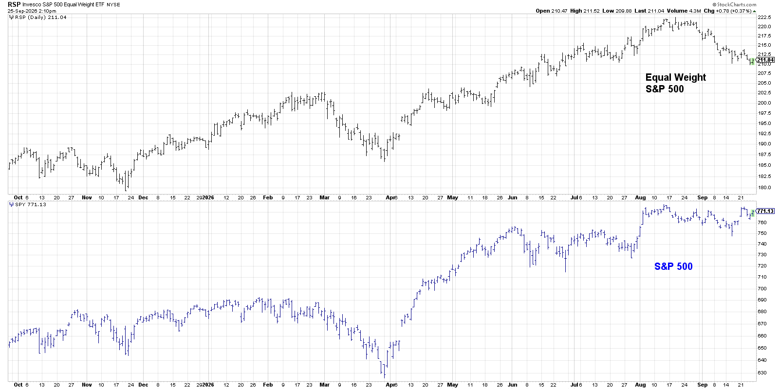
Note how the downtrend in the RSP matches more what we might expect given the weakness in the McClellan Oscillator. Thus, while the major benchmarks have remained neutral, the “market of stocks” has been steadily weakening.
Most S&P 500 stocks have broken key moving averages
We’ve also seen several stocks fail to hold key moving average support. As of this week, we’re observing that less than 30% of S&P 500 members remain above their 50-day moving average.
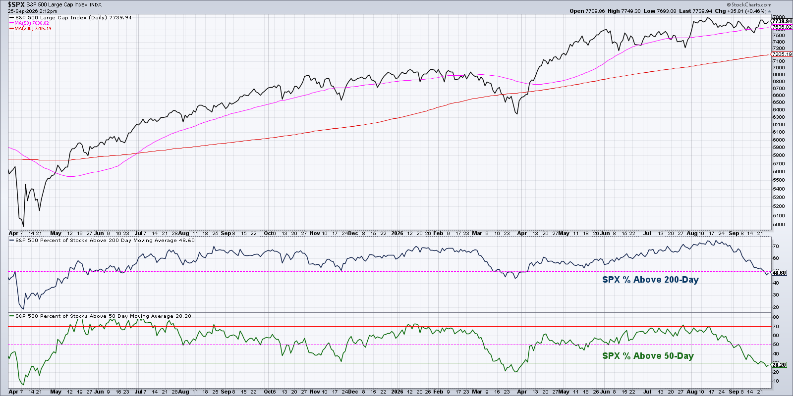
While that short-term measure of breadth may appear “oversold” as it reaches an extreme low level, the 50-day moving average breadth is more of a short-term breadth gauge. The more concerning feature of this chart is that less than 50% of S&P 500 stocks are sitting above their 200-day moving averages. While the S&P 500 and Nasdaq remain above key moving average support, most S&P 500 names have failed to do so.
New lows suggest lack of leadership momentum
Finally, there just aren’t enough stocks making new 52-week highs to be optimistic about this market. On an average day this week, only about 2–3% of S&P 500 members were making a new 52-week high. Back in July, that reading was up around 10–12%.

Even more disturbingly, we’ve noted an expansion in new 52-week lows. So, while we’ve all been focused on the S&P 500 potentially achieving another new all-time high, about 5–6% of S&P 500 stocks have been making a new 52-week low this week! With a lack of new highs and an expansion in new lows, we see more reasons to be skeptical of further market upside.
Market breadth indicators can provide a clear view into the performance of stocks that comprise our major indexes. And when the market is threatening new highs but breadth is almost universally weak, you have to question whether any uptrend is truly sustainable!

RR#6,
Dave
P.S. Ready to upgrade your investment process? Check out my free behavioral investing course!
David Keller, CMT
President and Chief Strategist
Sierra Alpha Research LLC
marketmisbehavior.com
https://www.youtube.com/@DKellerCMT
Disclaimer: This blog is for educational purposes only and should not be construed as financial advice. The ideas and strategies should never be used without first assessing your own personal and financial situation, or without consulting a financial professional.
The author does not have a position in mentioned securities at the time of publication. Any opinions expressed herein are solely those of the author and do not in any way represent the views or opinions of any other person or entity.