StockCharts Insider: A Century of Market Clues, Yours to Decode
Before We Dive In…
It’s easy to get too caught up in the present. Especially when it comes to investing. You’ve got news headlines, economic reports, current price moves, and just about everything to distract from what matters most: context. This is an exploitable blind spot, and not one in your favor.
You probably don’t think about it much, but pattern analysis relies on history for its robustness, especially in technical analysis. And that’s what we’re going to talk about today. We have four chambers of historical charts, most going back over a century. Can they yield some sort of advantage? Possibly, but it depends on how you use them. I’m just going to show you where they are, explain what they present, and toss in a few Insider tips to help get you started.
125 Years of Market Intelligence at Your Fingertips
Ever checked out StockCharts' Historical Chart Gallery? It’s a curated collection of long-term charts, some going back to 1900, depending on the index or topic. It’s organized into four sections and updated weekly.
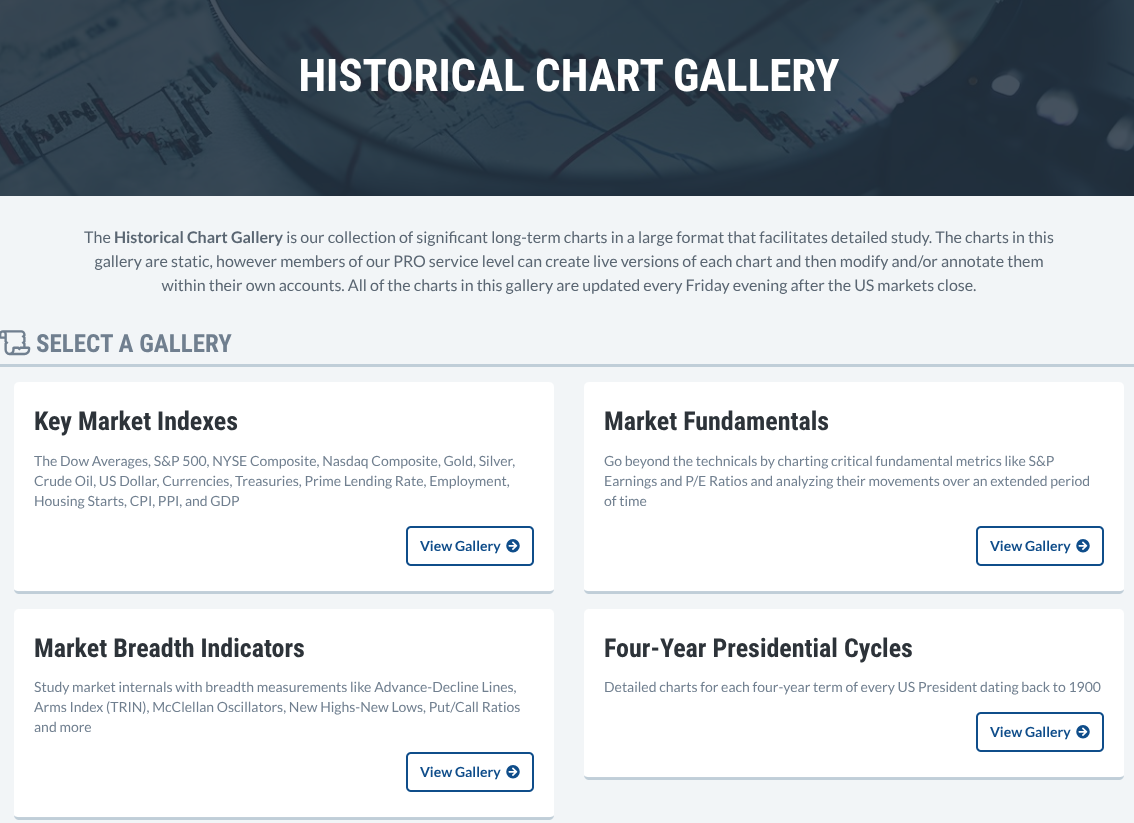
PRO members get to see the whole thing. For other levels, there’s a 1980 cutoff. Still, it’s worth checking out.
Key Market Indexes - A Large Scale Panorama
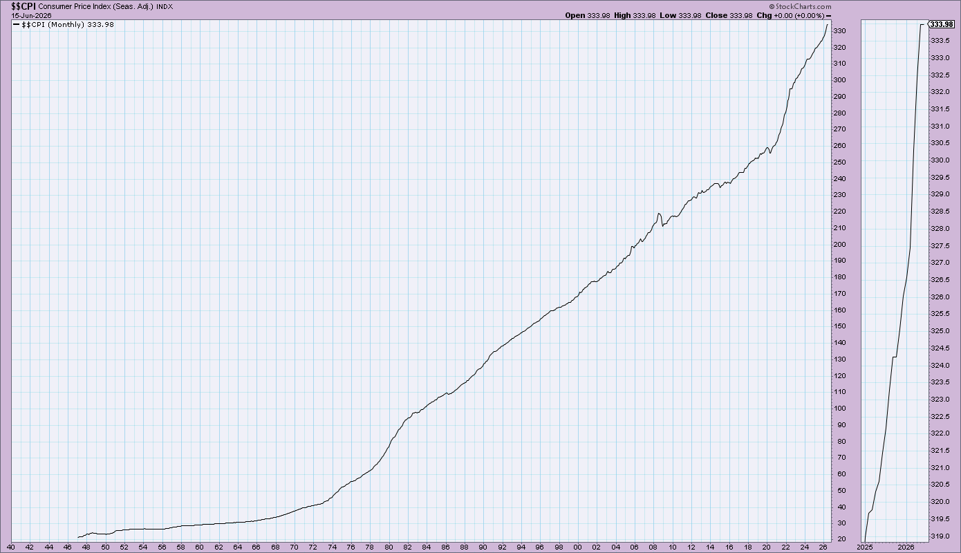
Here, you get broad historical data on the three Dows (industrial average, transportation, and utilities), S&P 500, Nasdaq Composite, and the NYSE Composite. You also get an assortment of bonds (30-Year, 10-Year, 3-Month, Prime Rate) and data for gold, silver, crude oil, and five major currencies. It also includes a long history of economic indicators like the CPI, PPI, unemployment rate, housing starts, and GDP.
This is like your cockpit. It’s what you need to orient yourself before zooming in on any single chart.
Market Fundamentals — Your Valuation Compass
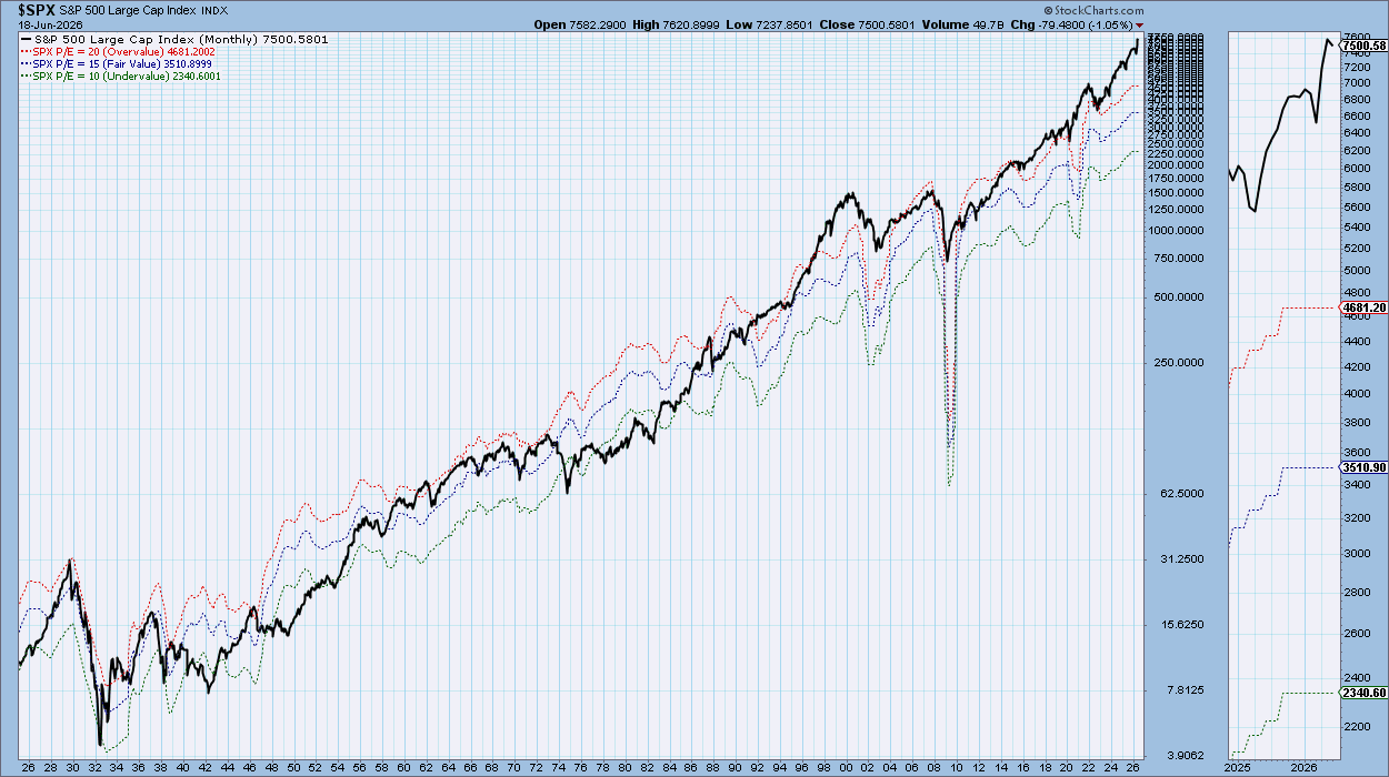
These are two deceptively powerful charts with data that you can’t get just anywhere. S&P 500 Fundamentals - 1926-Present includes historical earnings, P/E, and yield on separate panels, while S&P 500 P/E Range - 1926-Present which shows you the historical overvalued, fair-valued, and undervalued ranges.
These help answer several questions about the broader market, all of which can lead to the one every investor eventually asks: is now a good time to be in the market?
Market Breadth Indicators — The Undercurrent of the Market
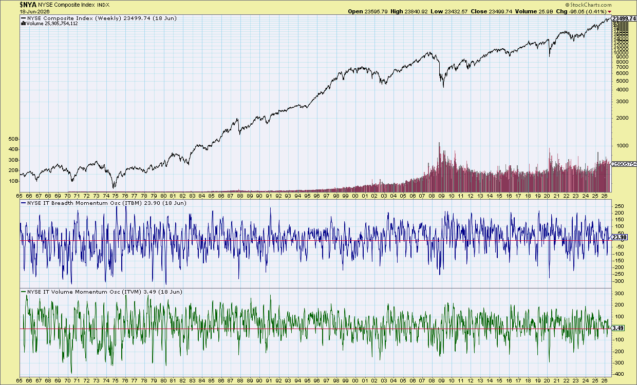
Price reveals what’s happening on the surface. But if you want to see the undercurrent, you look at market breadth. A rising index on deteriorating breadth is not a good sign. But a falling or consolidating market on increasing breadth? Possibly hidden accumulation.
Most investors are just watching price. This section shows you what’s moving it. Piece together the clues and maybe you’ll figure out where the market’s likely to go next before everyone else does.
Presidential Cycles — Each Year a Different Pattern
Have you heard of the Stock Trader’s Almanac? It’s a comprehensive, annual publication on various stock market seasonalities that was started by Yale Hirsch. Now, you don’t want to treat seasonal patterns as predictive indicators. But they do happen consistently enough for you to at least prepare for them.
This section of historical charts focuses on presidential cycles, with every term since 1900 charted. Yale Hirsch’s research on the weakness and strength of each year in a president’s term can give you a strong framework, especially if you’re looking to time the market.
Pause here and just check out the charts. Come back when you’re a bit more familiar with the general layout. When you’re ready, we can go over some Insider Tips.
Insider Tip #1: The Valuation + Rate Double-Check
Pull the P/E Range and the 10-Year Treasury yield chart side by side. High P/E in a low-rate environment is one thing. High P/E with rates rising is a different animal entirely. This combination has flagged every major overvaluation episode in the modern era. The reason? When rates rise, future earnings get discounted at a higher rate, meaning investors should pay less for every dollar of profit today, not more.
Insider Tip #2: The Breadth Divergence Alert
When the S&P is making new highs but the Advance-Decline Line is flattening or declining, that's a classic warning. The index is being lifted by only a handful of strong stocks. When they go, so too does the entire index. The Gallery lets you see every historical instance of this setup going back to 1965.
Insider Tip #3: The Presidential Cycle Overlay
Before making any medium-term market call, check which year of the presidential cycle you're in. First year? Hirsch says to expect weakness. Year three? Historically the strongest. Not entirely sure about this? Check the charts. Then see what it says about the current cycle.
And That’s a Wrap
So there it is. The Historical Chart Gallery. It isn't flashy. It doesn't send alerts. It won’t predict the next move. But what it does give you is something far more valuable that most other investors won’t even bother with: Proportion and context with a sense of scale. Things you can use to gain an advantage: “I’ve seen this before. Not recently. But I recognize the shape. In fact, I think I’ve seen it many times.” That’s the hidden edge these charts offer.