Reading the Tea Leaves: Why Short-Term Rates May Be Headed Higher

There has been considerable Fed-speak recently suggesting that interest rates could be raised one or two more times by year-end if economic conditions warrant. Cynics may argue that the Fed is merely talking tough to restrain inflation expectations today, thereby reducing the need for actual rate hikes later. However, provided commodity prices do not experience a significant decline, current indicators appear more consistent with raising rates now. This is especially true given that monetary policy affects the economy with a lag rather than immediately.
2-Year Yield Leads the Funds Rate
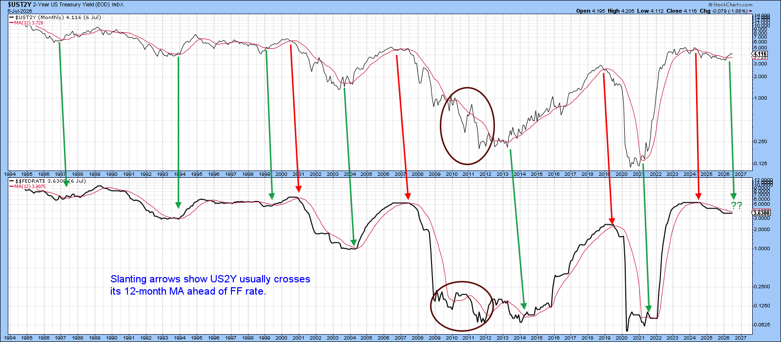
Chart 1 compares the 2-year US Treasury Yield Index ($UST2Y) with the Federal Funds rate. At most major turning points, the market-driven (but Fed-influenced) 2-year yield has tended to lead changes in the Funds rate. The green and red arrows identify positive and negative 12-month moving-average crossovers, respectively. The arrows generally slope to the right because the 2-year yield typically changes direction ahead of the federal funds rate. The steeper the slope, the greater the lead time.
Over the past month, the 2-year yield has crossed above its moving average, increasing the likelihood that a new rate-hiking cycle is beginning.
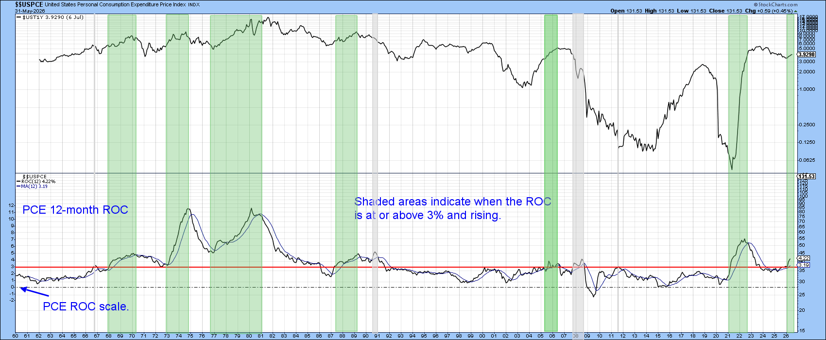
Swings in the inflation rate exert a powerful influence on interest-rate trends. In that respect, the center panel of Chart 2 features the 1-year Treasury yield and compares it with the 12-month Rate of Change (ROC) in the Federal Reserve's preferred inflation measure, the US Personal Consumption Expenditures Price Index ($$USPCE). The ROC scale is shown on the chart's left-hand axis.
The horizontal red line is plotted at the 3% level. The green-shaded areas identify periods when the Personal Consumption Expenditures (PCE) inflation rate was above 3% and above its 12-month moving average (blue line). These periods have historically been the most hazardous from the standpoint of rising interest rates. Inflation, however, isn’t the sole determinant of interest rates. The three gray shaded areas highlight periods when rates declined despite accelerating inflation. Conversely, the 2015–2020 period demonstrates that rates can rise even when inflation remains relatively subdued. Nevertheless, the historical relationship suggests that when the PCE inflation rate is above 3% and rising, money-market rates are generally likely to move higher as well.
This brings us to the current environment. The latest data show the PCE's 12-month rate of change comfortably above both the 3% threshold and its 12-month moving average, indicating conditions that have historically been associated with upward pressure on short-term interest rates.
Inflation: A Chronological Process
Another way of viewing the inflation process is to recognize that price pressures tend to move through the economy in a chronological sequence. Inflation often begins with commodities, progresses to producer prices (PPI), and ultimately reaches consumers through measures such as the CPI and PCE. Empirical studies generally suggest that changes in producer prices lead changes in consumer prices by several months, with estimates commonly ranging from roughly two to nine months.
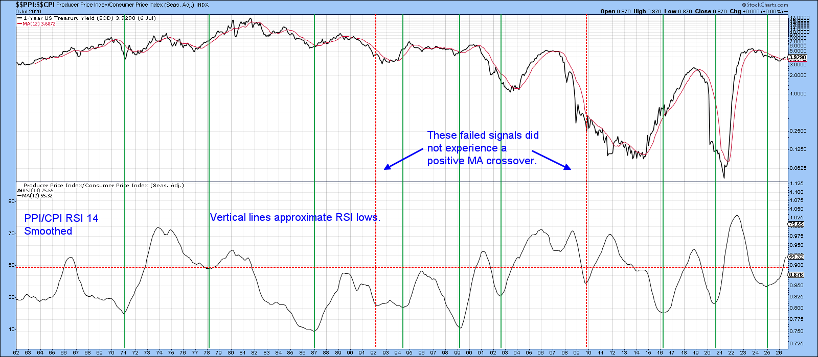
Recognizing this lead-lag relationship, Chart 3 compares the 1-Year US Treasury Yield Index ($UST1Y) with a ratio calculated by dividing the CPI by the PPI and then applying a 14-month smoothed Relative Strength Index (RSI) to that ratio. A rising RSI of the CPI/PPI ratio suggests that consumer prices are accelerating relative to producer prices, indicating that upstream cost pressures are being successfully passed through to end consumers. The green vertical lines, which intersect the major lows in the RSI, have historically been followed by rising short-term interest rates in most instances. These signals identify periods when inflationary pressures are gaining momentum, and the bond market is beginning to discount higher policy rates.
This is the type of environment that appears to be developing at present. With the RSI turning higher from a low level, the evidence suggests that inflationary pressures are still working their way through the system. Consequently, it’s reasonable to assume that the current rising-interest-rate environment could persist until there are clearer signs that those inflationary pressures are beginning to subside.
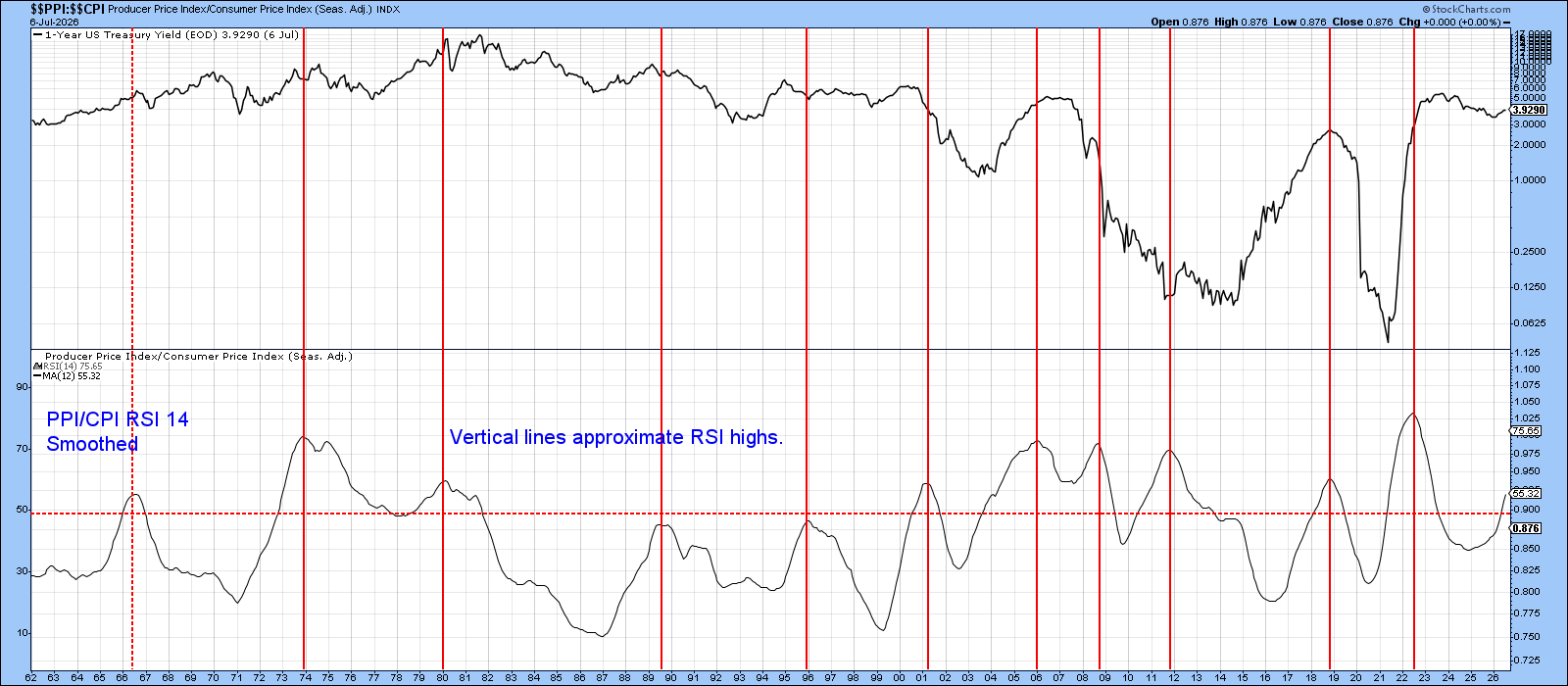
In that respect, Chart 4 is essentially a duplicate of Chart 3, with one important difference: the vertical lines identify peaks in the RSI rather than troughs. These peaks typically signal a moderation of inflationary pressures as the transmission of higher producer prices to consumers begins to lose momentum.
Historically, such peaks have often been associated with declining short-term interest rates or the early stages of a rate-easing environment. Consequently, they provide a useful indication that the inflation cycle is maturing and that upward pressure on interest rates may soon begin to recede.
At the present time, however, there’s no evidence of such a signal. The RSI remains well short of the type of peak that has historically coincided with a meaningful easing of inflationary pressures. As a result, the weight of the evidence continues to favor a higher-rate environment until clearer signs emerge that inflation is decisively cooling.
A Technical Indicator
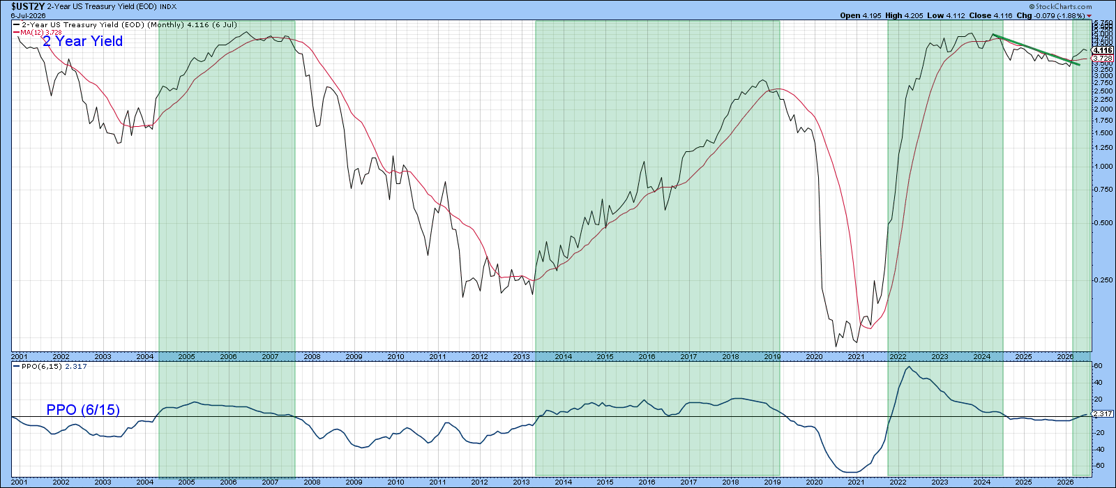
Finally, Chart 5 moves further into the technical arena by comparing the 2-year Treasury yield with its Percentage Price Oscillator (PPO) using 6- and 15-month moving-average parameters. The indicator turns bullish for rates when the PPO crosses above the zero line, which occurs when the six-month exponential moving average rises above its 15-month counterpart. These periods are highlighted by the green shading.
I particularly favor this approach because it has historically generated timely signals while minimizing whipsaws across most market environments. As a result, it does a good job of identifying meaningful shifts in the intermediate-term trend of interest rates without being overly sensitive to short-term fluctuations.
The PPO generated a bullish crossover last month, indicating that the trend in the 2-year yield has turned higher. Consistent with previous signals of this nature, the implication is that short-term interest rates are likely to continue moving upward in the months ahead.
The Bottom Line
Taken together with the evidence presented in the preceding charts, the balance of probabilities continues to favor a higher-rate environment, rather than an imminent decline in rates.
Good luck and good charting,
Martin J. Pring
The views expressed in this article are those of the author and do not necessarily reflect the position or opinion of Pring Turner Capital Group of Walnut Creek or its affiliates. The Six Stages of the Business Cycle are followed each month in Martin Pring’s Intermarket Review.