StockCharts Insider: ACP vs. SharpCharts—Why Using Both Beats Using One
Before We Dive In…
StockCharts has two main chart platforms, each powerful in their own right. But what does one do better than the other? What kind of trader or investor is either designed for? Which one better matches your needs?
Though both chart the same markets, comparing the two would be like comparing apples and oranges. They’re built for different jobs: one isolates, the other dynamically scans. One slows you down, the other speeds you up. And if you figure out how to use both of them, especially in sequence, you might unlock an advantage that you didn’t know was there. So I’m going to break it down for you so you can see the features that make each one tick.
Two Platforms. Two Speeds. One Workflow.
Looking at both platforms, the difference is obvious: SharpCharts gives you a single, clean, high-res view of a given chart with plenty of tools to add to it. ACP (Advanced Charting Platform), on the other hand, is a dynamic, multi-chart workspace with streaming data.
These are functional distinctions. But there’s another important secondary aspect to all of this, and it's not so much functional as psychological: whereas SharpCharts lets you do a deeper dive into a single chart, ACP enables you to think quickly across a wider context.
So, which one’s the right choice for you: slower, deeper dives or faster, wide context thinking?
Who Each Platform Is Really For
SharpCharts for the Focused Technician
If you’re looking for greater depth and clarity without the real-time distractions, then SharpCharts may be the suitable platform to use.
In particular, you should consider SharpCharts for:
- Identifying patterns (trendlines, classic chart patterns, etc.)
- In-depth and slower indicator analysis
- Refining swing-trading setups
- Creating clean, presentation-ready charts for articles, reports, or educational materials
The strength of a static chart is that you can go deeper into analysis. In addition, its PNG format makes it easy to export for presentations. It’s like saying “just show me one chart, and I’ll explore every angle to squeeze as much information out of it as possible.”
ACP for the Tactical Technician
Let's say you need a wider range of context, and you need it fast. Here’s where ACP comes into play.
In particular, you should consider ACP for:
- Making fast, informed intraday decisions
- Analyzing multiple timeframes simultaneously
- Monitoring and adjusting watchlists as the market unfolds
So, if you need to view up to 12 panels while tracking streaming charts and data, ACP will serve you well, giving you a dynamic workspace and a degree of situational awareness that static charts just can’t provide.
In short, ACP is designed for making decisions amid changing conditions. It’s like you’re saying “show me everything as it moves, and I’ll make sense of what’s really going on.”
Where Each Platform Wins
To be absolutely clear, I’m not saying that ACP lacks in depth, or that SharpCharts can’t be used in a more “active" context. But each one has its strong points, and I’ll attempt to cover that here.
Use SharpCharts for Depth and Clarity
The chart below is just one of many settings. It’s pretty simple—I’ve got the Relative Strength Index (RSI) to measure momentum, the Chaikin Money Flow (CMF) to gauge buying/selling pressure, the 200-day simple moving average (SMA) to get a clearer picture on trend momentum, and a Fibonacci Retracement tool to anticipate where the SPDR S&P 500 ETF (SPY) is more likely to reverse if it keeps falling.
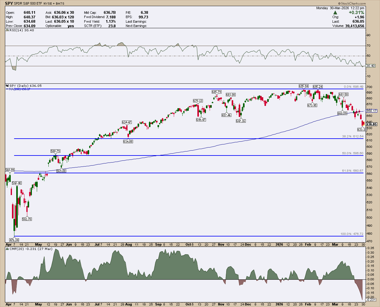
Plus, this chart lends itself easily to presentations (if that’s the kind of thing you do). In a way, SharpCharts slows you down a bit, which is actually a strength because it keeps you less distracted so that you can better focus on your analysis.
Use ACP for Dynamic Charting and Real-Time Context
When speed and context is critical to your analysis, you’ll want to use ACP.
Here’s a simple, hypothetical example. Suppose a trader was trying to fine-tune an entry point for a stock. That trader might have the stock use a three-chart layout:
- 15-minute chart to fine tune an entry
- Daily chart to see the near term-trend
- Weekly-chart to see the longer term trend
Take a look at the image below.
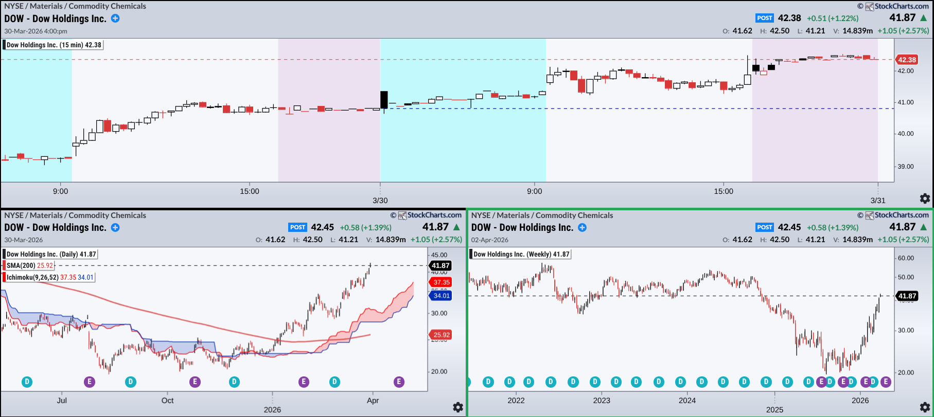
This simple setup is like a three-panel decision workspace. Suppose a trader was looking to enter a position in Dow Holdings Inc. (DOW). The 15-minute chart (top) is the fine-tuning panel. Price is compressing in a range, and the key question is simple: Does it break up or down?
Zooming out, the daily chart (left) shows intermediate-term structure. If price breaks higher, you can see the nearby swing lows, which is perfect for placing trailing stops. If things go south, it also highlights where stronger support might step in.
Then there’s the weekly chart (right), which is the context layer. Price is pressing into a level that used to act as support. Now? It may flip into resistance. We don’t know what’ll happen, but the early warning is visible in the chart.
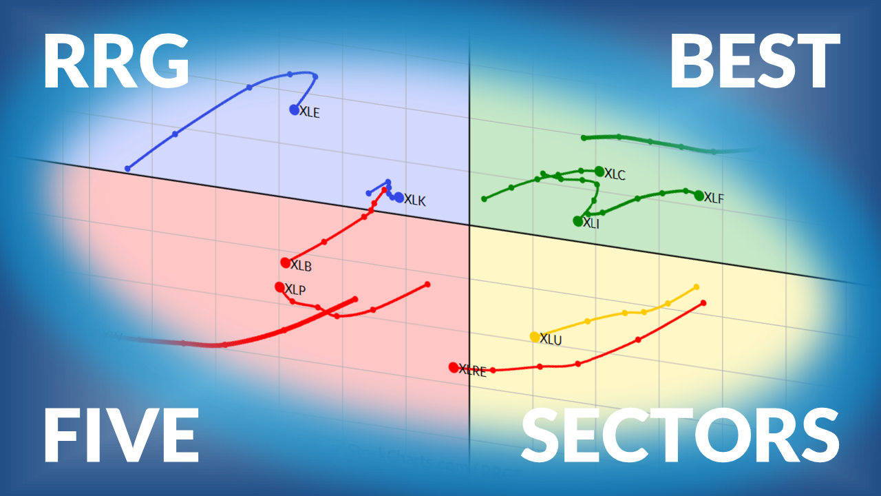
Here’s another example. Suppose a trader was looking for an entry point among the top six sectors. They pull up a chart of the top six, using a 200-day SMA and an Ichimoku Cloud to gauge trend momentum and support/resistance range.
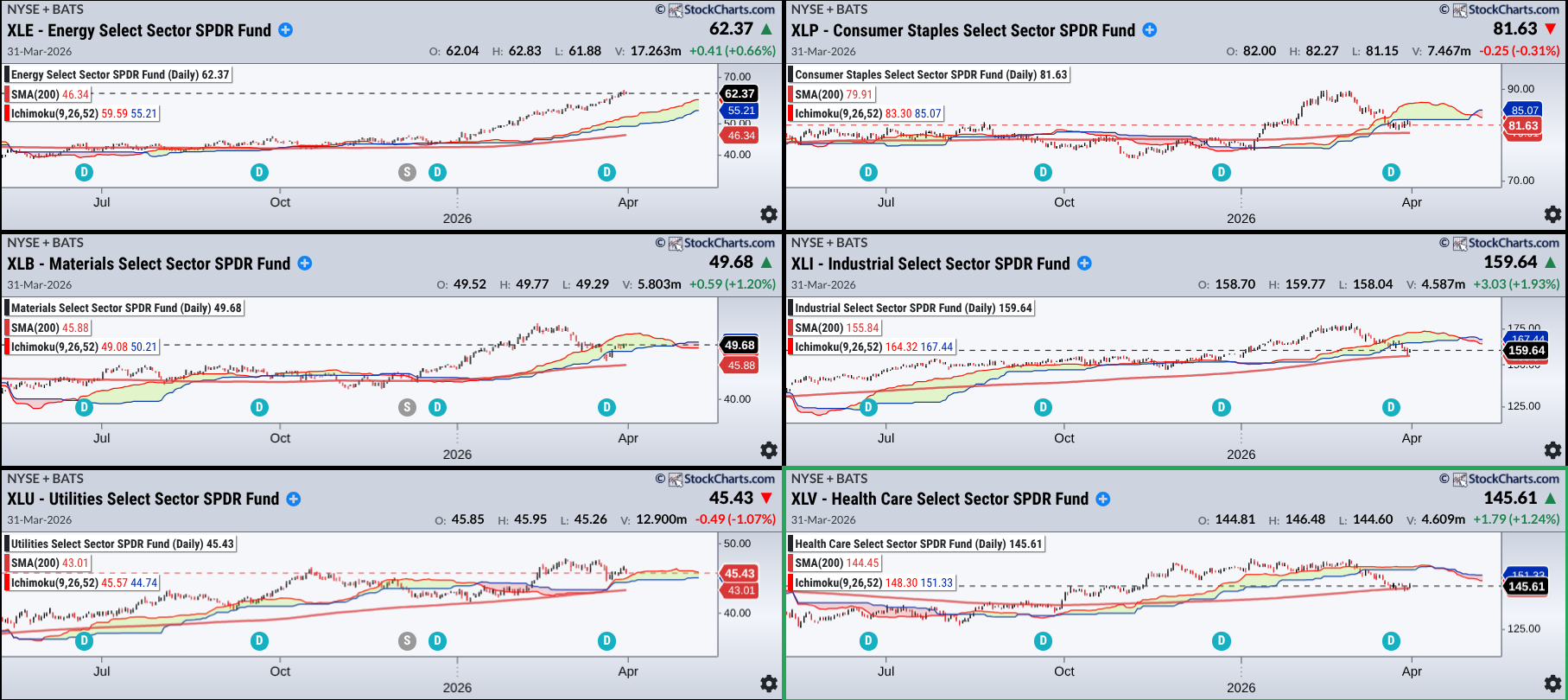
Here, that trader would see the stronger of the three on the left-hand side where those entry points might be. On the right side, prices are about to bounce off the 200-day SMA but, given that they’re below the cloud, a trader might expect some friction as price attempts to break above the potential resistance range.
Again, these may seem oversimplified, but I think you get the picture. Plus, these are just a few ways among several to use ACP.
Insider Tip: Using Both in Sequence May Give You an Advantage
Depending on how you approach your analysis, you might find some good ways to implement both into your workflow.
1 - Scan & Monitor -> ACP: Use ACP to identify opportunities.
2 - Refine & Confirm -> SharpCharts: Break it down, validate the structure, go deeper and identify risk as well as the setup.
3 - Execute & Track -> ACP: Monitor price action and alerts to help fine-tune your entry in real time.
4 - Document & Review -> SharpCharts: Study your decision post-trade.
The main point here is to use ACP to find and monitor a trade and SharpCharts to analyze it in greater depth.
Too many charts can also lead to multi-timeframe paralysis. That's what happens when too much information gets in your way of making a clear decision, and this is where pairing ACP with SharpCharts can help. ACP gives you speed and broad context to spot potential setups, while SharpCharts slows the process down so you can refine the setup and map out risks. Used together, this combination prevents you from making rash decisions and, in the end, can lead to smarter decision-making.
And That’s a Wrap
The point of this article is not only to highlight the differences between the two platforms, but also to show that they’re not competing tools. If used correctly, they can be strong complimentary platforms. The edge here is not in using one or the other, but knowing when to use each and how to move between them. After all, the difference between “noise” and “signal” really comes down to one thing: it’s not what you’re looking at, but how you’re looking at it.