Are Warning Signs Emerging Beneath the Surface of This Bull Market?

While the S&P 500 and Nasdaq 100 continue to push to new all-time highs in May 2026, not all signals beneath the surface are as constructive as the headline indexes might suggest. In fact, some of the more ominously-named breadth indicators are beginning to flash early warning signs.
Today, we’ll review two of those indicators, both rooted in the study of previous market tops, and discuss what they may be telling us about the current environment. As always, the goal is not to predict an imminent peak, but to recognize when conditions begin to resemble late-stage bull market behavior.
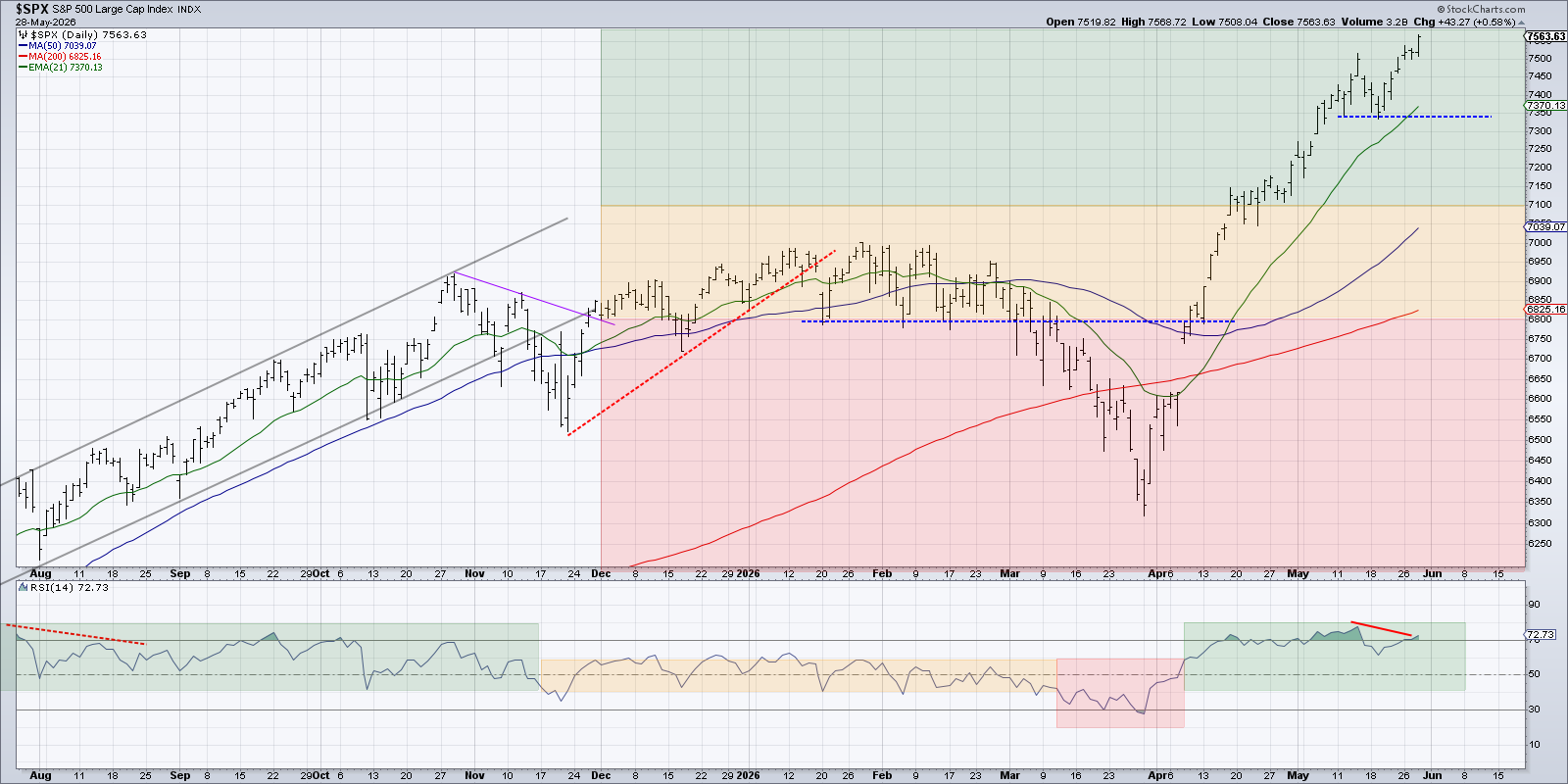
Reviewing the daily chart of the S&P 500 index, we can see the primary trend remains undeniably strong. A consistent pattern of higher highs and higher lows continues to define this uptrend phase. From a classic trend-following perspective, the market remains “innocent until proven guilty” as it continues a pattern of higher highs and higher lows.
As a technician, though, it’s important to think a bit like a contrarian. When price action looks the strongest, that’s often when we should be asking the most difficult questions. Are momentum readings confirming the advance? Is breadth expanding or contracting? Are volatility and credit markets signaling increased risk? And in this case, are composite breadth indicators beginning to flash warning signals?
The Hindenburg Omen Once Again Flashes an Initial Warning
The first indicator to consider is the Hindenburg Omen, a composite signal designed to identify conditions commonly seen before major market tops. Despite its dramatic name, the logic behind the indicator is fairly straightforward, as it looks for three key conditions to occur simultaneously.
First, the market must be in an uptrend, typically measured by the New York Composite Index trending higher over a defined period.
Second, there must be an unusual divergence in breadth, where a significant number of stocks are making new highs at the same time that a meaningful number are making new lows. This reflects a lack of uniform participation beneath a rising index.
Finally, a short term breadth measure, the McClellan Oscillator, must turn negative, signaling weakening momentum in the advance-decline data.
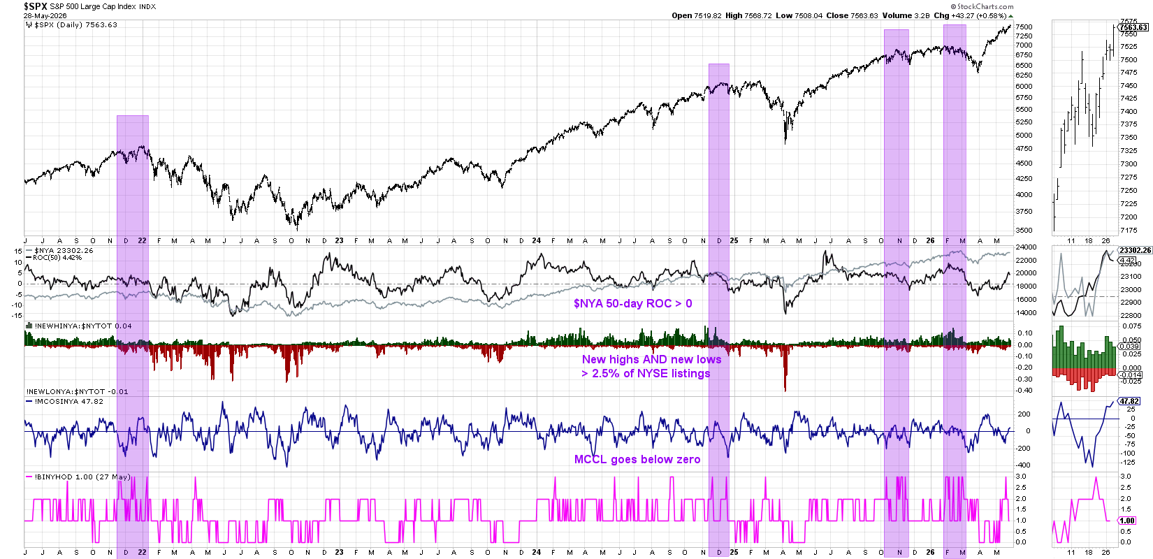
Here we’re showing a chart with all three factors shown separately, along with a “composite” indicator that counts the indicators fulfilling the criteria for the Hindenburg Omen. When all three of these conditions are met, the indicator goes to “3” which triggers an initial signal. And with all three of the conditions flashing last week, we’ve now experienced that exact warning sign.
Now, one key nuance is that a single signal is not enough. Historically, the Hindenburg Omen only becomes valid when multiple signals occur within one month. That clustering of signals has tended to align more closely with major turning points, because the frequency of occurrences in a relatively short window implies an urgency to the signal.
Looking back over recent years, the Hindenburg Omen has indeed had mixed results. There have been instances where signals preceded meaningful drawdowns, including the late 2021 peak into early 2022. There have also been plenty of false positives, where the market continued higher despite the warning. Most recently, the signal generated a confirmed bearish reading in November 2025 and again in February 2026. That first signal did not really result in much of a pullback before the uptrend resumed.
That’s why this indicator is best viewed as an early warning system, not a standalone trading signal. Think of it as a tornado watch, not a tornado warning. This chart tells you that conditions are favorable for potential instability, but it does not confirm that a breakdown is imminent.
At this point, the clock has started. Over the coming weeks, the key question is whether we see additional confirmed signals or whether this proves to be another false alarm.
The Titanic Syndrome Implies Rough Waters Ahead
The second indicator on our list, equally dramatic in name, is Titanic Syndrome. This signal is actually a bit more straightforward in its construction, looking for a divergence between the headline index and underlying breadth, but with a simpler rule set. Specifically, it requires the Dow Jones Industrial Average to register a new 52-week high and then, within one week, the number of stocks making new lows exceeds those making new highs.
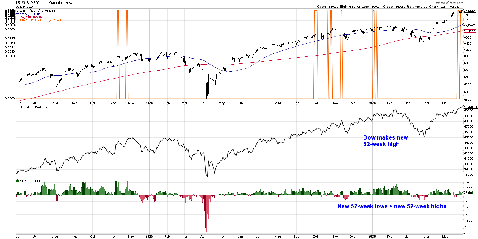
In other words, the market appears strong on the surface, but internally, more stocks are declining than advancing. That divergence has historically been a hallmark of weakening market conditions as it represents a lack of upside participation. We saw this signal trigger recently as the Dow pushed above 50,000 while underlying breadth deteriorated.
Like the Hindenburg Omen, the Titanic Syndrome is not a timing tool on its own. It has produced both meaningful signals and false positives over time. But when viewed in context, it can be a powerful way to highlight when the character of the market is beginning to change.
When indexes are making new highs but participation is narrowing, that is rarely a healthy long term condition.
Putting It All Together
Both of these indicators are rooted in the same principle. Strong markets are typically supported by broad participation. When that participation begins to fragment, even as indexes continue higher, it can signal a late stage environment.
What makes the current moment particularly interesting is that both indicators have flashed signals within a relatively short period of time. Does that mean a major top is imminent? Not necessarily. What it does mean is that conditions are beginning to resemble previous market peaks, and that is enough to warrant closer attention.
As always, the next step is confirmation. Are we seeing bearish momentum divergences? Are key support levels breaking? Are trend following indicators beginning to roll over? Until those signals emerge, the primary trend remains intact. But with breadth conditions deteriorating, it may be time to tighten risk management and pay closer attention to signs of a potential change in character.
While it’s always a good time to own good charts, it’s also important to recognize when the broader environment may be starting to shift!
RR#6,
Dave
P.S. Ready to upgrade your investment process? Check out my free behavioral investing course!
David Keller, CMT
President and Chief Strategist
Sierra Alpha Research LLC
marketmisbehavior.com
https://www.youtube.com/c/MarketMisbehavior
Disclaimer: This blog is for educational purposes only and should not be construed as financial advice. The ideas and strategies should never be used without first assessing your own personal and financial situation, or without consulting a financial professional.
The author does not have a position in mentioned securities at the time of publication. Any opinions expressed herein are solely those of the author and do not in any way represent the views or opinions of any other person or entity.