The CPI Threshold That Has Often Ended Equity Rallies
Key Takeaways
- Commodity price action is one of the earliest and most powerful drivers of consumer inflation.
- The relationship between CRB and CPI shows a likelihood of a higher level of consumer prices.
- Relationship between CPI and S&P 500 suggests additional upward pressure is working its way through the early stages of the inflation pipeline.
The outbreak of new hostilities in the Persian Gulf has triggered a sharp spike in oil prices and prompted analysts to raise their expectations for a higher rate of consumer price inflation (CPI). Because oil feeds into so many downstream products, and the rally has broadened across numerous commodities, it seems likely that a higher CPI reading is already in the pipeline. If that proves correct, the key question becomes how far the CPI can rise before it starts to undermine the equity bull market.
Before addressing that question specifically, let’s first take a closer look at the relationship between commodity prices and the CPI. That’s because commodity prices sit at the very front end of the production pipeline, making them one of the earliest and most powerful upstream drivers of consumer inflation.
Chart 1 illustrates this dynamic by comparing the 12‑month rate of change in the CPI with a long‑term KST of the ratio between the CRB Composite and the CPI. The vertical lines mark KST lows and, if you look to their right, you will see that the CPI typically firms after momentum in the CRB/CPI relationship has already turned higher. The dashed lines remind us that no two cycles are identical and that a variety of other forces influence CPI trends, but the overall message is clear: commodity momentum tends to lead consumer inflation, often by several months. What it does not forecast is the magnitude and character of the subsequent firming in the CPI. The KST bottomed last year and, following a brief period of hesitation, has now begun to accelerate on the upside. That doesn’t guarantee a greater level of consumer prices, but it puts the odds in that direction.
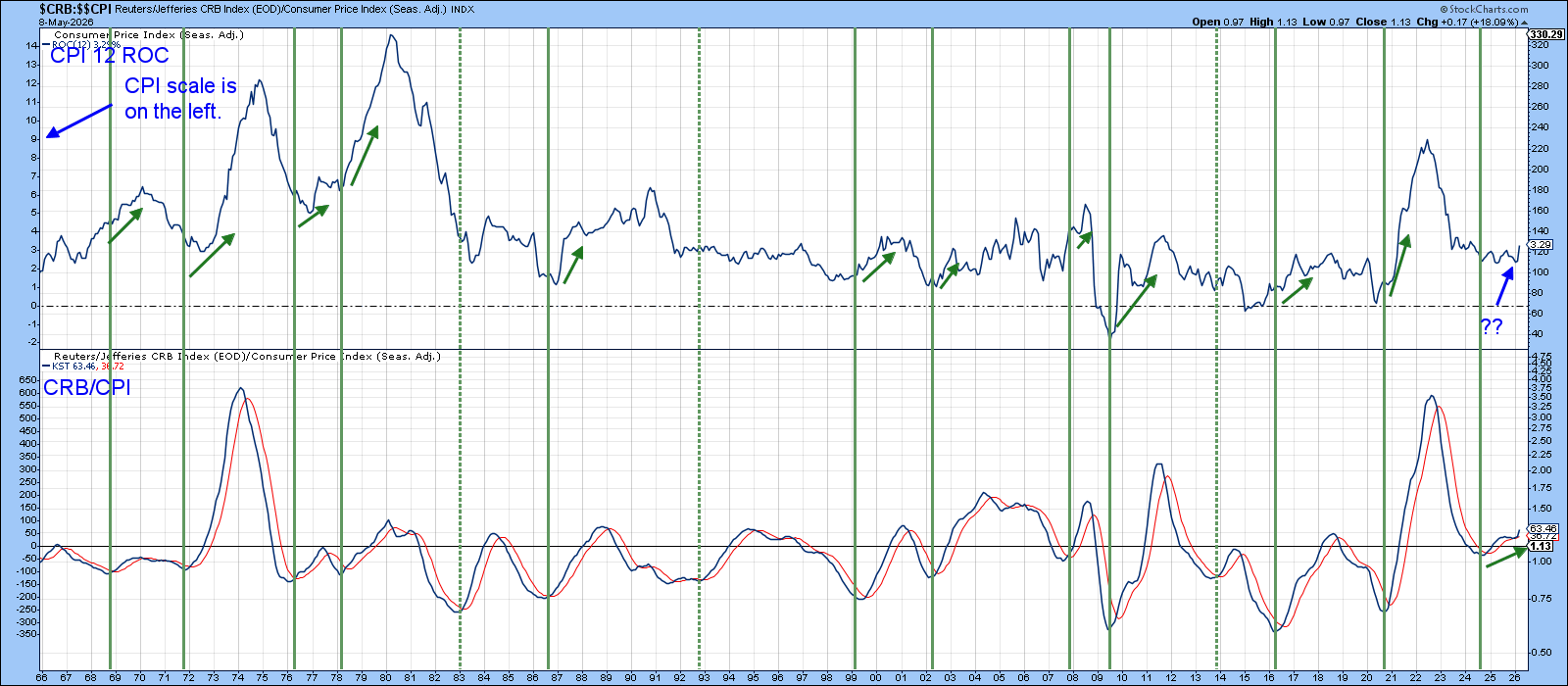
Chart 2, which compares the CPI to the inflation‑adjusted S&P Composite, underscores the importance of identifying the CPI danger zone. Please note that the CPI scale appears on the left axis. In this instance, I have substituted an 18‑month ROC for the 12‑month version. The reason is straightforward: the 18‑month ROC tracks the 41‑month business cycle more closely and exhibits far less month‑to‑month noise, thereby avoiding several false negatives, which are often generated by the 12-month span.
The horizontal red line at 5% marks the warning level above which equities have historically become vulnerable. The red vertical lines show each instance where the 18‑month ROC has pushed above that 5% threshold, and the downward‑sloping red arrows approximate the subsequent damage to inflation‑adjusted equity prices. Note that a re-entry of the sub-5% zone doesn’t mean that the bear market for stocks will end, as was experienced in 2001–2002 when the tech boom was unwinding. Neither does a prolonged and relatively elevated reading mean total disaster, as we saw in the 1987–1991 banking crisis period.
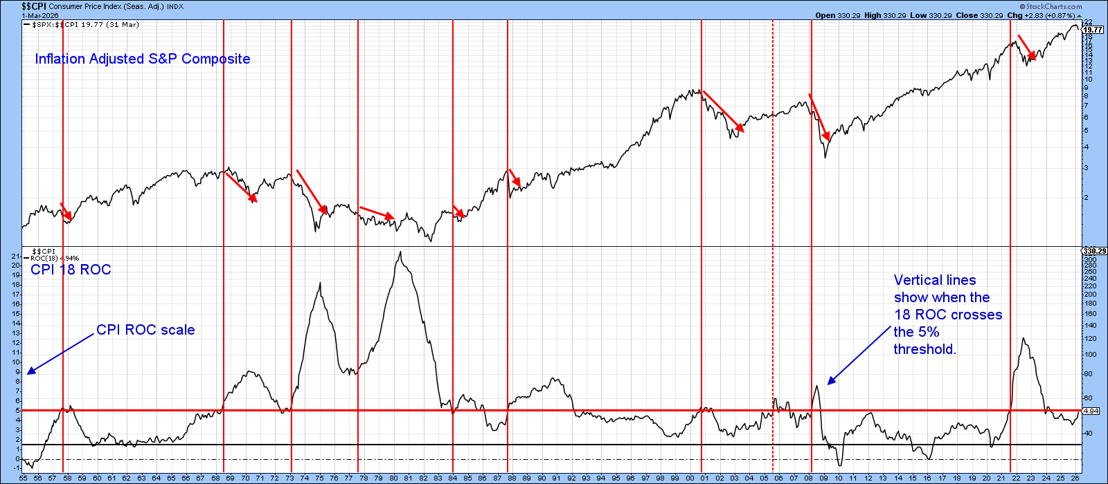
The current reading, hovering just below the 5% barrier, doesn’t leave much margin for error. Given the leading nature of commodity prices and their recent surge, it seems clear that additional upward pressure is already working its way through the early stages of the inflation pipeline. It would not take much further acceleration for the 18‑month ROC to break above the 5% line and trigger a formal warning.
If such a move proves transitory, the damage to inflation‑adjusted equities would likely be limited. However, my work indicates that the business cycle had already entered an inflationary Stage 4 before the outbreak of war, with the energy spike merely adding the icing to an already‑developing inflationary cake.
Consequently, even if hostilities subside and oil prices retreat, the economy will still be forced to contend with underlying inflationary pressures, pressures that are likely to push the CPI higher regardless. Either way, inflation‑adjusted stock prices are likely to suffer.
Good luck and good charting,
Martin J. Pring
The views expressed in this article are those of the author and do not necessarily reflect the position or opinion of Pring Turner Capital Group of Walnut Creek or its affiliates. The Six Stages of the Business Cycle are followed each month in Martin Pring’s Intermarket Review.